
Microsoft Power BI
Our Power BI articles below clearly and simply how to use specific aspects of Microsoft Power BI that we also cover in our Power BI training courses.
AllAdobe IllustratorAdobe InDesignAdobe PhotoshopAutoCADCommunication & AssertivenessGuides & TipsLeadershipManagementMicrosoft 365Microsoft AccessMicrosoft ExcelMicrosoft OutlookMicrosoft Power AutomateMicrosoft Power BIMicrosoft PowerPointMicrosoft ProjectMicrosoft SharePointMicrosoft WordMinute TakingNewsPresentation SkillsProject ManagementResilienceSQLTime Management
How To Use The Smart Narrative Visual In Microsoft Power BI
The Smart Narrative visualisation summarizes the information in your Power BI dashboard into text very quickly. It uses natural language processing to automatically generate text based on the visuals in your report. Visuals are part of both our introduction and…
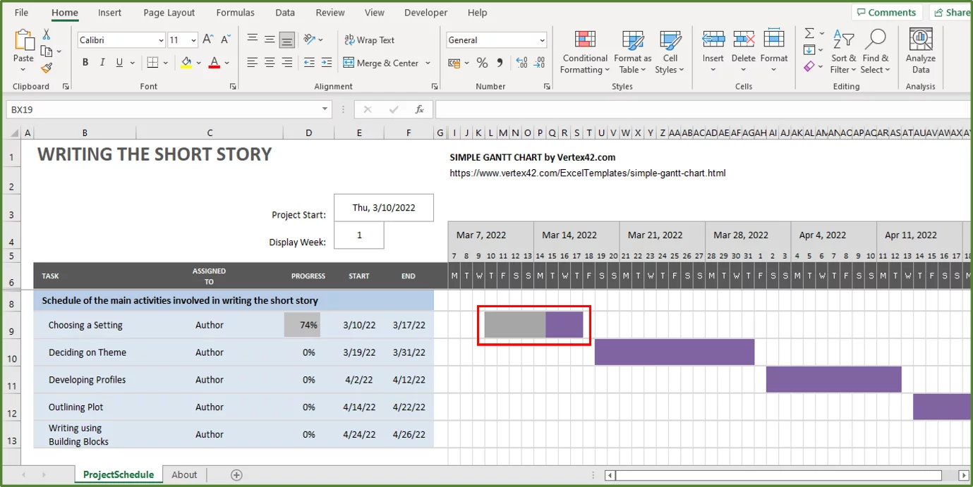
Creating Gantt Charts In Power BI
What Is A Gantt Chart? A Gantt chart is a bar chart commonly used in project management to schedule tasks and manage and report the progress of key tasks. A Gantt chart displays tasks in horizontal bars along with timelines…
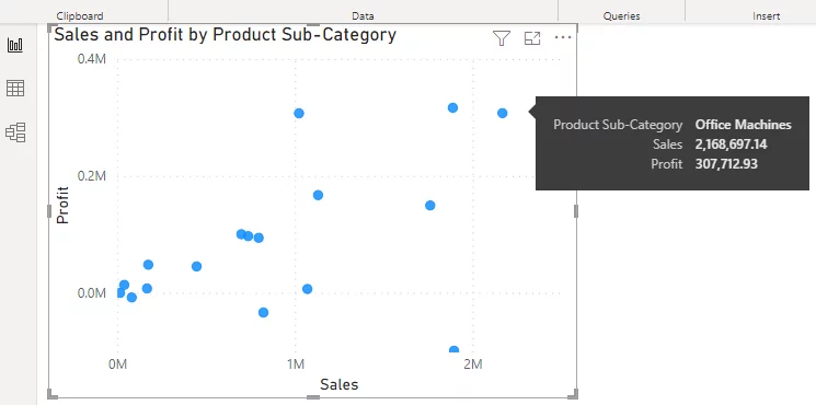
How To Create Scatter Charts In Power BI
A scatter chart is a diagram that displays the relation between two numeric variables for a set of values. Typically, a scatter chart plots data points for a set of values for two variables using Cartesian coordinates. They allow you…

Creating A Bullet Chart In Power BI
A Power BI bullet chart is a more advanced type of bar chart and great for plotting data comparisons. Each bar is shown against multiple qualitative ranges and a target, making it really easy to monitor progress. A bar plot…
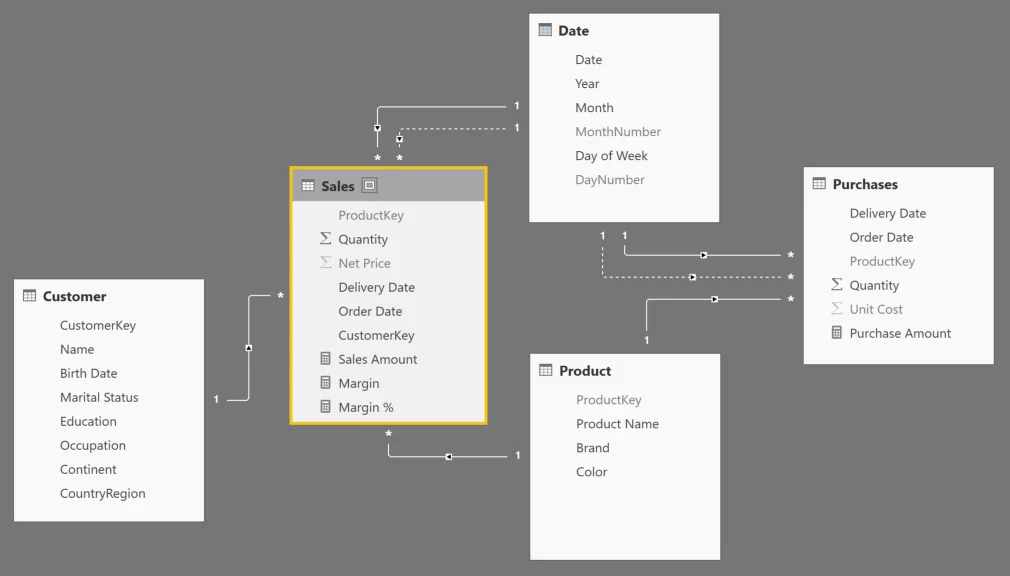
How To Create Data Models in Power BI
A Power BI Data model is a collection of entities (in the form of tables) connected via different types of relationships. Data Models looks very similar to an entity relationship (ER) diagram used in database design. We will cover the…
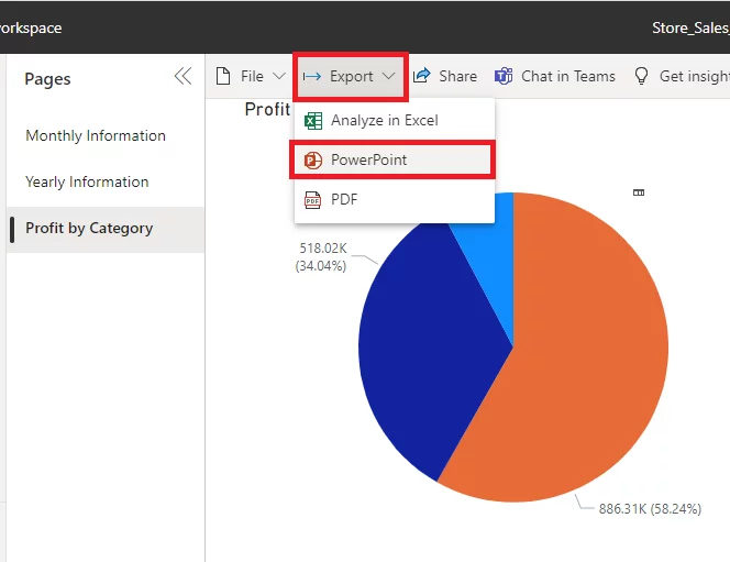
Exporting From Power BI To PowerPoint
One of Power BI’s great strengths is how easy it makes sharing dashboards and reports but there are occasions when you don’t want to. This article explains how to export Power BI to PowerPoint using Power BI Service. You will…
Step-By-Step: Creating A Power BI Dashboard
A dashboard is a single page designed to visually display a combination of data visuals that give someone a clear understanding of the underlying data very quickly. It is a great way for you to visualise your information A well-designed…
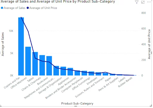
Creating A Combo Chart (Two-Axis Chart) In Power BI
In this article, you will learn how to quickly create and edit the formatting of Power BI combo charts. Combo charts are dual-axis charts (they have a secondary Y-axis), making them great ways to compare two different datasets against another…
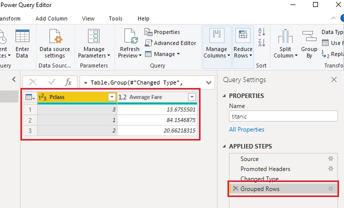
Using The Group By Feature In Power BI
The Group By feature in Power BI summarises data based on one or more aggregate functions. You can use the Group By feature to find the average, count, min, max, or any other aggregate value for one column, based on…
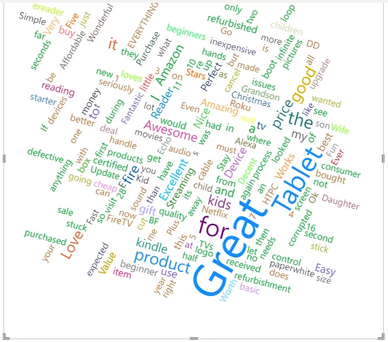
Creating A Word Cloud In Power BI
In this article, we will look at how to create a Word Cloud with Microsoft Power BI. We will see what a word cloud is, why it is useful, and how to perform various transformations on a Word Cloud. If…
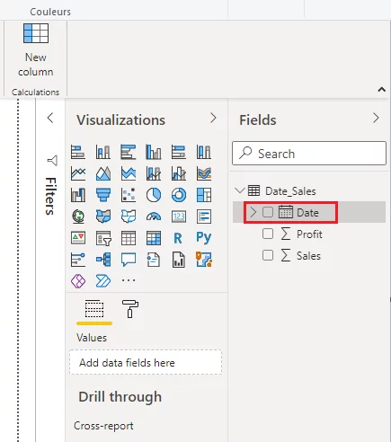
Working With Date Formats In Power BI
In this article, you will see how the Power BI Date format works and how you can format dates in the Power BI reports view as well as in the Power Query editor. You will also use the different methods…
Sharing Reports & Dashboards In Power BI
A Workspace is a place where you can work with your team, creating dashboards, datasets, dataflows and reports. Initially you will have access to your own personal workspace, called My Workspace, this enables you to work with your own content,…