
Power BI’s Scatter Charts – Create Amazing Visuals
Contents
A scatter chart is a diagram that displays the relation between two numeric variables for a set of values.
Typically, a scatter chart plots data points for a set of values for two variables using Cartesian coordinates.
They allow you to compare data points on two axes at the same time far more easily than you can in a line or column chart.
In this article, we will see how to plot a scatter chart in Microsoft Power BI.
The scatter chart in Power BI is the only default visualisation that you can use to create animations.
Our Microsoft Power BI courses cover visuals in detail if you want to learn more.
Importing An Example Dataset
The dataset used to create the scatter charts in this article can be imported from this Github link.
The dataset is about product sales, such as the product’s name, date, category, order id, and profit on each sale.
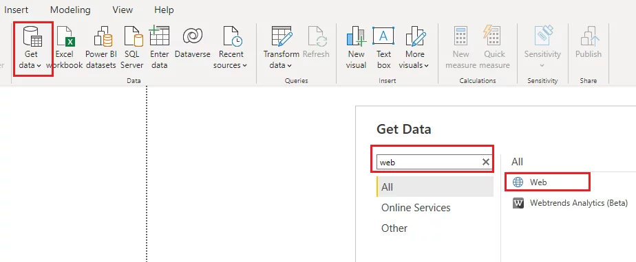
To import the data from this online link, click on the “Get data” button from the ribbon menu, type “web” into the search bar and then select “web” from the list of options.
In the following dialogue box, enter the link to the Github link containing your CSV file.
Then click the “Load” button to load the data in the reports view into Power BI.
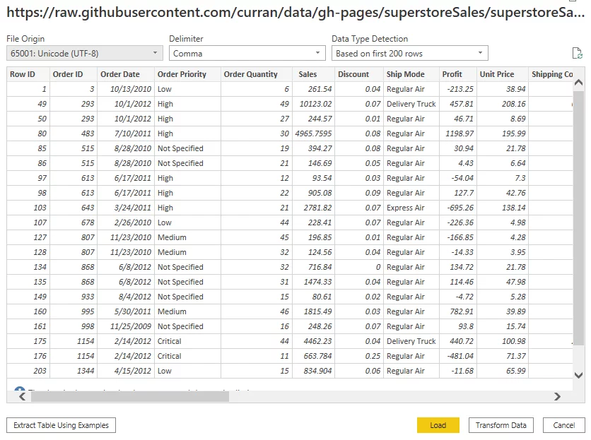
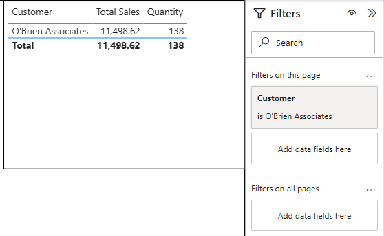
You should now see your dataset name along with the columns of your CSV file in the “Fields” pane of your reports view.
Simple Example: Scatter Chart
Let’s start simple and create a scatter chart that shows the relationship between sales and profit.
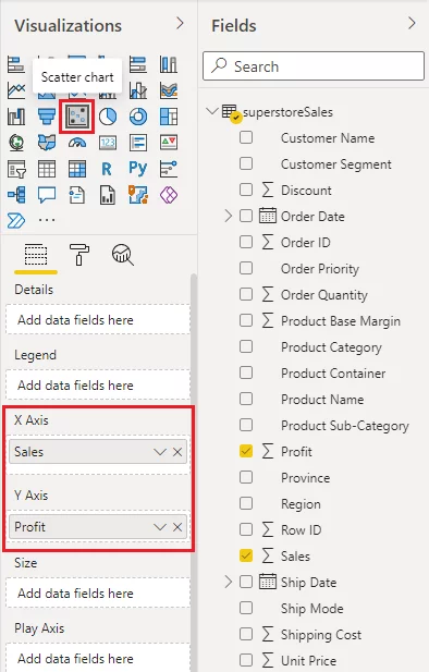
From the Visualizations pane, select “Scatter chart”. It is the icon that shows five dots on a chart.
Next, you need to specify column values for the “X-Axis” and “Y-Axis” fields. Drag “Sales” and “Profit” columns from the “Fields” pane and drop them in the “X-axis” and “Y-Axis” fields, respectively.
Here is a screenshot for your reference:
In the reports view, Power BI Desktop will create the following scatter chart.
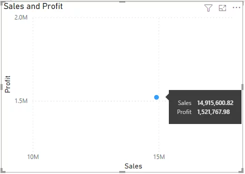
By default, you will see only a single data point, the sums of the two datasets.
If you hover your mouse over the data point, you will see the values shown.
A scatter chart with one data point doesn’t tell you much.
It would be better if you could see sales and profits grouped by categories of products.
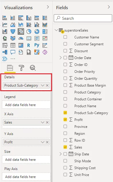
To do so, drag the “Product-Sub-Category” column from the “Fields” pane and drop it to the “Details” field.
Your scatter chart will now look like this:
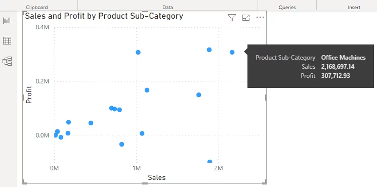
If you hover over any data point, you will see the sub-category name.
To see the category name for the products with high sales and high profits, you can hover over the data points near the top-right corner of your scatter chart, as we have done with office machines above.
Annotating Your Scatter Chart
Labelling Data Points
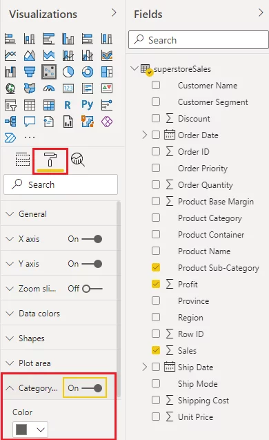
To display category names along with data points, go to the “Format” option (paint roller icon) in your scatter chart and then drag the value for the “Category labels” option to “On”.
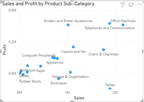
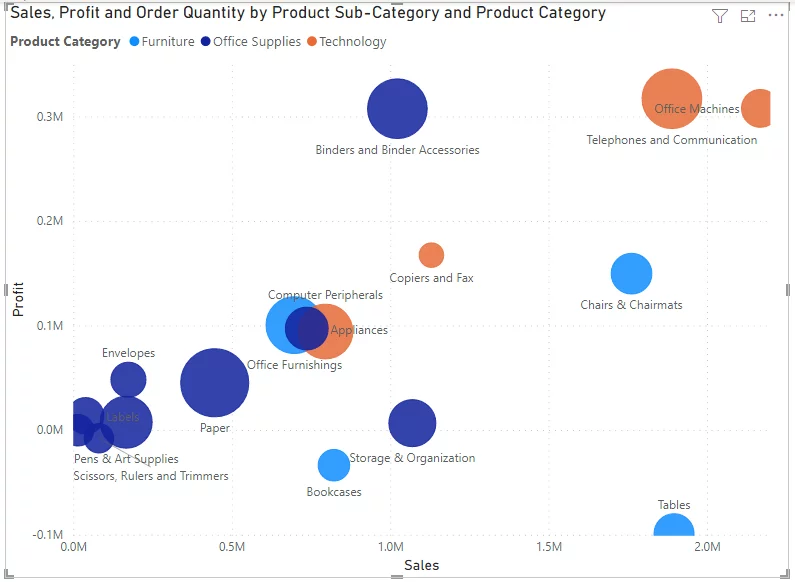
In the output below, you can see the names of your sub-categories along with data points.
Changing the Size of Data Points
By default, the scatter chart in Power BI displays all the data points with equal size.
You can plot data points with variable sizes by assigning them weights.
You can produce scatter charts where the size of a data point ( or bubble) it relates to. In our example, this would be the volume of sales for all the products in each category.
To do this, you need to add the “Order Quantity” column from the “Fields” pane to the “Size” field.
You also add the “Product Category” column to the “Legend” field”.
These changes will adjust the colour of the data points depending on their primary product category.
You can learn more about this option by accessing our article about bubble charts.
Adding Animations With Play
The Power BI scatter chart is the only default chart that can be used to plot animations in Power BI.
Something that’s difficult to do in SSRS and Google Data Studio.
To do so, you need temporal or time-series data, e.g. year, dates, months, etc.
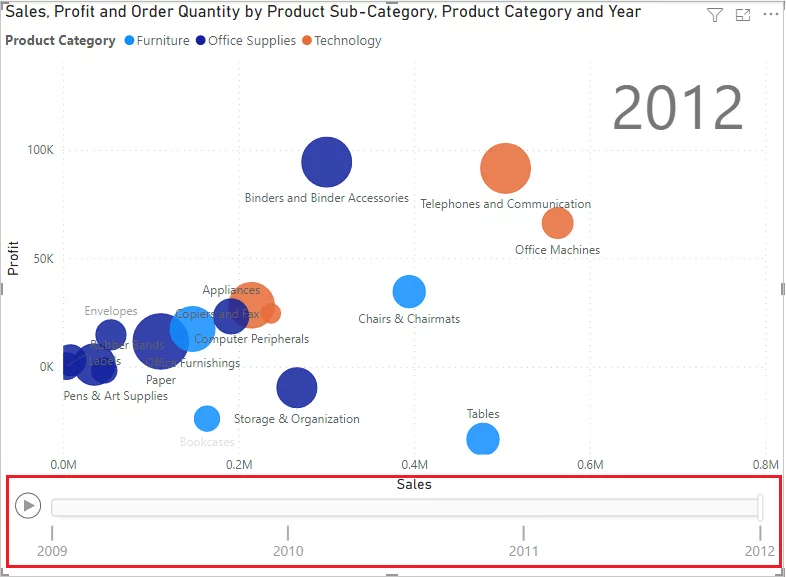
Let’s create an animation that changes the position of data points on a scatter chart based on yearly information.
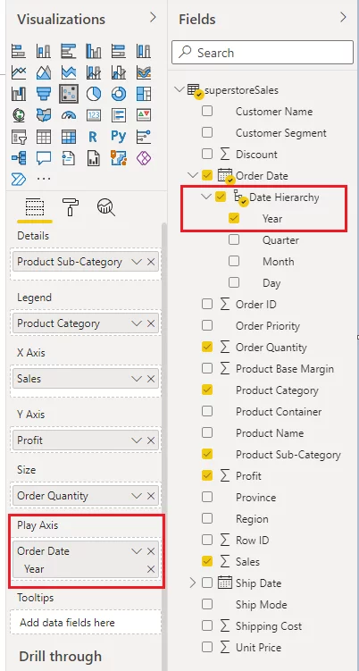
Select the “Year” values from the “Order Date” date hierarchy and drop them on the “Play Axis” field.
You will now see a play option on your scatter chart and a bar showing progress across the bottom of your chart.
If you click the play button (the triangle), you will see that the data point positions and sizes will change with the year.
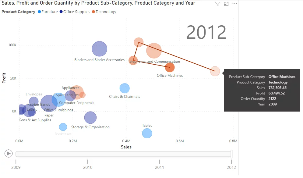
You can also trace a trend in your animation.
Once your animation has finished playing, if you click on any data point, you will be able to see its trend over the years, where a line and differing size bubbles trace how the data for that point has changed over time.
Conclusion
A Power BI scatter chart is a handy tool to plot your data when you want to make a decision based on values from two sets of variables.
With Power BI scatter chart, you can also plot animations and see data trends over a specific period.
The scatter chart visual works well with the Q&A visual and smart narrative visual if you want to bring out the critical points of your data in a dashboard you are creating.
However, if you want to see the relationship between more than two variables, the Power BI Matrix chart is probably a more fitting solution.
Other Power BI Articles
How To Create A Tree Decomposition Visual
Power BI Dashboards And Reports Compared
How To Connect Power BI To A SQL Server

- Facebook: https://www.facebook.com/profile.php?id=100066814899655
- X (Twitter): https://twitter.com/AcuityTraining
- LinkedIn: https://www.linkedin.com/company/acuity-training/