
Master The Smart Narrative Visual [Advanced Guide]
Contents
The Smart Narrative visualisation summarizes the information in your Power BI dashboard into text very quickly.
It uses natural language processing to automatically generate text based on the visuals in your report.
Visuals are part of both our introduction and advanced Microsoft Power BI courses.
This advanced functionality sets Power BI apart when compared to SQL Server Reporting Services and Google Data Studio.
Power BI automatically analyses the trends / data in your report and creates insights based on the filters in your report.
It is important to note that visuals are not the end goal of reporting!
Like learning, different people absorb information differently, and finding the right way to present it is key.
Enabling the Smart Narrative Visual
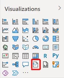
Assuming you have a current version of Power BI, Smart Narrative will be a default option on the Visualizations pane regardless of the Power BI licence that you have.
If you are on an older version, you may have to enable preview mode!
This can be done by going into File > Options and Settings > Options > Preview Features.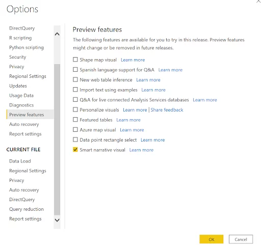
Creating A Smart Narrative Visual
Like most visuals, creating a Smart Narrative visual is as simple as selecting the visual from your Visualisations pane.
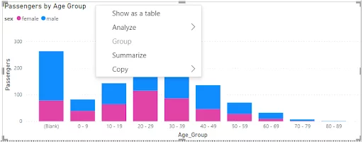
Alternatively, you can right-click on the visual and select “Summarize”.
In this case, we are going to use the Titanic Dataset which, you can find here.
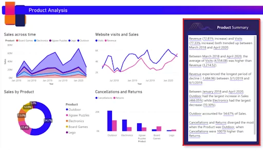
The Smart Narrative will create a block of text similar to the one shown below.
It should be noted that you do not have to add any fields to the visual.
The Smart Narrative visual will pull all of your data and summarize it.
After that, you will be able to delete or add other information as you require.
The blue underlining shows where your data has been summarised.
Advantages: Smart Narrative Visuals
The most significant benefit of the Smart Narrative visual is that it saves you vast amounts of time.
The visual allows you to skip the step of manually typing out your notes, as it does for you.
Since Power BI does this dynamically, it doesn’t matter how the user slices the data, it will provide a narrative.
Out of the box, the visual will create its own narrative, but you can also adjust it to tailor it to your needs.
Given Power BI’s natural language processing capabilities, adding dynamic values to your narrative is also possible.
See here for more details of Power BI’s machine learning capabilities.
You can simply type a statement into your text box, and where there should be a value, click “Add Value’ and Power BI will search your data and suggest values.
This is particularly the case for people producing visuals to export to PowerPoint slides.
Use Cases for Smart Narrative Visual
1. KPIs
As an analyst, how often do you get asked the same question?
This is primarily due to leaders or senior leaders focusing on specific metrics that drive their business or incentives.
While stunning visuals are most analysts preference, senior leaders are different.
Many prefer tables or plain text that get right to the point and tell them precisely what they need to know.
The Smart Narrative allows leaders to get straight to their talking points while seeing trending or other visuals beside them if they want more detail.
2. Exploratory Analysis
At the other end of the spectrum, analysing a new data set trying to find useful trends can be very time-consuming.
Setting up a Smart Narrative visual will show you the trends that Power BI can find at the touch of a button.
It probably won’t find all of them, but it will give you a great start. The tree decomposition visual is another useful visual for exploring data.
3. Where Your Data Changes Frequently
Your Smart Narrative visual will automatically update when your data does.
4. Focusing Attention
Smart Narrative makes it very simple to focus users’ attention on a specific subset of your data.
Simply click on the data points you would like to use, and the Smart Narrative visual will cross-filter everything on the page.
It will automatically amend the summary to only speak to those data points.
Limitations
Smart Narrative is it is only as smart as your data.
It depends on how you structure and label your data to produce its key points. If your structure or labelling aren’t correct, it may well be a little clumsy.
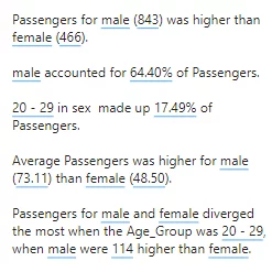
Using the Titanic dataset for passengers, the above shows the key takeaways that Smart Narrative produced.
The wording is not grammatically correct because of how the columns are labelled and how the data is laid out.
This can be solved in 2 ways:
1. Amend The Dataset
Change the way your columns are labelled, and Smart Narrative will automatically update.
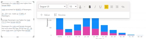
2. Edit The Summary Directly
The summary can be edited by clicking on the visual and selecting “+ Value” or simply highlighting the visual and deleting lines that you do not want.
It is also important to note that there is also some functionality that Smart Narratives doesn’t support at this time. A complete list of limitations can be found here.
The biggest issue currently is that Smart Narrative struggles when analysing data specific visuals. These include custom visuals or visuals made with R or Python, maps without summarized latitudes and longitudes, and summary visuals that contain on-the-fly calculations (QnA, complex measures, etc.).
This can be solved by including another supported visual on the report page. As long as your report contains at least one supported visual, Smart Narrative will work.
It should be noted that other visuals, like the Q&A visual, have lacked functionality when they were launched and that Microsoft has improved them over time. Microsoft will likely enhance the Smart Narrative as time goes on.
Especially as it is a standard visual and so included within Power BI. Don’t forget there is a whole world of other visuals to explore in the Power BI Marketplace like Gantt charts.
Conclusion
The Smart Narrative visual is a huge time saver when you need a data summary produced.
It is still new and so is a bit rough around the edges but will improve over time.
As a data analyst, learning to use it will pay back the time you spend doing so many times over.
Other Helpful Power BI Articles
A Guide To The Map Visual In Power BI

- Facebook: https://www.facebook.com/profile.php?id=100066814899655
- X (Twitter): https://twitter.com/AcuityTraining
- LinkedIn: https://www.linkedin.com/company/acuity-training/