
Creating A Combo Chart (Two-Axis Chart) In Power BI
Contents
In this article, you will learn how to quickly create and edit the formatting of Power BI combo charts.
Combo charts are dual-axis charts (they have a secondary Y-axis), making them great ways to compare two different datasets against another single dataset (the X-axis) on the same chart.
For example, you are comparing sales (millions of USD) with the weather outside (in C) by month (on the X-axis).
The range of values for sales and weather might make plotting them on the same axis complicated.
Much simpler to use a combo chart and use a two Y-axis chart to create a single visualisation.
You can place sales on one Y-axis and temperature on the other and conserve canvas space in your report canvas or report page.
In Power BI, a second axis is only available for your y-axis or vertical axis. The x-axis remains shared between data from multiple columns.
Data presentation is covered during our Power BI training courses if you would like to learn more.
Let’s see how to plot Power BI charts with secondary axes.
Importing the Dataset
You can download the dataset for this article from this link:
https://raw.githubusercontent.com/curran/data/gh-pages/superstoreSales/superstoreSales.csv

The dataset consists of a CSV file that contains various information about product sales at a superstore.
To import the data from this online link, click on the “Get data” button from the ribbon menu on the dashboard, type “Web” into the search bar and then select “Web” from the list of options.
In the following dialogue box, enter the link to the Github link containing your CSV file.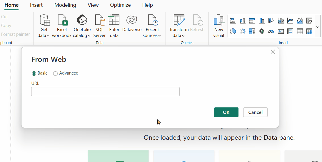
You will see the window below.
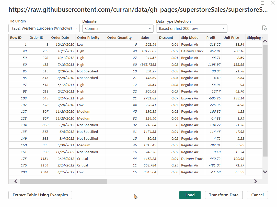
Click the “Load” button to load the data in the reports view into Power BI.
Creating a Secondary Axis Step-By-Step
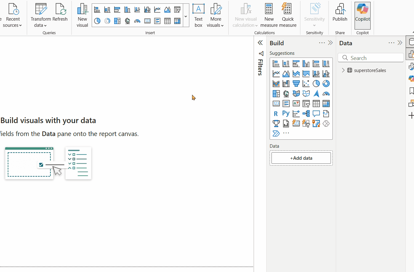
In this section, we will look at creating three different charts with a secondary axis.
- Combined Line & Clustered Column Chart
- Combined Line & Stacked Column Chart
- Line Chart
The process is slightly different for each.
If you want to learn about a specific type of chart, you probably want to skip that part.
Combined Line and Clustered Column Chart
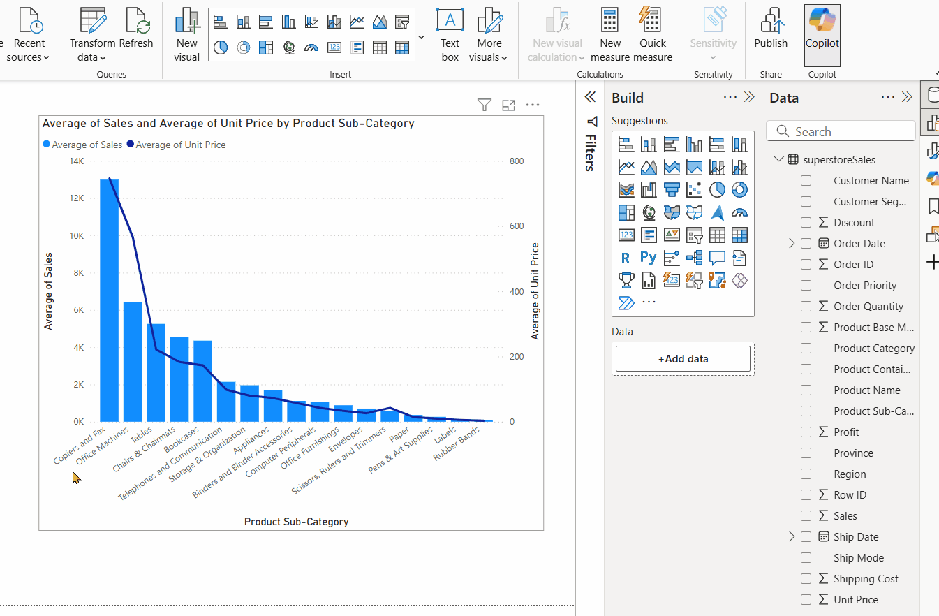
Select the corresponding visualisation from the Visualizations pane to create a “Line and Clustered Column Chart”.
As discussed earlier, the x-axis will be the shared axis. Let’s add the Product Sub-Category column from our dataset to the Shared axis field for our example.
The next step is to select the values displayed in the form of a column chart.
Drag and drop the Sales column to the Column Values field. Change the value of Sales from Sum to Average by clicking the dropdown symbol (the down-pointing arrowhead also known as an ‘inverse caret symbol’).
For the line plot, add the average of the Unit Price column to the Line values field.
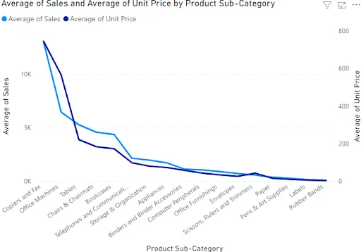
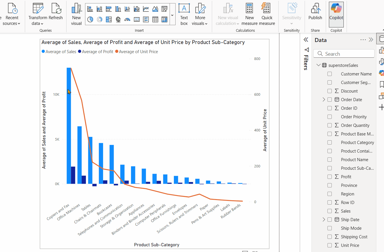
You should see the following line and clustered column chart with a shared x-axis and two y-axes (vertical axes).
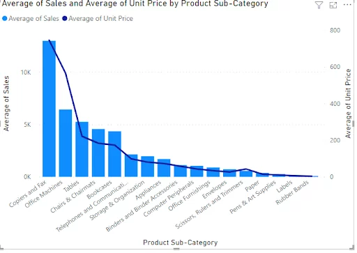
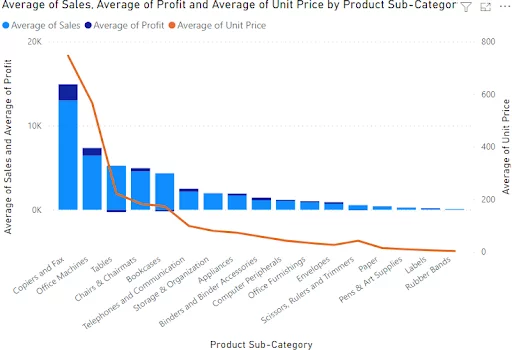
The left y-axis in the above image shows average sales values as depicted by the columns. At the same time, the right y-axis shows the average unit price values represented by the line.
The chart clearly shows that as you decrease the average unit price, you also reduce your average sales.
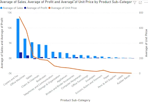
You can add more columns to the Column values or Line values field. For instance, if you add the average of profit from the Profit column to the Column values field, you will see the following chart:
You can now see from the above image that the left y-axis shows the average values for sales and profits.
Line and Stacked Column Chart
The steps needed to create a “Line and Stacked Column Chart” are similar to what you saw in the previous section.
You have to select the Line and stacked column chart visualisation from the Visualizations pane and then add dataset columns to the Shared axis, Column Values, and Line values fields.
As a result, you will see the following chart in your reports view.
Line Chart
The line chart visual in Power BI also allows you to plot a secondary axis.
To do so, click the Line chart visualisation from the Visualizations pane.
The Axis field contains the shared axis (the x-axis). The Values field contains the first y-axis that will be displayed on the left-hand side.
On the other hand, the Secondary values field contains data that will be displayed on the y-axis on the right-hand side, the secondary axis.
In the image below, you can see the corresponding line plot with two y-axes.
Editing Your Secondary Axis
You can edit your secondary axis to improve its presentation, as you would expect.
For example, you will see editing options for your Line and clustered column chart that you plotted in the first section.
To format your secondary axis, click the Format button (paint roller icon) to see all the available formatting options.
Next, select the Y axis option. You will see two options for your y-axis: Y-Axis (Column) and Y-Axis(Line).
Note: You have to scroll down a little to see the options for Y-Axis (Line)
The screenshots show the different options side-by-side.
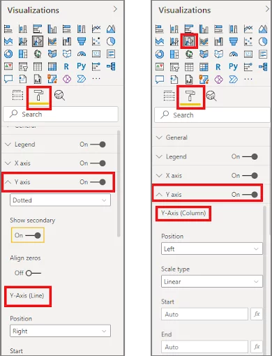
To edit the main Y-axis (left), you need to modify the options under the “Y-Axis (Column)” field, which is shown on the left in the above image.
You need to modify options under the “Y-Axis (Line)” field to edit the secondary axis.
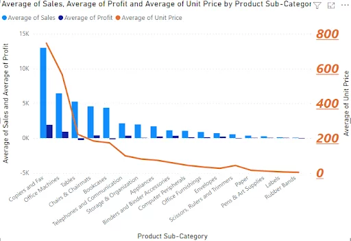
The following settings will change the colour, increase the font size, and make the secondary axis appear in bold and italic font. Other options include adjusting the axis range to a different value range, altering the presentation of the numeric value and axis title, and adding grid lines.
Here is how your plot looks after the modification of the secondary axis:
Limitations Of Combo Charts
Combo charts can be used to compare simple data from more than two columns, however, they have two main limitations:
- You can only add a secondary axis to your Y-axis. The X-axis will always be shared.
- Not all charts in Power BI allow you to plot a secondary axis. Only the charts that contain fields for Column Values and Line Values or Secondary Values will enable you to draw a secondary axis.
If you would like to learn about other types of charts, you can start with the bubble chart by accessing our article on this topic.
Conclusion
Secondary axes can be very useful when comparing two datasets (or more) against a shared dataset.
Though some Power BI charts allow you to plot the secondary axis, it is more convenient to use the Power BI Table chart for a more advanced comparison between multiple data values.
Other Articles On Power BI Visuals


- Facebook: https://www.facebook.com/profile.php?id=100066814899655
- X (Twitter): https://twitter.com/AcuityTraining
- LinkedIn: https://www.linkedin.com/company/acuity-training/