
Master The Bullet Chart In Power BI – 5 Minute Guide
Contents
A Power BI bullet chart is a more advanced type of bar chart and great for plotting data comparisons.
Each bar is shown against multiple qualitative ranges and a target, making it really easy to monitor progress.
A bar plot has two mandatory parts:
1) Category name,
2) Numeric score for that category, which is referred to as the actual value.
To learn more about Power BI, custom visuals are covered in our Microsoft Power BI training.
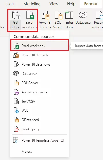
Accessing The Bullet Chart Visual
The bullet chart visualisation is not available as a default visualisation in Power BI, it is a custom visual.
You have to import it from the Power BI marketplace for visuals.
The ability to access so many visuals so easily is one of the biggest advantages of Power BI when compared to SSRS or when compared to Google Data Studio.
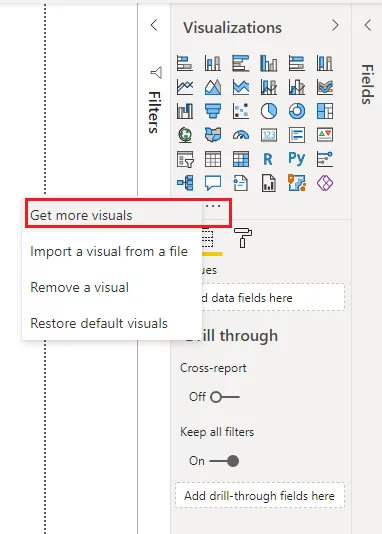
To do so, click the three dots (…) just below the Visualizations pane in the reports view and click the “Get more visuals” option.
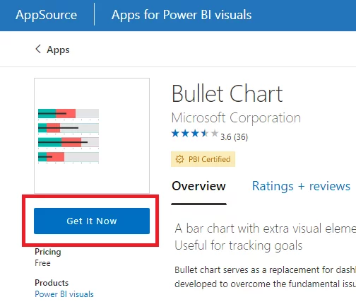
Search using the keyword “bullet” in the search bar at the Power BI visuals marketplace.
Select the “Bullet Chart” from Microsoft Corporation in the results.
Click “Get It Now” button to download it to your Power BI desktop.
Your visual will now appear in your Visualizations pane.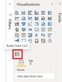
Importing Our Example Data
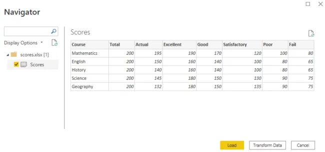
You will be using the Microsoft Excel table shown below as our example dataset.
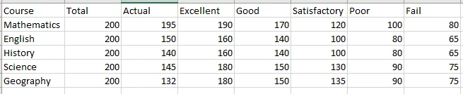
The dataset contains fictional values for total, actual, excellent, good, satisfactory, and fail scores for various courses taught during a school term.
To import the dataset, click the “Get data” or “Excel workbook” button.
Navigate to your Excel file and select it.
Finally, click the “Load” button when a screen showing your data appears.
Simple Example: Bullet Chart Creation
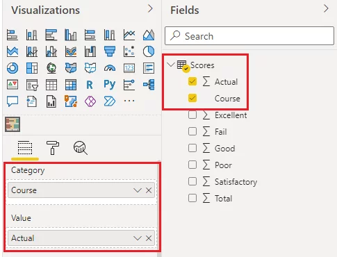
First, let’s create a basic bullet chart that displays the score name, the actual value for the score, and the maximum value for score from our dataset.
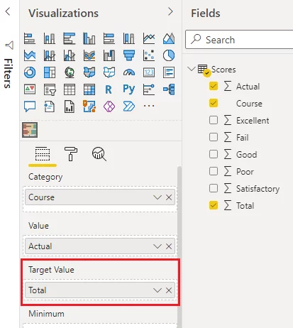
Drag the “Course” column from the dataset to the “Category” field and the “Actual” column to the “Value” field.
Similarly, to set the maximum value for our bullet chart:
Drag the “Total” column from the dataset to the “Maximum” field.
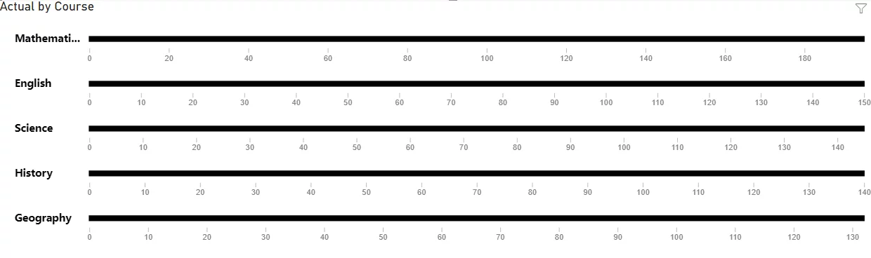
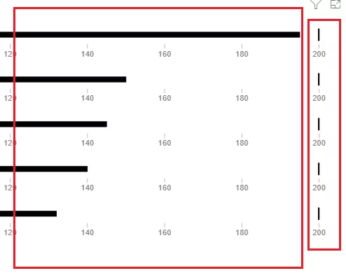
You will see the chart below.
By default, the thick black line corresponds to the actual value.
You can see the score values for different courses in your dataset as a proportion of total values.
Annotating A Bullet Chart
Let’s now further annotate the bullet chart by adding the target values and qualitative bands.
We assume that the target scores for courses in our dataset are the average scores from the previous years which are presented in the “Prev.Avg” column of our dataset.
To set the target, drag the “Prev.Avg” column from the dataset and drop it to the “Target Value” field.
You will now see small vertical bars in your bullet chart. These are the target values.
Since bold horizontal bars represent the actual values:
You can see that the actual value for the Mathematics and English courses have exceeded the corresponding target values.
By contrast, the actual values for science and geography are a long way from the target values.
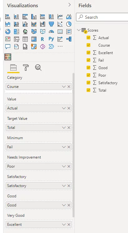
You can further add qualitative bands to your bullet chart to see quality categories for all the scores.
By default, the Power BI bullet chart by Microsoft supports the following qualitative bands:
- Minimum
- Needs Improvement
- Poor
- Satisfactory
- Good
- Very Good
- Excellent
- Maximum
You simply add these columns from your dataset to the appropriate field to edit your visual.
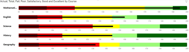
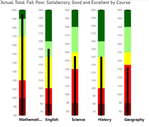
Now, your bullet chart should look like this.
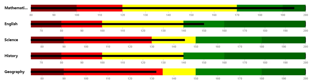
The dark red or maroon band on the left is the “minimum” band.
The red colour is the “Needs Improvement” band.
The yellow band is the “Satisfactory” band.
The light green is the “Good” band.
The dark green is the “Very Good” band.
This colour coding makes it very easy to see that for the Mathematics course, the actual score falls in the “Very Good” band (dark green), while the score for the English course falls in the “Good” band.
Keep in mind the column names from your dataset can be different from the band names in the bullet chart.
For example, you added the column “Excellent” from your dataset to the “Very Good” field in the chart above.
Changing Colours On Your chart
You can change the colours of the bands in your bullet chart.
Click “Format” > “Colors” as shown below.
The paint roller shows the format option.
In our bullet chart, the colours for the “Good” and “Very Good” bands are not very distinct, so we’ll change the “Good” band to a lighter green.
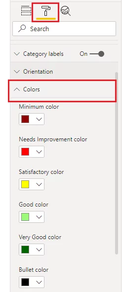
The difference between the “Good” and “Very Good” bands now appears more distinctive.
Changing Chart Orientation
By default, a bullet chart is horizontal, but it can be horizontal or vertical.
You can change the orientation of a Power BI bullet chart by clicking “Format” > “Orientation”.
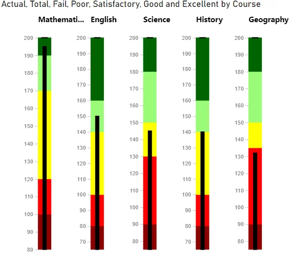
Below, we set the orientation of the bar plot to “Vertical Top”.
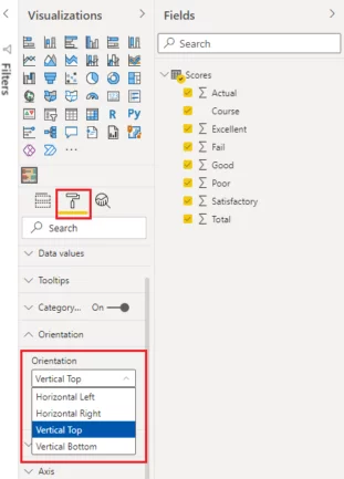
Now you have a vertical bullet chart with category name labels displayed at the top.
If you set the orientation to “Vertical Bottom”, the category names will appear along the bottom axis, as displayed in the chart below:
Conclusion
Power BI bullet chart is a powerful tool for analysis and comparison of data distributed between qualitative bands.
A quick look at the bullet chart reveals how far the actual value is from the target value and which category the actual value falls.
This makes them ideal for data dashboards.
Though bullet charts are simple to plot, you should take care when using them for detailed comparisons.
They do not reveal if the difference between the actual and target values is statistically significant.
- Facebook: https://www.facebook.com/profile.php?id=100066814899655
- X (Twitter): https://twitter.com/AcuityTraining
- LinkedIn: https://www.linkedin.com/company/acuity-training/