
Step-By-Step: Creating A Power BI Dashboard
Contents
A dashboard is designed to visually display a combination of data visuals
It should give someone a clear understanding of the underlying data very quickly.
It is a great way for you to visualise your information.
A well-designed dashboard focuses on visualisations, like pie charts, bar charst, or Gantt charts.
The ability to quickly turn confusing data into actionable info is one of the key benefits of learning to use Power BI.
What Is A Report Page?
A report page is a blank reporting canvas at heart. It is similar to an Excel workbook with multiple tabs.
Reports give dynamic insights into your data with the help of visualisations.
For more detail on reports, please see this article.
PRO TIP: Dashboards can also be viewed and shared on mobile devices.
Where Can You Create A New Dashboard?
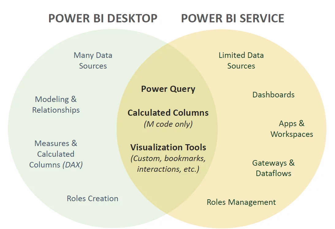
You can create a dashboard in either Power BI Desktop or Power BI Service.
However, as dashboards are a feature of Power BI service, not Power BI desktop, you can only share a dashboard in Power BI service.
You can also view and share dashboards in Power BI mobile apps, but you can’t create them.
The graphic below gives a quick overview of the difference between Power BI service and Power BI desktop. If you want more details on the differences, see this article on the difference between Power BI desktop and services.
Power BI Report vs Power BI Dashboard
Reports and dashboards are dependent on each other but quite different.
It is important to understand the differences between them.
Below are the key differences:
- Power BI dashboards are used to visualise and derive essential insights from Power BI data. They contain information combined into a single page from different reports. Reports are displays of other datasets, especially after data analysis and modelling.
- Reports are the information providers to dashboards, and the information can be in formats like text, table, charts, etc.
- A dashboard is not available in the desktop version. Reports can be created and viewed in the desktop version.
- A dashboard can use different data sources for its data visualisations. Only one dataset can be used as a source for a report.
- You can pin an existing dashboard to another dashboard using the dashboard navigation feature in Power BI services. Power BI reports can pin or navigate to any report or dashboard.
- Power BI dashboards cannot slice and dice data. Reports contain many different ways to slice and dice data.
Creating A Simple Power BI Dashboard Step-by-Step
Let’s look at how you publish a report from Power BI desktop to Power BI service.
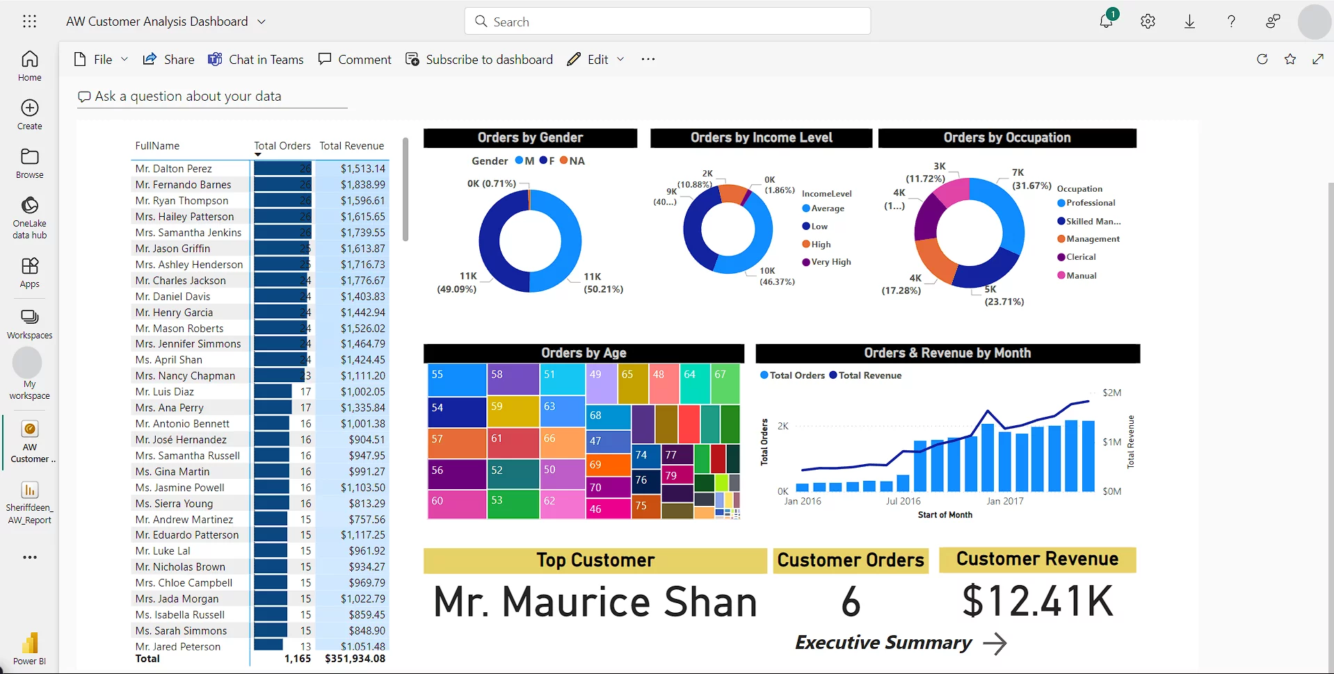
We will start with the sample report on the Master Data report page, as shown below.
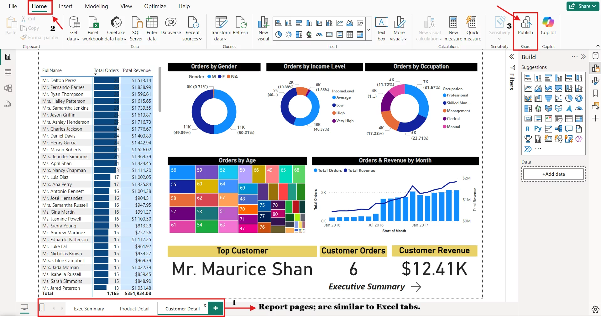
Select a Report page, go to the Home tab.
Click on Publish
Input your Sign in Identification to sign in to your Power BI account.
After you’ve successfully signed in to your Power BI account, it will show you the list of all workspaces in your Power BI service that you might want to publish your report to.
Select a destination or workspace for your dashboard.
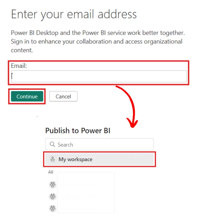
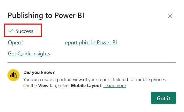
You will receive a Success! Message when it’s done.
Now that your report is in the right place in Power BI services, it’s time to create a dashboard.
There are two ways you can assemble or create a Power BI dashboard.
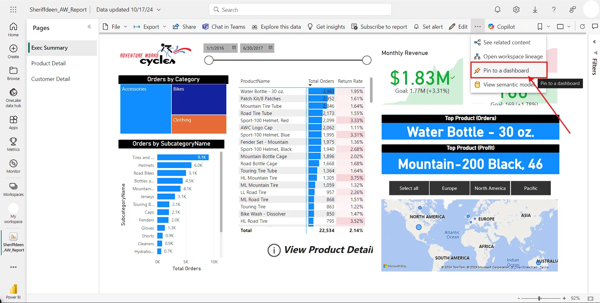
Method 1: Pin individual visuals called tiles to a new or existing dashboard.
Method 2: Pin the entire report as a page to a dashboard.
Method 1: Pinning Tiles To A Dashboard
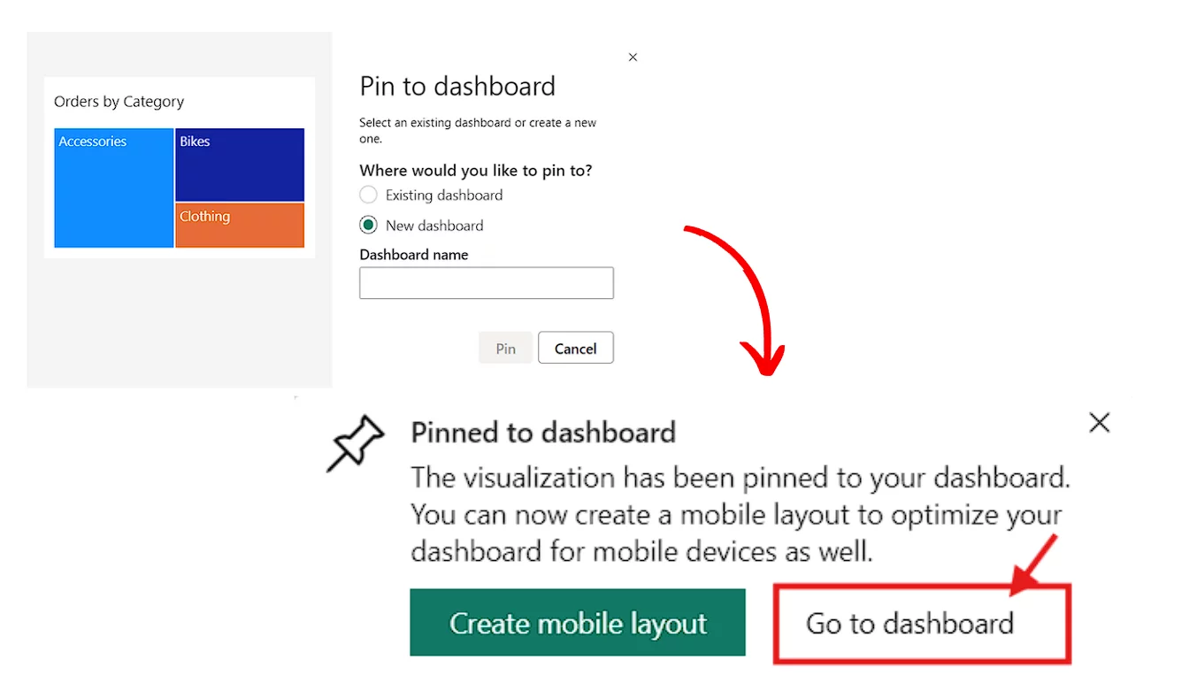
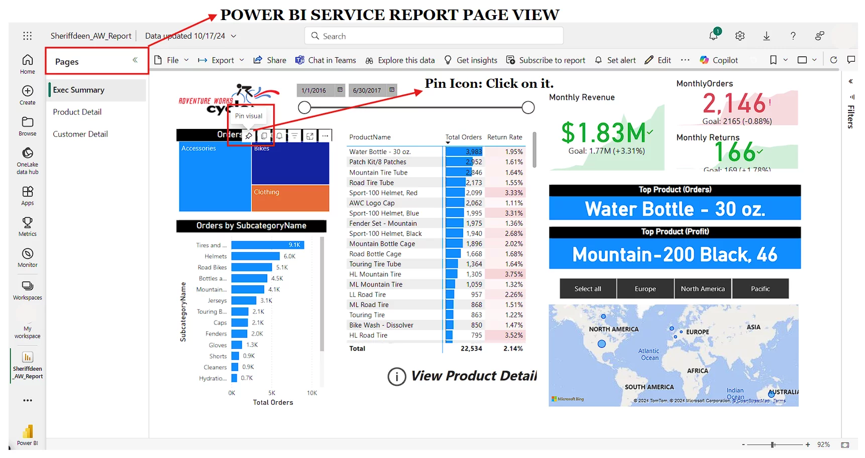
On a report page in the Power BI service, hover over an individual visual (for example, a Q&A visual), and a pushpin icon will appear. If you click the pin, it will pin the visual to an existing or a new dashboard.
You will receive a message telling you, “The visualisation has been pinned to your dashboard” from there, you have an option to go directly to your dashboard with a single click of the mouse.
PRO TIP: There is no limit to the number of tiles you can pin on a dashboard, but don’t use too many!
Method 2: Pinning Entire Reports To A Dashboard
Live report pages are an excellent option for creating a dashboard when you want to pin an entire report page as a single visual and retain all the interaction and filtering functionality.
To pin live pages from the report view or page, you need to click on the “Pin a live page” button.
This button will launch the same dialogue box you saw when trying to pin individual tiles.
PRO TIP: Pinning a live page will import slicers, and reflect any updates to the dashboard.
Multi-Page Dashboards
Multi-page dashboards are unavoidable if you have a large number of reports pages or tiles you want to include in your dashboard.
You can create a navigation button (which is way beyond the scope of this article) in Power BI to easily transition between each dashboard. See tip 6 in this article for more details.
The Dashboard Interface
The dashboard interface provides different options to the toolbar menu.
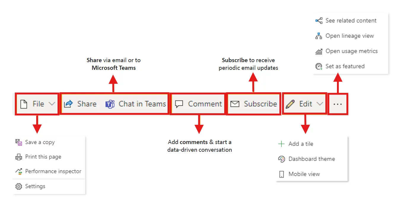
The toolbar provides options to add new tiles, add a new comment, create email subscriptions, and set the dashboard as featured.
Ask a Question allows you to type in a sentence using natural language to query the underlying data and create new visuals based on what you type.
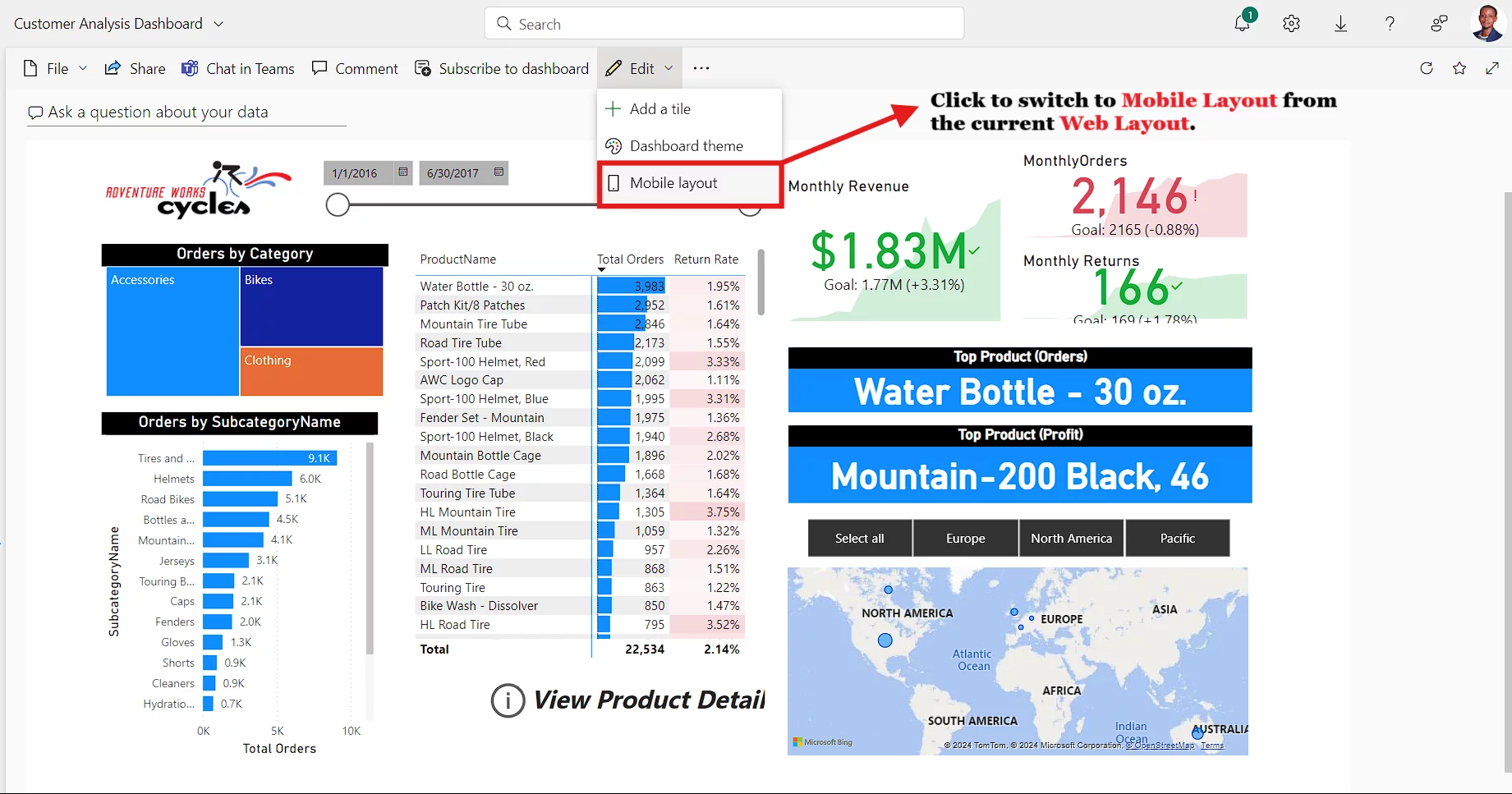
Web vs Mobile Layout
Mobile layout view allows you to design your reports to be viewed by mobile users.
The right way to do this is to use the mobile layout view in the Power BI service and specifically add in a range of different visuals from your dashboard or report.
PRO TIP: You cannot build content within the Mobile Layout view; you need to build in Web Layout.
Final Thoughts
Dashboards are a great way to allow people across your business to access actionable information.
Learning how to create them is a great first step to rolling them out, and being able to describe how to can be very useful in Power BI related job interviews.
Once you have created them Power BI’s new capabilities like the smart narrative visual, allow you to create executive summaries very quickly.
- Facebook: https://www.facebook.com/profile.php?id=100066814899655
- X (Twitter): https://twitter.com/AcuityTraining
- LinkedIn: https://www.linkedin.com/company/acuity-training/