
Creating Gantt Charts In Power BI [Quick Guide]
Contents
What Is A Gantt Chart?
A Gantt chart is a bar chart commonly used in project management to schedule tasks and manage and report the progress of key tasks.
A Gantt chart displays tasks in horizontal bars along with timelines and resources assigned to each job.
The status of tasks (Eg completed, in progress, not yet started) is often shown by the colour of the chart.
This article shows you how to create Gantt charts in Power BI, Microsoft’s data visualisation and business intelligence tool.
Creating visuals and dashboards is covered in our Power BI courses.
Importing The Gantt Chart Visual
Unlike most basic Power BI visuals, a Gantt chart is not a standard visual in Power BI.
As a custom visual, Gantt charts don’t come preinstalled with the default dashboard. This is strange given how many more advanced visuals (Eg Q&A visual or smart narrative visual) come as standard in Power BI. See this article if you are unclear on the difference between a Power BI dashboard and a Power BI report.
There are two ways to import a Power BI Gantt chart:
- From the online marketplace
- From a local visualisation file
Importing A Gantt Chart: Marketplace
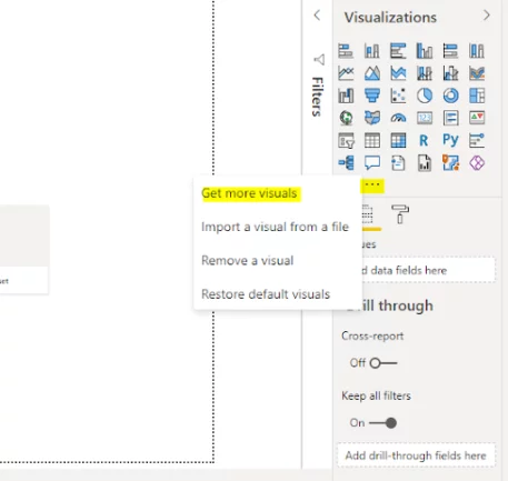
To import a Gantt chart to your visualisation pane in reports view, click the three dots (…) at the bottom of your Visualizations pane.
From the dropdown list, click “Get more visuals”.
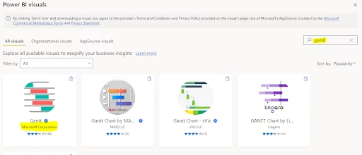
In the search bar in the online marketplace, search for the keyword “Gantt”.
Various Gantt chart options will appear.
For this article, you will use the one provided by Microsoft Corporation, which is free to download.
Click the corresponding icon to download the chart.
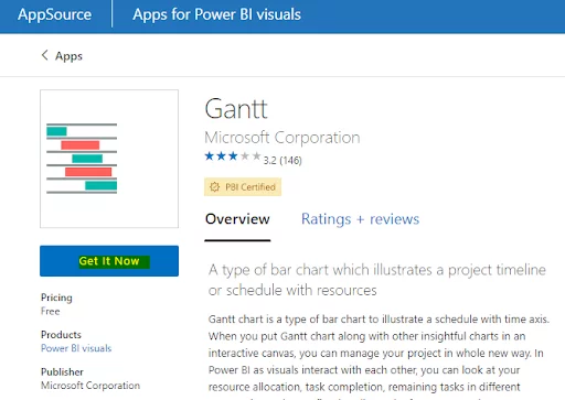
From the following screen, click the “Get it Now” button to import the Gantt chart.
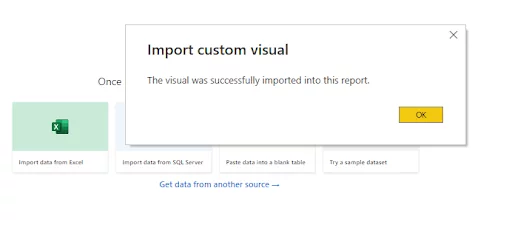
Once your Gantt chart is successfully imported, you will see the following dialogue box.
Click the “OK” button.
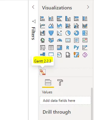
You should now see an icon for the Gantt chart in the Visualizations pane, as shown below:
Importing A Gantt Chart: Local File
If you cannot import the Gantt chart visualisation from the online marketplace, you can import the Gantt chart using a local file.
To download the file for the Gantt chart visualisation to your desktop, go to the following link.
https://appsource.microsoft.com/en-us/marketplace/apps?product=power-bi-visuals
You will need to log in to your Microsoft Account to download files from the above link.
At the AppSource page, search for the Gantt chart. You should see the following web page.
Click on the “Get it now” button to download the file.
Now click the three dots (…) at the bottom of your Visualizations pane and then click “Import a visual from a file”.
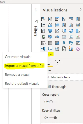
A file dialogue box will open. Navigate to the file that you just downloaded and open it in your Power BI desktop.
If your file is successfully imported, you will see the following message.
Click the “OK” button.
As above, the Gantt chart icon will now show in your Visualizations pane.
We have chosen this Gantt chart as it is straightforward to use. It will appear limited to advanced users of other project management software.
For example, this visual makes it tricky to show each project milestone with a vertical line, something many project managers like to use.
To find more advanced Gantt charts, I recommend you to try some other Gantt charts available in the Power BI marketplace.
Importing Data From Excel To Power BI
In this section, you will see how you can import an Excel file in Power BI.
We will then use this Excel file to create a simple Gantt chart in the next section.
Click the “Get data” button from the top menu. From the dropdown list, select the “Excel workbook” option.

Navigate to the Excel file that you want to import.
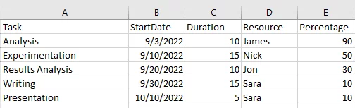
For this article, we will be using the following Excel file, called “thesis-tasks.xlsx”.
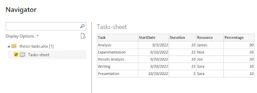
This file contains a worksheet called “Tasks-sheet”, which holds the table below.
Once the file is uploaded, you will see the following option.
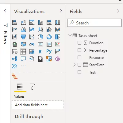
The column names from the Excel sheet will now show in your Fields pane.
For details of how to import from a database see our article – Importing data from SQL Server into Power BI
To learn more about manipulating date data in Power BI see – Working With Date Formats in Power BI
Creating A Simple Gantt Chart
Let’s now create a simple Gantt chart.
In the Visualizations pane, click the Gantt chart icon.
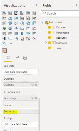
You will see different fields you can use for your Gantt chart.
Drag the “Task” column from your Excel file into the “Task” field.
Similarly, drag the “StartDate” and “Duration” columns from your Excel file and drop them respectively to the “Start Date” and “Duration” fields in your Gantt chart.
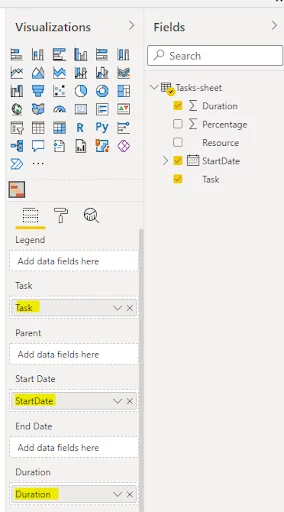
Note: The names of the fields in the Gantt chart and your Excel file do not need to be the same.
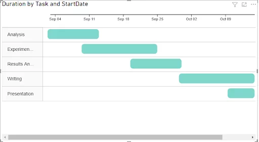
In the Reports view, you will now see the following timeline in your Gantt chart.
If you know the end date for your tasks, you can add it to your Gantt chart’s “End Date” field. Power BI will then calculate the duration automatically.
Adding To Your Gantt Chart
You can further customise your Gantt chart by adding different elements to it.
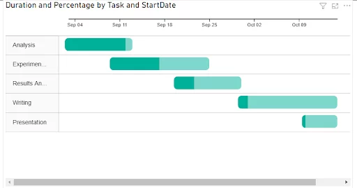
Adding a completion bar
You can highlight the completion percentage for a task using a completion bar.
To do so, add a column containing each task’s completion percentage to the “% Completion field” in your Gantt chart.
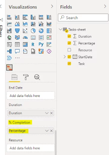
Your Gantt chart will now display the completion percentage of each task (highlighted in darker green colour).
Annotating your chart
Managers often want to show the resources that are assigned to each task in projects.
You can annotate the taskbars in your chart with information such as resources.
Simply add a column that contains the names of the resources to your data table and then, in turn to the “Resource” field in the Gantt chart.
Your taskbars are annotated with resource names, making it very easy to see how complete each part of this project is and who is running it.
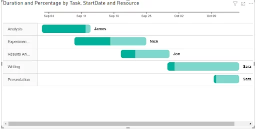
You could equally use numerical values where appropriate.
Final Thoughts
Microsoft Power BI doesn’t come with a Gantt chart visualisation pre-installed.
However, as you have seen, you can easily import a Gantt chart visual from the Power BI marketplace.
For anyone managing a project, creating a Gantt chart in Power BI is a simple way to show project progress and completion as part of a more extensive Power BI dashboard.
Articles On Power BI Visuals
The Power BI Word Cloud Visual
Connecting SQL Server To Power BI
An Introduction To Power BI’s Machine Learning Capabilities
An Introduction To Using DAX In Power BI
How To Create Scatter Charts In Power BI
Creating a Power BI Bullet Chart
Creating Combo Charts In Power BI

- Facebook: https://www.facebook.com/profile.php?id=100066814899655
- X (Twitter): https://twitter.com/AcuityTraining
- LinkedIn: https://www.linkedin.com/company/acuity-training/