
Introduction To Power BI Slicers [Beginners Guide: Step-By-Step]
Contents
Slicers are a great way to visually filter your data.
They offer a much more appealing alternative to filters, but achieve the same goal:
Digging deep into your data and making subsets based on your needs.
Let’s get straight into it by making a simple slicer!
Creating A Simple Slicer
Before you can add a slicer we need to add a visualisation that you will be filtering.
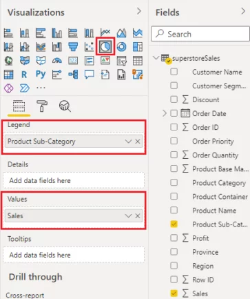
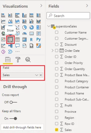
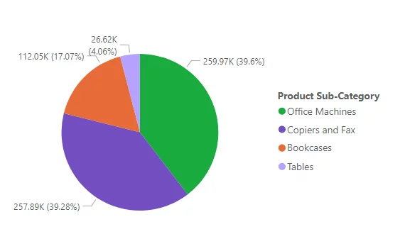
Let’s add a pie chart that displays the sum of sales for different product categories.
Click the Pie chart icon from the Visualizations pane.
Add the Product Sub-Category column from the dataset to the Legend field and Sales column to the Values field, as shown below:
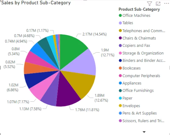
You will see the following pie chart in the view of your report.
As discussed earlier, in Power BI, you can add slicers for categorical as well as numerical columns.
One particularly great use is a day-level slicer, which will let you see sales on a day-to-day basis.
Let’s start by creating a categorical slicer.
Slicers For Categorical Fields
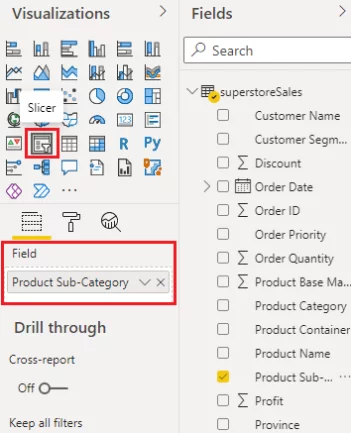
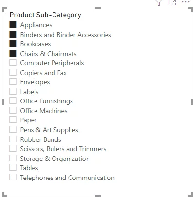
Let’s create a slicer that allows you to filter your pie chart using the product sub-category.
To do so, click the Slicer icon from the Visualizations pane.
Next, add the Product Sub-category column from the dataset in the Field option.
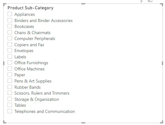
You will see the following slicer in the view of your report.
By default, all the sub-categories are unchecked.
Let’s check the first four sub-categories.
If you now look at your pie chart, you can see that it only contains the distribution of sales for categories selected by your slicer.

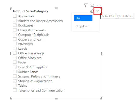
Switching between List and Drop Down View
You can switch between the list and dropdown view for slicers that contain categorical fields.
By default, the categories are displayed in the form of a list.
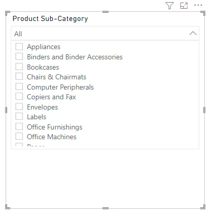
You can change the view to dropdown by selecting the downward arrow symbol in the top right corner of your slicer.
You will see the categories in the form of a dropdown with a scrollbar, as shown below:
Slicers For Numeric Fields
You can also create slicers for numeric fields such as sales, profit etc.
Let’s create a slicer for the Sales column.
You will see a slicer with a range bar.
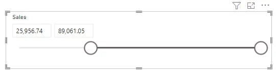
You can drag the range circles from left to right, and vice versa, to select a specific sales range.
You can also enter the range values you want in the text fields in the top left.
In the above example, the slicer minimum is set to approximately 26,000, and the maximum is set to 89,000.
This slicer is based on the sales value in the individual order.
The pie chart now shows the sales distribution for those selected sub-categories where at least one order has a total sales value of between 25,956 and 89,061.
We also cover using slicers during our beginners Power BI courses if you would like to learn more.
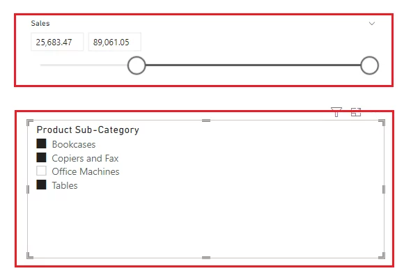
Adding Multiple Slicers
You can also filter information on your visualisations using multiple slicers.
For example, in the screenshot below, there are two slicers.
The numeric slicer selects sub-categories in the pie chart based on the orders with a sales value between 25,683.47 and 89061.05.
This selector selects four sub-categories.
These categories are then shown in the product sub-category slicer below it, as they are the only sub-categories that meet the requirements of the numerical slicer.
The categorical selector has then been used to select 3 out of the four categories.
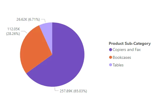
In the output pie chart, such as the one seen below, you can see the sales distribution for three categories selected via the numeric and categorical slicer.
Types Of Slicers
A Power BI slicer provides an interactive way to filter and compare information on different visualisations in Power BI.
Power BI slicers can be categorised into three broad types:
- Categorical Slicers:
- Filter information via categorical data such as country names, city names, product categories etc.
- Numeric Slicers:
- Filter information based on a range of numeric values. For instance, age, total sales, scores in an exam, etc.
- Date Slicers
- Date slicers are a type of numeric slicer. However, they deal specifically with date type data and filter information between a range of dates.
You can also use Power BI slicers to filter hierarchical data, find out more with these articles!
Slicers are available to all Power BI users, whatever Power BI licence they have.
Limitations of Slicers
The Power BI slicer has some limitations as well:
- A slicer can’t be pinned to a dashboard in Power BI.
- The numeric slicer is only available on the Power BI desktop and not in Power BI Service.
- The numeric slicer filters data on row-level and does not deal with aggregated values.
- Slicers do not work with measures.
Conclusion
Slicers are incredibly useful.
Mastering them will make your reports and dashboards more interactive and practical for users.
They’ll also save you a lot of questions from users asking you to manipulate the data – once you start using them, you’ll never go back.
Importing A Trial Dataset
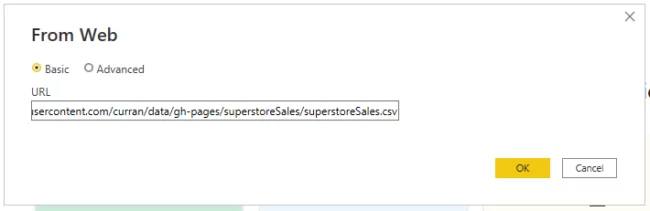
The CSV file for the dataset used to create slicers in this article is available at this link.
https://raw.githubusercontent.com/curran/data/gh-pages/superstoreSales/superstoreSales.csv
You can either download the CSV file and then go to the Power BI Dashboard and import the CSV file. Or, you can directly import the dataset from the online resource.
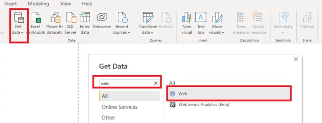
To import the data from this online link, click on the “Get data” button from the ribbon menu on the dashboard, type “Web” into the search bar and then select “Web” from the list of options.
Enter the Github link containing your CSV file in the following dialogue box.
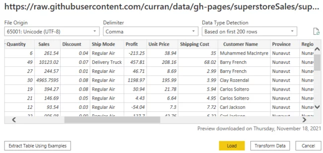
You will see the window below.
Click the “Load” button to load the data in the reports view into Power BI.
Articles On Power BI Visuals
- Facebook: https://www.facebook.com/profile.php?id=100066814899655
- X (Twitter): https://twitter.com/AcuityTraining
- LinkedIn: https://www.linkedin.com/company/acuity-training/