
Comparing Power BI Dashboards vs Reports
Contents
- 1 Importing The Dataset
- 2 What Is A Power BI Report?
- 3 Creating A Report In Power BI
- 4 Features Unique To Power BI Reports
- 5 What Is A Dashboard In Power BI?
- 6 Creating A Power BI Dashboard
- 7 Features Unique To Power BI Dashboards
- 8 When To Use A Power BI Report & When To Use A Dashboard
- 9 Final Thoughts
- 10 Other Helpful Power BI Articles
In this article, we will look at the main differences between Power BI Reports and Dashboards.
The article explains how to create Power BI Reports and Dashboards, their unique features, and when to use each of them.
Power BI is a business intelligence, data visualisation and analysis tool developed by Microsoft that provides you with rich functionality to analyse your data via different visualisations.
Power BI Reports and Dashboards are two main tools that you can use to plot your data in Power BI.
When you are learning to use Power BI understanding the difference is critical. See this article – What is Power BI? – for more details on Microsoft Power BI.
In this article, we will look at both, compare them and look at when it is better to use a dashboard and when it is better to use a report.
Note: We will be working with the Power BI service since Power BI Desktop does not currently support dashboards.
Importing The Dataset
To create reports in Power BI, you will need some data. You can import data from various sources.
For this article, we will be using a CSV file containing information about passengers on the Titanic.
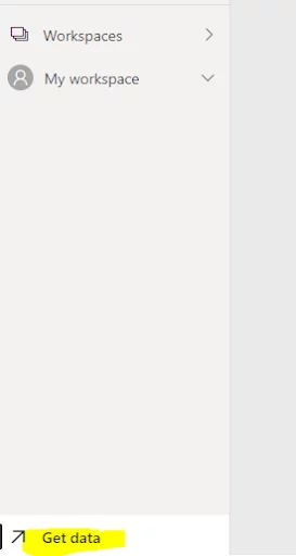
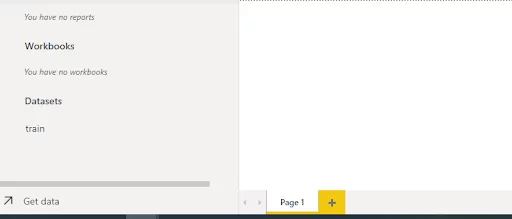
Next, in your workspace in the Power BI Service, click the “Get Data” link, which exists at the bottom of your sidebar.
Click the Files -> Local Files and upload the CSV file that you just downloaded.
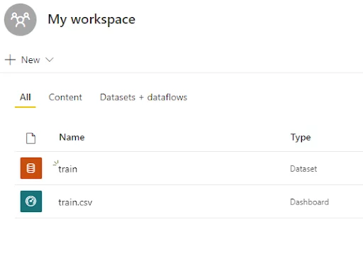
Now in your workspace, you should see a dataset “train” and a dashboard “train,csv”. A default empty dashboard with the same name is also created when you import a dataset.
Let’s now create a Report using the training dataset.
What Is A Power BI Report?
A Power BI report is a visualisation that conveys some information about the underlying data in one or more charts, tables, or other visual.
For instance, a report may contain a Pie chart that displays the distribution of passengers travelling in different classes.
For details of other types of visual that Power BI contains see these articles – Q&A visual in Power BI, The smart narrative visual, the decomposition tree visual.
Creating A Report In Power BI
Creating a Report with Power BI is straightforward.
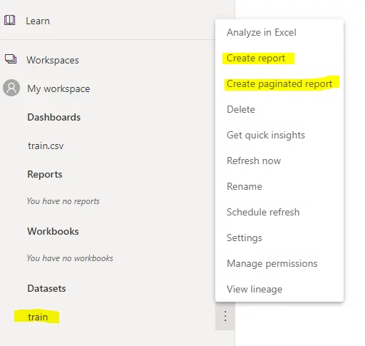
In your workspace, click the Dataset that you just imported and then click “Create” report as shown below:
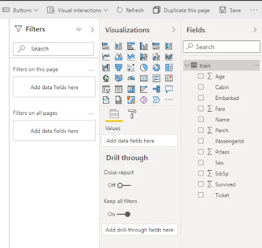
You will see the reports view as shown below:
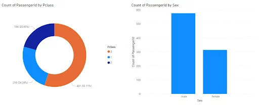
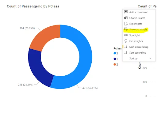
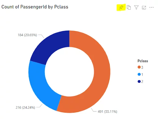
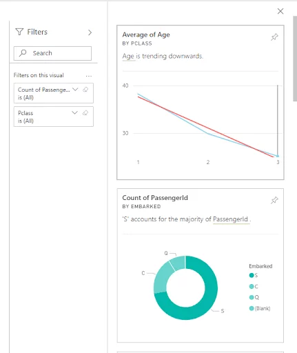
Let’s create a Donut Chart that shows the distribution of passenger ids against the class that the passengers travelled in.
To do so, you have to select a Pie chart from the Visualizations pane in your Reports view.
In the “Legend” field, you need to add the “Pclass” column from your dataset, whereas the “Values” field should contain the “PassengerID ” column.
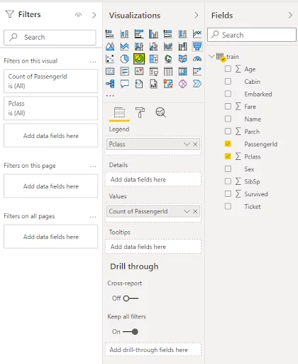
Similarly, we will add a clustered column chart displaying the count of passenger IDs by passenger Sex.
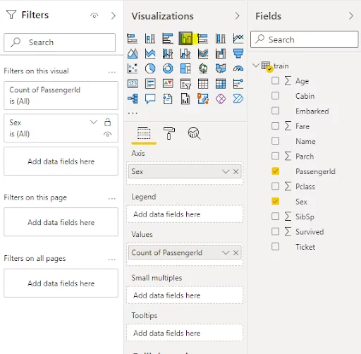
In your reports view, you should now see the following two charts:
Features Unique To Power BI Reports
In this section, we will look at the features that are unique to Power BI Reports.
These features are not available in Power BI Dashboard, which you will see in the next section.
Interactivity
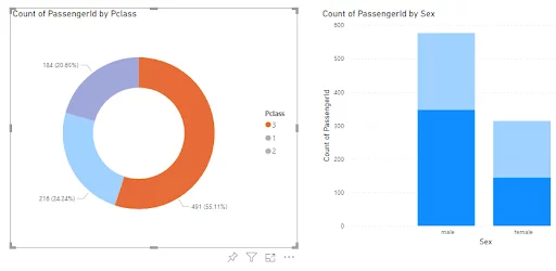
If you click on part of a visualisation in your report, Power BI will automatically highlight this subset of the data on all your charts.
On the other hand, the corresponding report is opened if you click on a visualisation (or tile) in Power BI Dashboard.
As you have seen, you can go to a report directly from a dashboard, but the opposite is not possible.
Viewing underlying data
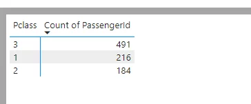
You can see the underlying data used to plot a chart in reports view by clicking the “Show as a table” option that appears when you click on three dots “…” at the top right or bottom right corner of your chart.
The feature to view the underlying dataset tables is not available in a dashboard.
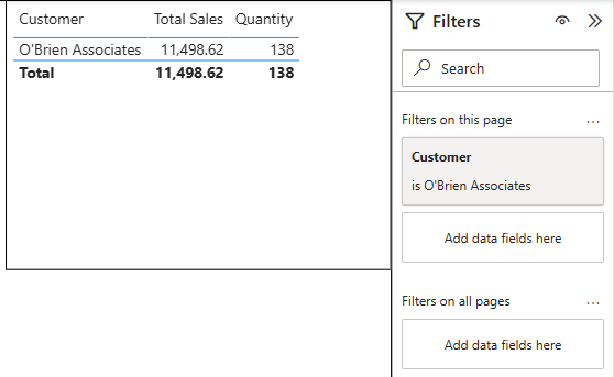
Slicers
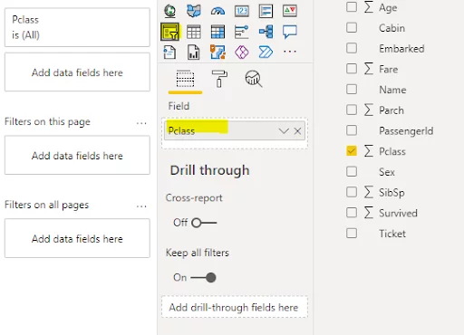
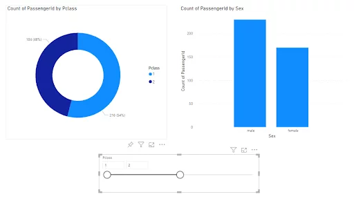
Power BI contains a slicer tool that you can use to filter your visualisations in the Reports view. You just need to add a value to your slicer tool.
In our example below, we have added “Pclass” as the value for the slicer.
You will see a slicer appear on your dashboard. You can drag the slicer around to filter records.
A slicer is not available in the Power BI dashboard.
Paginated reports
A Power BI Report can have multiple pages.
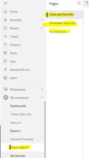
You can add a new page in a report by clicking the plus (+) symbol at the bottom of the Report view. You can also rename a page by double-clicking the page name.
We will rename our Page 1 as “Class and Sex Info”.
Next, we will add two more pages.
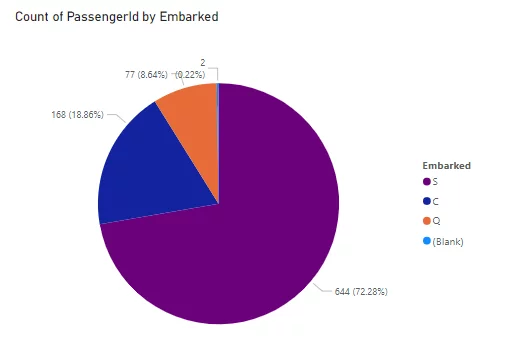
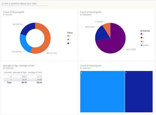
The second page is named “Embark Town Info” and contains a Pie Chart, as shown below.
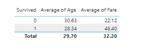
And the third page is named “Survived”, which contains a Table that shows average ages and fares paid by the passengers who survived and those who did not survive.
Save your report as “Titanic Report”. You will see the three pages in your report as shown below:
The ability to add multiple pages is not available in the Power BI Dashboard.
Shareable on the web
Though both Power BI and Reports contain share options, only Power BI Reports can be published to the Web.
What Is A Dashboard In Power BI?
A Power BI Dashboard can be used to display the most important elements from your various reports generated via different data sources or sets.
A dashboard is a visual element that displays a summary of multiple reports. With dashboards, you can select one or more pages from multiple reports that you want to show in a single place.
Pre-Power BI businesses often created Excel dashboards. These were difficult to create and maintain, especially when they were interactive dashboards and didn’t contain the self service BI and predictive analytics capabilities that the Power BI app does.
Creating A Power BI Dashboard
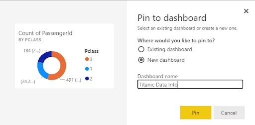
To create a Power BI Dashboard, open any chart in your report and click on the pin symbol at the corner of your chart.
A dialogue box like the one below will appear, where you pin your visualisation to an existing dashboard or create a new dashboard.
We will create a new dashboard called “Titanic Data Info”.
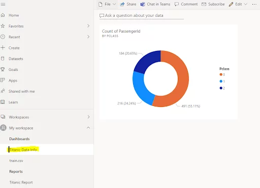
Now, if you open your workspace, you will see the new dashboard name.
Clicking the dashboard name will open the dashboard, where you can see the visual that you used to create the dashboard.
Features Unique To Power BI Dashboards
Let’s discuss some features that are intrinsic to Power BI dashboards.
Display data from multiple reports
As discussed earlier, a dashboard can contain visuals from multiple pages within one or multiple reports.
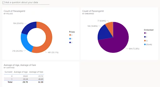
If you pin the visuals from the “Embark Town Info” and “Survived Info” pages of the “Titanic Report” report, your dashboard will look like this.
To demonstrate that a dashboard can display visuals from different reports, create a new report called “Survived Treemap” and add a Treemap chart to it.
Your workspace should now look like this:
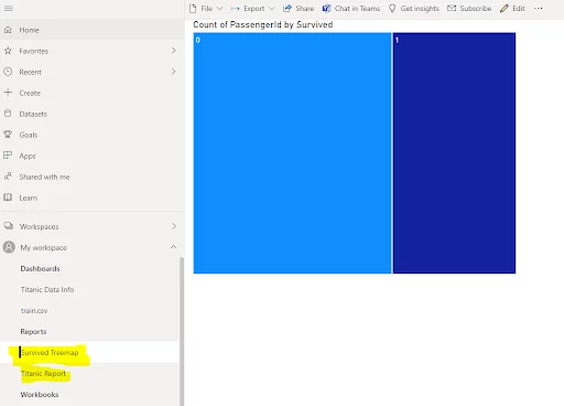
If you pin the chart from the Survived Treemap report to your “Titanic Data Info” dashboard, it will now look like this:
You can see that the visuals are arranged symmetrically by default by the dashboard. You can select, drag and change the positions of your charts (also called “dashboard tiles”) on your dashboard.
Clicking a chart opens the corresponding report
If you click a chart in the dashboard, the corresponding page in the report will open where you can make changes to your chart. The reverse is not possible.
The lineage view
You can also see a hierarchy that shows relationships between data sets, reports generated using the data sets, and corresponding dashboards using the lineage view in your dashboard.
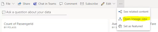
In the output, you can see the “Titanic Data Info” dashboard charts from two reports: “Titanic Report” and “Survived Treemap”.
Both the reports contain charts generated using data from a single dataset: the “train” data set.

Insights view for non-premium accounts
For Reports, the “Get Insights” option is only available with Power BI premium.
In a dashboard, you can view a chart’s insights WITHOUT a Premium account.
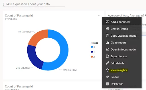
Chart insights will appear on the right-hand side of your dashboard.
See this article on Power BI licencing for more details on the differences between the various Power BI licences.
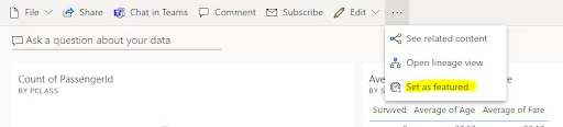
Featured dashboard
You can also set a dashboard as your featured dashboard.
When you do this, that dashboard will always appear at the top of the list of your dashboards when you log in to your Power BI workspace.
Here is how you can set a featured dashboard.
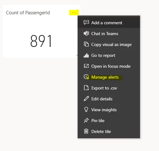
Automated alerts
For some charts, you can create alerts with your Power BI dashboard.
For instance, with the “Cards” chart, you can set a maximum threshold value. When that threshold is reached, Power BI will automatically generate a report.
Here is how you can create alerts in your Power BI dashboard.
When To Use A Power BI Report & When To Use A Dashboard
Power BI Reports and dashboards are commonly used to display different types of visuals. Though both the tools display charts, the two tools are designed for different scenarios.
When to use a Power BI report
You should use a Power BI Report when:
-
- You need to separate your visualisations logically.
- You want to slice and dice the data in your visualisations
- You want to interact with and filter information on your visualisations
- You want to view the underlying data used to generate your visualisations
- You are not able to access Power BI service
When to use a Power BI dashboard
You should use a Power BI Dashboard when:
-
- You want to have a high-level overview of key performance indicators (KPIs)
- You wish to summarise visualisations from multiple reports or data sets
- You want to display visualisations on a single page
- You want to show related insights for your visualisations
- Want to add alerts to your visualisations
Final Thoughts
As with all tools, you need to make sure that you use them for the right job.
In this article, we have compared dashboards vs reports in Power BI and tried to show when it is best to use each. Being able to clearly explain this can be very handy in BI job interviews.
To summarise, if you want to perform detailed data analysis, the Power BI Report is the right tool to use.
On the other hand, if you want to give a high-level view of your data and present your audience (of other Power BI users) with a summary of your analysis, a Power BI dashboard is the right way to go.
Other Helpful Power BI Articles
A Guide To the Power BI Map Visual
Creating A Word Cloud In Power BI
Creating a Power BI Bullet Chart
How To Create A Scatter Chart In Power BI

- Facebook: https://www.facebook.com/profile.php?id=100066814899655
- X (Twitter): https://twitter.com/AcuityTraining
- LinkedIn: https://www.linkedin.com/company/acuity-training/