
6 Best Practices for Efficient Data Modeling in Power BI
Contents
- 1 What is Data Modeling in Power BI?
- 2 Six Best Practices for Power BI Data Modeling
- 3 1. Get to grips with Power BI
- 4 2. Use the right layout for you
- 5 3. Manage relationships
- 6 4. Use measure tables effectively
- 7 5. Optimize your key columns
- 8 6. Manage your visible columns
- 9 Effective Data Modeling in Power BI
Why do over 62,000 businesses worldwide choose Power BI for analytics?
The visuals are simply the best on the market.
However, Power BI can be complex and difficult to use, especially for newcomers to the software.
This is especially true when it comes to data modeling!
We find delegates on our Power BI London courses always want to know about data modeling.
What is Data Modeling in Power BI?
Data grows in importance every year.
Power BI is allows you to transform raw data into more easily accessible visuals.
This lets you derive key insights from data, as well as share these insights across your organization in the form of visualizations, such as charts, tables, or graphs.
Delta lake books are an important additional resource here, helping you gain an understanding of the big data landscape.
A key function of Power BI is its data modeling tool.
This allows you to create a visual representation of your data.
It should make clear the connections between:
Different data elements, how your data is grouped and organized, and the main attributes of each type of data.
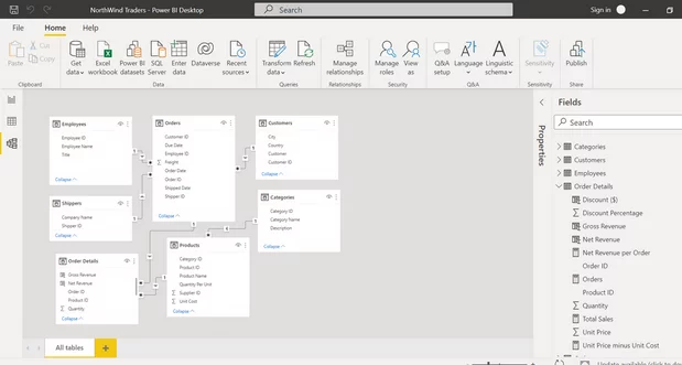
Image sourced from community.fabric.microsoft.com
From these comprehensive data models, you’ll then be able to produce more detailed insights about your data.
You might be better placed to decide whether to use a probabilistic vs deterministic model, for instance.
Without the data modeling tools of Power BI, you’ll find it pretty much impossible to produce meaningful but accessible data reports for your organization.
Think of it as a foundational skill from which you can build increasingly deeper insights about your data.
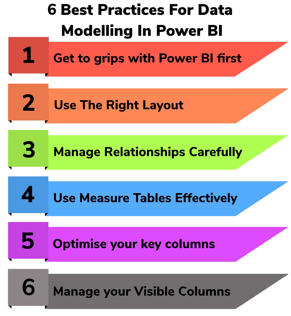
Six Best Practices for Power BI Data Modeling
How can you ensure that you’re as efficient as possible when creating data models in Power BI?
Here are our six best practices for Power BI data modeling:
1. Get to grips with Power BI
Power BI is a complex and demanding piece of technology, so we recommend taking time to make sure that you really know the software inside out before you try to do any data modeling.
It might sound obvious, but start by downloading the most recent version of Power BI from Microsoft.
This will mean that you can get the most up-to-date functions and assistance.
Once you’ve downloaded Power BI, open the software and start to use the workspace.
Follow any suggested tours or guidance that will help you effectively operate each function.
With the workspace open in front of you, you should be able to clearly see space for data to be imported.
This can be from a range of different sources, as you can see in the image below.
This allows you to model and visualize many different categories of data, from supply chain optimization models, to defect management.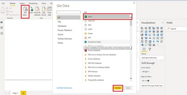
Image sourced from c-sharpcorner.com
In this initial stage of getting to grips with Power BI, you might also want to search for the specific functions that will be crucial for data modeling.
On the bar to the left, you’ll be able to see three symbols: the lowest symbol relates specifically to Power BI’s data model tool.
On top of this, look for the visualizations tab – this is on the right of the main screen. Both functions will be very useful as you start to produce data models.
2. Use the right layout for you
When you’re ready to start crafting your data models, you need to begin by laying out your data tables.
You’ll have to choose between two of the most commonly used layouts:
The Star Schema approach and the Waterfall approach.
It’s pretty easy to distinguish between the two approaches – they’re named after their visual appearance.
The Star Schema approach will create a data model – through your desktop or cloud computing – that visually resembles a star.
The fact table (which essentially explains the data that is being modeled, such as sales on a particular day) will be at the center of your model.
Shooting off from this central fact table will be your dimension tables, which are the companion tables to your fact table.
This will produce a shape that looks like a star, with multiple dimension tables coming out of the center.
The Star Schema layout is an intuitive way of ordering your data, as it clearly demonstrates the relationship between your fact table and your dimensions tables.
It is a simple visualization of data management through the creation of clear schemata.
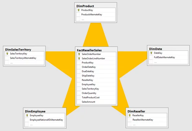
Image sourced from learn.microsoft.com
However, you may instead decide that the Waterfall layout is more appropriate.
This is where you organize your dimensions tables or lookup tables across the top, before they “trickle” into one fact table.
This resembles a waterfall, hence the name.
This Waterfall approach is a simple visualization of the data hierarchy, which can be useful for identifying any potential errors in relationships.
Being able to recognize what layout is right for you and your organization is a key skill when using Power BI.
This is especially true if you’re considering different forms of visualization later on, such as the decomposition tree visual.
Ultimately, you’ll need to decide which layout you prefer through experimentation.
3. Manage relationships
Once you’ve set up a simple and easy-to-understand visual representation of your data, you’ll be better placed to manage the relationships between different data elements.
To start this relationship management, go to the main toolbar and find the manage relationships icon.
This will open a dialog, which will act as a command center for refining relationships in your model.
As Power BI automatically assigns relationships between tables, you should use this tool to check the data relationships.
This is a crucial part of any data model.
Setting the direction of relationships and clarifying whether they have a one-to-many or many-to-one quality will make your model more useful.
4. Use measure tables effectively
Another key part of a data model is the measure tables.
You can add these by going to the home toolbar, selecting the data section, and clicking the Enter Data icon.
These measure tables can let you add specific data for in-depth analysis in your data model – they could include calculations for profit margins if you’re a B2B ecommerce platform, for instance.
In order for these measure tables to be used effectively, however, you should make sure that you’ve organized them in a coherent and structured way.
This will let your data model be readable and make it easier for you to produce insights later on.
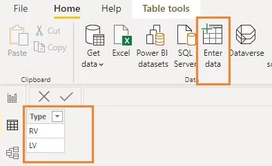
Image sourced from community.fabric.microsoft.com
5. Optimize your key columns
When it comes to your data relationships, the columns that are used to structure these are known as key columns.
This identifier will make it easier for you to order your data model so that it is easy to understand.
To further optimize your key columns, you’re going to want to consider how they’re used – this will let you specify their names and link columns with the same name in order to simplify your data model.
This will make it easier for you to create Power BI dashboards and reports from your data.
6. Manage your visible columns
For many data models, you’ll need to carefully manage what you want to be visible.
This is even more important with large datasets such as those used in machine learning models, whether gradient boosted or Random Forest.
That’s because too many visible columns will make your data model messy and difficult to understand.
You might want to consider hiding all linking columns and columns that will be of little use to end users.
However, the ‘view hidden’ toggle will ensure that you and other users can always transition between the core columns and the hidden columns, meaning that they can be accessed if necessary.
Effective Data Modeling in Power BI
With data becoming more and more important in the world of business and computing, it’s imperative that you’re able to effectively produce data models in Power BI.
This will ensure that you have a clear image of your organization’s data management and workflow, allowing for simple visualizations and easy analytics.
By following our six best practices for data modeling, you’ll soon be able to confidently create intuitive and simplified data models that are laid out effectively.
If you’re interested in Power BI and efficiency, have a look at our article about incremental refresh.
For more, check out our introduction to Power BI here!

- Facebook: https://www.facebook.com/profile.php?id=100066814899655
- X (Twitter): https://twitter.com/AcuityTraining
- LinkedIn: https://www.linkedin.com/company/acuity-training/