
[Ultimate Guide ]Learn Every Type Of Map In Power BI!
Contents
Power BI Map Visuals are used to plot data distributions with respect to that data’s geographical location.
Map visuals are typically used to visualise data by country, state or city but can be used on any type of map.
In this article, we will visualise the number of covid infections in different states in the USA in the form of a map!
If you want to learn more about maps, they are covered during our Microsoft Power BI training.
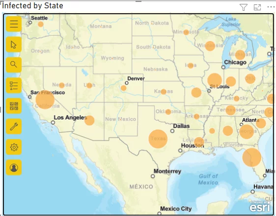
Read on to learn how to create a detailed map in Power BI like this one:
Which Maps Does Power BI Support?
You can plot four main types of Microsoft Power BI map visualisation:
- Basic Map: Normally used to plot the numeric distribution of data in the form of data points.
- Filled Map: Plots data points as geospatial areas rather than points on a map. They usually are used to plot the geographical distribution of categorical data.
- Shape Map: These plots are based on Esri/TopoJSON maps and can be used to plot Power BI custom map visuals as well.
- ArcGIS Map: This is the most advanced type of map supported by Power BI. It allows you to plot maps containing street views and heat maps, with advanced customisation options.
In this article, we will briefly look at each of these four Power BI map types.
Preparing & Checking Your Data
Power BI is intelligent enough to identify when geographical data is passed to it in one of the following forms:
- Addresses (street names, numbers, etc.)
- Zip Codes
- Cities, States, Countries, Continent names.
- Airport Names
- Latitude and Longitude coordinates.
Power BI uses the Bing Search Engine to identify locations passed as one of the above entities.
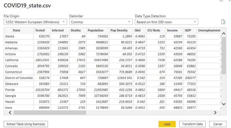
For this article, we will be using the Covid information dataset of various states in the USA. The dataset contains state names, the number of infected patients, the number of deaths, etc.
The dataset is available as a CSV file from the following Kaggle link:
https://www.kaggle.com/nightranger77/covid19-state-data?select=COVID19_state.csv
Once you have downloaded the CSV file, click the “Get Data” option from your Power BI dashboard and then the “Text/CSV” option from the drop-down list.
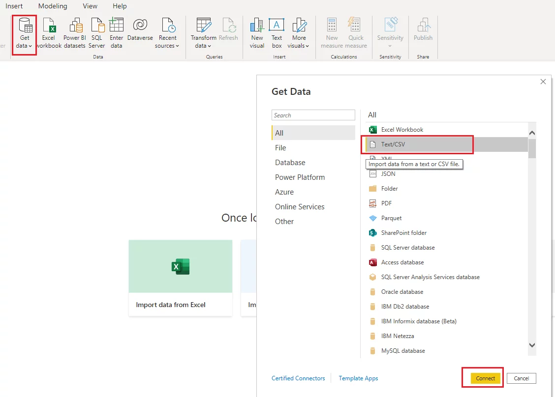
Now browse to the CSV file that you just downloaded and click “Connect”.
Once the file is loaded, you will see your data displayed (as shown below).
Click the “Load” button. This will load the data to the reports view of the Power BI dashboard.
Let’s now create different types of Power BI maps.
Creating a Basic Map
By default, the options for a basic map (also known as a bubble map) and a filled map are enabled in Power BI’s reports view.
Let’s plot a basic map with Power BI.
Click on the “Map” icon in your visualizations pane.
Drag and drop the “State” column from your dataset into the “Location” field,
You will see the following map appear. You can see that bubbles or circular data points appear for each state in your dataset.
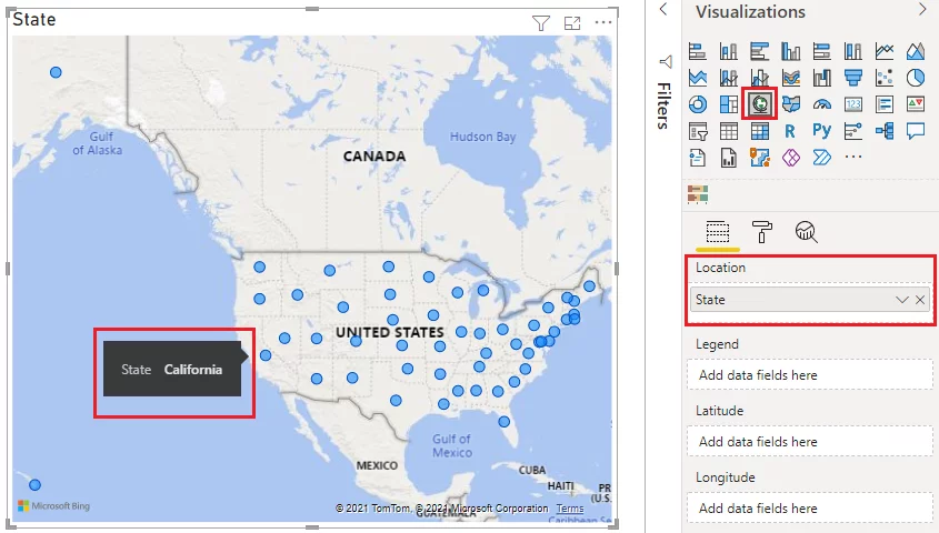
By default, the bubbles are all the same size.
You can vary the size of the bubbles according to the value of the numeric data in your dataset.
To create bubbles whose size depends on the number of covid infections in each state, drag the “Infected” column from your dataset and drop it in the “Size” data field as shown below.
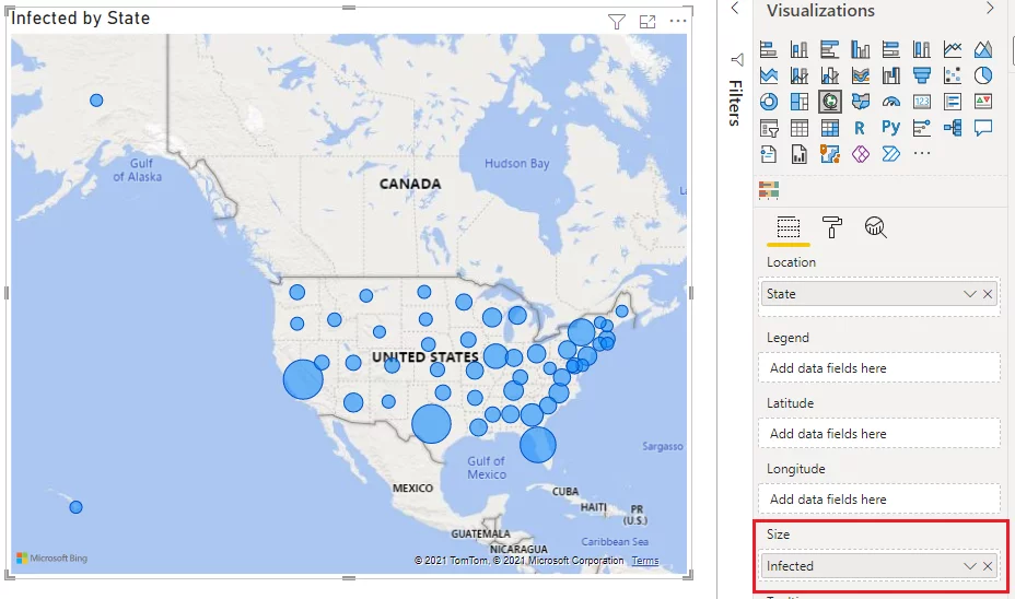
Now the largest bubbles are in California, Texas, and Florida, as they have the highest numbers of covid infections.
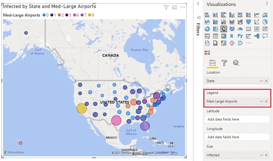
You can further categorise data points on your map using the “Legend” field.
Let’s categorise our data using the number of airports.
Drag the “Med-Large Airports” field from the dataset and drop it in the “Legend” field.
You can now see via the colour key that California, Texas, and Florida have the largest number of larger airports and the highest number of infections.
Note: Occasionally, two geographical locations have the same name (Eg Boston UK and Boston USA). In such cases, you will need to use longitude and latitude data that can be specified in the “longitude” and “latitude” fields, respectively, to ensure Power BI handles them correctly.
Creating A Filled Map
A filled map plots data in the form of geospatial locations.
This means that given a data value, the whole region in a map is filled.
Let’s plot a filled map for all the states in the USA.
The process is similar to that used for the basic map.
Select the filled map type from the visualizations pane.
Drag the “States” column from the dataset and drop it in the “Location” field, as shown below.
As you can see, the filled map displays relevant regions in blue.
You can plot numeric data using a filled map, but it is not recommended.
The filled map below is displaying our data.
As each state has a different number of infected patients, it is a different colour.
This means you need to refer to the key for the actual number of patients and gain no additional understanding from displaying the data as a visual compared to a simple table.
To show you how best to use a filled map, let’s plot one that shows the distribution of Med-Large Airports in the USA.
This dataset only contains nine unique discrete values and so is much more appropriate for a filled map as it will be easy to understand.
However, you could argue it is still not that easy to use. Filled maps work best with datasets containing four or fewer discrete values.

To plot numeric data, you should use any of the other map types.
Creating A Shape Map
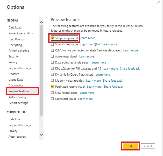
A shape map is not enabled by default in Power BI. You have to enable it.
On your Power BI dashboard, click “File” > “Options” and then “Settings” > “Options”.
From the global list of options, select “Preview features” and then enable the “Shape map visual”.
Doing this will enable both the shape map and ArcGIS map.
You need to restart your Power BI Desktop before the icons for these maps will show in your “Visualizations” panel.
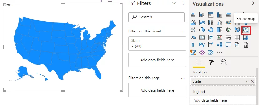
By default, the shape map only contains the map of the USA.
However, you can plot your own custom maps for other countries, cities, and parts of the world.
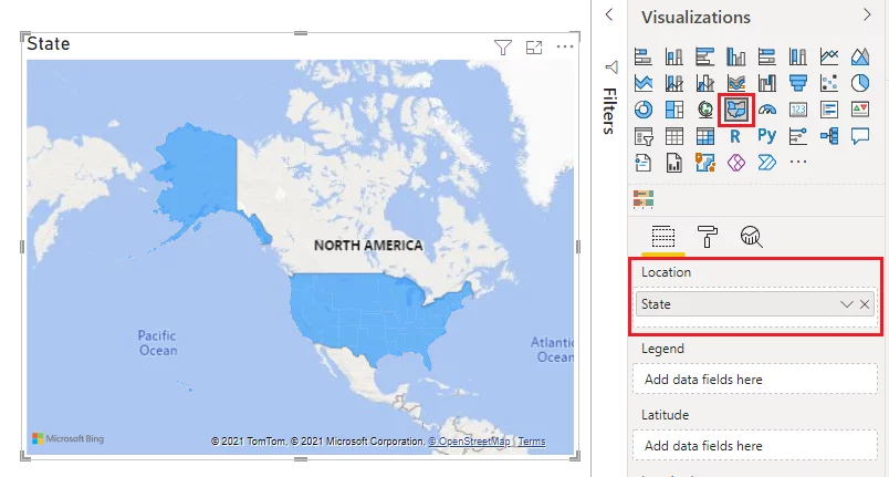
First, let’s plot the USA states’ default map using the “State” column from the dataset.
You can see that by default, all the states are highlighted with the same colour.
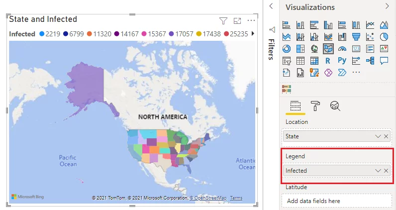
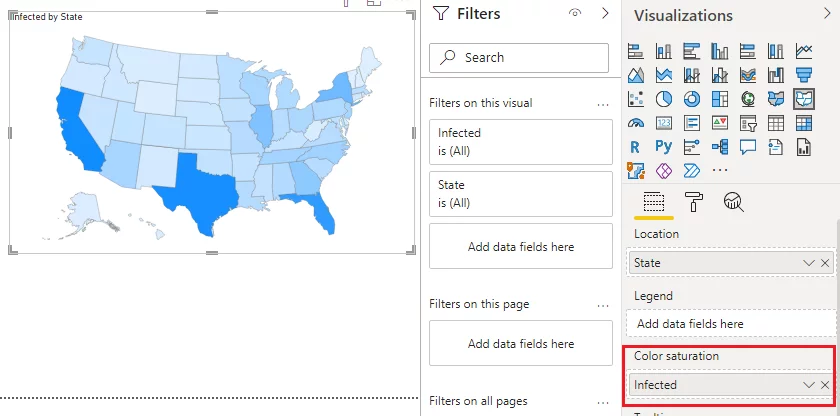
To see the distribution of infected patients by state, drag the “Infected” column from the dataset to the “Color saturation” field.
You can see the shape map now shows different shades of blue for each state, depending on the number of infected patients. The darker shades of blue correspond to higher values.
The shape map visual allows you to add your custom maps that are in the TopoJSON format.
To do so, select the shape map visual and then click the “Format” option.
Expand “Shape” > “Map” and then add your custom map in the TopoJSON format to the “+ Add map” field.
Creating An ArcGIS Map
The ArcGIS Map is one of the most advanced Power BI maps with the richest set of features. However, an ArcGIS map can be slow.
You should only use an ArcGIS map when you need advanced map features such as heat maps, street views, etc.
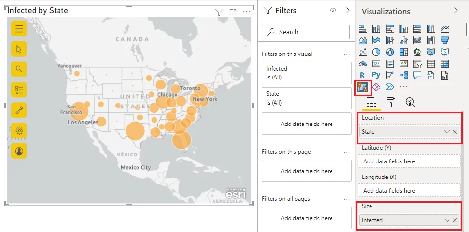
Let’s plot a simple ArcGIS map with a default view.
Drag the “State” column from the dataset and drop it in the “Location” field.
Similarly, drag and drop the “Infected” column from the dataset to the “Size” field.
By default, you will see circular data points for all states. The size of the data points varies with the number of infected patients.
Now let’s use the ArcGIS map visual to plot a street view map.
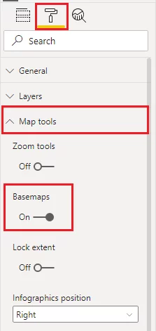
Click the “Format” icon, and then click the “Map tools” dropdown.
Drag the button next to the “Basemaps” option across to “On” and enable it.
On your map, click the button containing four squares.
It has the tooltip “Choose the background or visual context for data on the map”.
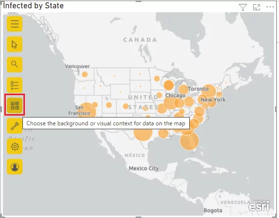
From the list of maps, click “Streets”.
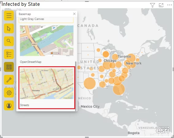
You can now see the map of the United States in street view.
If you create an account with ArcGIS or log in, you will see more basemap types such as heatmap, etc.
Conclusion
Power BI Map visuals are extremely handy for visualising geographical data. Many people then export their visualisations to PowerPoint for use in presentations and talks.
In this beginners article, we’ve looked at the four standard types of map visualisation you can use in Power BI and discussed where they are best used.
Next time you are working with geographic data, we suggest using a map visual given how effective they are.
Other Useful Power BI Articles
How To Create Scatter Charts In Power BI
How To Create A Word Cloud In Power BI
Comparing Power BI Dashboards & Reports
Creating Gantt Charts In Power BI

- Facebook: https://www.facebook.com/profile.php?id=100066814899655
- X (Twitter): https://twitter.com/AcuityTraining
- LinkedIn: https://www.linkedin.com/company/acuity-training/