
Decomposition Tree Visuals – Quick Guide!
Contents
Power BI has a wide range of visuals, both built-in and ones you can download.
Many users stick to the tried and tested visuals in their Power BI dashboards, even when they are sub-optimal.
Finding the right visual can make a huge difference.
Our Microsoft Power BI training doesn’t have time to explore all the different visualisation so we wanted to highlight an example of an under-used visual – the decomposition tree visual.
What Is A Decomposition Tree?
A decomposition tree visualises your data in its components or building blocks.
Disaggregating your data allows you to follow a thread through it, from dimension to dimension and understand what makes up a value.
The example below about video game sales shows you sales split by years, system, and then genre.
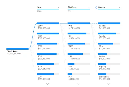
The information displayed this way allows you to conduct ad-hoc analysis very quickly to understand what makes up the totals in your data.
The decomposition tree is standard visual in Power BI desktop available no matter which Power BI licence you have, and you can find it will all the other visuals in your visualisations pane.

When To Use: Decomposition Trees
The decomposition tree is a great visual when you are interacting with it and actively exploring data.
The ability to dynamically drill down into the component parts of your data is powerful, especially when you are dealing with many component parts.
However, if you are looking for a static visual to include in a dashboard, it is probably not the best choice. See this article for full details of Power BI dashboards vs Power BI reports.
Creating a Decomposition Tree
Adding a decomposition tree visual to one of your reports works the same as just about any other visual.
In this section, we will be using this dataset from Kaggle if you wish to follow along.
1. Download the video game dataset, or have your own dataset ready.
If you need help with importing data, you can look at our tutorial on importing data from SQL Server.
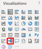
2. Select the visual from the Visualisations pane. The visual comes as standard in Power BI desktop.
3. Upon adding the Decomposition Tree, your visual will look like this.
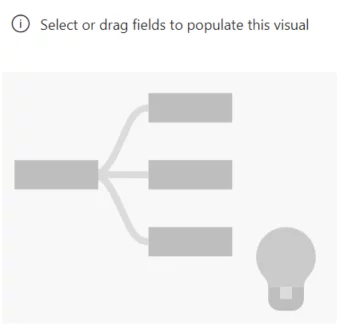
As a note, any visual you see with the lightbulb (bottom right corner) indicates it has intelligence built into the visual.
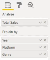
4. The first step in bringing in your data is to select the field you want to analyse.
Since this is a sales example, we will use sales dollars as the metric we want to analyse.
In our dataset, sales are shown in millions of dollars and are rounded to the nearest million.
To deal with this, I created a column with the full value called Total Sales (Global Sales *1,000,000).
5. You can now start adding dimensions to the “Explain by” field. Add Year, Platform and Genre.
6. You will notice that as you add these fields, the visual does not create itself.
Click the “+” sign beside the “Total Sales” node to do this.

7. Power BI will now ask you to pick a dimension. Choose Year.
Repeat this step to add Platform and Genre.
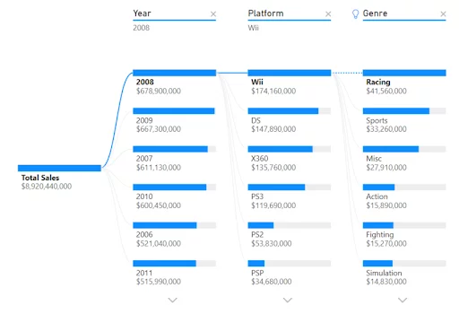
Each time you add a dimension, you will notice that a new branch and set of nodes are created.
The default setting is that they are shown in order from highest to lowest values.
Take a moment to click on some of the different nodes and watch how the visual interacts.
Now that you understand the basics of the tree decomposition visual, let’s look at some more advanced features.
Locking A Level In A Tree
The ‘Lock Dimension’ feature allows you to focus on a specific dimension.
This means that you will not affect that dimension when you interact with the visual.
To lock a dimension, hover over the top of that dimension and click the lock icon. You will find it on the left.

To unlock a dimension, simply click the lock again.
Using AI Splits
Another helpful feature built into the decomposition tree is AI splits.
The AI split feature uses artificial intelligence to find the highest value and lowest value in your data.
You can enable this by hitting the “+” sign beside an empty node.
If you hover over the dimension header at the top, it will give you a little more detail, with the dialogue box showing ‘high value’ and ‘low value’.
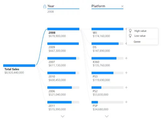
You will be able to tell you used an AI split by the lightbulb icon that appears beside the header.
Power BI is increasingly incorporating AI and machine learning capabilities. Learning to make the most of these is key to working quickly.
You can find our articles here – The Q&A visual , The Smart Narrative visual and An Introduction to Power BI’s machine Learning Capabilities.
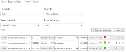
Conditional Formatting
Adding a little conditional colour to a visual is always a nice touch.
Conditional formatting will allow you to automatically colour the nodes in your visualisation based on rules that you can set up.
Under the “Format” pane, open the “Conditional formatting” header and select “Advanced controls”.
In the example below, we have set up a traffic light system where the most significant sales (>$50,000,00) appear in green, intermediate levels of sales ( $10,000,000 – $50,000,000) appear orange and small sales (>$10,000,000) appear red.
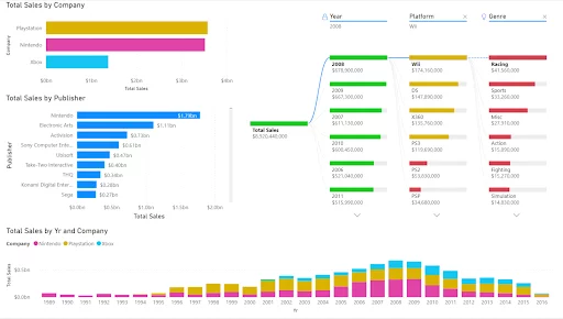
This gives you a final visual looking like this. As you can see for this example we’ve embedded it into a dashboard so that you can see how this works in reality.
For more information on controlling the presentation of your dashboards see our article – Customising Themes In Power BI
Disadvantages: Decomposition Trees
There are very few limitations on a decomposition tree.
The main ones are:
- Decomposition trees are limited to 50 levels and 5,000 data points.
- They are not supported with the on-premise Analysis Services.
- AI Splits are not supported in Azure Analysis Services, Power BI Report Server, and publishing to the web.
Conclusion
If you are using Microsoft Power BI to investigate your data actively, it is a handy chart.
It works very well to help you create a narrative, especially when carrying out a root cause analysis. This type of analysis is also something that Gantt charts can help project managers with.
While it can appear technical at first, it is very intuitive and straightforward to use once you are used to it, so we would encourage you to give it a try.

- Facebook: https://www.facebook.com/profile.php?id=100066814899655
- X (Twitter): https://twitter.com/AcuityTraining
- LinkedIn: https://www.linkedin.com/company/acuity-training/