
[Intro] Power BI’s Date Slicers
Contents
- 1 What Is A Power BI Slicer?
- 2 What Is A Power BI Date Slicer?
- 3 Importing An Example Dataset
- 4 Creating A Simple Date Slicer
- 5 Filtering Information Using A Date Slicer
- 6 Setting Before And After Date Limits
- 7 Displaying Dates As A List And Dropdown
- 8 Filtering Using A Relative Date Range Slicer
- 9 Adding Hierarchy Using Slicer Properties
- 10 Formatting A Date Slicer
- 11 Conclusion
- 12 Articles On Power BI Visuals
This article looks at using a Power BI Date slicer on different types of Power BI visualisation.
We will also look at creating a date slicer with hierarchies.
We cover date slicers during our Power BI courses if you would like to learn more.
What Is A Power BI Slicer?
A Power BI slicer is a visual element that allows end-users to filter information on different visualisations in Power BI.
You can use a Power BI slicer to filter data based on categorical, numerical, as well as date information.
In this article, we will be focusing on the Power BI date slicer.
What Is A Power BI Date Slicer?
A date slicer in Power BI filters information on visualisations using the date type data.
For example, you can plot a bar chart that shows the total sales values for a particular city between two date ranges with the date slicer.
A Power BI date slicer is similar to a numeric range slicer by default. However, you can also treat it as a categorical slicer when filtering data based on a specific day, month, or year.
We particularly recommend making day-level slicers to see how your sales are changing from day-to-day.
Depending upon the dataset, the Power BI Date slicer is intelligent enough to explicitly find connections between different date levels. It can filter data based on a hierarchy of information such as year, quarter, month, days, etc.
The other specific type of slicer is a hierarchical slicer.
Importing An Example Dataset
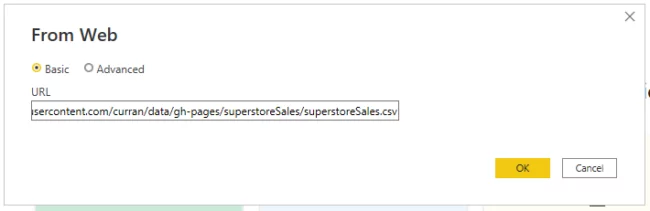
You can download the dataset for this article from this link:
https://raw.githubusercontent.com/curran/data/gh-pages/superstoreSales/superstoreSales.csv
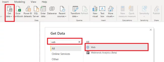
To import the data from this online link, click on the “Get data” button from the ribbon menu on the dashboard, type “Web” into the search bar and then select “Web” from the list of options.
In the following dialogue box, enter the link to the Github link containing your CSV file.
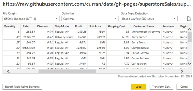
You will see the window below.
Click the “Load” button to load the data in the reports view into Power BI.
Creating A Simple Date Slicer
To create a date slicer, you use the default Power BI slicer visual that you can find in the Visualizations pane in the reports view.
Before we do that, let’s create a chart that we will use as an example to filter information via a date slicer.
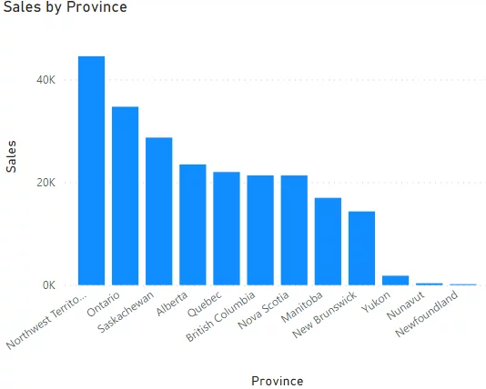
From the Visualizations pane, click the icon for the Clustered column chart visual.
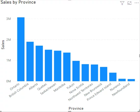
Drag and drop the Province column from our dataset to the Axis field of our clustered column chart.
Then drag and drop the Sales column to the Values field.
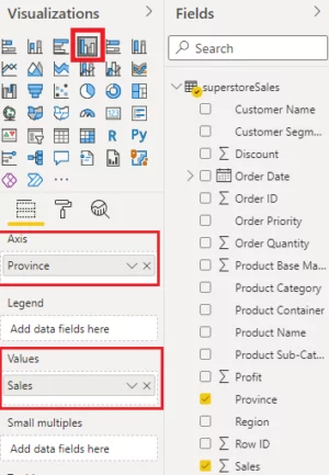
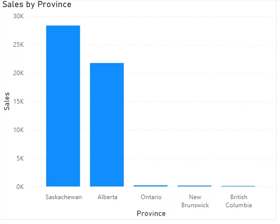
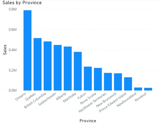
The chart shows the total sales for different provinces in our dataset.
For example, you can see that 3 million of total sales belong to the Ontario province.
Now let’s add a date slicer.
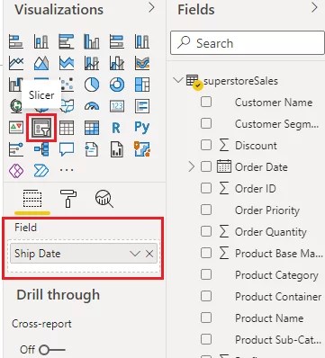
Click the Slicer icon from the Visualizations pane.
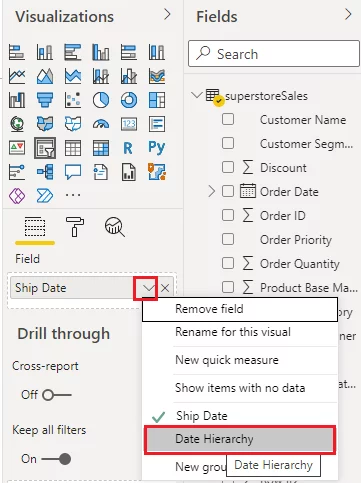
Drag and drop the Ship Date column to the Field option for the slicer, as shown in the screenshot below:
If you click on the reverse carrot symbol (down arrow) to the right of the Ship Date field name, you will see that the date consists of Year, Quarter. Month, and Day, as shown below:
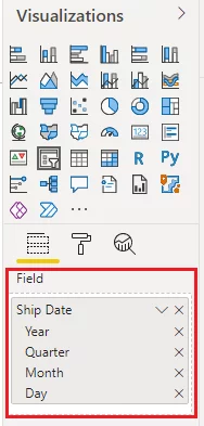
You can add or remove any field.
If you remove the Day sub-field, the minimum unit for filtering date will be the Month field.
In this article, we will create a slicer based on all the fields.
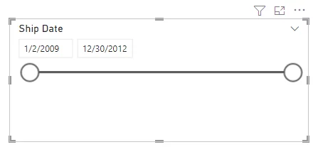
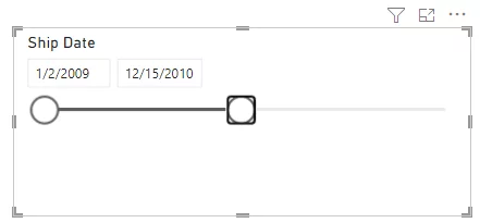
You should now see the following slicer in your reports view.
The slicer contains a horizontal range bar where you can drag the left and right circles to set the minimum and maximum date range limits, respectively.
You can also enter the minimum and maximum dates in the text fields directly if that is faster.
By default, the slicer contains the minimum and maximum date values from the Ship Date column that you used to create this slicer.
Filtering Information Using A Date Slicer
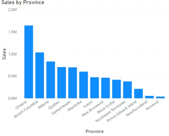
Let’s now filter information on our clustered column chart displaying total sales for different provinces.
For example, let’s keep the minimum date as the default date and make the maximum date 15/12/2020 (December 15th, 2020).
Your clustered column chart will only contain the sum of sales for the period between the dates specified by the slicer.
You can see that the sum of sales for Ontario province has now reduced to around 1.6 million since the period in terms of dates has been reduced by the slicer.
Setting Before And After Date Limits
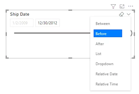
The date slicer offers a variety of options that you can use to set minimum and maximum date values.
To see these options, click the downward arrow symbol at the top-right corner of your slicer, as shown in the image below.
By default, the Between option is selected. That selects all days between two dates.
If you select the Before option, you will see that the option to set the minimum range will disappear.
You will only be able to select a date before the maximum date.
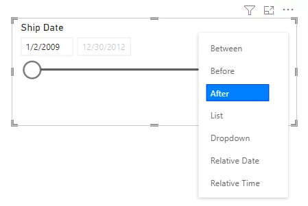
Similarly, selecting the After option disables the options to choose maximum date values and only allows you to select any date after the minimum date.
Displaying Dates As A List And Dropdown
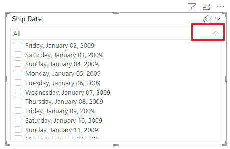
In addition to displaying a range bar for selecting dates, you can also display a list of all the dates.
To do so, select the List option as shown below.
You will now see a list of all the dates in your dataset, as shown in the screenshot below.
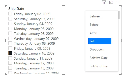
In the above screenshot of the slicer, the only date selected is January 10, 2009.
In the clustered column chart below, you can see total sales for all the provinces on this date.
Note:
If you remove the Date sub-field from the Field option in your slicer, your slicer will show a list of months (the next minimum unit of date in your dataset).
In the same way, you can display all the dates in the form of a dropdown list. To do so, you need to select the Dropdown option as shown in the screenshot below:
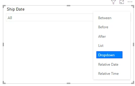
You will see the following dropdown list where the first item is All, which means that all the dates are selected by default.
Filtering Using A Relative Date Range Slicer
You can also create a relative date filter known as a relative date slicer.
For instance, you can set the date range to “Last ten years”, “Last 40 minutes” and so on.
To use this, select the Relative Date option from the list of options that appear when you click the reverse carrot symbol on the top right of your slicer.
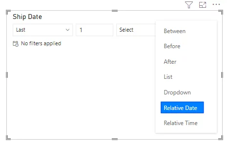
You will see the following options on your slicer.
Here you can set relative date range filter options such as Last, Next, etc., along with a value and the range to filter such as the Days, Weeks, Calendar Weeks, Months, Years, etc.
Below, we have filtered dates from the last ten years.
You will see that the range for the relative date period will automatically appear on your slicer, as highlighted by the red box in the following screenshot where you enter a start date and an end date.
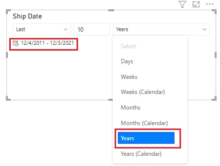
The clustered column chart now contains the sum of sales for all provinces for the last 10 years.
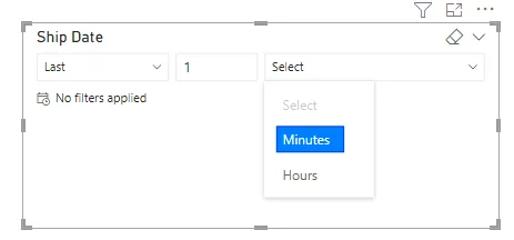
In the same way, you can select the Relative Time option and set the relative time as shown in the following screenshot if that is useful for your dataset.
Adding Hierarchy Using Slicer Properties
In a previous section where you created a basic date slicer, you saw that the Ship Date column is further divided into different date components such as Year, Quarter, Month, Day etc., as shown in the screenshot below:
Using this information, you can add date hierarchies to your date slicer.
To do so, click the downward arrow symbol at the end of the Ship Date column in the slicer Field.
Click the Date Hierarchy option from the list of options.
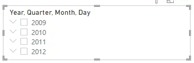
Your date slicer will now look like this.
At the top level of the hierarchy, the checkboxes for the years are displayed.
If you click the downward arrow symbol to the left of the year checkboxes, you will see that the quarters within the years will be displayed. They are the next layer down in the hierarchy.
In the same way, you can see months within different quarters, and days within months.
In the following slicer image, February, which belongs to the first quarter of the year 2010, is selected.
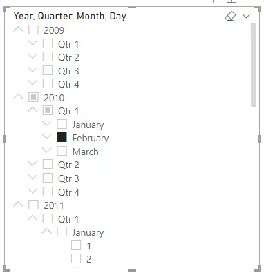
In the clustered column chart, you can see the total sales for all the provinces for February 2010.
You should be careful while creating hierarchies of data to use the appropriate time periods.
If you have a long term dataset it is not recommended to use very small date units such as days to filter data.
Common practice is to either:
- Use range slicers for dates, or
- For categorical slicing, use bigger date units such as months, or years.
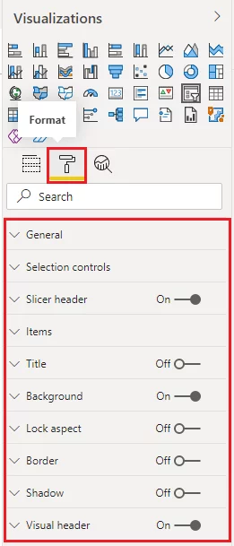
Formatting A Date Slicer
The process of formatting a date slicer is similar to the other slicer types.
You select the Format option (paint roller icon) which is next to the Properties for the slicer.
Clicking the Format option displays all the formatting options available.
Here you can change colours, fonts, set selection controls, and other formatting options for your slicer.
As an example, select the Slicer Header option and change the font colour, background, font size and outline of your slicer, as shown in the image below:
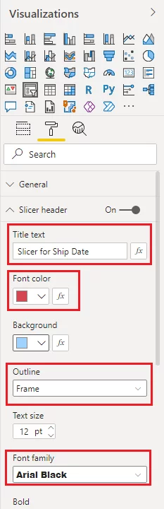
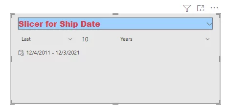
Also, change the background colour by clicking the Background option.
Depending on the background colour you select, your slicer should look similar to the one in the following screenshot.
Conclusion
The Power BI date slicer is a handy tool for filtering records based on date information.
Including them in a power bi report or any dashboards that you create can add significant functionality for users.
To learn more about managing dates in Power BI see our article – Date formats in Power BI.
Articles On Power BI Visuals
The Decomposition Tree Visual In Power BI

- Facebook: https://www.facebook.com/profile.php?id=100066814899655
- X (Twitter): https://twitter.com/AcuityTraining
- LinkedIn: https://www.linkedin.com/company/acuity-training/