
Filter Your Information With Hierarchy Slicers [Power BI Guide]
Contents
- 1 What Is A Power BI Slicer?
- 2 What Is A Power BI Hierarchy Slicer?
- 3 Ragged Hierarchy In The Hierarchy Slicer In Power BI
- 4 Importing An Example Dataset
- 5 Creating A Hierarchical Slicer In Power BI
- 6 Allowing Only A Single Selection In A Hierarchy Slicer
- 7 Formatting A Hierarchy Slicer
- 8 Conclusion
- 9 Articles On Power BI Visuals
This article explains what a Power BI hierarchy slicer visual is and how you can use it to filter information on various report types.
The article also describes some basic formatting options for the Power BI Hierarchy Slicer.
We cover using slicers during our introduction to Power BI courses.
What Is A Power BI Slicer?
A Power BI slicer is a visual element that provides an interactive way of filtering information on different visualisations on a report canvas.
A Power BI slicer can be used to filter data based on categorical, numerical, as well as date information.
What Is A Power BI Hierarchy Slicer?
A Power BI hierarchy slicer allows you to filter information based on hierarchical filters, just as you can use slicers on numerical data.
For example, you can filter a dataset on product categories and product subcategories within the parent categories.
With a hierarchy slicer, you can create any number of levels in a hierarchy depending only upon the relationship between various columns in your dataset.
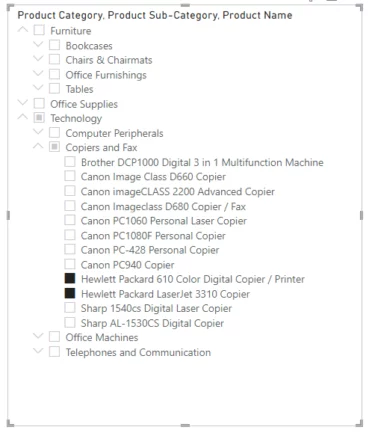
The image below shows a three-level Power BI slicer.
Let’s now look at your you create a hierarchical slicer.
Ragged Hierarchy In The Hierarchy Slicer In Power BI
A ragged hierarchy is one in which an element in a hierarchy may be linked to a member of the hierarchy two levels higher (or lower) than it, but not to a member one different to it.
Effectively, this is a grandparent to child relationship without a parent in the middle.
Power BI Desktop does not currently support ragged hierarchies, but it is on the Power BI roadmap.
Importing An Example Dataset
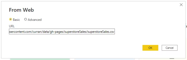
The dataset for this article is available at this link:
https://raw.githubusercontent.com/curran/data/gh-pages/superstoreSales/superstoreSales.csv
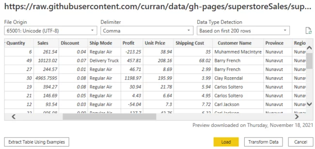
The dataset consists of a CSV file that contains various information about product sales at a superstore.
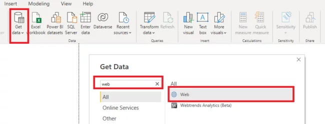
To import the data from this online link, click on the “Get data” button from the ribbon menu on the dashboard, type “Web” into the search bar and then select “Web” from the list of options.
Enter the link to the Github page containing your CSV file in the following dialogue box:
You will see the window below.
Click the “Load” button to load the data in the reports view into Power BI.
Creating A Hierarchical Slicer In Power BI
You can use the default standard slicer in Power BI to create a hierarchy slicer.
However, before creating a hierarchy slicer, let’s create a clustered column chart that displays total sales for all the product sub-categories in our dataset.
Next, we will create a hierarchy slicer that will filter information on this clustered column chart.
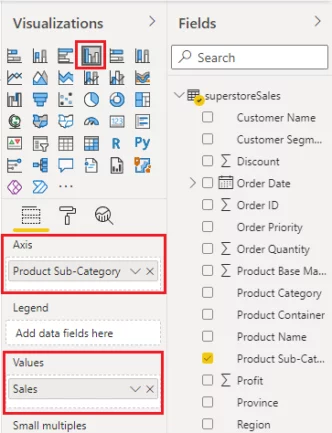
To create a clustered column chart, click the icon for the Clustered column chart from the Visualizations pane.
Drag and drop the Product Sub-Category column into the Axis field from your dataset.
Similarly, drag and drop the Sales column to the Values field of your clustered column chart.
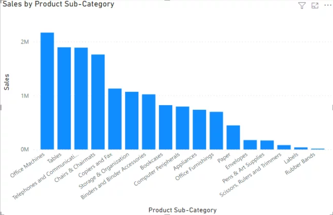
You should now see the following clustered column chart in the reports view.
Now, let’s add a slicer that filters this information by product category (parent level) and product sub-category (child level).
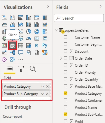
Click the icon for the Slicer visualisation from the Visualizations pane.
Drag the Product Category and Product Sub-Category columns from your dataset and drop them under the Slicer Field option as shown below.
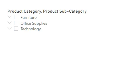
You will see the following slicer visual on your reports view.
You will only see checkboxes for Product Category by default, as shown below.
Click on the downward arrow symbol to the left of the category name.
You will now see the checkboxes for all the subcategories within that top level category.
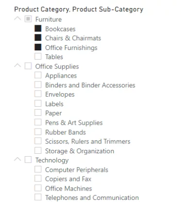
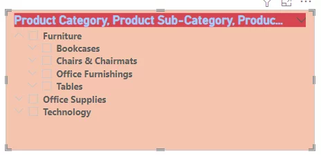
The top-level checkboxes contain product category names, whereas the second level checkboxes correspond to product sub-category names.
It is interesting to see that though you didn’t explicitly specify a relationship between the Product Category and Product Sub-category columns, the hierarchy slicer is intelligent enough to place correct sub-categories under the main categories.
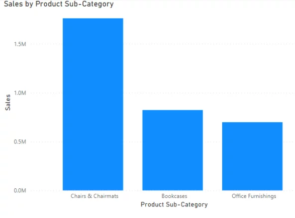
You can select multiple checkboxes by pressing control and clicking a checkbox. Three sub-categories under the Furniture category have been selected in the screenshot above.
Total sales are now only shown for the three selected sub-categories on the corresponding clustered column chart.
There is no limit on the level of hierarchies in your Power BI slicer. It depends on your dataset and the relation between data columns.
In our dataset, each product belongs to a particular category and sub-category. If you wanted to, you could add a product name to your hierarchy slicer to add a third level of hierarchy in the hierarchy slicer that you created earlier.
To do so, drag and drop the Product Name column under the Fields option as shown in the screenshot below:
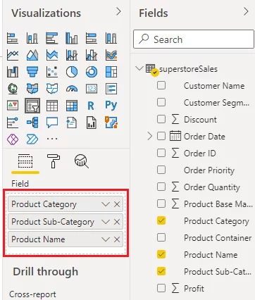
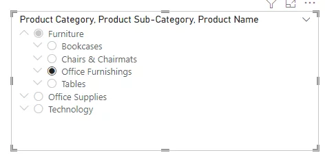
Now you will see that your hierarchy slicer will contain checkboxes at three different hierarchy levels corresponding to Product Category, Product Sub-Category, and Product Name.
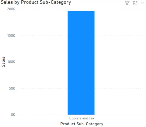
Only two products from the Copiers and Fax sub-category are selected below.

In the clustered column chart below, you can see the total sales for Copiers and Fax column (which is sum of the total sales for the two product names selected in the slicer)
Allowing Only A Single Selection In A Hierarchy Slicer
By default, you can select multiple options in a hierarchy slicer. However, you can enforce a single select mode as well.
To do so, click the Format option next to the slicer properties and select Selection Controls. Next, enable the Single select option as On, as shown in the screenshot below:
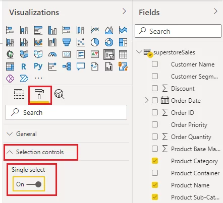
Now you should see that your slicer contains radio buttons instead of checkboxes, and you will be able to select only one radio button at a time.
Formatting A Hierarchy Slicer
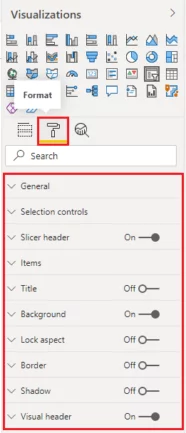
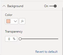
To format your hierarchy slicer, click the Format (paint roller icon) option.
You will see different formatting options to format selection controls, items, slicer header and background etc.
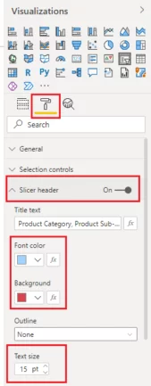
For this example, we will apply a style to the slicer header.
Click the Slicer header section under the Format options, and update the font colour, background and text size for the slicer title as shown in the screenshot below:
Similarly, click the Background option and change the background as well, as shown in the screenshot below:
Your hierarchy slicer now looks like this. We have adjusted the title text box and the presentation of the other different levels in the hierarchy.
In the same way, you can try other formatting options and see what style best suits your hierarchy slicer.
Conclusion
The Power BI hierarchy slicer is handy when filtering reports on a hierarchy of columns and makes reports and dashboards far more helpful for users.
Although the Power BI hierarchy slicer is extremely handy for creating hierarchies of categorical columns, it is not suitable for creating hierarchies of numeric columns.
To create a hierarchy of numerical columns, you can use multiple slicers, as shown in this article.
Articles On Power BI Visuals
- Facebook: https://www.facebook.com/profile.php?id=100066814899655
- X (Twitter): https://twitter.com/AcuityTraining
- LinkedIn: https://www.linkedin.com/company/acuity-training/