
The Q&A Visual In Power BI
Contents
The Q&A visual in Power BI uses Power BI’s natural language processing engine.
It can interpret your question and get an answer from your data.
Half of Power BI is learning the best way to present your data using Power BI, which we cover on our Power BI courses.
This article is for Power BI beginners & intermediates who already understand what Power BI is!
When Should I Use a Power BI Q&A Visual?
The Q&A visual is most valuable when you are looking to produce something quickly.
It is perfect when trying things out or exploring, as it allows you to develop multiple visuals very quickly.
Power BI’s automated machine learning capabilities allow you to experiment with multiple data models very quickly.
Instead of building a visual for every possible question, the Q&A visual allows users to ask and answer their own questions interactively.
If you are looking for a specific visualisation, we recommend the tree decomposition visual.
Keep in mind that the Q&A visual works best when your data is prepared, with all fields in plain language.
Creating a Power BI Q&A Visual Step-By-Step
Adding a Q&A visual is very simple.
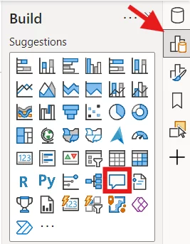
In Power BI Desktop, navigate to your Visualisations pane and search for the icon that looks like a speech bubble.
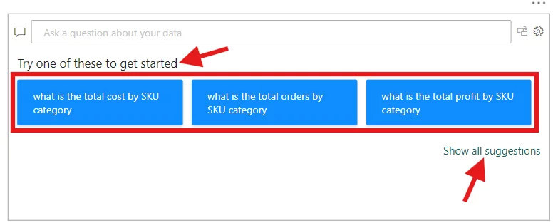
Adding this visual to your report will review your data and suggest some questions for you.
You can create your own question by typing in the “Ask a question about your data” box.
The Q&A visual can also present more question options by selecting “Show all suggestions” at the bottom.
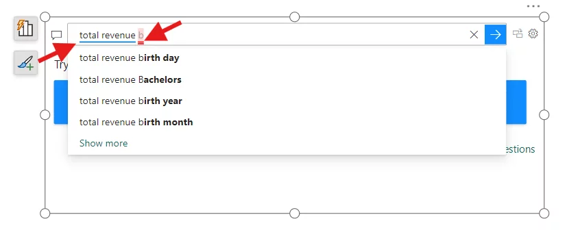
The beauty of the Q&A visual is that it can understand complete sentences or shorter phrases containing just keywords.
As you begin to type your questions, Power BI creates suggestions based on your data to make it even easier.
Fields that Power BI recognises will be underlined in blue.
Words Power BI doesn’t recognise will be underlined in red.
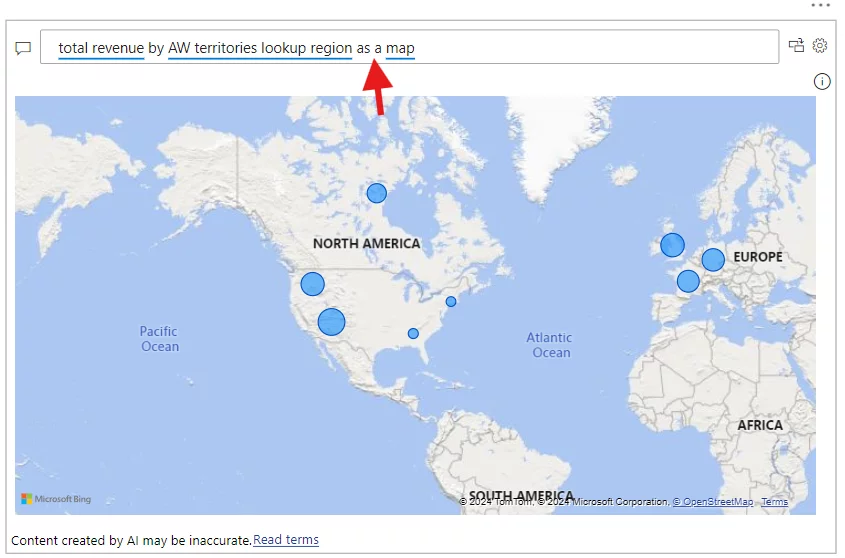
In this example, the Q&A visual also suggests the best way to present the data is a horizontal bar chart.
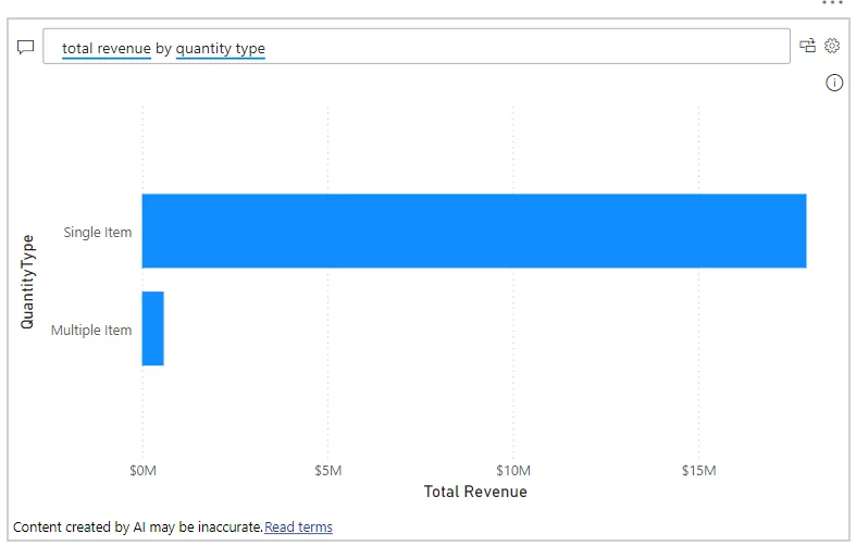
If the chart that Power BI creates for you does not look right, you can also define the type of visual you want.
You can specify the type of chart you want by adding “as a” and the type of visual to the end of any question.
The Q&A visual can recognise a variety of types of keywords, such as:
Aggregates (sum, total, highest lowest), comparisons (vs, compared to), and dates.
Freezing A Q&A Visual
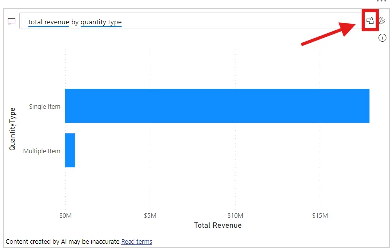
Once you have a visual that you want to keep for your Power BI report:
You can convert it into a standard visual by clicking on the button in the top right of the visual.
After converting the visual, you can make any of the usual alterations to a visual’s formatting, such as using a theme to standardise your presentation.
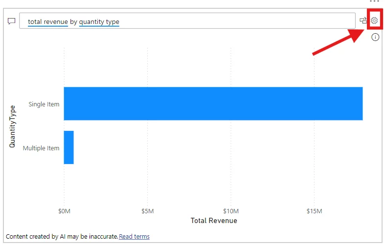
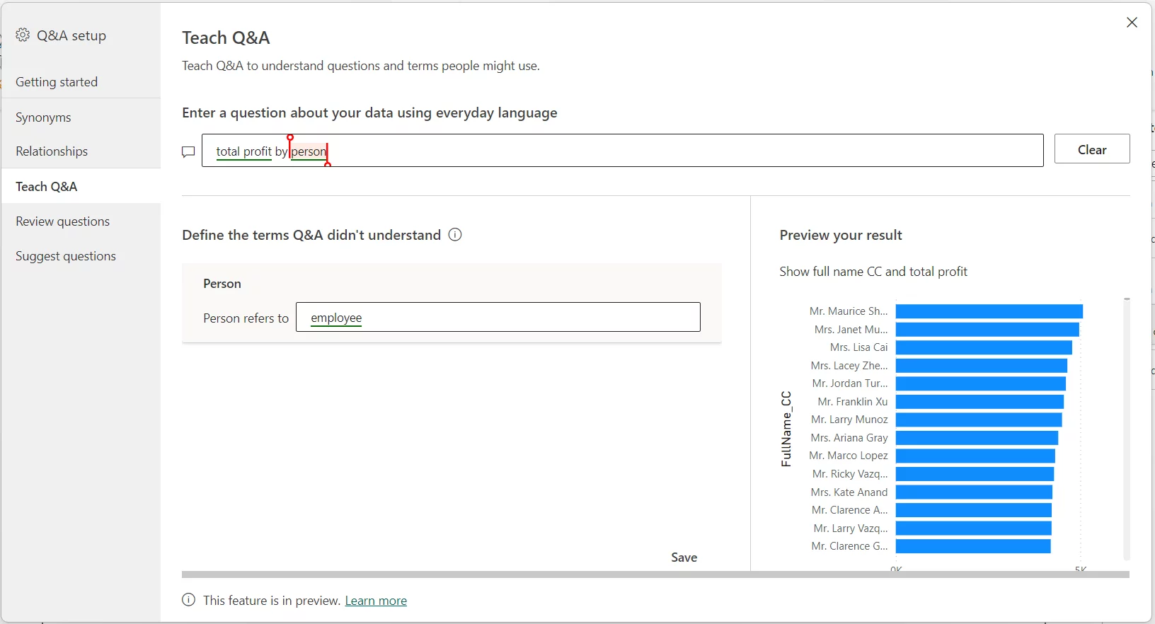
Using “Teach Q&A”
The “Teach Q&A” feature allows you to enter new terms, and teach Power BI how to respond to them.
Depending on your organisation and how you operate, there may be different phrasing people use.
One example is geographic boundaries.
In some cases, it could be “State”, in others “Province”, or something else entirely.
This feature is accessed by clicking on the gear icon in the top right of the visual.
Once inside the setup menu, you will have several different options.
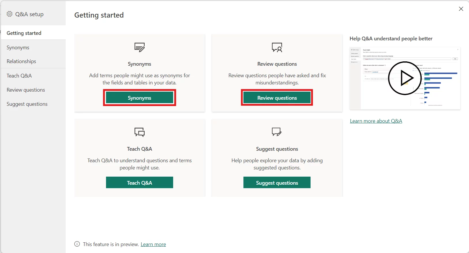
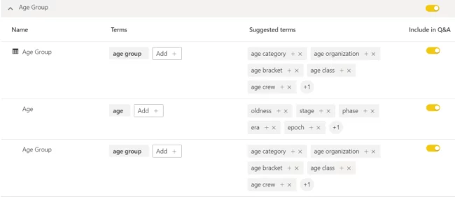
1. Field synonyms
Field synonyms allow you to manually adjust which words Power BI understands to be the same.
So using our example above, you can update Power BI to understand that “State” and “Province” are being used to mean the same thing.
You can add or remove terms, and even turn on or off the synonyms for a field.
The Q&A visual automatically creates synonyms based on the common terms.
2. Review questions
Review questions give you the ability to see what questions users have asked.
This can help improve the accuracy of Q&A by tweaking synonyms or changing what your fields are called.
The review questions feature requires an enterprise subscription to work.
In this example, “person” was used, which isn’t in the data fields or the synonyms.
Power BI can create the visual by updating Power BI’s language processing engine to know “person” actually refers to “employee”.
3. Suggest Questions
Suggest questions allow you to pre-populate the suggested questions for the visual.
This can be helpful if you review questions users are asking most often and put the top questions in the list, or include questions users are asking incorrectly.
Final Thoughts
The Q&A visual can be a powerful tool, but it must be used for the right job, like all tools.
It isn’t something that you will want to have on every report and can quickly become overused.
Just as you might work to speed up Power BI, this is a way to speed up your report development.
Articles On Other Power BI Visuals
Creating Combo Charts In Power BI
Creating A Bullet Chart In Power BI

- Facebook: https://www.facebook.com/profile.php?id=100066814899655
- X (Twitter): https://twitter.com/AcuityTraining
- LinkedIn: https://www.linkedin.com/company/acuity-training/