
2 Ways To Make A Heat Map In Excel [Advanced Guide]
Contents
Heat Maps distinguish important figures through vibrant colours.
They are a unique visualisation tool, they are approachable while keeping important data intact.
On our advanced London MS Excel courses, you’ll learn all about heat maps with the help of our expert trainers.
Understanding Heat Maps
Heat maps are a visual representation of numeric data.
Different colours highlight extreme, low, or mid-values from a data set.
Heat maps make it much easier to visualise and understand the statistics.
Here are a few real-world examples where an Excel heat map is great.
Air temperature heat map – Displays data concerning air temperature in a specific region.
Risk management heat map – Presents different risks and their side effects concisely.
Geographical heat map – Showcases numeric data for different regions of a geographical area with different shades.
If this is all sounding a little complex, start by just learning how to create charts!
Creating A Heat Map In Excel
1 – Conditional Formatting
The easiest way to create a heat map in Excel is through conditional formatting.
To get started, you can download this template for a heat map. It comes complete with the conditional formatting.
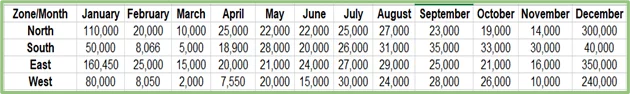
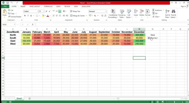
To demonstrate how this works, we’ll use the following sheet displaying the sales figures of a florist from the different zones of the country in a single year.
To create an Excel heat map, follow the steps below:
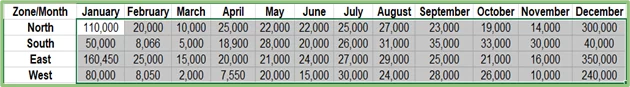
Select the numerical values you want to display in the heat map.
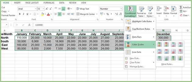
Head to Home Tab > Styles > Conditional Formatting > Color Scales (There are six distinct colour scales representing the colour schemes for your heat map)
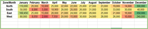
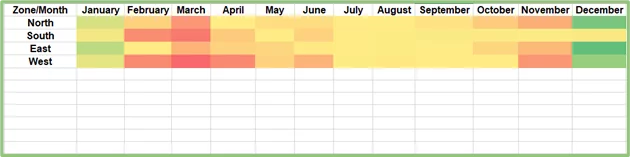
After you select the colour palette of your choice, its shades will be applied to the cells you had selected according to their distinct values, and you’ll get a heat map as presented below:
You can also create an Excel heat map without any numbers. To do this, select the heat map again and press Ctrl + 1. This will take you to the format cells dialogue box.
From the Numer Tab, go to Custom, and under Type, enter “;;;” then hit OK.
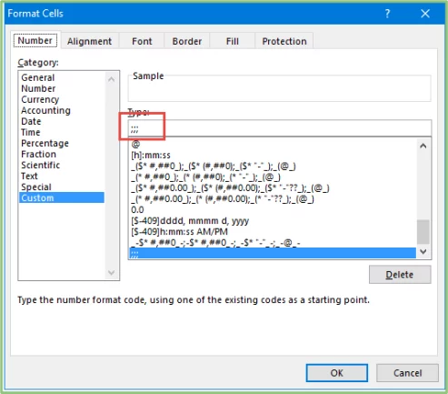
Your new heat map will present data like this:
2 – Dynamic Heat Maps
You may not always want the coloured cells in your sales spreadsheet.
To solve this, lets create a dynamic heat map, where you can hide and show the heat map effects according to your preference.
Navigate to the Developer Tab > Insert > Form Controls > Checkbox.
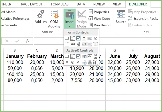
Select and drag the checkbox to your desired cell. Then right-click on it and go to Format Control > Control Tab.
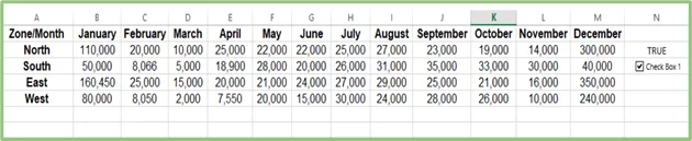
In the Cell Link space, add the cell address where you want the linked message of the checkbox to appear.
In this case, we chose cell N2.
Next, select the entire data set and head to Conditional Formatting > Color Scales > More Rules to create a custom colour scale for the figures.
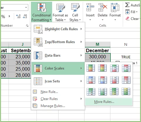
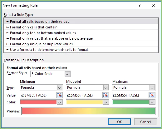
In the Formatting Rule dialogue box, head to the Format Style section to unveil its drop-down list and choose the 3-Color Scale.
From the Minimum, Midpoint, and Maximum drop-down lists, tap on Formula.
Based on your data points, it’s time to add values in the Value bars so that the heatmap highlights them accurately. Here is an example:
- Minimum: =IF($N$2=TRUE, MIN($B$2:$M$5), FALSE)
- Midpoint: =IF($N$2=TRUE, AVERAGE($B$2:$M$5), FALSE)
- Maximum: =IF($N$2=TRUE, MAX($B$2:$M$5), FALSE)
These formulas command Excel to highlight the lowest, middle, and highest values in your data chart (B2:M5) when the cell linked to your checkbox (N2) is TRUE with the help of MAXIMUM, MINIMUM, and AVERAGE functions.
This means that the moment you remove the check mark from the box and the message turns to FALSE, the different shades vanish, leaving behind the original structure of the data.
Before hitting OK, select a custom colour scale from the Color drop-down list, and you’re good to go.
Here’s a preview of what happens to a dynamic heat map when the linked cell (N2) changes from TRUE to FALSE.
Pros And Cons Of Heat Maps
Pros
Data Interpretation – Instead of drowning in a sea of numbers and figures, Excel heat maps compartmentalise your data so you can analyse it.
Observing Trends – In their raw form, all figures look alike.
With a heat map, you can see months that experienced high sales, indicating peak periods that can help shape your marketing campaigns.
Enhancing Presentation – Heat maps in Excel turn dull reports into a visual representation of colours without losing their crux.
Cons
Performance Issues – If you’re working with an extremely large data set, understanding and working with heatmaps can get nerve-wracking, resulting in slower performance.
Dependence On Colours – Colour schemes are at the core of a heatmap’s effectiveness in data analysis. This can be challenging for individuals with visual deficiencies!
Conclusion
Imagine looking at a data set revealing endless rows of numbers and being unable to differentiate between the highest or lowest values.
To do this, you start going row by row, highlighting cell values individually, only to find out it will take you forever to finish this project.
With heatmaps, we can help you complete it within seconds. Data analysis and complex decision-making are now easier and simpler than ever!

- Facebook: https://www.facebook.com/profile.php?id=100066814899655
- X (Twitter): https://twitter.com/AcuityTraining
- LinkedIn: https://www.linkedin.com/company/acuity-training/