
Making A Gantt Chart In Excel (Quick & Easy!)
Contents
In this article, we will look at how to create a Gantt chart in Microsoft Excel. Gantt charts assist with project planning since they allow you to schedule and plan project activities.
If you would like to learn more about other advanced features and functions in Excel then please join one of our top-rated Excel courses.
What Is A Gantt Chart?
A Gantt chart is a type of visualisation tool that is used to display a project plan. Usually, one will see a list of activities/tasks on the left hand side while the right hand side graphically shows the duration of each activity/task.
The Gantt chart was developed by Henry Gantt during the early 1900s and it is named after him. He was a mechanical engineer and management consultant. He developed the Gantt chart to record the daily activities of employees, in terms of the time it took to reach milestones.
Want to learn more about mathematics in Excel? Read our guide here all about Percentages in Excel.
You can use Gantt chart software such as MS Project or Smartsheet to create a Gantt chart.
Microsoft Excel does not have a built-in Gantt chart option, but you can create one easily by using a template or by modifying an existing Stacked Bar Chart.
If you are working on project management, it’s the most effective way to chart your data.
In this post, we are going to review these two techniques.
Learn more about how to create charts in Excel here.
Gantt Chart Template – Simple Example
Microsoft provides a number of useful Excel templates that you can utilize to create customized spreadsheets. So, let’s see how to create a simple Gantt chart in Excel by using a template.
Description of the Data Set
A hypothetical aspiring author plans to write a short story.
A short story is typically a brief work of prose or fiction, that is much shorter than a standard novel. Short stories are usually between 1000 and 7500 words.
The main advantages of writing and publishing short stories in literary magazines, is that they allow new writers to quickly build a portfolio of work and thus attract readers.
The author wants to use a Gantt chart to schedule the main tasks/activities involved in writing the short story. The activities involved are the following.
She would like to start the project on 10 March 2022.
- She wants to spend 7 days choosing a setting for her short story.
- Consequently, she plans to spend 12 days deciding on the central message or theme of her short story.
- She then wants to spend 10 days developing the character profiles of the two main characters in her short story.
- She wants to spend 8 days outlining the plot of her short story, afterwards.
- She then wants to spend 2 days actually writing her short story, using the building blocks she completed thus far.
The author would like to take a two day break between each activity.
Gantt charts are also great tool for planning SEO projects. For more check out this article on Excel for SEO training.
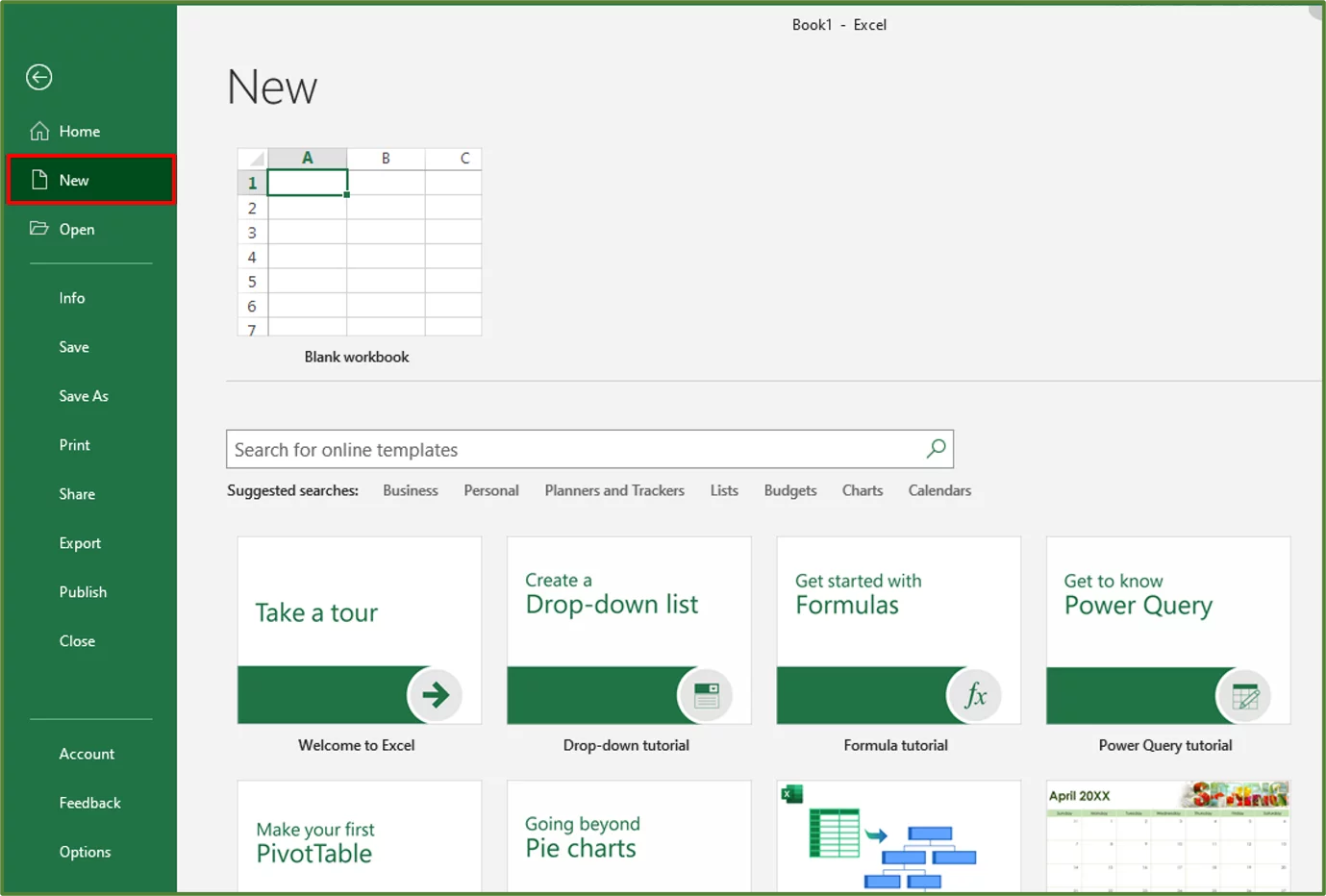
Step 1:
With a blank workbook opened, go to the File Tab and click New.
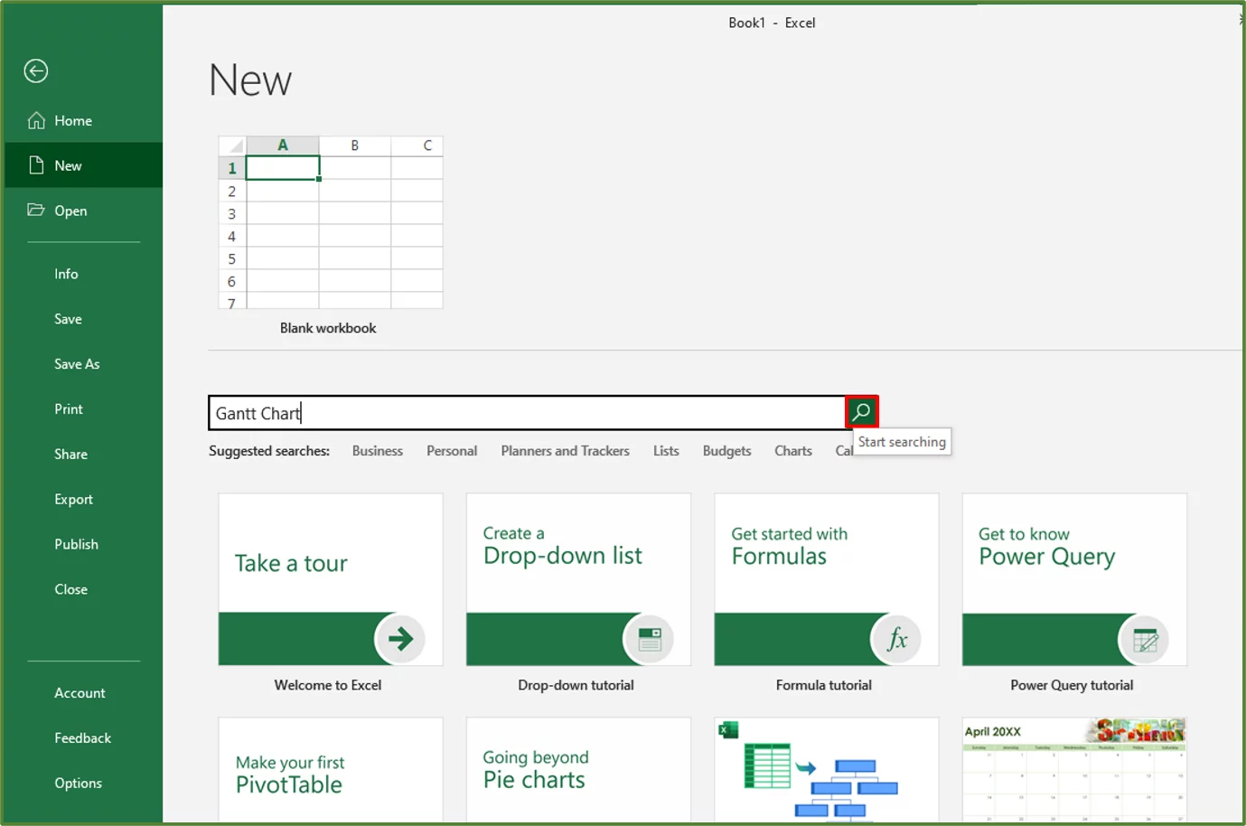
Step 2:
Type Gantt Chart in the Search Box and click to start searching.
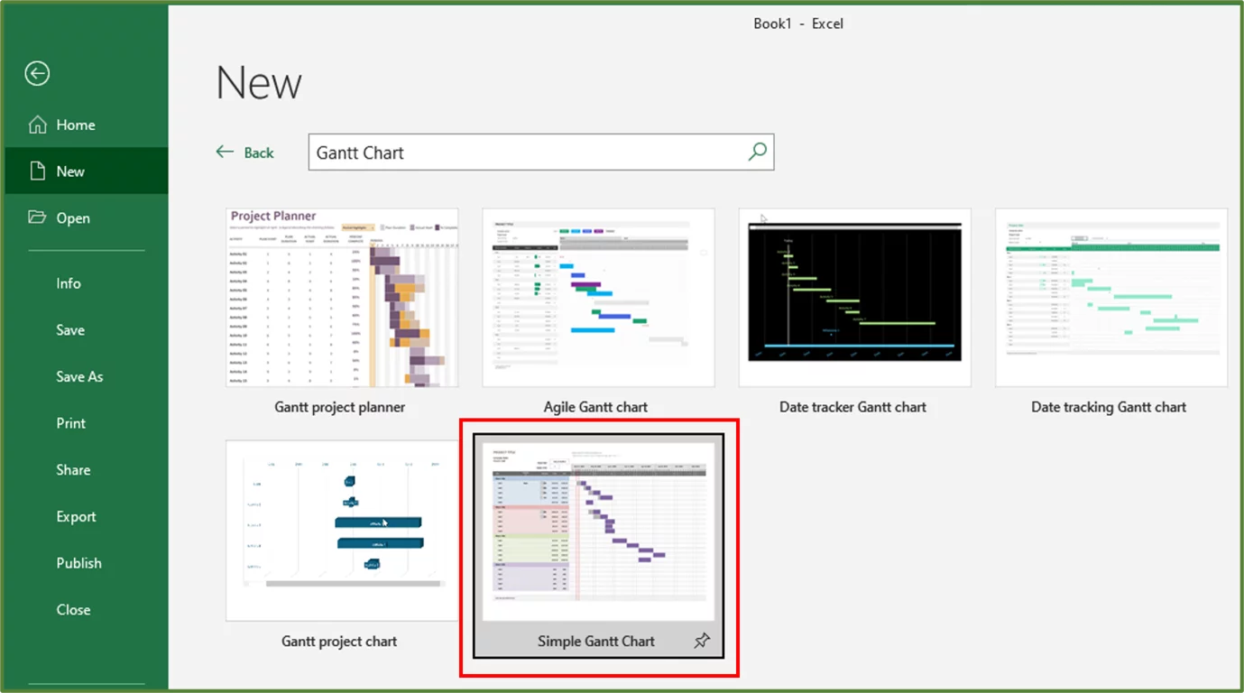
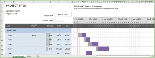
Select the Simple Gantt Chart template.
This is a template provided by Vertex42 and can also be downloaded directly from their site.
Click Create.
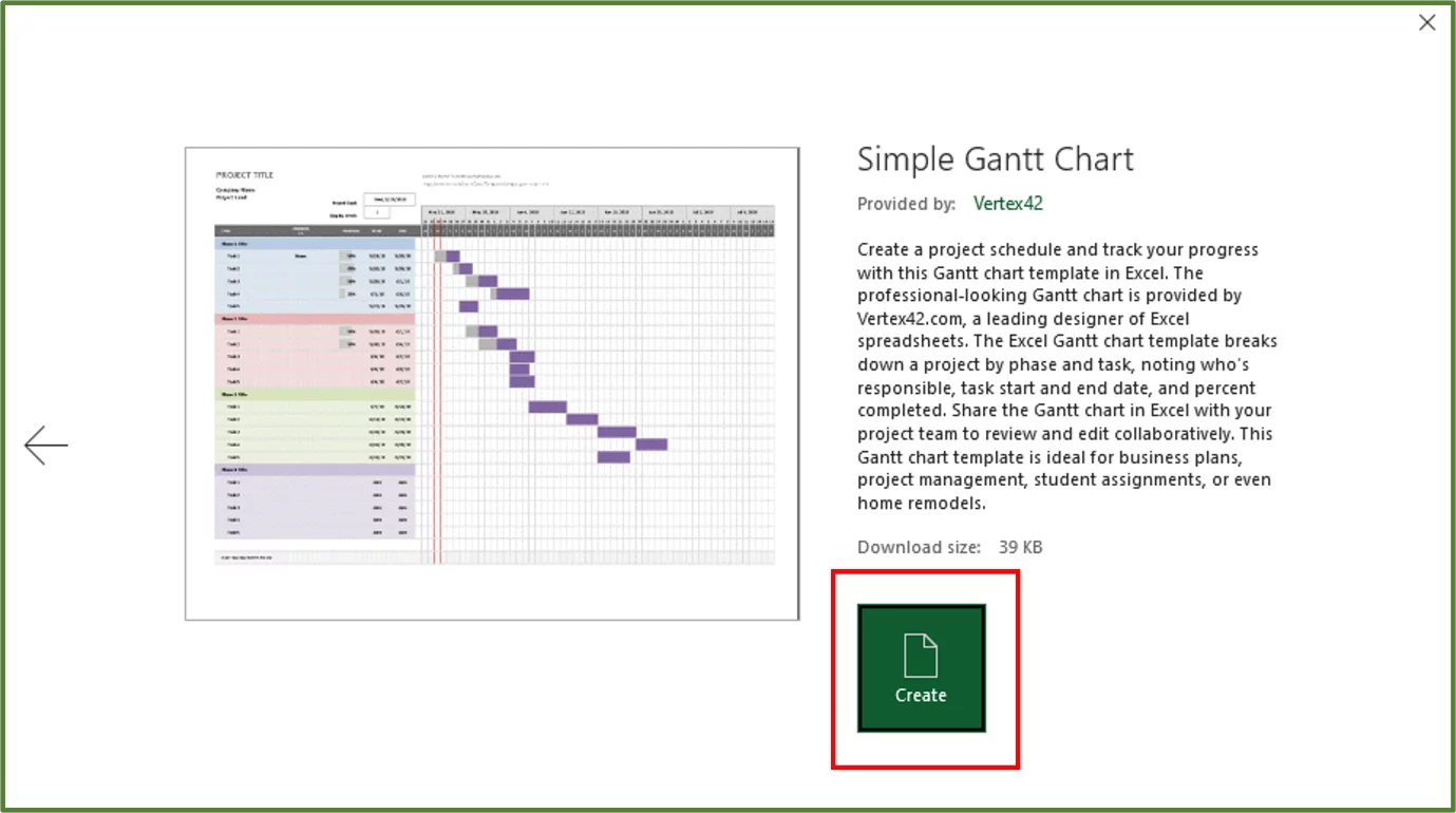
You should see the following.
Step 3:
We will now customise the template to suit our needs.
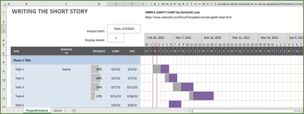
Firstly, we will enter the new title which is Writing The Short Story in cell B1. We will then delete Company Name and Project Lead.
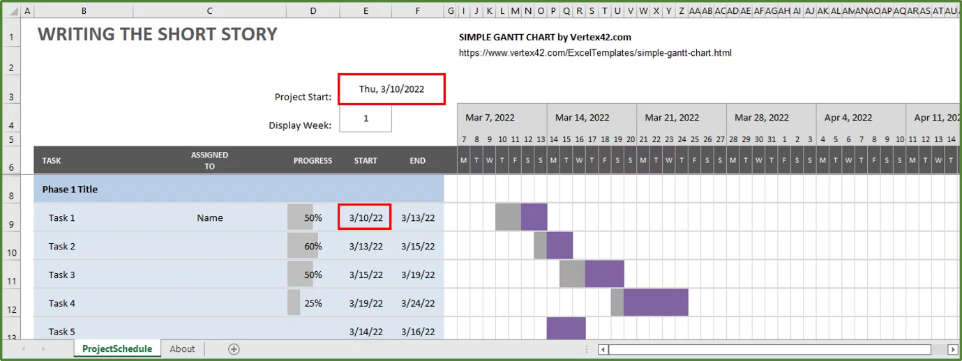
Now we will change the Project Start Date to 10 March 2022. You will see cell E9 automatically updates with the new Project Start Date, due to the formula that is in cell E9.
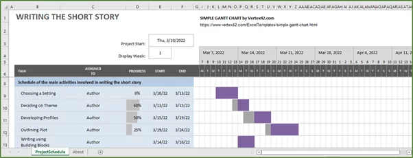
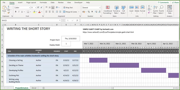
Now we will change the text Phase 1 Title to Schedule of the main activities involved in writing the short story. We will change the values in range B9 to B13 to reflect the main activities.
In range C9:C13 we will enter Author, since the same person is responsible for all the activities in this case.
In cell D9, we will enter 0 as the progress since nothing has been completed, as yet.
You should see the following.
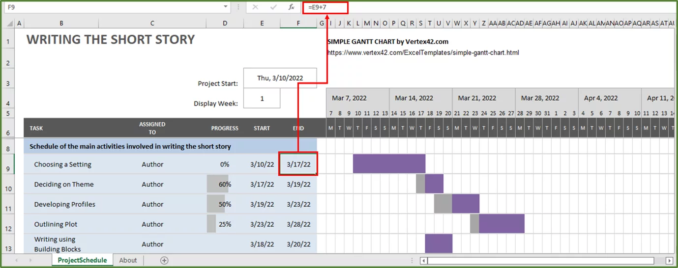
We will change the end date for our first activity, to reflect that we want our end date to be 7 days after our start date. The formula in cell F9 is currently =E9+3 and we are going to change this to E9+7.
You should see the following.
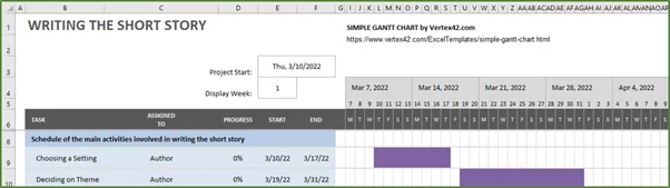
Now after doing this, you should see that the formula in cell E10, which shows the start date for the next activity automatically updates to reflect the end date of the previous activity.
Now this is fine in the case where one starts the next activity as soon as the previous one has been completed. In our case however, the author would like to take a two day break between each activity.
So, to reflect this in cell E10 enter the formula =F9+2. In cell F10, which reflects the end date for this activity change the formula to =E10+12. Since the author wants to take 12 days from the start of this activity to decide on the central message or theme.
Change the progress to 0%.
You should see the following.
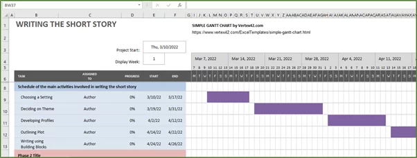
Change the rest of the start dates and end dates accordingly. Change the progress to 0% for all activities.
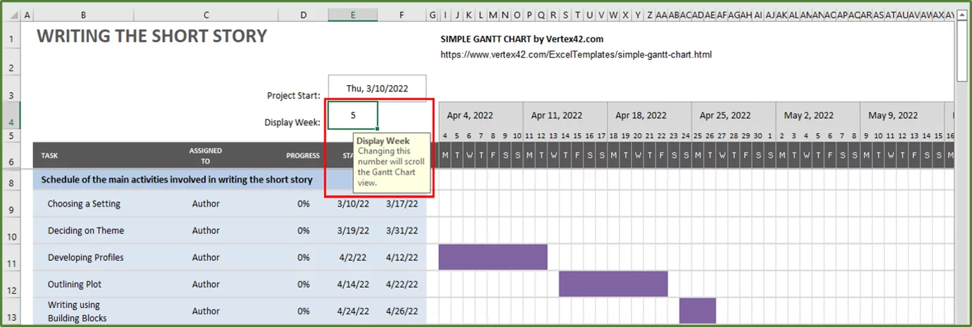
If you’d like to see the last activities then you can either manually scroll across or change the Display Week value to 5, to see this view of the Gantt chart from the perspective of week 5.
Step 4:
Since we are not using rows 14 to 31, we can delete these rows.
So, select rows 14-31 and go to the Home Tab (Step 1 in the image) and in the Cells Group, click on the Drop-Down arrow under the Delete button and select Delete Sheet Rows (Step 2 in the image).
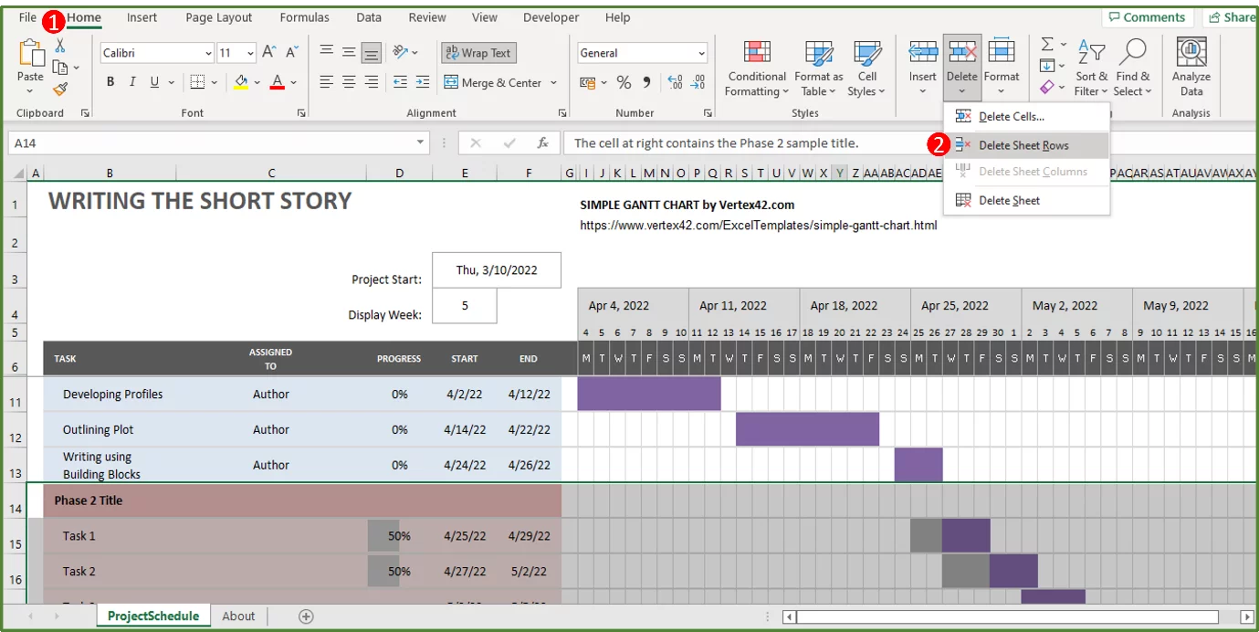
You should now see the following.
Step 5:
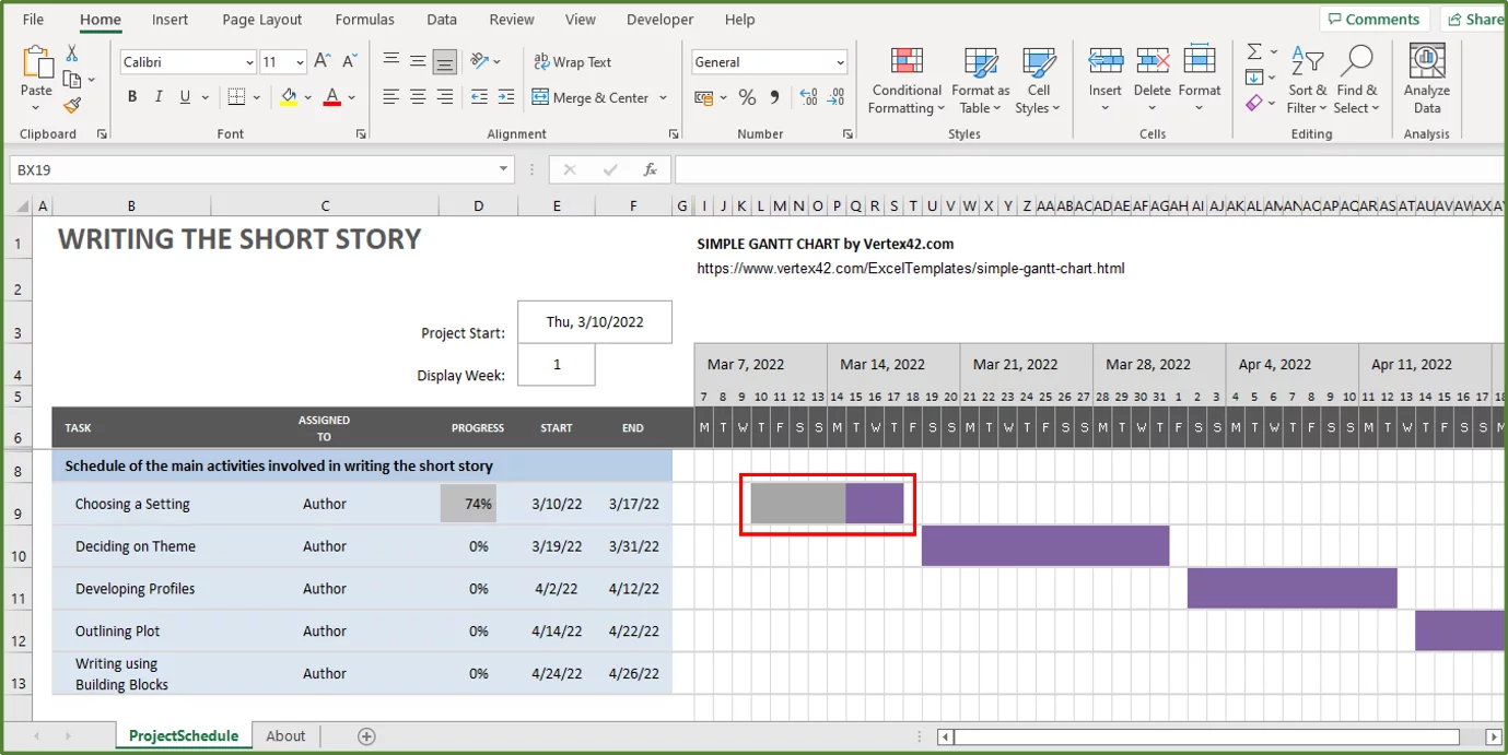
In order to use this Excel Gantt Chart to track progress, you would change the percentages accordingly in column D.
So, let’s say the project has started and the author has completed 74% of the first activity. All we would need to do is enter 74 in cell D9 and the Gantt chart will be updated as shown below.
Tip: If you unhide column H, you will see the total duration of each activity including the start day.
If you would like to learn more about how to summarise a workflow in Excel using a flow chart then read our guide here.
How To Make A Gantt Chart In Excel – Step By Step
We will look at how to modify a stacked bar chart to create an Excel Gantt chart. We will use the same data set as in the above example.
Step 1:
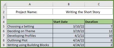
So, the first thing that we have to do is set up our project table. You will need to set up your data in this way in order to create the Gantt chart.
So, enter the activity names in the first column. The start dates for each activity in the second column, and the duration in the third column.
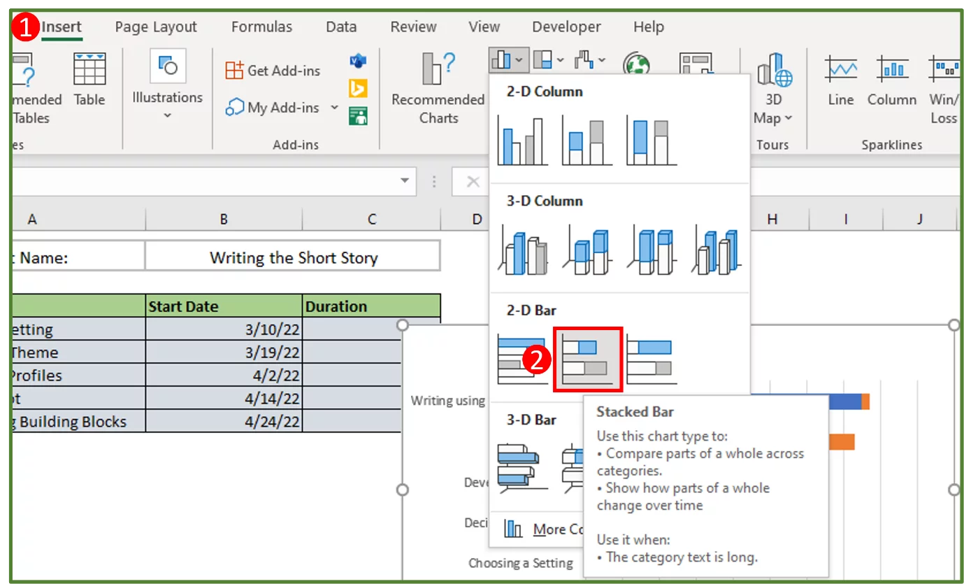
Step 2:
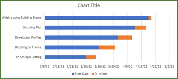
Now select the range A4:C9. Go to the Insert Tab (Step 1 in the image) and in the Charts Group, click on the drop-down arrow by Column chart and in the 2-D Bar options, select Stacked Bar (Step 2 in the image).
You should see the following.
Step 3:
We are now going to modify this chart to create our Gantt chart.
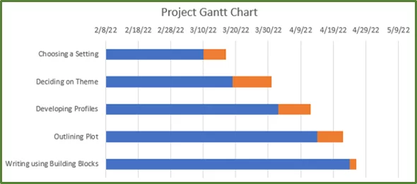
So, click on the + sign for Chart Elements and uncheck Legend.
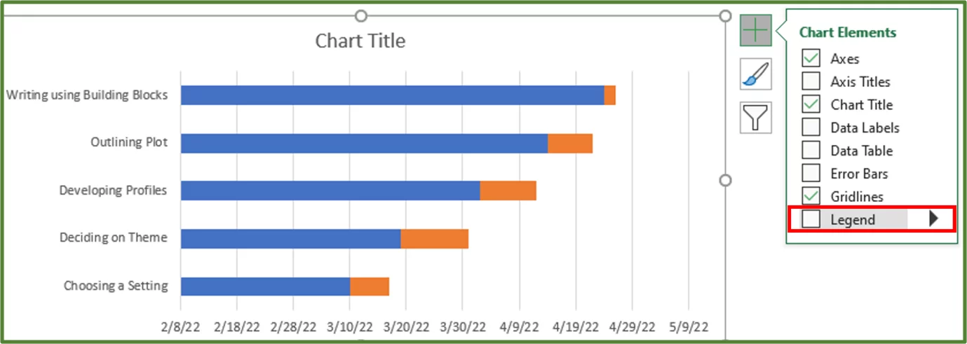
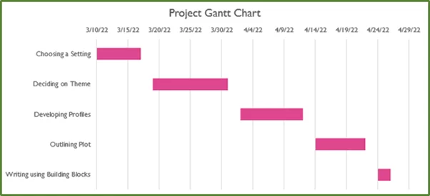
Change the Chart Title to Project Gantt Chart.
We can see that the order of our activities has been reversed. In order to change this, select the activities on the chart and right-click and choose Format Axis.
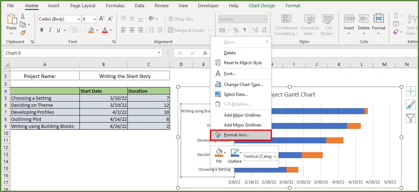
Using the Format Axis Pane, check Categories in reverse order.
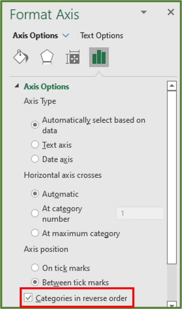
You should see the following.
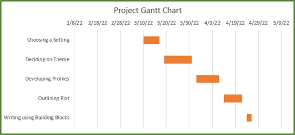
Now select all the blue bars by clicking on one of them. Go to the Home Tab (Step 1 in the image) and in the Font Group, select the Fill Colour option and choose No Fill (Step 2 in the image).
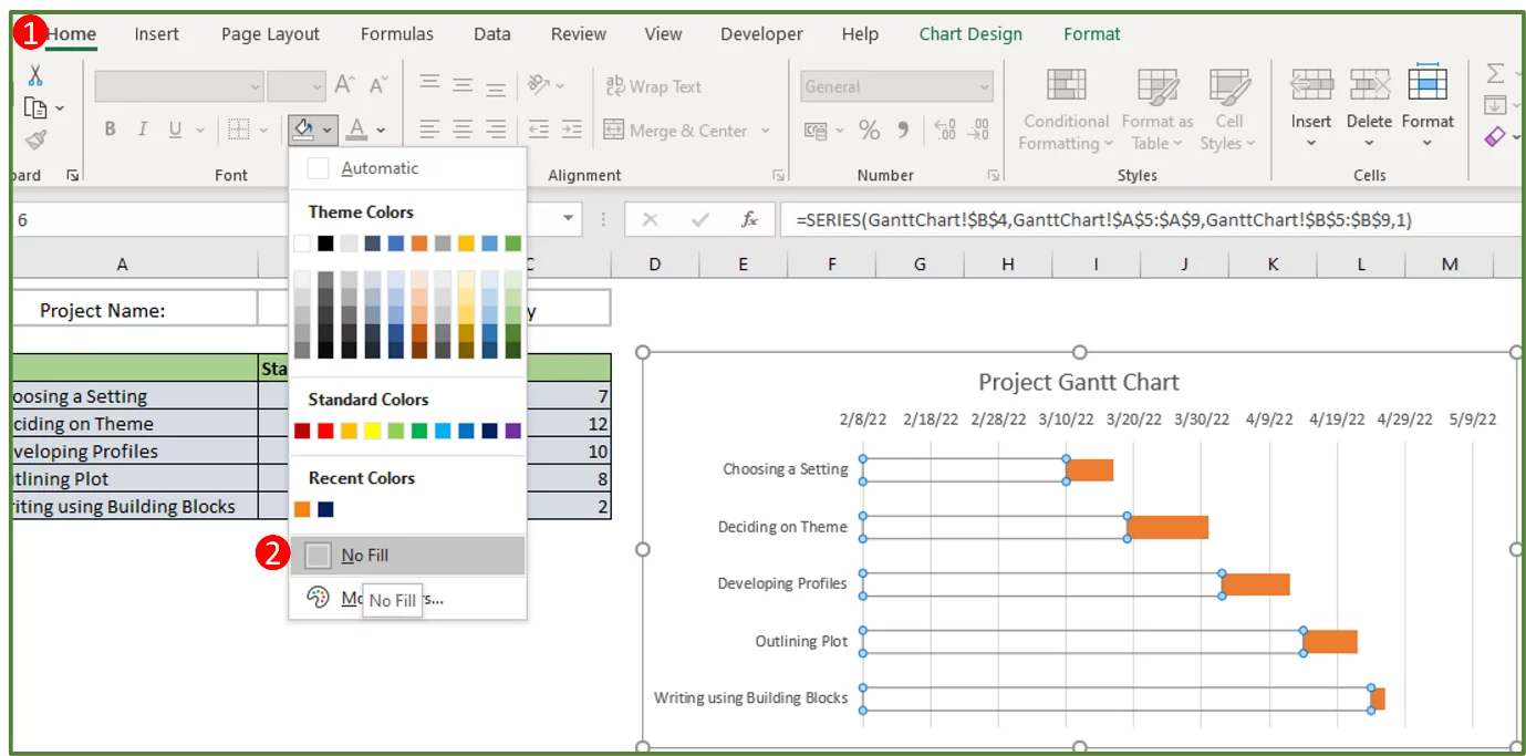
You should see the following.
Step 4:
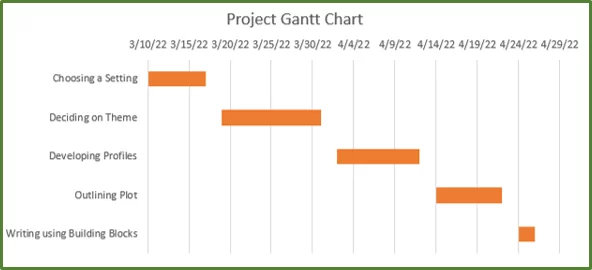
So now what we’d like to do, is modify the chart further in order for the first bar to start on the date of the first activity.
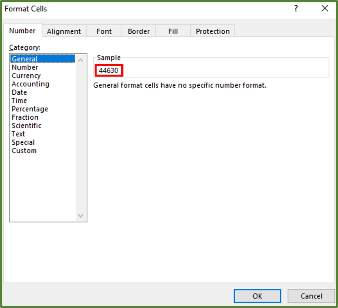
To do this we have to get the general format for the first date. So select cell B5 and press Ctrl+1 on the keyboard to open the Format Cells Dialog Box.
Note the number that appears when you click on the General option. This is 44630 in this case.
Now select the dates on the chart and right-click and select Format Axis.
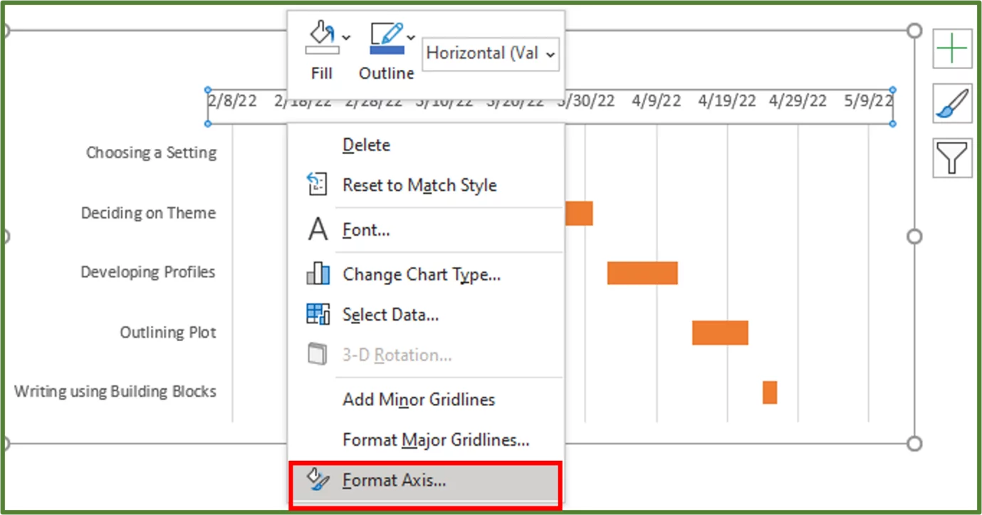
In the Bounds section change minimum to 44630.
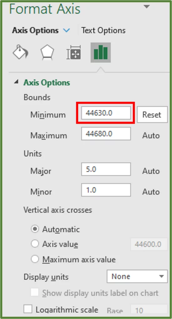
You should see the following.
For more on Excel and Visual Data Representation, view our guide here on Data Models In Excel.
Customize Your Gantt Chart
You now can change the appearance of your Gantt chart by changing the theme. Themes in Office, are collections of co-ordinated colours, fonts and effects.
Themes can be applied to a document, presentation or workbook in order to change the overall appearance.
So go to the Page Layout Tab (Step 1 in the image) and in the Themes Group, choose the Themes drop down arrow and select one of the themes. In this case we will choose Gallery (Step 2 in the image).
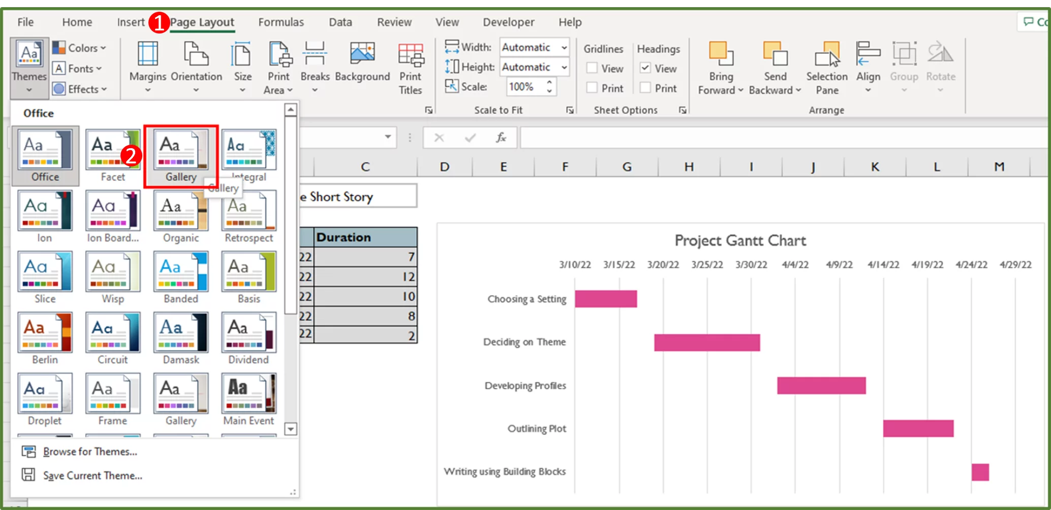
You should see the following.
Now you know how to use a Gantt Chart, why not move on to more? Read our guide here on the Growth Function In Excel.
Gantt Chart Use Cases
Gantt charts are utilized in many industries. Gantt charts are used to show the progress of the activities on construction sites and by event planners to structure and plan events.
Learning Objectives
You now know how to:
- Download and modify a template to create a Gantt Chart in Excel
- Create a Gantt Chart by modifying a stacked bar chart
Additionally, you have an understanding of:
- When to use a Gantt Chart
Conclusion
You can use Gantt charts to track milestones and monitor project tasks. Excel Gantt Charts are useful for both the beginner and professional user to know about.
If you’re part of a project team, you’ll find our article about Excel for Web useful.
Looking for more Excel tips? Check out the Ultimate Guide To Advanced Filters here!
Special thank you to Taryn Nefdt for collaborating on this article!

- Facebook: https://www.facebook.com/profile.php?id=100066814899655
- X (Twitter): https://twitter.com/AcuityTraining
- LinkedIn: https://www.linkedin.com/company/acuity-training/