
How To Make A Stacked Bar Or Column Chart (5 Minutes Or Less!)
Contents
Charts and graphs are efficient ways of data presentation that help users visualize data.
They help a user to decode and readily understand data, big or small.
Visualizing data in the form of a picture is always easier than skimming it through densely packed spreadsheets.
It’s important to learn when each method is appropriate, which we teach on our London based intermediate excel courses.
To learn how you can visualize large chunks of data through a stacked bar or column chart, continue reading.
What Is A Stacked Bar / Column Chart?
Before we dive into further details, let’s first see what a stacked bar and a column chart are.

Stacked Bar / Column Chart
A stacked bar/column chart is an advanced cumulative bar / column chart where the data is either represented as adjacent horizontal bars or stacked vertical bars.
Each bar/column displays the total amount divided into sub amounts and shaded parts of the bar.
It is called a stacked chart as data is represented in the form of data series stacked on top of one another.
This makes it easy for the users to decipher the statistics by readily visualizing the area covered by each category and understand the whole picture.
Stacked Bar Charts and Column Charts are two popular ways to visualize your data, but when you need to represent a process rather than just data, using a flowchart in Excel is a great option.
Purpose and Uses of a Stacked Bar / Column Chart
There is no end to the use of a stacked bar/column chart. You may use them for a visual representation of large data, quick comparisons, trend analysis, and whatnot. Common uses of stacked bar and column charts are as follows.
- Comparisons between different categories
- Representation of data grouped into nominal or ordinal categories
- Analysis of changes in data over a period of time
- Visualization of data distribution into different classes
- Presentation of a helicopter view of dense / large-sized data
Stacked bar and column charts are great for comparing categories, but there are other types of charts that display data distribution. Histograms, for example, are perfect when you want to show the frequency of data in defined intervals, such as for exam scores and their equivalent grades.
How can a stacked bar/column chart be of any help?
Walk into any corporate business meeting, and you will certainly find graphical visuals spread all around, be it in the form of reports, presentations, or supporting workings. There can be many instances where you might need to put together in excel a stacked bar or column chart.
For example, every business has its financial statements accompanied by an annual report that discusses the financials in more detail.
Businesses often present their comparative financials in the form of charts and graphs to help the users make financial decisions supported by an efficient comparative analysis.
In other cases, you may want to present a Pro-forma financial report or a cash flow forecast to explain the growth expected over the coming years. Data presented in the form of charts looks catchier and more understandable.
Inserting a Stacked Bar / Column Chart
You can easily insert a stacked bar/column chart to your excel sheet through the following route.
Select the data > Go to Insert Tab > Charts > See all Charts > Select and insert the desired chart
Now your chart will show up, all linked to the data you selected.
If you’re looking to take it a step further and present your charts in a presentation, you can embed the Excel chart in a Word document.
How to Create a Stacked Bar Chart in Excel
Setting up a stacked bar chart in excel is simple enough.
Let’s go through a simple example to learn the steps you must follow to insert a simple stacked bar chart in excel.
You can also follow along by using this template with a pre-built Stacked Bar Chart!
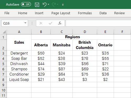
Step 1:
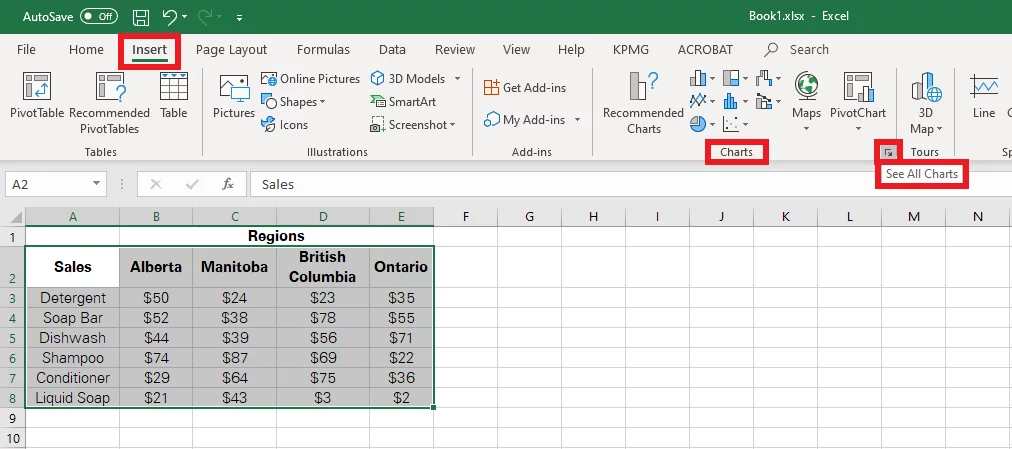
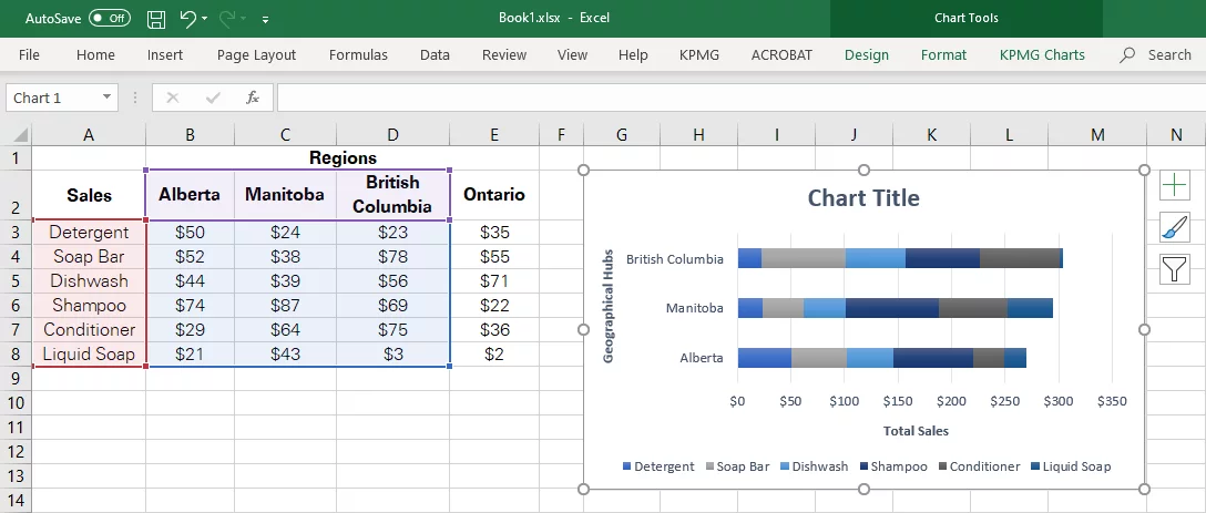
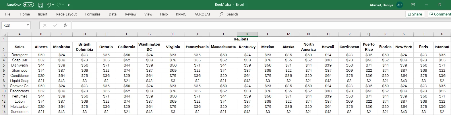
Below is a table that entails the sales of different products made in different regions.
Step 2:
Select the data that you want to be presented through the chart. For instance, from the given data, we need products, regions, and their respective sales to be exhibited through a chart.
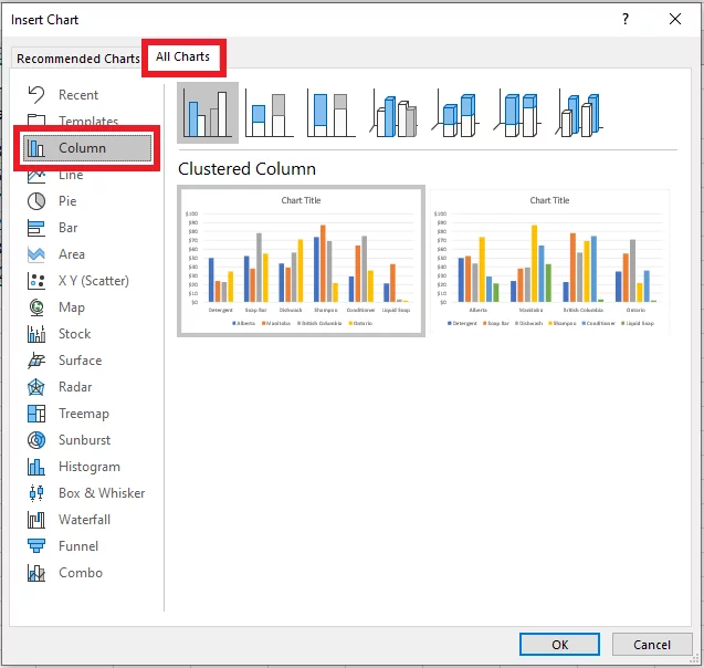
Next, you need to go to the Insert tab > Charts > See all Charts

Step 3:
Once you have toggled to the ‘Insert Chart’, go to ‘All Charts’. From the column (list of chart types) appearing on the left side, select the ‘Bar Chart’ Option.
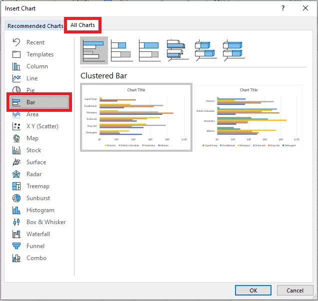
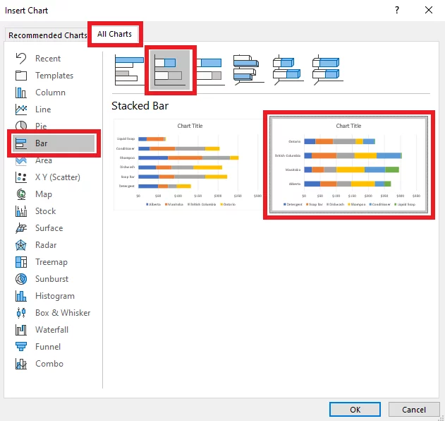
Step 4:
There are different options that you can choose from Bar Charts. To have a stacked bar chart inserted, choose the second option as follows.
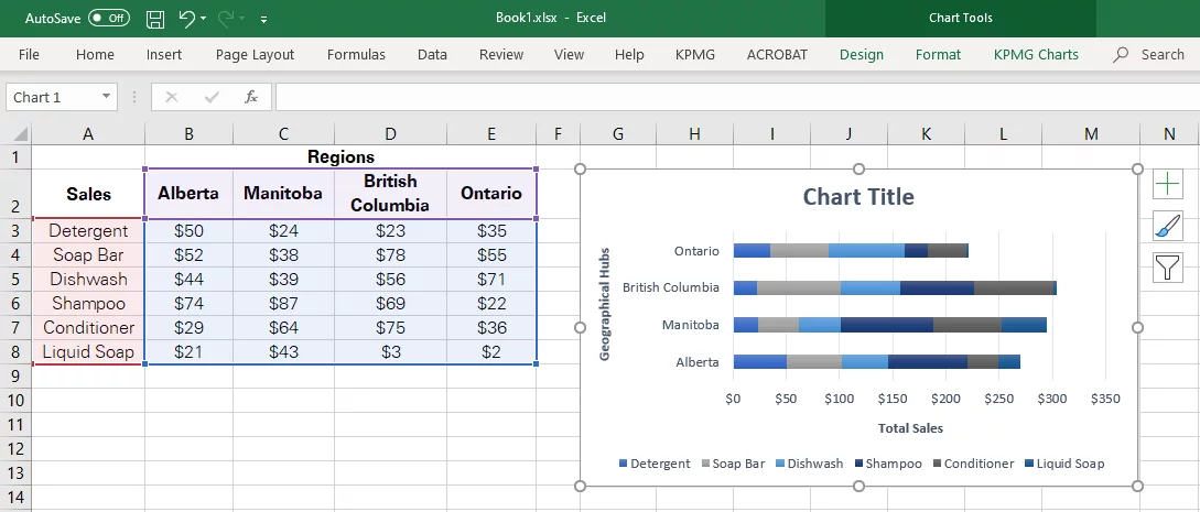
Excel would then present you with the option to align either of the data along the X or the Y-axis. In the given example, we have chosen to have the regions aligned along the Y-axis, whereas the sales are presented along the X-axis.
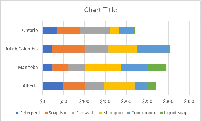
Excel inserts a stacked bar chart to the excel sheet as follows.
Step 5:
Once the chart is inserted into your excel sheet, excel allows users several options to edit it for different purposes.
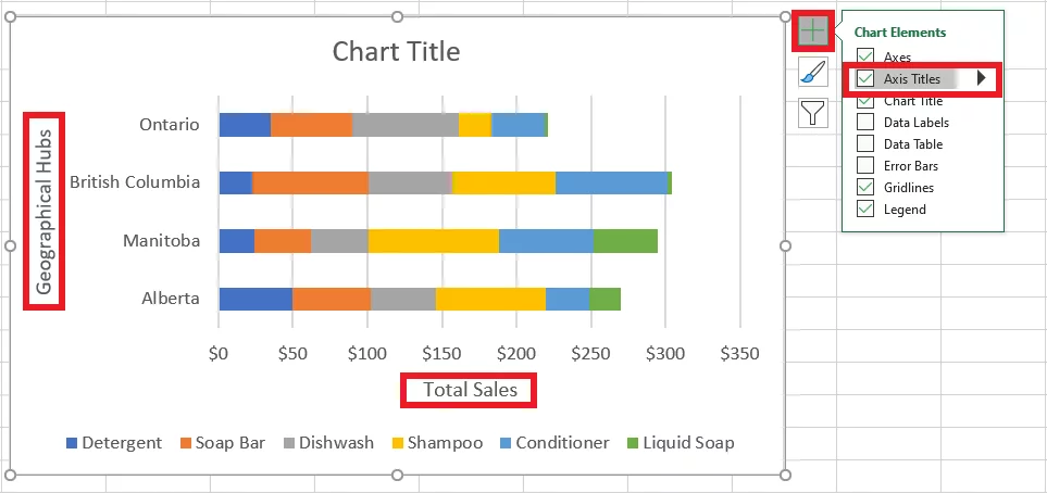
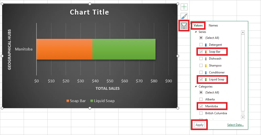
Clicking on the chart enables three icons on the right of the chart as evident in the screenshot below.
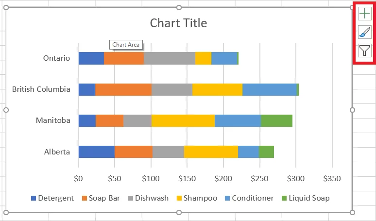
The ‘+’ icon appearing on the top right allows users to add or eliminate different features from the chart. For example, check the option for ‘axes titles’ to add the X and Y axis to the chart. You can then name the axis as required.
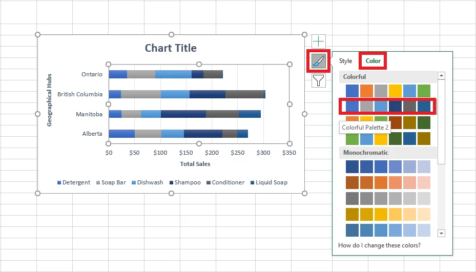
The paintbrush icon has a ‘Color’ option that allows users to choose different color palettes for highlighting the sub-categories within each bar.
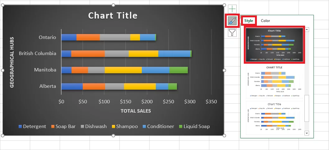
Whereas, using the ‘Style’ option, you can add different styles to the chart or change the layout of the chart, as evident through the screenshot below.
The third and the last icon that pictures a funnel allows users to filter out components of the chart that they want to be eliminated. In some cases, if you want the emphasis to be placed on a certain class or item, you may uncheck others.
For instance, in the screenshot below, only ‘Manitoba’ has been checked from the geographical locations, whereas, from the products, only ‘Soap Bar’ and ‘Liquid Soap’ are selected. As a result, excel has only presented the checked items, and the rest are eliminated.
Stacked Bar Chart Use Case
A stacked bar chart is one of the most commonly used charts as it facilitates an effective representation of data at a quick glance. Below is a practical example of how a stacked bar chart may prove to be of great help.
Charts are a great form of analysis. Whether you’re comparing values, spotting trends, or analyzing the distribution of data, stacked bar charts offer a simple yet powerful way to make sense of your data.
To explore more advanced techniques and approaches, check out our comprehensive guide on data analysis in Excel.
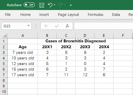
Analysis of the trend of disease diagnosis among different age groups
To determine if Bronchitis (a disease that causes severe coughing and breathing difficulties) has seen a rise among age groups between 7 to 17 during the last four years, you may set up a stacked bar chart to see which age group has suffered the most.
Here is the source data that depicts the cases of Bronchitis diagnosed among different age groups during the past four years.
Follow the steps enumerated above to have the given data presented in the form of a stacked bar chart.
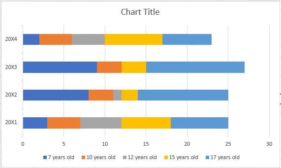
Clearly evident, 17- year old children (represented in blue color) have suffered the most from Bronchitis through 20X1 to 20X3. However, children aged 15 years (represented in yellow color) indicated the highest cases of Bronchitis during the year 20X4.
Create A Stacked Bar Chart
A stacked column chart is more like a stacked bar chart in excel.
Creating a stacked column chart in excel is very similar to creating a stacked bar chart.
Below are a few easy steps that must be followed in order to create a stacked column chart in Excel.
Step 1:
Select the data that you want to be presented through the chart. For instance, from the given data, we need the products, regions and their respective sales to be exhibited through a chart.
Next, you need to go to the Insert tab > Charts > See all Charts
Step 2:
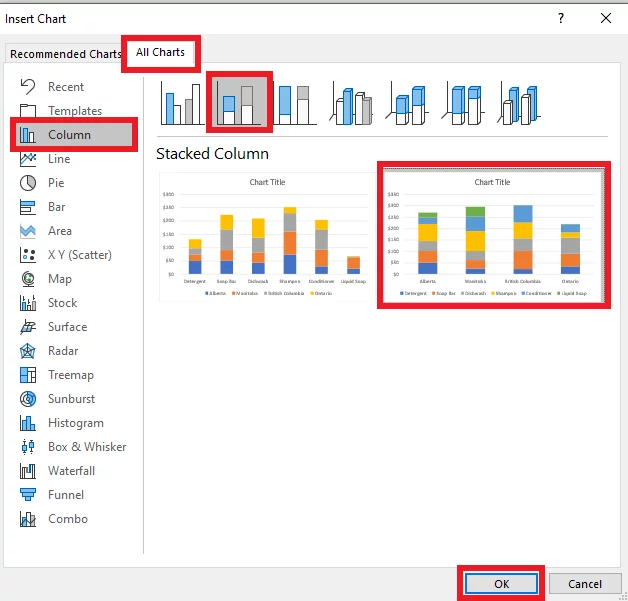
Once you have toggled to the ‘Insert Chart’, go to ‘All Charts’. From the column (list of chart types) appearing on the left side, simply select the ‘Column Chart’ Option.
Step 3:
Choose the option for a stacked column chart where different items appear to be stacked over another. You are also required to select a particular type of presentation i.e. data allocation along each axis.
In the given example, we have chosen to have the regions presented through the X-axis, whereas sales are presented through Y-axis.
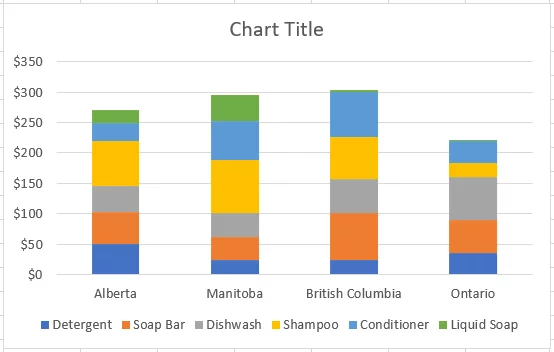
Excel inserts a stacked column chart to the excel sheet as follows.
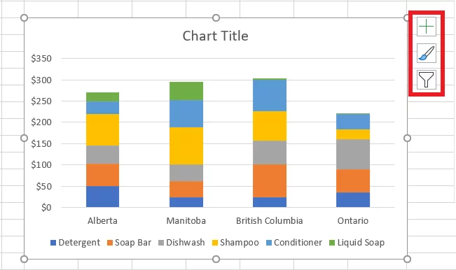
Step 4:
Just like a stacked bar chart, you can edit a stacked column chart in a number of ways by exploring the three icons appearing on the right side of the chart. This includes changing the color, style, presentation, and the number of items to be presented.
Pro Tip:
If you’ve already put together a stacked bar chart, but that doesn’t seem like a good fit, no need to go back and insert a new stacked column chart from very scratch.’
You can change a stacked bar chart to a stacked column chart by simply right-clicking on the chart > Change the Chart Type.
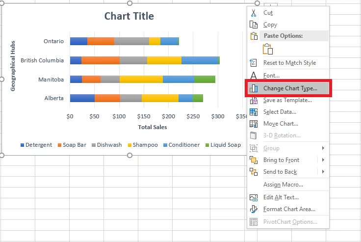
Doing so would take you back to the ‘Insert Chart’ window. You may now select ‘Column Chart’ from the options on the left side to change a stacked bar chart into a stacked column chart.
Stacked Column Chart Use Cases
In the practical world, there are several uses of stacked column charts.
These charts are widely used in the field of business, science, data analytics, and mathematics.
Mastering the creation of stacked column charts, along with other types of data visualization, can greatly enhance your ability to communicate insights clearly.
Below is a practical example of how a stacked bar chart may prove to be of great help.
Comparing the sales of different products over the years
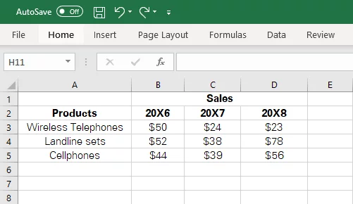
A company deals in three products say wireless telephones, landline sets, and cellphones. To compare which product has been more successful over the years, it may stipulate a quick stacked column chart as follows.
Here is the source data that depicts the sales within each of the products during the last three years.
Follow the steps enumerated above to have the given data presented in the form of a stacked column chart.
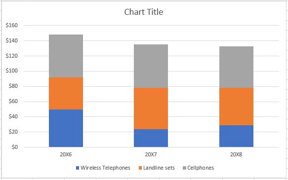
Cellphones (represented in grey color) have captured the majority market share, as is evident from the screenshot below.
If you have your data spread across multiple spreadsheets, you can still create a stacked chart!
Mastering how to link data in MS Excel is a great skill, especially in the modern workplace where you have data from all sorts of sources.
Troubleshooting for Stacked Bar / Column Charts
Making stacked bar/column charts shouldn’t cause you much problem as most of the job is performed by Excel.
However, following are some common reasons that may cause Excel users to confront problems while working with stacked charts.
1. Incomplete data selection
Presenting small sets of data using charts is simple enough. However, practically, this is not often the case. For instance, businesses may have thousands of rows and columns packed with data that are to be presented through charts.
In such circumstances, you must double-check the data selection you’ve made before inserting a chart. Leaving out any data can often go unnoticed and can mislead the information recipients.
Pro Tip: If you have ever left out some data, don’t fret about inserting a new chart altogether. Just click on the chart, and there’d appear a blue box around the data underlying the chart. Take a look below.
Simply enlarge the box and include the data previously left out as below.
You can do the same the other way around, leave out some data by shrinking the blue box. Adding borders will also help you to make the sections of your data clear, great for presenting your data.
2. Inappropriate chart selection
Stacked bar/column charts are multi-purpose charts that are widely used. However, this doesn’t ensure their suitability for all purposes.
The purpose of charts is to enhance the understandability of data for the information recipients and not to confuse them.
Choosing the wrong type of chart in line with the underlying data can often result in a chaotic representation of data rather than an effective one.
Stacked charts go well with moderately sized data sets, comparisons of fewer categories, and brief names.
Too large data sets can often result in a poor presentation of data making it challenging for the users to make sense out of it. Take a look below to see how the inappropriate selection of charts can make the visual unintuitive.
Below is the source data the represents a large group of categories.
Here is how it looks when turned into a stacked chart – barely understandable.
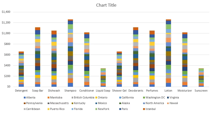
This doesn’t mean large data sets cannot be graphically plotted. However, the choice of charts plays a crucial role. For large distributed data sets, scatter plots and data tables work fine.
Conclusion
Needless to say, all business organizations these days use Excel to record, manage and store data. Spreadsheets, despite being good at storing data, often fail to offer users a quick and efficient analysis of the data movement trends.
That is where charts come in handy. Preparing charts in Excel is brisk and easy, and it brings so much more transparency to data. Using the above guide, try transforming difficult-looking data into charts in Excel and experience ease for yourself.

- Facebook: https://www.facebook.com/profile.php?id=100066814899655
- X (Twitter): https://twitter.com/AcuityTraining
- LinkedIn: https://www.linkedin.com/company/acuity-training/