
Create A Flowchart In Excel Easily!
Contents
Flowcharts are very effective forms of visual communication.
We are going to cover two different ways of creating flowcharts in Excel.
What Is A Flowchart?
A flowchart is a diagram that depicts the steps in a process, or workflow in a visual manner.
Many people are familiar with using charts and graphs as visualization tools. A flowchart can also be a powerful visualization tool and Excel provides two main ways of creating a flowchart.
The first method that we are going to use to create a flowchart, involves using Shapes and is available in older and newer versions of Microsoft Excel. The second method, which involves using the Visio Data Visualizer Add-in is only available in Office 365.
Learn more about how to create charts in Excel here.
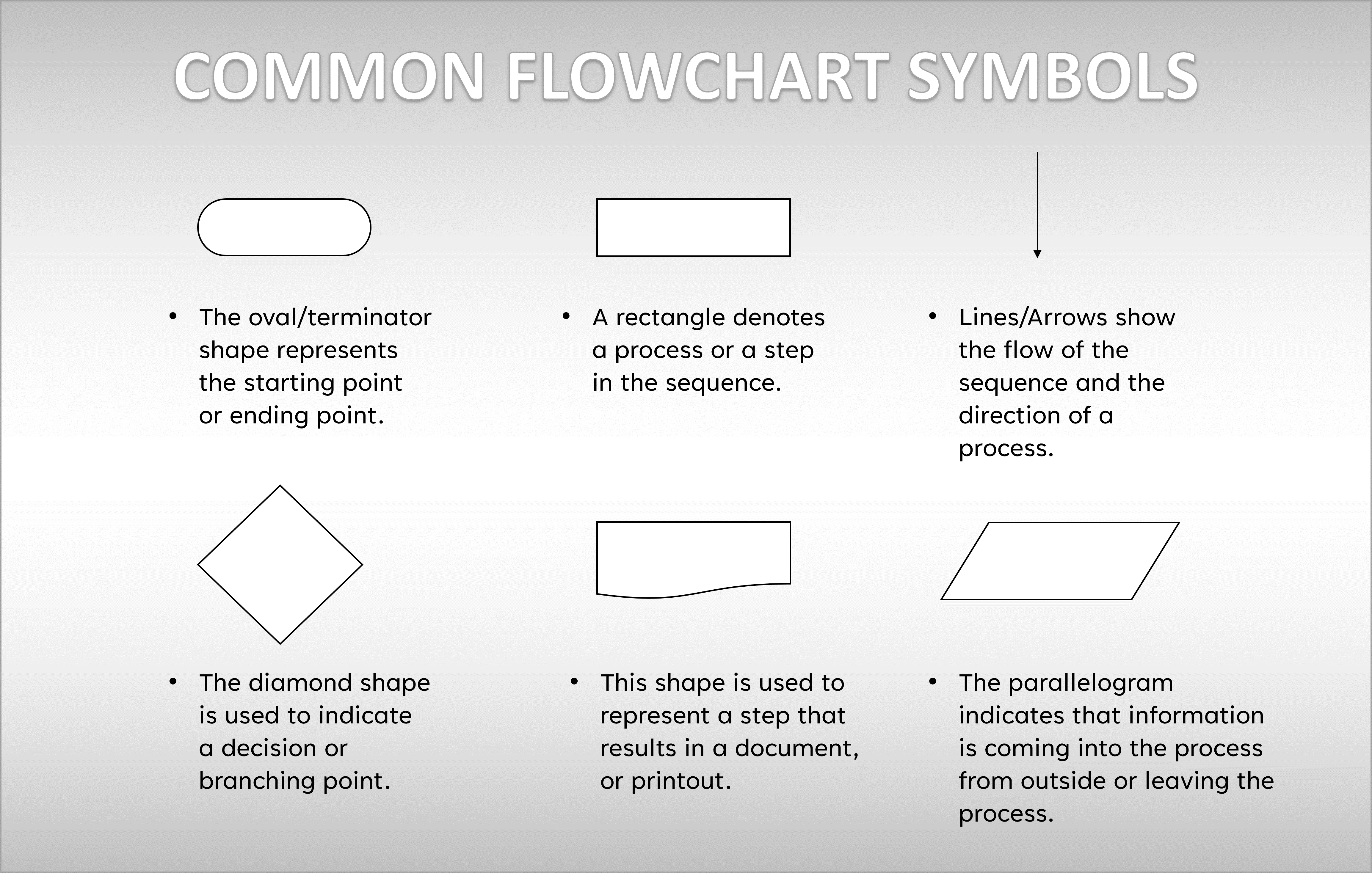
Fundamentals – Flowchart Shapes
Flowchart shapes are the basic elements, that you need to be familiar with, in order to create a flowchart in Excel.
We will review some of the common shapes that are often utilized in flowcharts and see what they mean/denote.
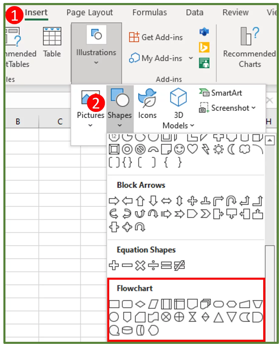
You can see all of these standard flowchart symbols, if you go to the Insert Tab (Step 1 in the image), select Illustrations and choose Shapes (Step 2 in the image). Scroll down to the Flowchart section as shown below.
How to Make a Flowchart?
Firstly, we need to look at a workflow that we’d like to use a flowchart to summarise or describe.
A hypothetical company that sells custom made candle lanterns online, has hired some new junior customer service representatives.
During the onboarding program, the manager has to explain to the new employees, what to do when they receive a request for a refund from a customer.
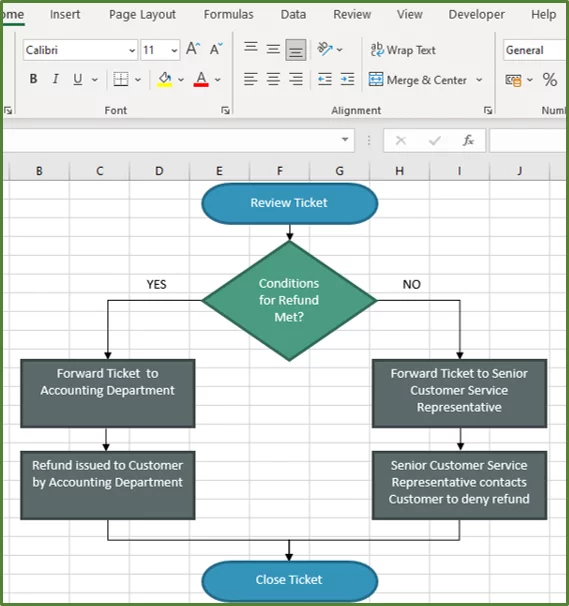
Firstly, the junior customer service representative must review the ticket that contains the details of the refund request.
- If the conditions for a refund are met, then the customer will get a refund. The refund must be requested within 15 days of purchasing the product, and the reason for return has to have merit.
- The junior customer service representative must then forward the ticket to the accounting department.
- The accounting department will issue the refund and the customer will receive the refund.
- The junior customer service representative must then close the ticket.
- However, if the conditions for a refund are not met, then the customer will not get a refund.
- The junior customer service representative must then forward the ticket to a senior customer service representative.
- The senior customer service representative will contact the customer and explain why the company cannot issue a refund.
- The junior customer service representative must then close the ticket.
The manager can create a flowchart in order to effectively explain this workflow.
If you are looking for a different type of visual representation in Excel, read our guide on Forecasts In Excel.
Step 1:
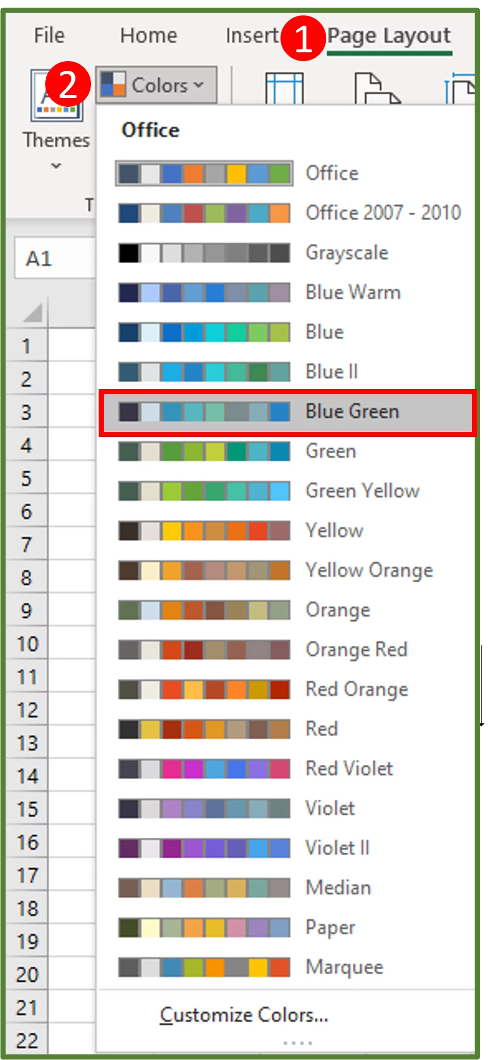
Create a new sheet. Next, we will change the default colour palette. By doing this, we will get an alternate set of co-ordinated colours that we can use to format the shapes for our flowchart and other elements in the spreadsheet.
You can also use this template we have with all the shapes pre-made.
To do this, go to the Page Layout Tab (Step 1 in the image) and in the Themes Group, select Colors (Step 2 in the image). Choose the Blue Green palette.
Step 2:
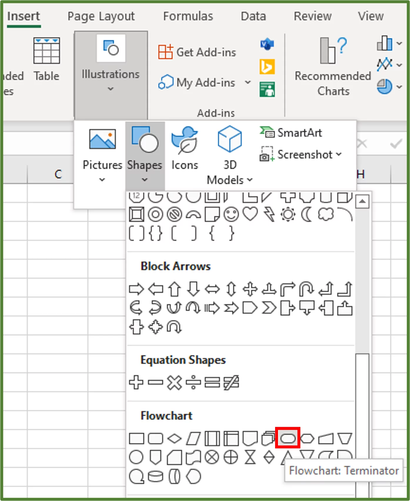
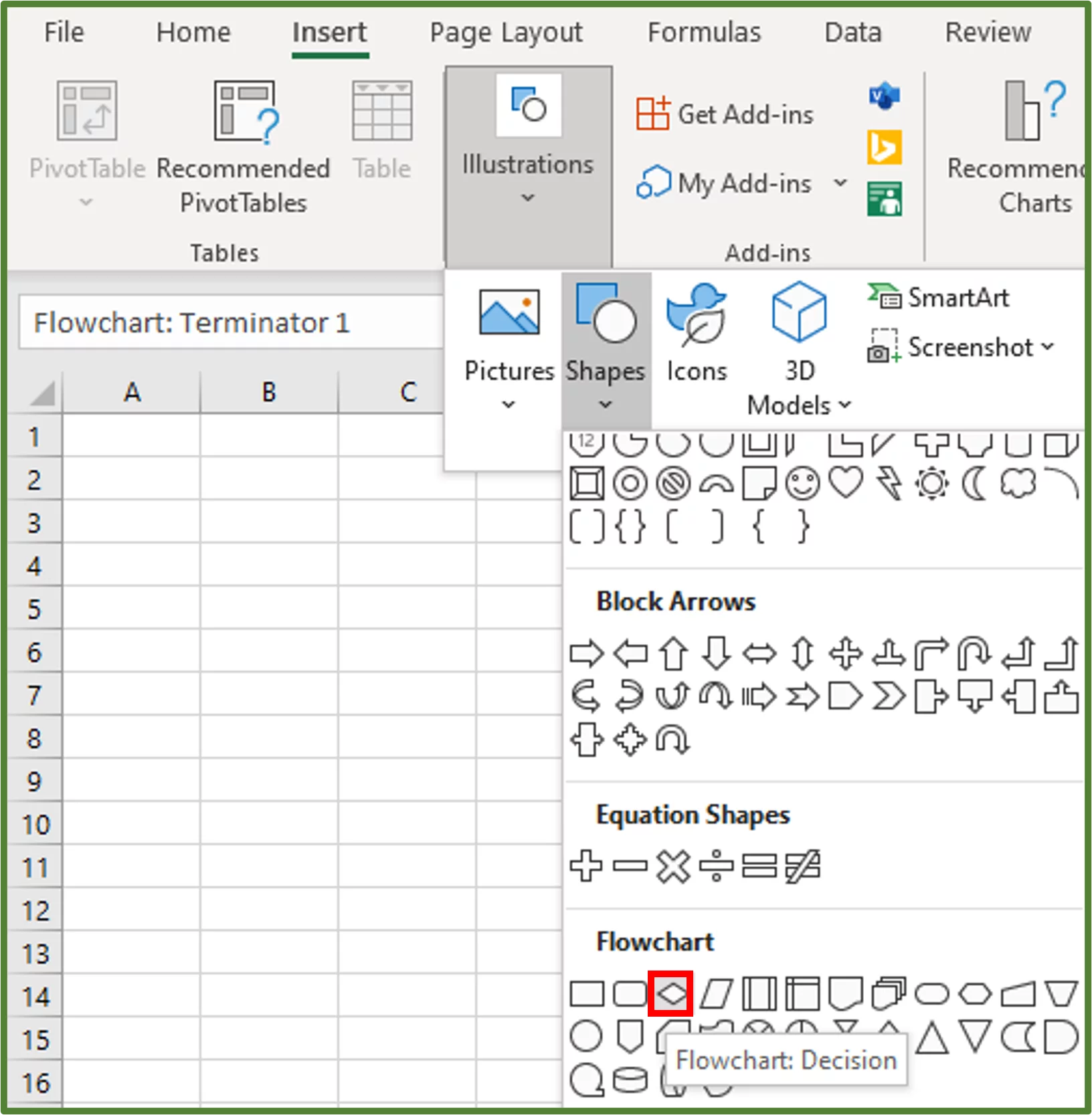
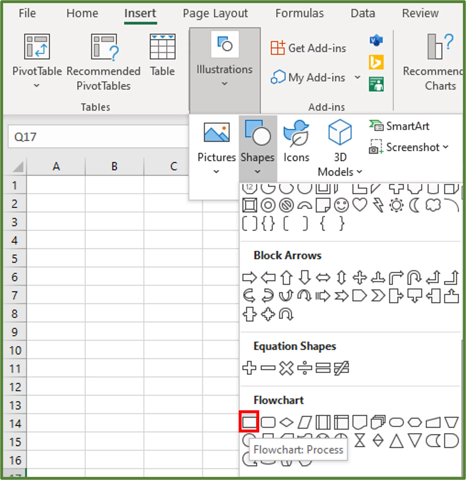
Add the first shape which is the terminator. Go to the Insert Tab, select Illustrations and choose Shapes. Scroll down to the Flowchart section.
Choose Terminator.
Step 3:
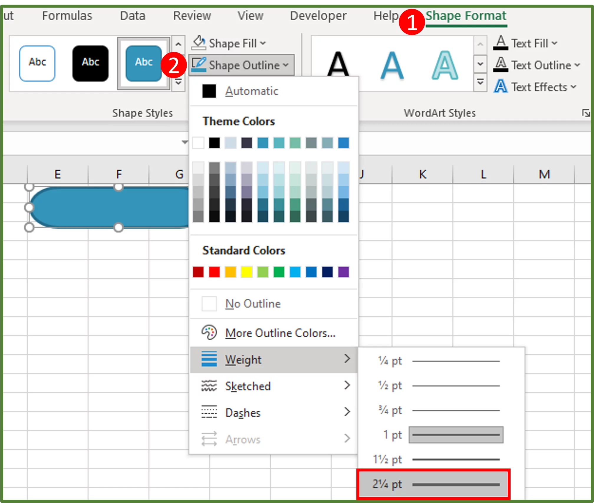
Draw the shape on the spreadsheet. With the shape selected, go to the Shape Format Tab (Step 1 in the image), and in the Shapes Styles Group, select Shape Outline (Step 2 in the image). Change the weight of the outline to 2 1/4 pt.
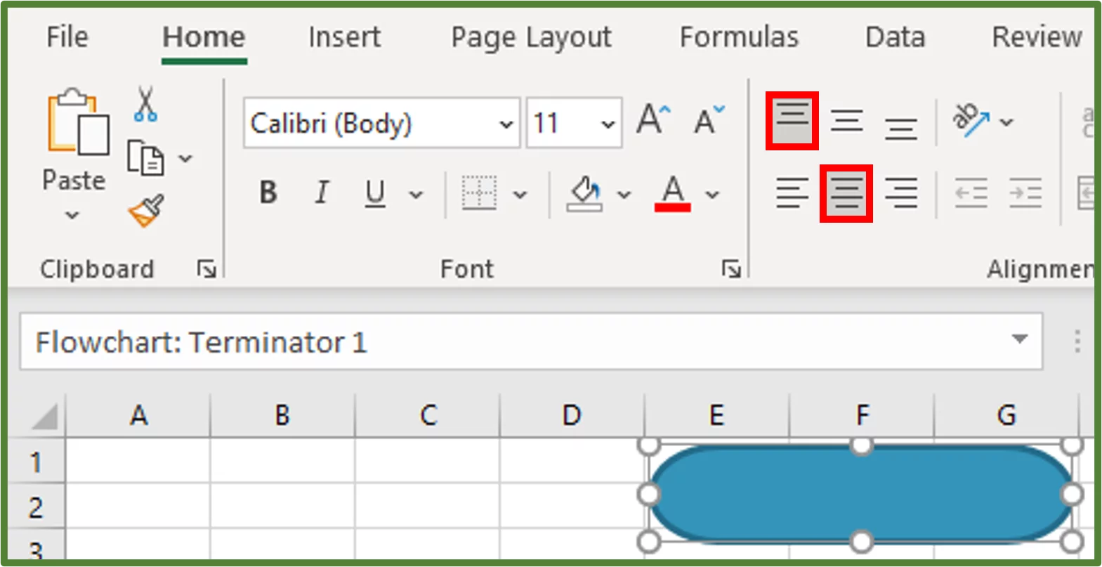
We now want to ensure that the text that we will type in the shape, is aligned correctly.
Now with the shape still selected, go to the Home Tab, and in the Alignment Group, select Top Align and Center.
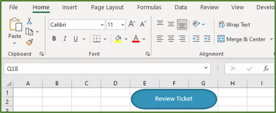
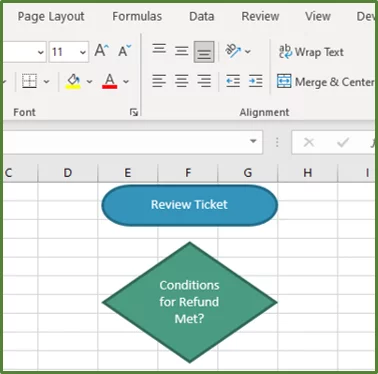
Select the shape and type the text Review Ticket.
Step 4:
We are now going to add the rest of the shapes needed for the flowchart, on the spreadsheet.
Go to the Insert Tab, select Illustrations and choose Shapes. Scroll down to the Flowchart section.
Choose Flowchart:Decision.
Draw the shape on the spreadsheet and with the shape selected, go to the Shape Format Tab (Step 1 in the image) and in the Shape Styles Group, select Shape Fill (Step 2 in the image).
Choose Teal, Accent 3, Darker 25% as the fill colour.
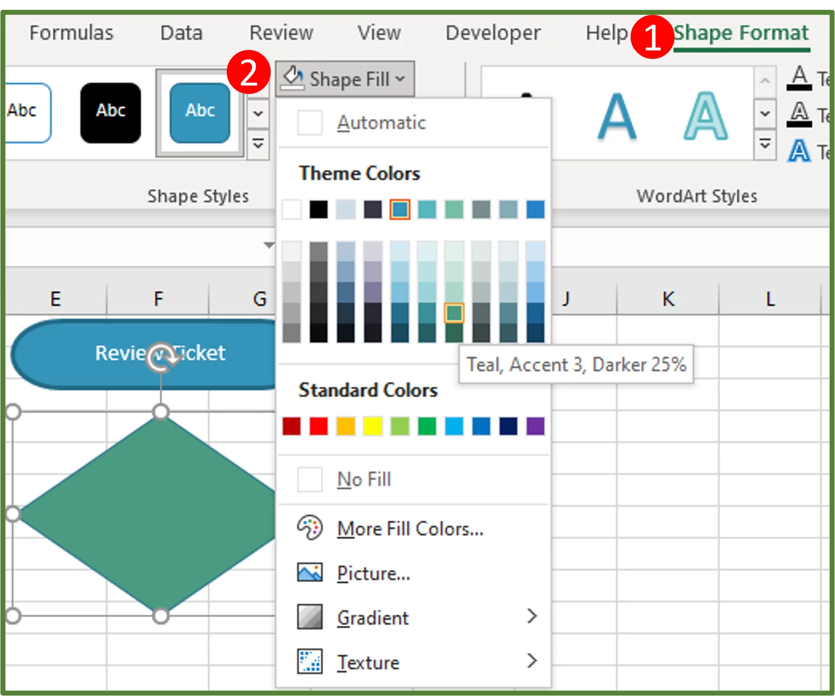
Change the outline colour to Teal, Accent 3, Darker 50% and change the weight of the outline to 2 1/4 pt. Select the shape and go to the Home Tab, and in the Alignment Group, select Top Align and Center.
Select the shape and type the text Conditions for Refund Met?
Go to the Insert Tab, select Illustrations and choose Shapes. Scroll down to the Flowchart section.
Choose Flowchart:Process.
Draw the shape on the spreadsheet and with the shape selected, go to the Shape Format Tab (Step 1 in the image) and in the Shape Styles Group, select Shape Fill (Step 2 in the image).
Choose Teal, Accent 4, Darker 25% as the fill colour.
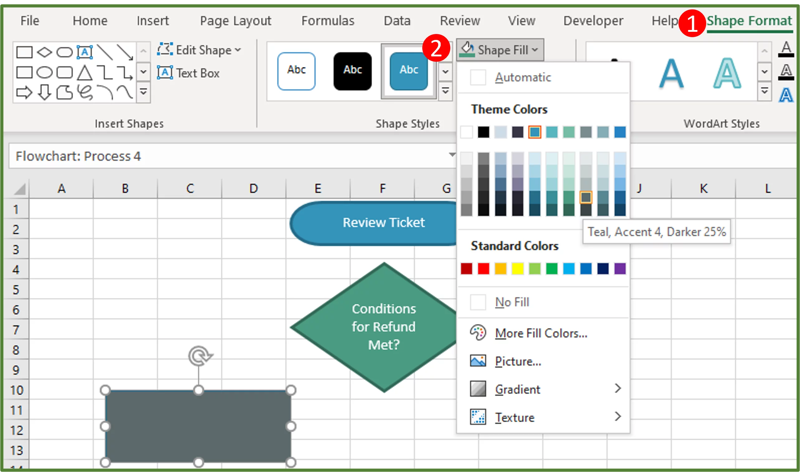
Change the outline colour to Teal, Accent 4, Darker 50% and change the weight of the outline to 2 1/4 pt. Select the shape and go to the Home Tab, and in the Alignment Group, select Top Align and Center.
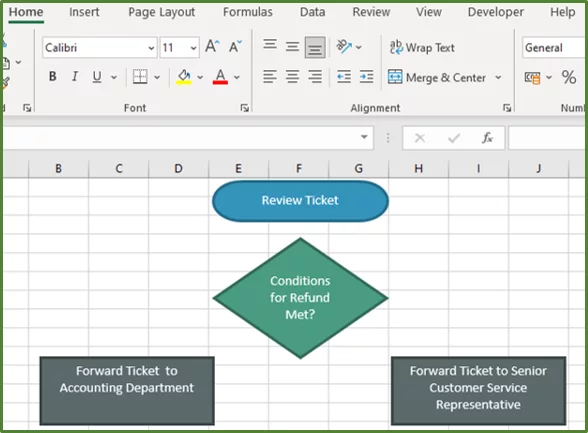
Select the shape and press Ctrl-D to duplicate the shape and move the duplicated shape to the position shown.
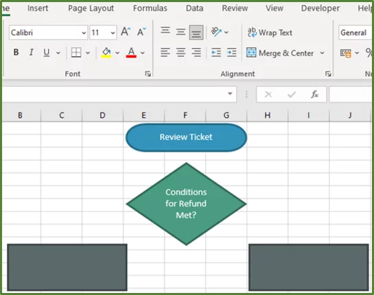
Add the text Forward Ticket to Accounting Department to the process shape on the left. Then add the text Forward Ticket to Senior Customer Service Representative to the process shape on the right.
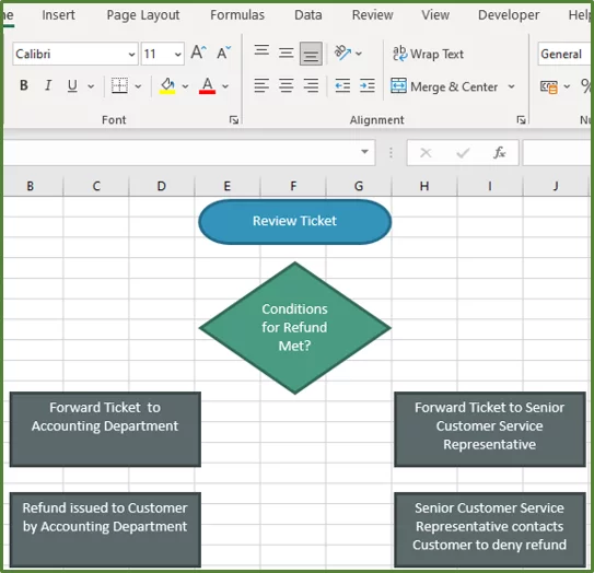
Now select either one of the process shapes and duplicate it twice.
Change the text of the first duplicate to Refund issued to Customer by Accounting Department.
Change the text of the second duplicate to Senior Customer Service Representative contacts Customer to deny refund.
Now select the Terminator shape and press Ctrl-D to duplicate it. Change the text to Close Ticket and move it to the bottom as shown.
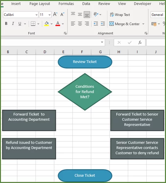
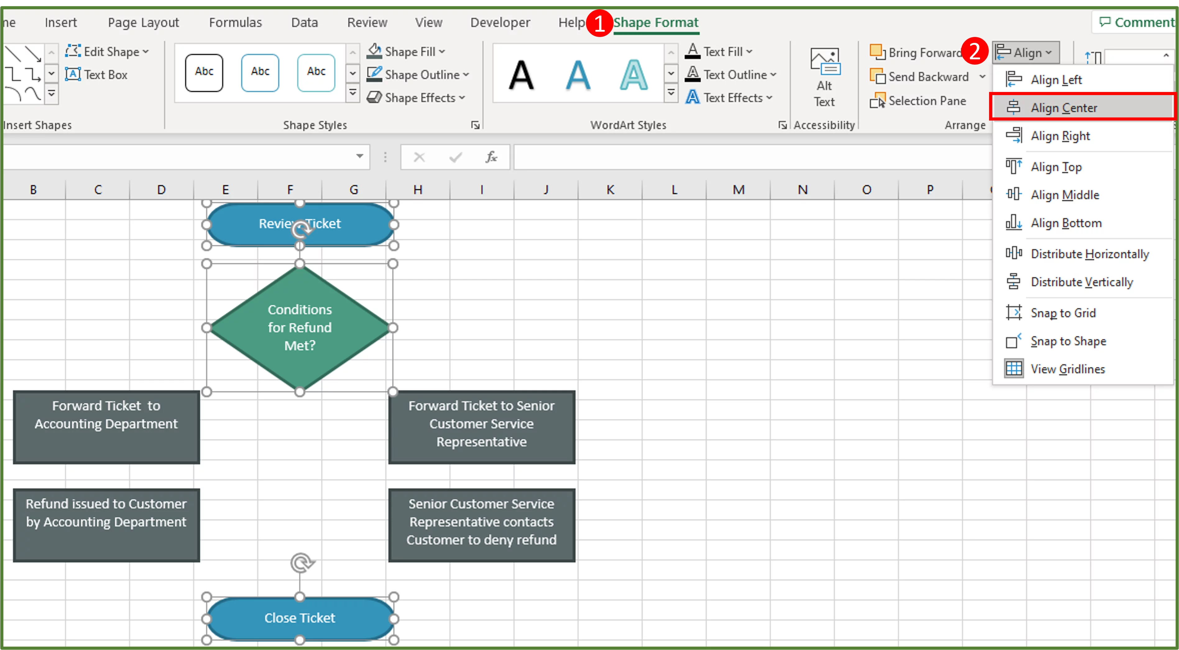
You can align the two oval shapes and the diamond shape along a central axis. You need to select all three at the same time.
To do this select, one of the shapes, then holding the CTRL key select the next shape by clicking on it. While still holding the CTRL key, select the third shape by clicking on it.
With these three shapes selected go to the Shape Format Tab (Step 1 in the image) and in the Arrange Group, choose Align (Step 2 in the image).
Select Align Center.
Tip: You can align any of the other shapes we have created thus far. To do this, select the shapes you would like to align and use the Align tool in the same way shown above. You can align the tops of all the selected shapes or align the left sides or right sides.
Step 5:
We are now going to add the Connector lines to connect the shapes in the flowchart.
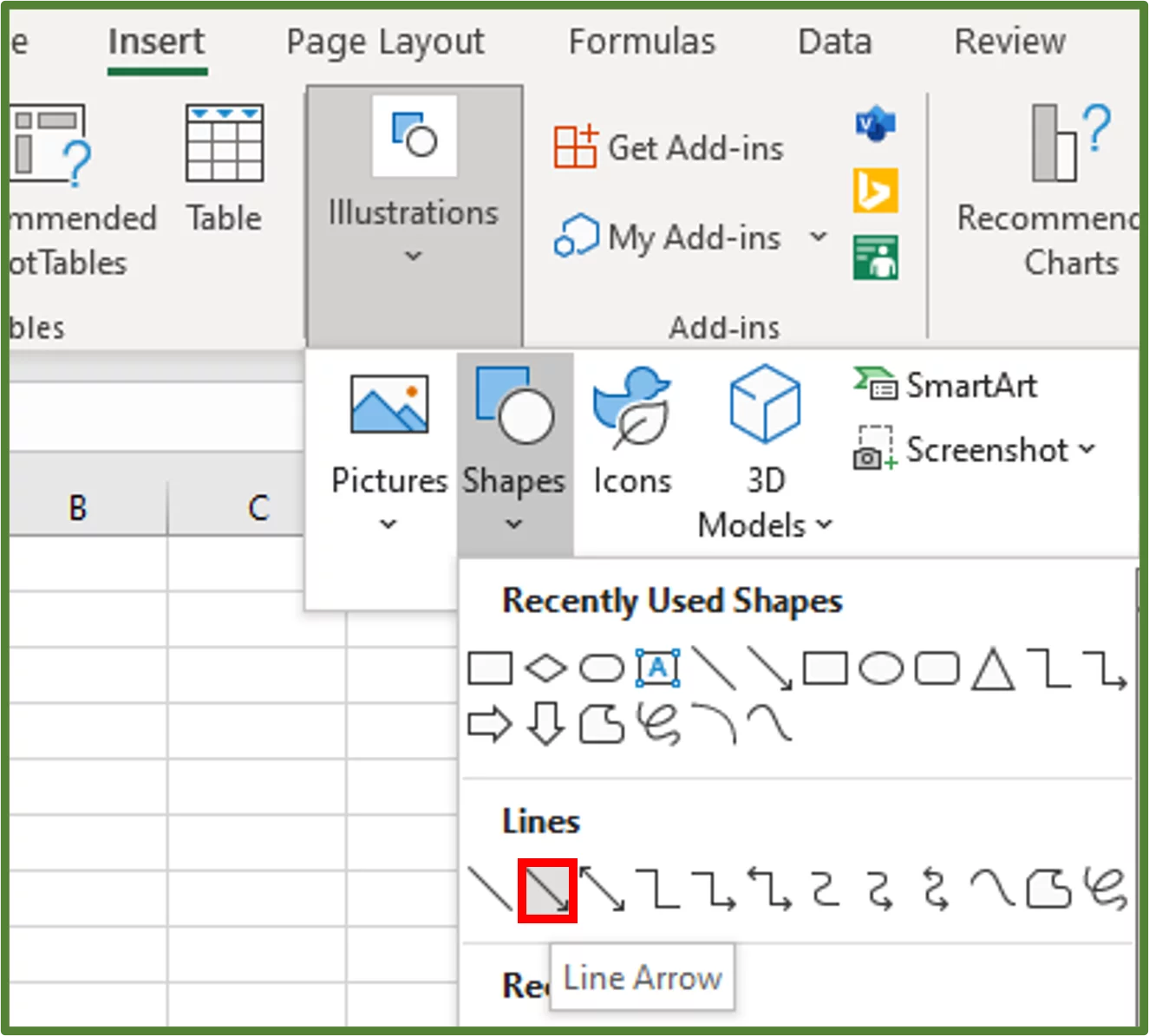
Go to the Insert Tab, select Illustrations and choose Shapes. In the Lines Section, choose Line Arrow.
Connect the Start Terminator and the Diamond shape using the Line Arrow.
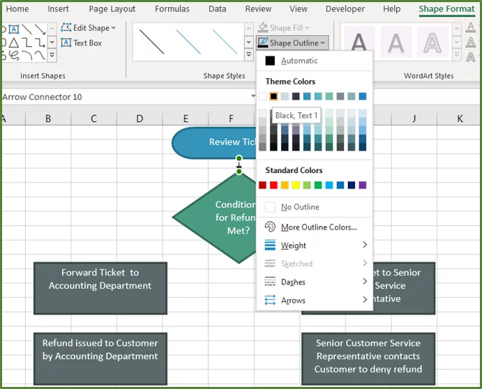
Now, select the arrow and go to the Shape Format Tab and in the Shape Styles Group select Shape Outline. Change the Shape Outline color to Black, Text 1.
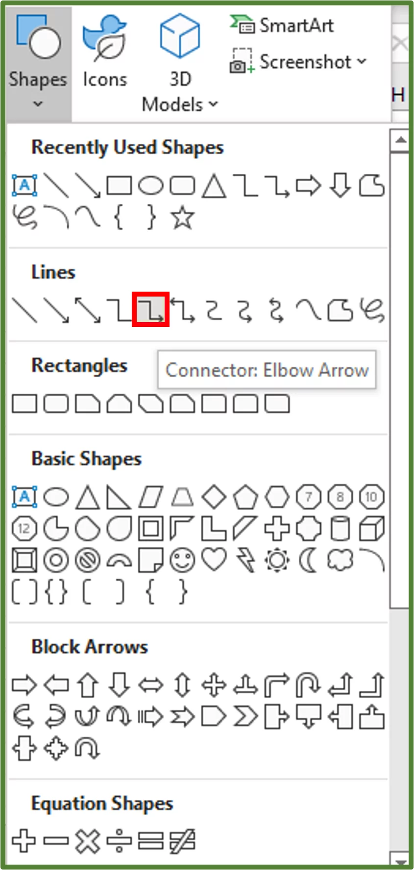
Connect the first and second process shapes to the diamond shape using the Elbow Arrow.
Connect the Forward Ticket to Accounting Department process and Refund issued to Customer by Accounting Department process using the Line Arrow. Then connect the Refund issued to Customer by Accounting Department to the Close Ticket shape using the Elbow Arrow.
Connect the Forward Ticket to Senior Customer Service Representative process and Senior Customer Service Representative contacts Customer to deny refund process using the Line Arrow. Then connect the Senior Customer Service Representative contacts Customer to deny refund shape to the Close Ticket shape using the Elbow Arrow.
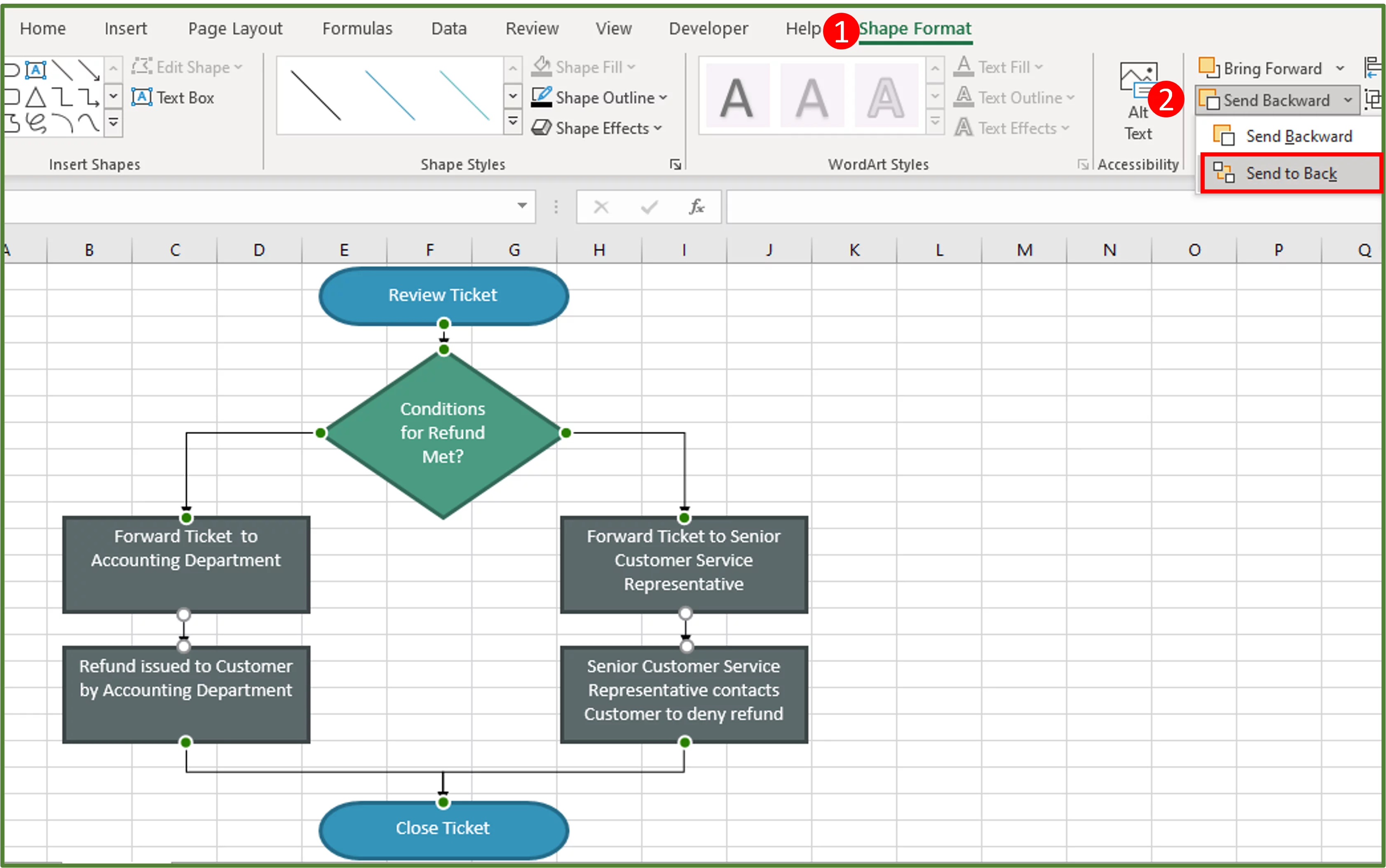
We now want to place all the lines behind the other shapes. This just ensures that our lines don’t overlap the top of the other shapes.
Select all the lines, and go to Shape Format (Step 1 in the image), and in the Arrange Group, select Send Backward (Step 2 in the image). Choose Send to Back.
Step 6:
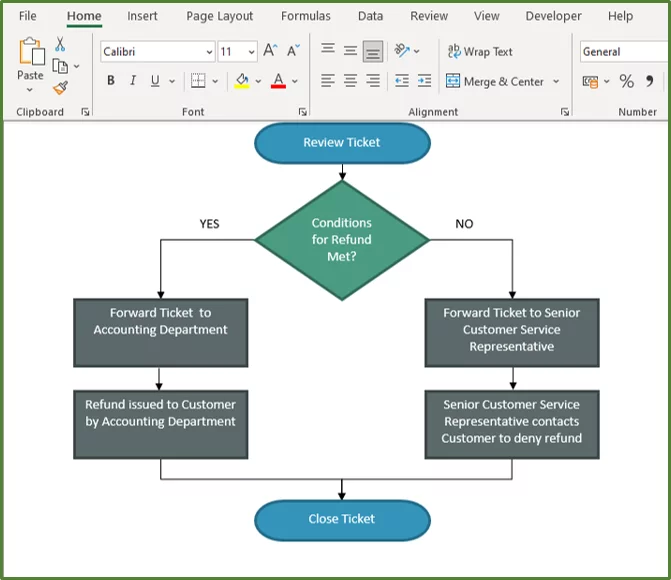
Now add the textboxes for Yes and No as shown below.
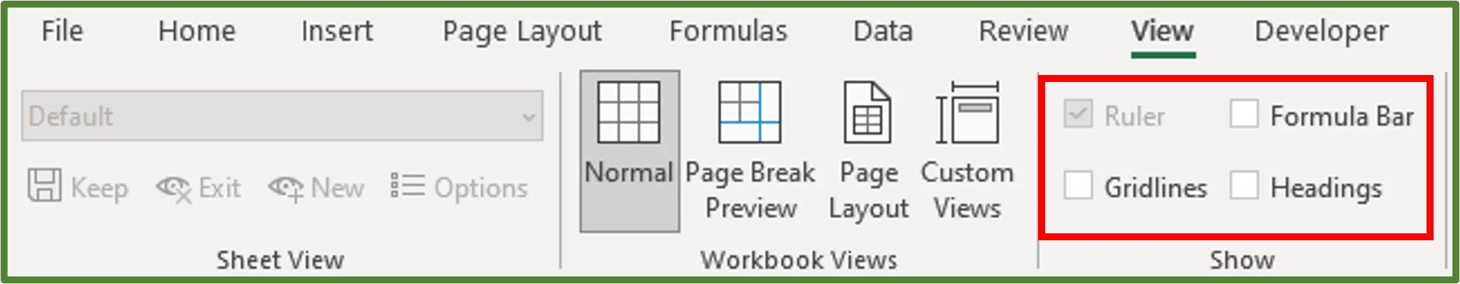
For the last step, go to the View Tab, and in the Show Group, uncheck Gridlines, Formula Bar and Headings.
You should see the following.
Looking for more Excel Guides? Read our post here on Advanced Filters in Excel.
Create a Flowchart using the Visio Data Visualizer Add-in
The Visio Data Visualizer Add-In for Microsoft Excel allows you to create professional flowcharts easily and quickly.
It generates a table with sample data that you can edit for your specific needs.
Add-Ins can be hit or miss.
Learning how to incorporate the good ones into your workflow will make creating visualisations that stand out that much faster, learn how to create them on our Excel training courses in London and online!
The Add-in automatically creates the shapes, and connections needed for your flowchart, from the Excel table.
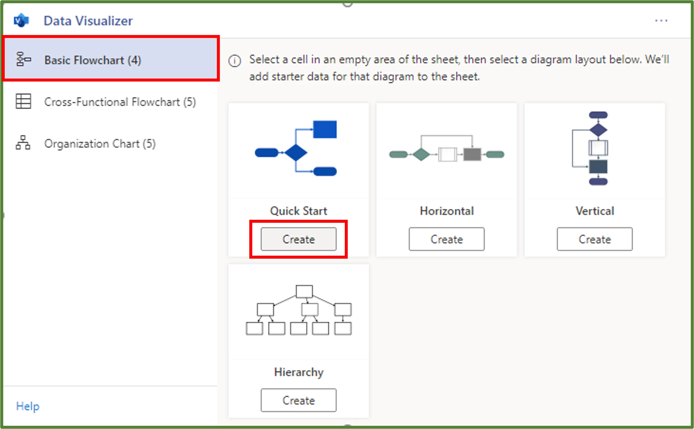
Step 1:
So to get started select one cell in a blank workbook.
Go to the Insert Tab (Step 1 in the image) and in the Add-ins Group, select the Get Add-Ins option (Step 2 in the image).
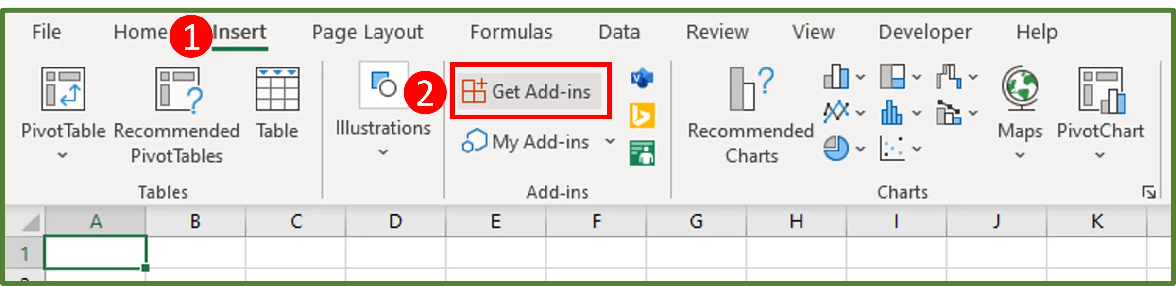
You should see the Office Add-Ins Window. Ensure you are in the Store Tab and search for Microsoft Visio Data Visualizer.
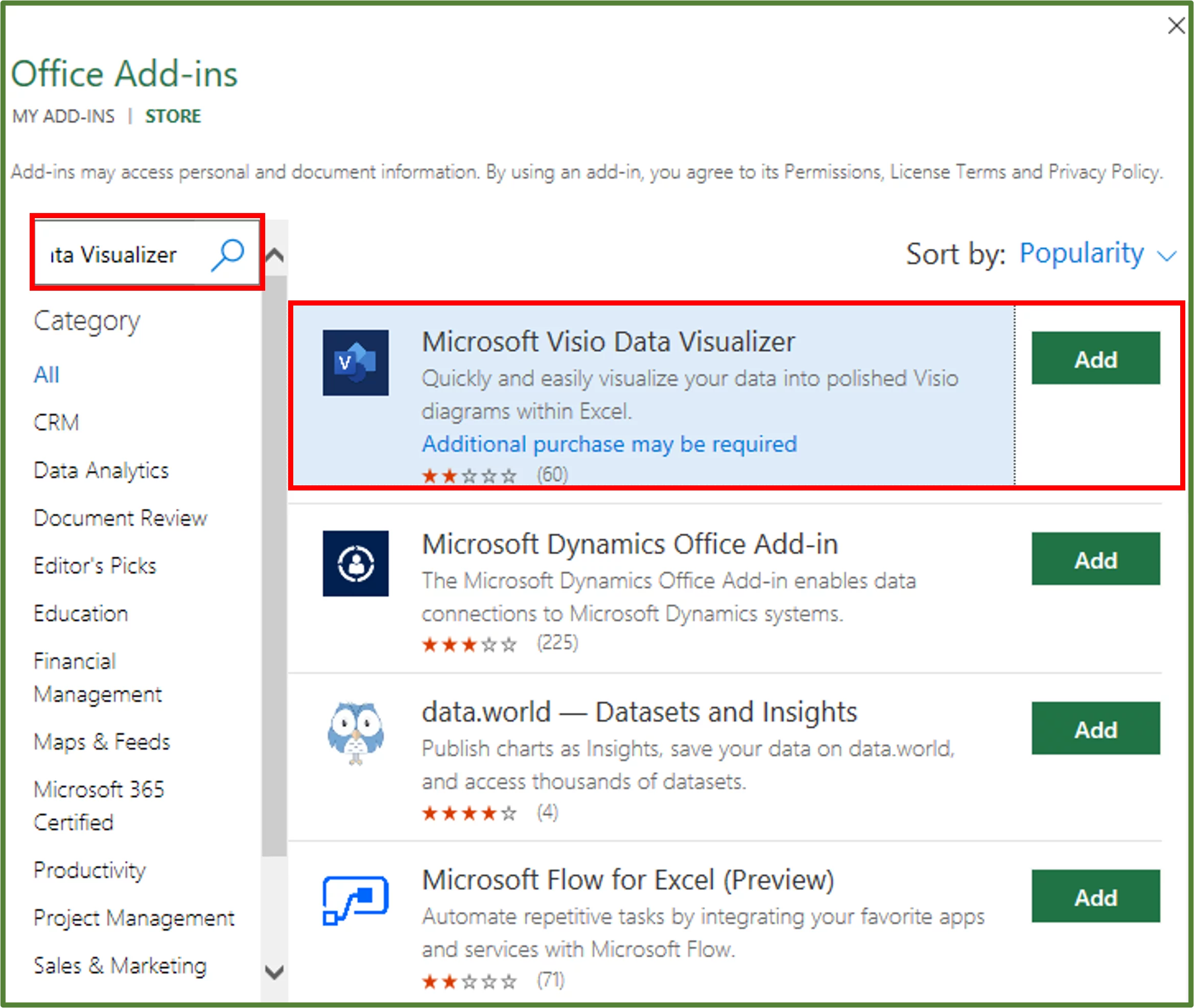
Click Add. Click to Continue.
You can Continue without Signing in as shown.
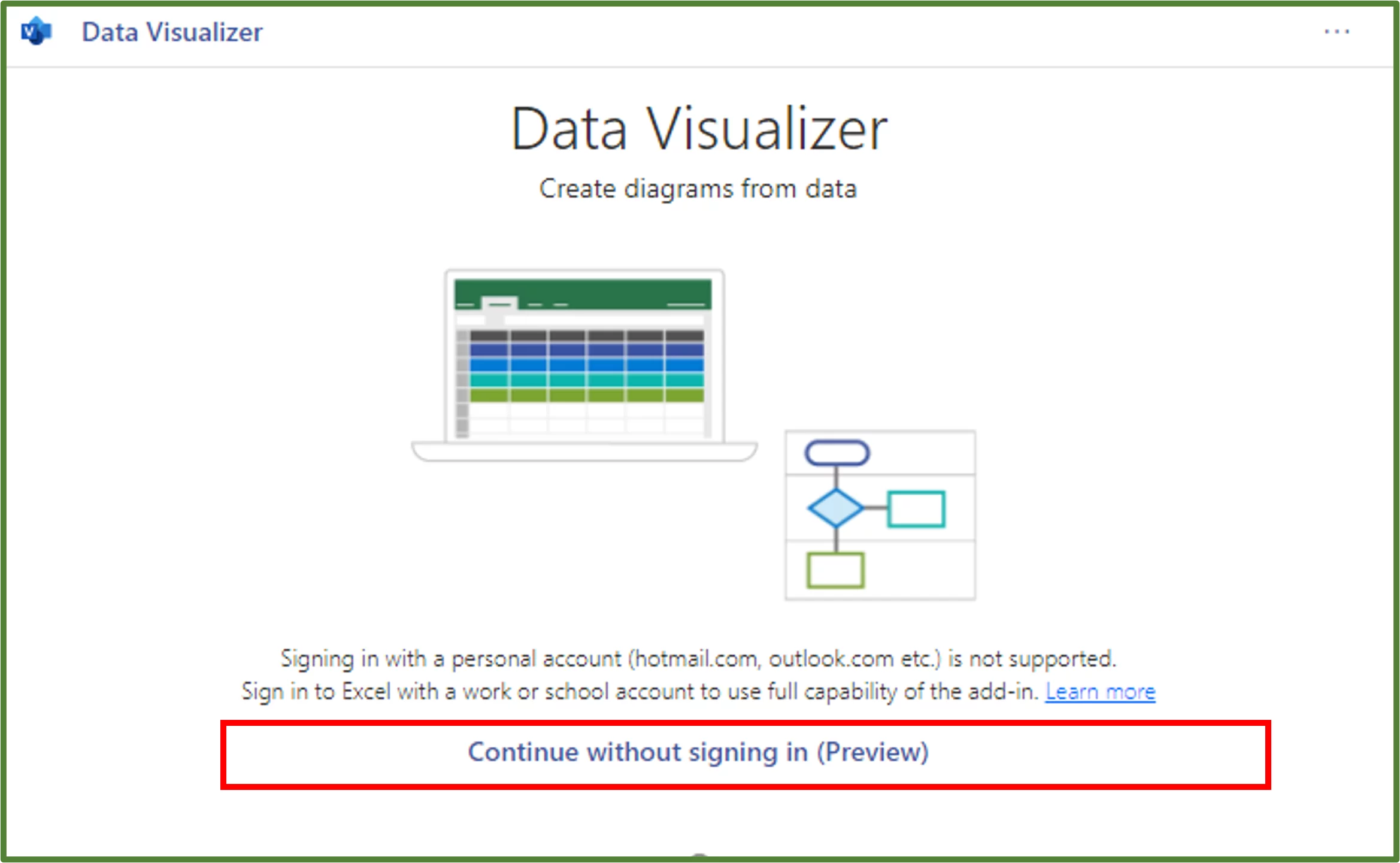
The Add-In will now be inserted into your worksheet.
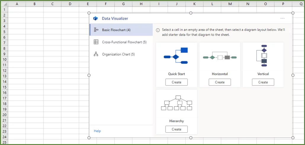
Step 2:
With the Basic Flowchart option section selected, under Quick Start press the Create button.
Now you should see an Excel Table with some sample data that has been automatically generated, and the corresponding flowchart.
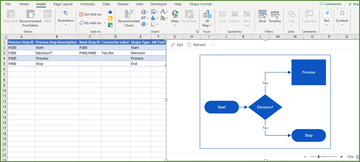
For the sample Table generated:
-
- The first column in the Table is the Process Step ID, which contains the unique identifier for the shape at hand. So for the Start shape the Process Step ID is P100.
- The Process Step IDs and the shapes are listed in the table in a sequential manner, which means the Start shape is first and then followed by the shape that is in the next row. This is the P200 shape, which is the decision shape in this case.
- Since the decision shape has two options, either Yes or No, the next Step ID column contains two shape IDs. P300 is the process that happens if the answer is Yes. P400, which is the stop or end point is what happens when the answer is No.
Step 3:
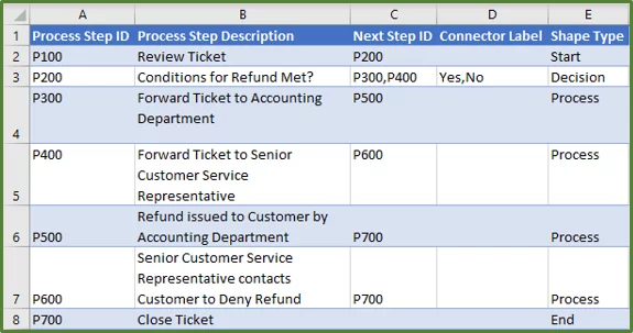
To customise the flowchart to our needs we need to edit the data in the table. We can change descriptions, add rows and change shape types where necessary.
We are going to use the same example about the junior customer service representative and the refund ticket, to populate our table. So populate the table as shown below.
-
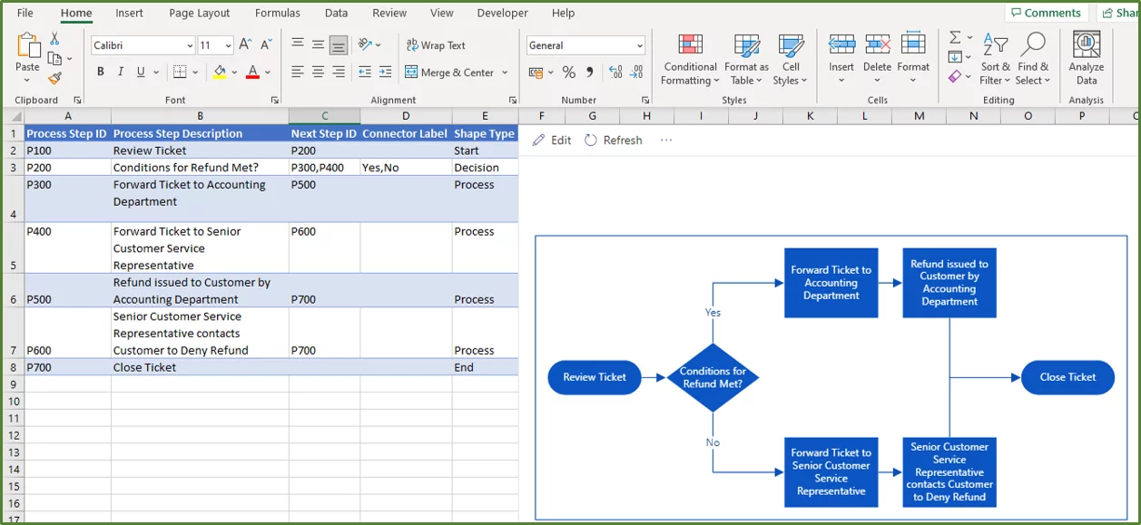
- You can see that we changed the Process Step Description for P100, to match our needs which in this case is Review Ticket. So our workflow starts in other words with reviewing the ticket.
- We changed the Process Step Description for P200 to match our needs. This is a decision shape, so therefore there are two shape IDs, given in the Next Step ID column for this shape.
- Next, we changed the Process Step Description for P300 to match our needs.
- Then we changed the Process Step Description for P400 to match our needs and the Shape Type to Process.
- We added two new rows for Shape P500 and P600.
- For Shape P500 we input a Process Step Description, which in this case is Refund issued to Customer by Accounting Department. We set Shape Type to Process.
- Then for Shape P600, we input a Process Step Description, which in this case is Senior Customer Service Representative contacts Customer to Deny Refund. We set shape type to Process.
- We added another row for Shape P700, and input Close Ticket as the Process Step Description, and set the Shape type to End.
- Next, we then went to the Next Step ID column and input the correct next steps using the appropriate ID. So for example, shape P300 is followed by P500, which is the next process in the workflow. So one indicates this by putting P500 in the Next Step ID column for Shape P300.
If you want to move this data into a Word Document from Excel, read here!
Step 4:
Now simply click Refresh on the flowchart to see the corresponding flowchart based on the edited table data.
Flowchart Use Cases
Flowcharts are utilized in many industries and fields.
- A flowchart can be used to summarise the hiring process of a company.
- Flowcharts are often used in programming to solve problems and identify bugs
Conclusion
A flowchart is an extremely useful tool that you will frequently encounter and perhaps need to create. Microsoft Excel provides two ways of creating flowcharts which are useful for both beginner and professional Excel users to know about.
You can use flowcharts in order to enhance your spreadsheets and dashboards.
To learn more about other advanced features such as how to create a Data Model in Excel, please read this post.
Special thank you to Taryn Nefdt for collaborating on this article!

- Facebook: https://www.facebook.com/profile.php?id=100066814899655
- X (Twitter): https://twitter.com/AcuityTraining
- LinkedIn: https://www.linkedin.com/company/acuity-training/