Power BI Bubble Chart
Power BI is a powerful and versatile data visualisation tool, developed by Microsoft, that has revolutionised the way organisations make data-driven decisions. This intuitive and user-friendly platform enables users to connect to various data sources, transform raw data into insightful visuals, and share interactive reports and dashboards with stakeholders.
Whether you’re a business analyst, data scientist, or executive, Power BI empowers you to uncover hidden insights and track key performance metrics, and drives informed decision-making through compelling, interactive data visualisations. In this article we will cover the use of bubble charts and their significance within the Power BI tool.
Bubble charts and other types of data visualisations are taught in our Power BI courses. So if you would like to go deeper regarding this topic with the help of a trainer, access detailed information on our website.
What Is A Bubble Chart?
A bubble chart is a type of data visualisation in Power BI that displays data points as bubbles on a two-dimensional grid, with the position of each bubble determined by its X and Y coordinates and its size represented by a third numeric value. This chart is particularly useful when you want to visualise and compare three variables simultaneously.
- X-axis and Y-axis: The X and Y axes represent two different data variables, and each bubble’s position on the chart corresponds to the values of these variables. You can choose which data attributes to place on each axis.
- Bubble Size: The size of each bubble is determined by a third numerical variable. The larger the value, the bigger the bubble.
- Colour: You can also use colour to represent a fourth variable. Each bubble can be coloured differently to provide additional information or categorisation.
Important to note the difference between a scatter chart and that of the bubble – the bubble enables the third numerical value of data plot size, scatter does not.
Bubble charts are a powerful tool in Power BI for exploring and visualising relationships between multiple variables in your data, making it easier to identify trends, patterns, and correlations within your datasets.
How To Create, Format, And Interpret A Bubble Chart
To use Power BI and all its visualisation tools you first need a dataset. Power BI can connect to an array of different sources. For this example, you will use a prepared dataset that has been connected to Power BI. To understand how to do this, visit one of the earlier articles in this series, like this one about the Report Builder.
For this example, we will use a supermarket database. The goal is to analyse the performance of product sub-categories using Sales, Quantity, and Profit values.
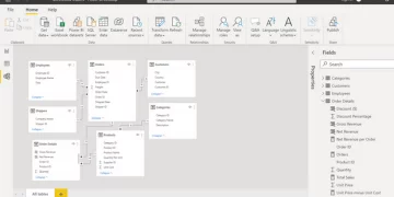
Step 1 –Power Query Editor
The editor will enable you to clean and format the data ahead of using visualisations.
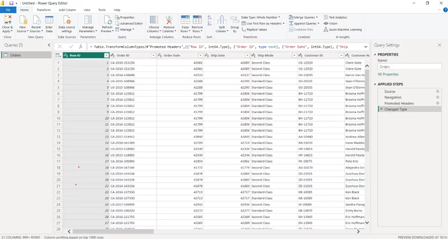
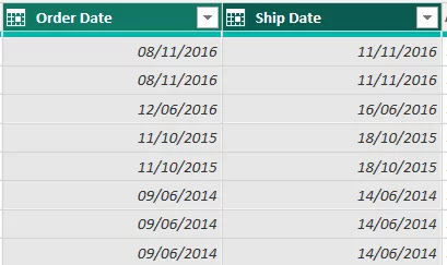
Step 2 – Formatting The Data – Date
Power BI will preformat all columns in the way it believes is correct, for example, as Date, Time, Text, Numerical etc. The dataset used here has two date options, order and ship date. These values have been formatted as a number, not as a date.
To format as a date, click on the Transform tab.

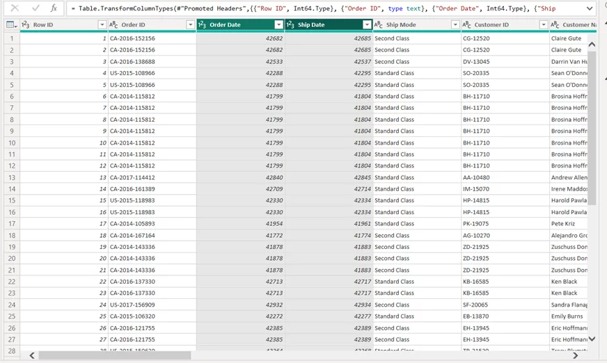
Select the columns to update the formatting.

Under Data Type, select Date.

The prompt Change Colum Type will appear depending on which step you are at in the editor. For now, click Add new step so you can see the change you have made outside of Power BI’s automated Change Type step.

Order Date and Ship Date are now formatted as a Date. Continue to check and format all the data using the same process to ensure all column formatting is correct. Once complete, Close and Apply the changes.
Step 3 – Creating A Bubble Chart
Select the Scatter chart from the display visualisations.
The visual will now appear in the display area.
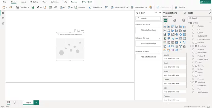
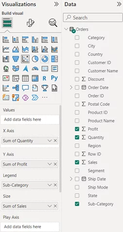
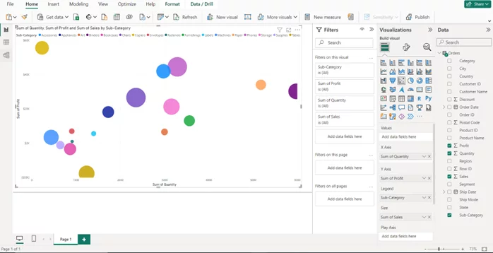
Once selected, drag in the data points required. For this example, Quantity will be the X-axis value, Profit the Y, Sales the Size (bubble size) and Sub-Category the Legend.
Enlarge the visual by dragging each corner point to the edge of the page.
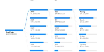
The creation of the bubble chart is now complete, displaying Quantity, Profit, Sub-Category, and Sales.
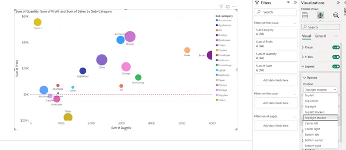
Step 5 – Formatting The Bubble Visual
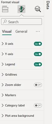
When we click on the visual, the Formatting pane will be available.
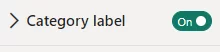
To add labels to the bubbles, update the Category Label to On.
Each data point now has a label added. This is useful when the data selected for the Legend variable is high, such as the supermarket data.

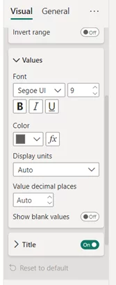
Increase the size font of both X- and Y-axis values. Select X and Y drop downs and then increase the font size.
Move the Legend to the right, suitable for data sets with a greater number of variables. Click on Legend and select Top right stacked.
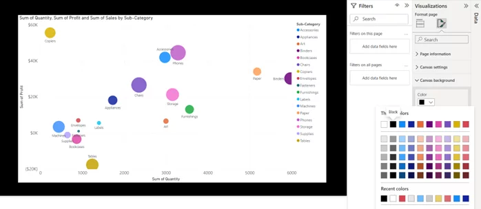
Updating the canvas background can draw attention to the visual. Click on Canvas background and amend the colour.
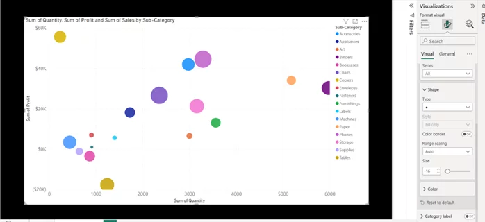
To avoid data points overlapping as seen above, amend the size of the bubble. Under Marker in the pane, decrease the size of the marker.
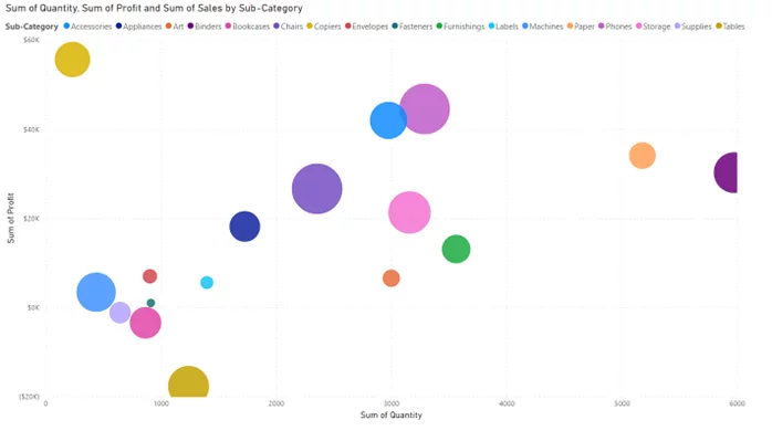
The below display brings together all that was mentioned before in one clean visual, which can be used to analyse the supermarket sub-categories using Sales, Profit and Quantity.

Step 5 – Advanced Features
Add further analysis to your visuals using the below features.
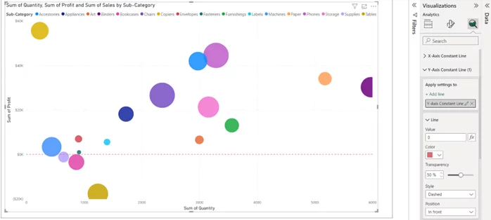
Constant lines – Select the magnifying analysis icon to bring up the additional tools, adding a constant Y line where the value equals zero will segment profitable sub-categories from non-profitable ones.
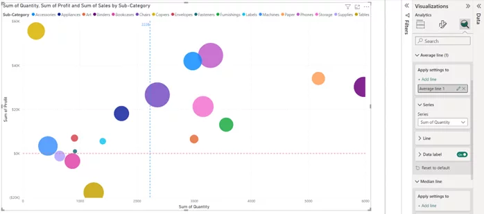
Average line – Add an average quantity line to the plot.
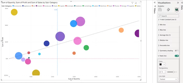
Ratio Line – Show the correlation between your X- and Y-axis.
These additions are not always required or relevant but are to be used to enhance your analysis in the correct context.
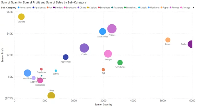
Step 6 – Interpreting The Bubble Chart
Interpreting a bubble chart involves understanding the relationships between the three or more variables that are represented in the chart.
-
- Understand the Axes: Identify the two axes of the bubble chart. Each axis represents a different data variable. The X-axis represents sales quantity, and the Y-axis represents profit. Copiers have the highest profit whereas binders have sold the most units.
- Bubble Size: The size of each bubble indicates the sales value. The larger the bubble, the higher the sales value. The supermarket makes the most sales (value) through phone sales.
- Bubble Colour: This is used to separate the different sub-categories – copiers highlighted in yellow, phones in purple.
- Interactions: Pay attention to how the bubbles interact. Are they concentrated in a particular area of the chart or are they spread out? Do you see any patterns, clusters, or outliers?
- Trends and Relationships: Look for trends or relationships between the variables. The supermarket data shows a correlation between quantities sold and profit made due to the upward diagonal trend.
- Outliers: Identify any bubbles that are significantly larger or smaller than the others. The outlier above would be the yellow-orange circle representing copiers, as quantity is low but profit is high.
- Data Context: Always consider the context of your data and the specific variables you’re visualising. Understand the business or research questions you’re trying to answer with the chart.
- Compare and Analyse: Use the bubble chart to compare data points and draw insights. Sub-categories above zero on the Y-axis would be profitable, those below not so.
Advantages And Disadvantages Of Using Bubble Charts
Bubble charts in Power BI, like any data visualisation method, have their own set of advantages and disadvantages. Here’s a breakdown of both:
Advantages of using bubble charts in Power BI:
- Visualising multiple variables
- Size encoding
- Categorical data representation
- Identification of outliers
- Interactivity
- Pattern recognition
Disadvantages of using bubble charts in Power BI:
- Complexity vs other charts
- Limited to a few variables (clutter)
- Accuracy (estimations due to size)
- Limited for nominal data
- Limited chart customisation
In summary, bubble charts are a valuable tool for visualising complex data relationships, but they should be used when suited. It’s essential to carefully consider your data and audience when deciding whether a bubble chart is the most suitable choice or if another visualisation method might better serve your data communication needs. If you think that a bullet chart would be more appropriate for representing your data, one of our articles explains in detail how to create one.
Conclusion
In this article, we’ve explored the bubble visual within Power BI. We introduced the bubble chart feature, which excels at providing you with an efficient way to visualise and compare three data variables simultaneously.
Bubble charts in Power BI use X and Y coordinates to represent two variables and bubble size for a third. They also allow for categorical representation through colour. The article covered constructing a bubble chart step by step, highlighting data preparation, formatting, and interpretation.
To enhance your bubble charts, we introduced advanced features like constant lines and ratio lines. However, these are context dependent and should only be used when required.
We discussed the advantages and disadvantages of bubble charts in Power BI. They are excellent for visualising multiple variables and identifying outliers but can be complex and require visual estimation.
In conclusion, bubble charts are valuable for complex data visualisation, but their usage should be considered carefully. Following best practices can create effective visuals in Power BI, and we encourage experimentation to leverage this feature for data-driven decisions.
Looking for some Excel tips? Check out this guide to calculate ages from date of birth!