
Create Your Own Histogram In Excel
Contents
Histograms are visualisations of the distribution of your data.
For a simple example, think about breaking down exam scores into grade bands.
Professionals from industries across the globe rely on histograms to make sense of patterns and trends.
Knowing how to create effective visualisations is a very marketable skill, learned as a key part of our classroom Excel training.
Access all the information on our website and pick the best one for you.
Inserting A Histogram– Simple Example
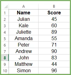
The following data is a record of the test scores of 30 students.
We want to see how many students scored low, mid, and high marks.
To do this, we’ll create a histogram dividing test scores into intervals of 10.
You can also follow along with this template!
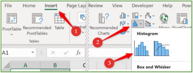
To create a histogram from this input range:
- Highlight the range A1:B31.
- Next, go to Insert > Insert Statistic Chart > Histogram.
- The following histogram will appear on your screen, grouping the 30 scores into four ranges/bins.
- As you can see, the data is somewhat jumbled and does not showcase the results we wanted. This means it’s time to edit the vertical and horizontal axis. To do this, you’ll have to:
-
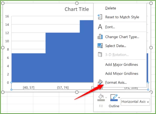
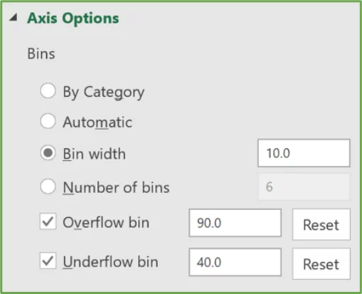
- Right-click on the x-axis and select Format Axis from the menu box.
-
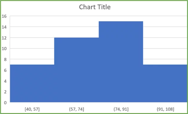
- Go to the Axis Options category and enter 40 in the box beside the Underflow bin space and 90 in the box beside the Overflow bin (40 indicates the range from which the histogram bins will start, and 90 indicates the final bin, which will include scores of 91 and above).
- Enter a bin width of 10. This means that the bins will be created in intervals of 10.
This is what your renovated histogram will look like.
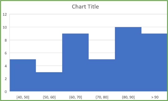
Note: It’s vital to understand that if a score resembles a bin’s upper value, it will be recorded in that bin only.
For instance, a score of 80 will fall under the 70-80 bin range instead of the 80-90 bin range.
To take your histograms a step further, you can use slicers to make them more interactive.
What Are Histograms?
A histogram chart shows a visual representation of the frequency distribution of a data set.
Too complex?
Simply put, a histogram is like a bar chart. Even if you’ve not made one, you’ve probably seen it at some point in life.
In a histogram, each bar or column represents the frequency rate of characteristics within a specific range.
Hence, we can conclude that a histogram graphically depicts the recurrence of elements within consecutive, separate intervals, more appropriately known as bins.
For instance, you can create a histogram chart to determine the number of customers with positive reviews between 1 and 10, 11 and 20, 21 and 30, etc., or customer response times in intervals of 1–5 minutes, 6–10 minutes, 11–15 minutes, and so on.
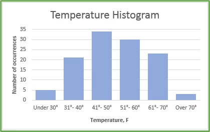
Here’s a demonstration of an Excel histogram:
Making A Histogram From Formulas
This method is compatible with all versions of Excel and initially uses a column chart, which is then formatted to match the conventional histogram.
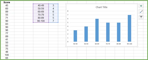
We’ll use the same data tab, but before diving into the steps, we have to create a data source for the histogram.
This can be seen in the following image. The bins are entered into cells G2:G7, and the COUNTIFS function is implemented to record the frequency of scores for each bin.
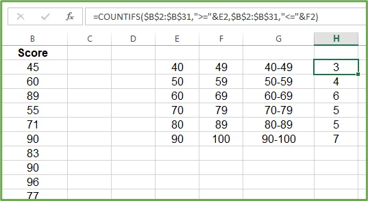
The values in cells E2:F7 highlight the upper and lower range of the bins.
Before we unveil the steps to create our Excel histogram, we’ll hide these two columns because they serve no other purpose than to support the COUNTIFS function
Feel free to note down this COUNTIFS function (=COUNTIFS($B$2:$B$31,”>=”&E2,$B$2:$B$31,”<=”&F2) and then proceed with the steps mentioned below:
- Mark the cells G2:H7
- Go to Insert > Insert Column Chart > Clustered Column. The following chart will be inserted into your Sheet.
- All that’s left is making some general improvements in the chart and tightening the gaps between the columns. Here are some suggestions you can incorporate into your histogram dialogue box:
-
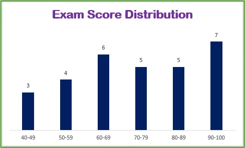
- Change the chart title to Exam Score Distribution by clicking the Chart Title.
- Format the columns to the colour of your choice.
- Remove the y-axis by selecting the horizontal axis and pressing Delete.
- Remove the gridlines by clicking on them and pressing Delete.
- Add frequency labels above each column.
Your semi-finished histogram will look somewhat like this after these changes.
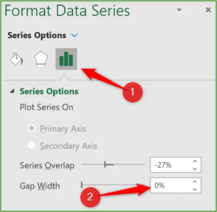
- Now, to eliminate gaps between columns, right-click on a column and select Format Data Series from the menu box.
- Hit the Series Options section and bring the Gap Width to 0.
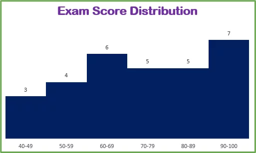
Without the gaps between the columns, your chart will now look like a typical histogram.
Why Use A Histogram?
Histograms are the primary choice for data analysis for several reasons. These include:
- Distribution visualisation: Histograms make it easy to visualise the trends and patterns within a continuous data tab, while other types of graphs, like bar charts, only show a comparison between different categories of data.
- Understanding the frequency of data ranges: Histograms are the preferred method for data analysis when the objective is to showcase and analyse the distribution of a data set instead of a single data point.
- Comparing large data sets: A histogram displays the amount of data points for each interval, bringing a large input range into a concise summary so you can compare the columns easily.
Advantages And Disadvantages Of Histograms
Advantages
1 – A histogram chart can uncover patterns and distributions that would otherwise be concealed within the heaps of data, making them great for data analysis.
2 – Histograms are trusted sources for data analysis, assisting analysts with identifying trends, important data points, and outliers to make informed decisions.
3 – As suggested above, histograms divide data into separate categories and display them in an easily digestible format. This is especially helpful when you’re juggling large amounts of data from an analysis group.
Disadvantages
1 – Histograms focus on frequency distribution, overlooking the individual values that create the entire picture. This may leave you with a shallow understanding of a data set.
2 – While we talked about how histograms can simplify complex data, they’re also known to oversimplify the underlying meaning of a situation. This limits our understanding of the data.
3 – Histograms are adjustable. The person constructing the histogram can use different groups to
Histogram Troubleshooting
While histograms play a prominent role in data analysis, it’s essential to understand the limitations and challenges you can encounter before you start working with them. These include:
Data Skewness
Data skewness refers to asymmetry in a distribution of data enclosed in a data set.
For instance, if you’re working with a data set representing a country’s population with a large amount of old people, the histogram will be skewed that way.
This can create a misleading impression that the population’s average age is high, even if that’s not the case.
Bin Size Selection
The bin range selection depends on the person creating the histogram and can significantly impact the chart output.
Where choosing too many bins can amplify the meaning of the data, selecting too few bins can cause the meaning to be overlooked.
Data Outliers
Outliers are bits of data that don’t align with the majority of the data points.
Including them in the data range can noticeably affect the histogram chart’s skewness shape.
For example, for data on the salaries of people in a company, recording the CEO’s salary in the data pool will skew the distribution.
Conclusion
While we have seen how working with histograms can be risky given its limitations, you can’t deny its importance in data analysis.
Histograms are reliable tools that empower the user to make decisions from their data.
They will help you understand your data’s variability and tendencies, but are best used when outliers are taken out beforehand!

- Facebook: https://www.facebook.com/profile.php?id=100066814899655
- X (Twitter): https://twitter.com/AcuityTraining
- LinkedIn: https://www.linkedin.com/company/acuity-training/