All You Need To Know About Forecasts In Excel
Microsoft Excel provides quite a few built-in tools to assist with forecasting.
Forecasting refers to the process of predicting a possible future result/future results based on historical data.
What Is A Forecast In Excel?
Forecasts are models that contain predicted future value(s) based on past values or historical data. Financial analysts and others working in the finance industry often have to create forecasts.
Forecasting can be used to provide estimates of future sales and future expenses, for example. Forecasts can thus be used to assist with making informed business decisions.
A business owner can develop strategies to tackle expenditure if they see that their expenses are estimated to increase by a sizeable margin.
Some of the techniques for forecasting, in Excel that we are going to cover in this post include:
- How to use a Line Chart to Forecast
- Using the FORECAST.LINEAR Function
- Using the FORECAST.ETS Function
- Creating a Forecast Sheet
To learn more about Excel data analysis, please visit this page.
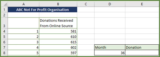
Description of the Data Set
So, let’s take a look at our sample data set. We have data from a hypothetical not-for-profit organisation. The spreadsheet stores the number of donations the organisation has received, each month, due to an online marketing campaign. There are 30 months in total.
In this case we have time series data. Our x-values, which are our independent values are in the left column and our y-values or dependent values are in the right column.
Understanding the difference between dependent and independent values in Excel is also covered in our courses!
In other words, we have our months as the independent x values in column A, and our donations as the dependent array in column B.
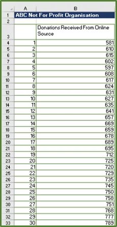
Note: You will see that we don’t have a label for months in cell A3. This is just so that our line chart will have the data series of interest displayed correctly.
For more on working with Data Sets, read our guide on Power Queries in Excel here.
Using a Line Chart to Provide More Information and Make Predictions
Line charts are useful when you want to display a trend and you have time series data. They are simple to create and easy to understand.
Inserting a Line Chart
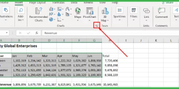
1) So, to create a line chart, select the entire range A3:B33.
2) With the range selected, go to the Insert Tab (Step 1 in the image) and in the Charts Group click on the drop-down arrow next to Line Chart (Step 2 in the image).
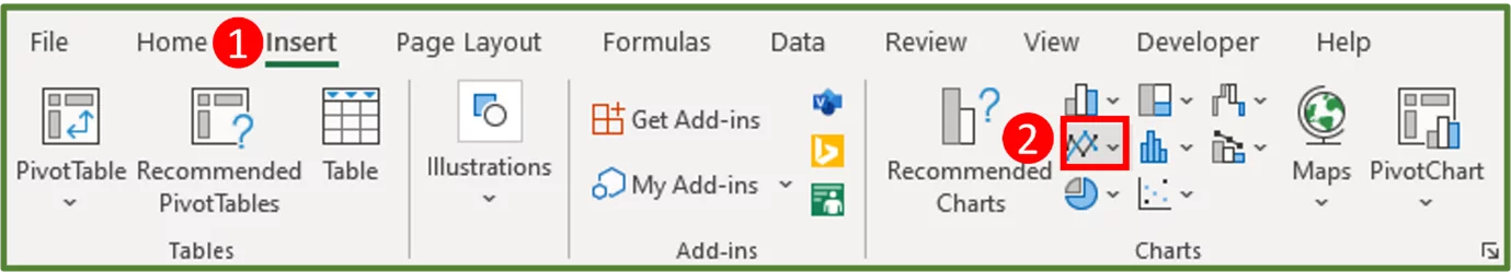
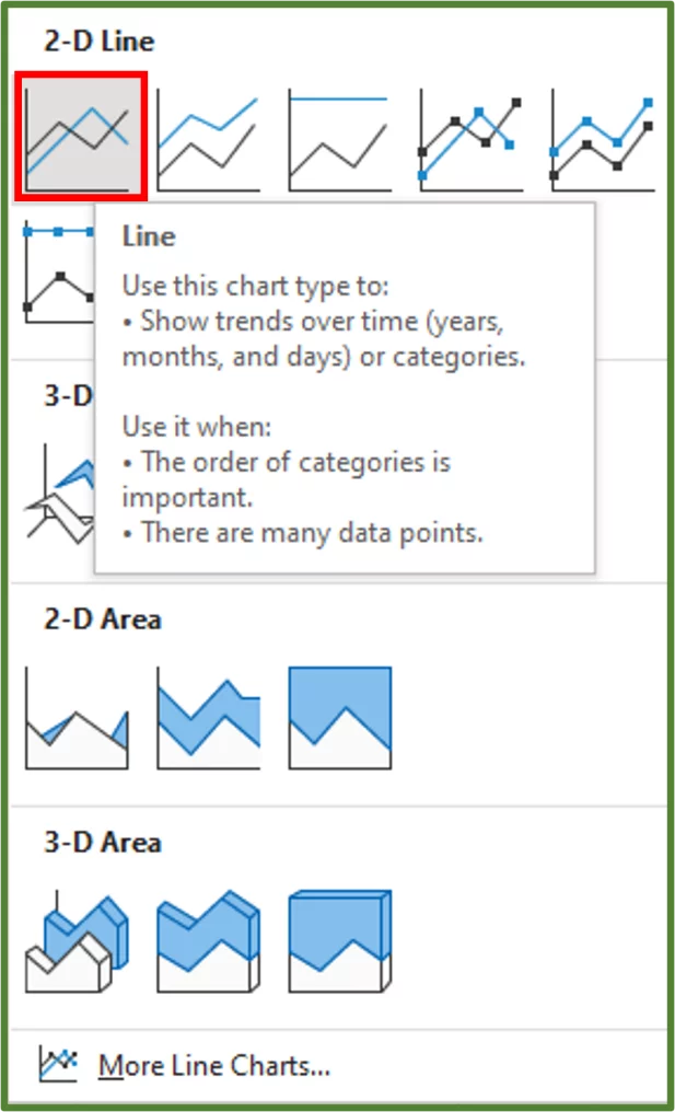
3) In the 2-D Line section, choose Line.
4) You should see the following.
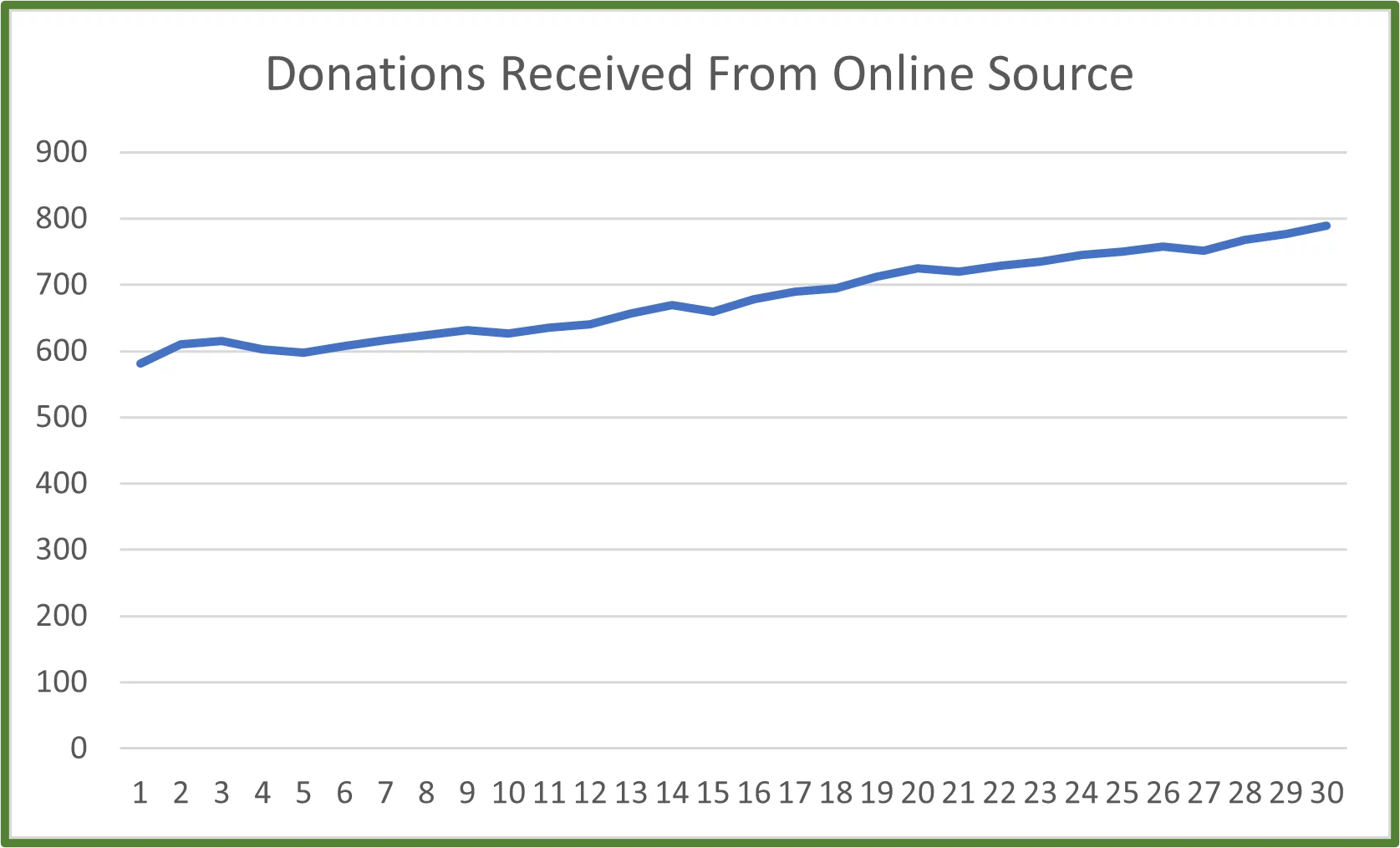
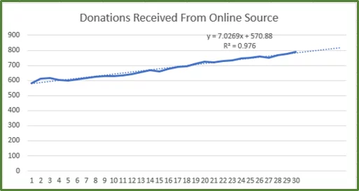
Note: We can see from our chart, that there has been a general upward linear trend in donations received over the months.
Adding a Trendline, A Forecast, Displaying the Equation and the R-Squared Value
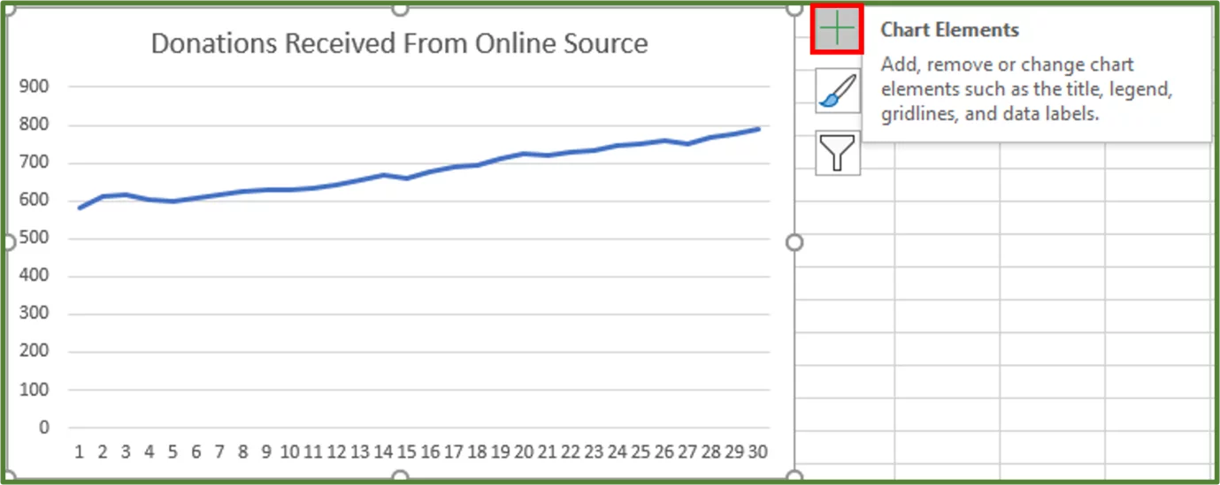
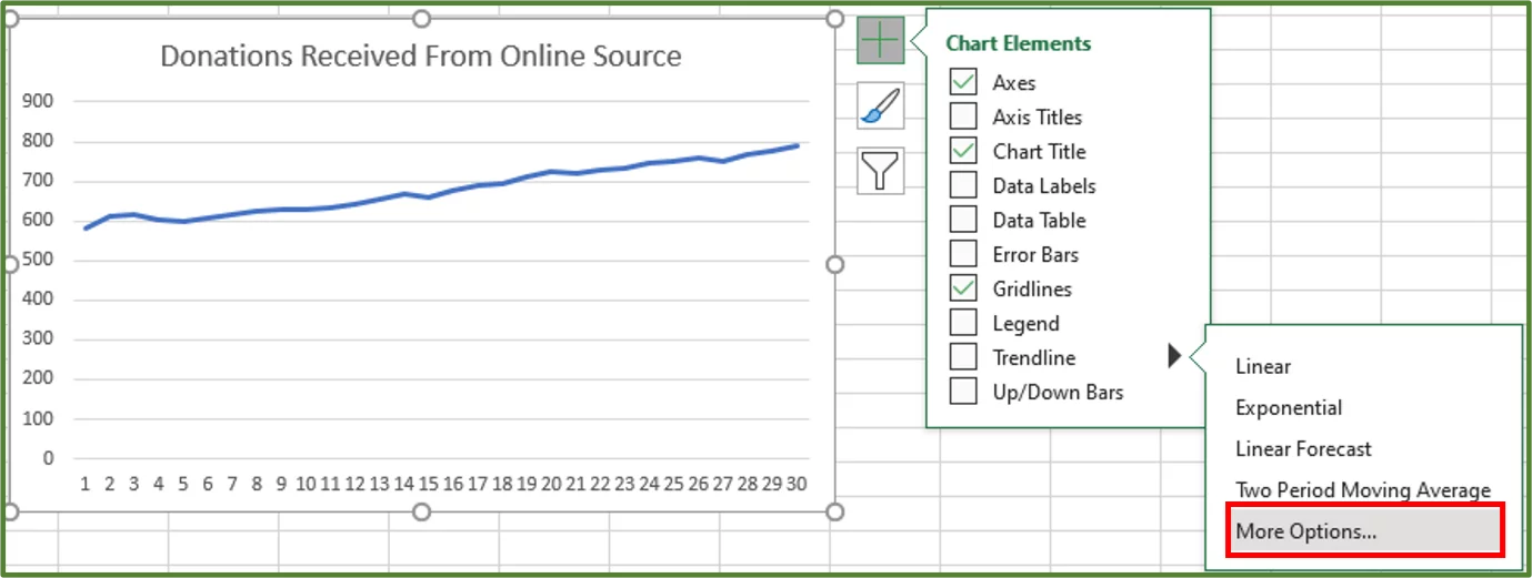
1) So, with our chart selected, click on the + button to see the Chart Elements.
2) Click the arrow next to Trendline and select More Options…
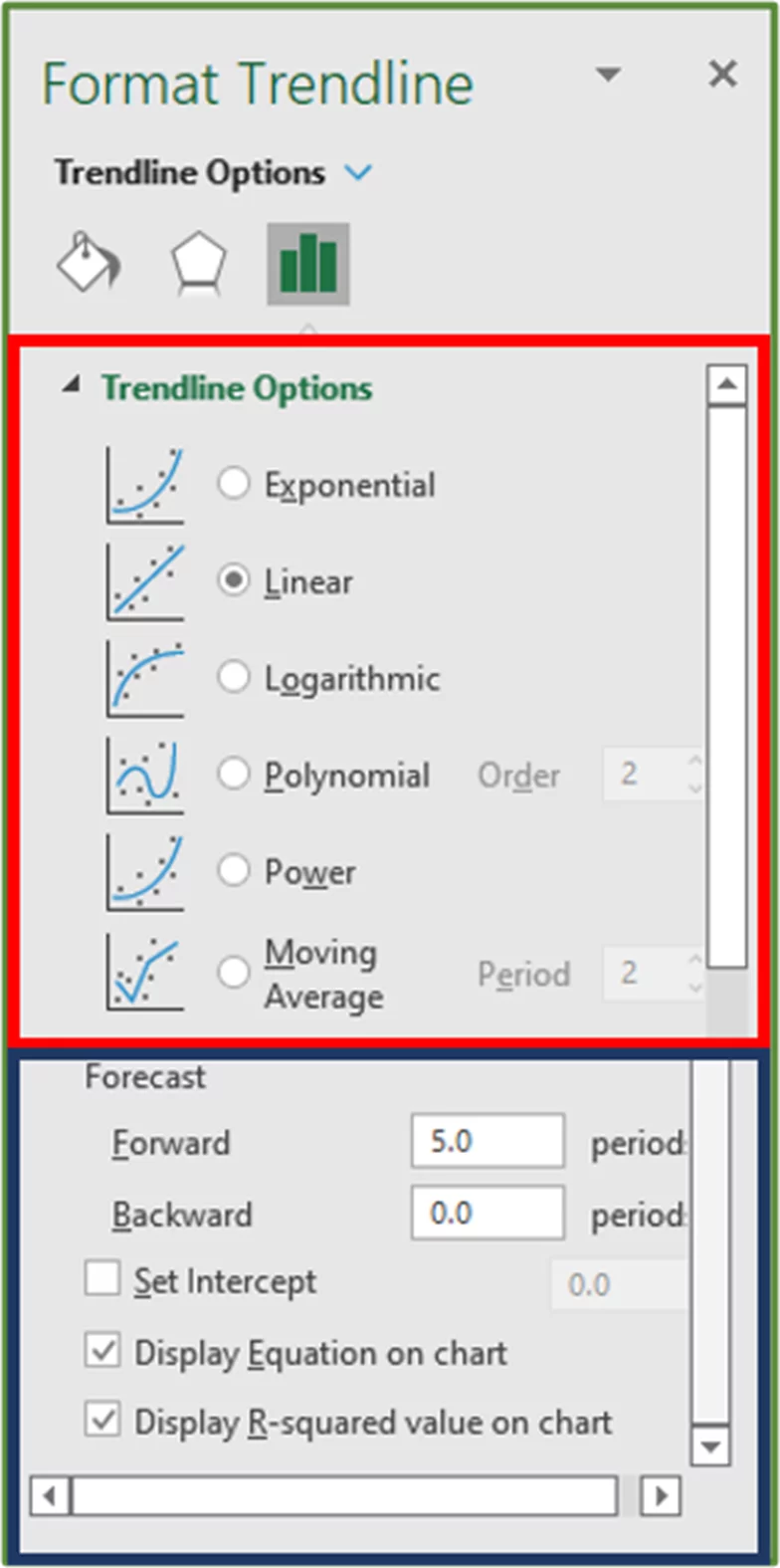
3) You should see the Format Trendline Pane.
4) In the Trendline Options section check Linear. Scroll down to see the Forecast option and in the Forward textbox enter 5 as the period. Since we want to predict the corresponding y data points for 5 months ahead.
Check the option to Display Equation on Chart and Display R-Squared value on chart.
5) You should see the following.
6) Right-click the Horizontal Axis of the chart and then choose Format Axis.
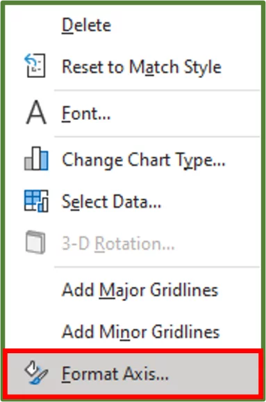
7) The Format Axis Pane should appear. In the Axis Options section under Axis Type check Date axis.
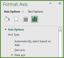
8) You should see the following.
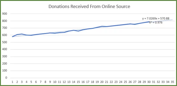
We can see that the predicted donations for the 35th month are approximately 816.
The COUNTIF Function in Excel can be a great help when analysing the data from a forecast.
The FORECAST Function – A Simple Example
Microsoft Excel also provides a built-in FORECAST Function which you can use to predict a future value based on past data.
From Microsoft Excel 2016 onwards FORECAST.LINEAR was introduced to replace the standard FORECAST. However, the Excel FORECAST Function is still there to maintain backwards compatibility. The syntax of FORECAST.LINEAR and the FORECAST Function are the same.
If you have a later version, you should use FORECAST.LINEAR.
The syntax of the FORECAST.LINEAR Function is:
+=FORECAST.LINEAR(x, known_ys, known_xs)
where x is required and is the given data point for which you want to predict a value
known_ys are required and refer to the dependent array or past y values
known_xs are required and refer to the independent array or past x values
Using the FORECAST.LINEAR Function
We will use the sample data set that we used in the above example. We want to use the FORECAST.LINEAR Function to predict what the number of donations in the 36th month will be.
1) So, in cell D8, on our sheet we enter the value 36, which is our independent x value.
2) In cell E8 we enter the following formula.
=FORECAST.LINEAR(D8,$B$4:$B$33,$A$4:$A$33)
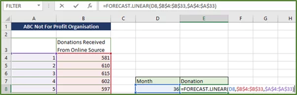
3) Press Enter.
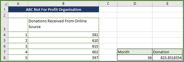
4) You should see the following. The y value or predicted value for the 36th month is 824 approximately.
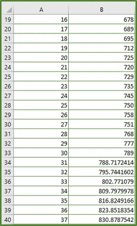
Now we have added the months 31, 32, 33, 34, 35, 36, and 37 to column A as shown below and will use the FORECAST Function to produce the corresponding predicted future donations values in column B.
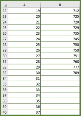
1) So, in cell B34, we enter the following formula.
=FORECAST.LINEAR(A34,$B$4:$B$33,$A$4:$A$33)
2) Press Enter and we can drag the formula down to populate the rest of the column since we used relative and absolute references.
If you’d like to learn more about relative, absolute and mixed references then please visit this post.
We have now produced a simple forecast in Excel, which the directors of the non-profit can used to make informed business decisions.
For example, let’s say the directors would like to increase the number of donations received, they can run an additional awareness campaign where people hand out flyers.
Tip: Be aware that forecasting is basically making an informed guess and there are often other factors or variables which may affect outcomes.
An economic downturn may mean people have less money to spend. Alternatively, the directors of the non-profit could hire a grant writer and thus donations will be increased as a result of the additional funders.
For more tips on Excel, read our guide on calculating a percentage difference in Excel.
The FORECAST.ETS Function – A More Complex Example
The FORECAST.ETS function is used for predicting a future value based on past data points and it uses the AAA version of the Exponential Smoothing algorithm. Exponential smoothing assigns higher priority to newer data and lower priority to older data.
The FORECAST.ETS Function takes seasonal and other cycles into account.
You should use this function with non-linear data models.
The FORECAST.ETS Function is only available in newer versions of Microsoft Excel.
Looking for a way to recover a lost document? Read our guide on how to Recover Unsaved Files here!
Description of the Data Set
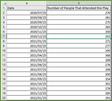
So, let’s take a look at our sample data set. We have a hypothetical theatre that is looking at the number of people in attendance, at a contemporary play called Green Planet and Squares. The play is shown on the 25th of every month.
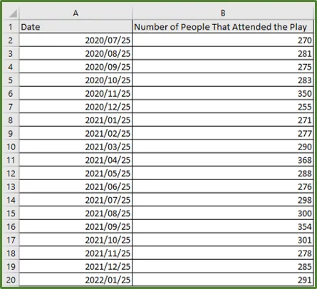
As we can see there are fluctuations in the number of people that attended the play. There is not a consistent increase instead every five months there is a peak and then numbers drop again.
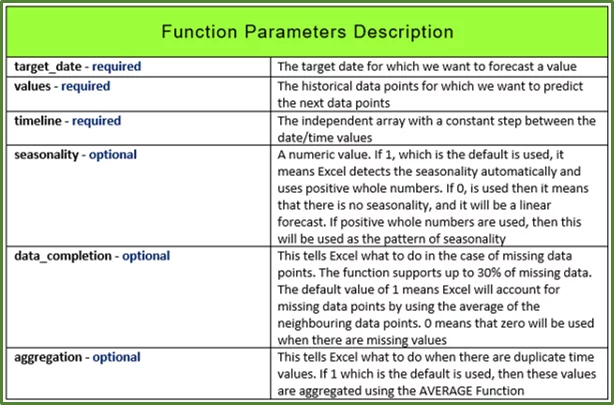
The syntax of the FORECAST.ETS Function is:
=FORECAST.ETS(target_date, values, timeline, [seasonality], [data_completion], [aggregation])
In this post, we show how to highlight duplicate values, which can help greatly when working in Excel.
Using the FORECAST.ETS Function
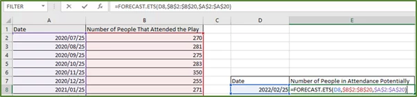
What we are interested in, is using the FORECAST.ETS Function to predict the number of people that may attend the play on the 25th Feb 2022.
1) So, in cell D8 on our sheet we enter the date 25th Feb 2022, which is our target date.
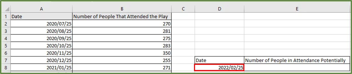
2) In cell E8, we enter the following formula.
=FORECAST.ETS(D8,$B$2:$B$20,$A$2:$A$20)
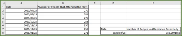
3) Press Enter.
4) You should see the following. The returned or estimated number of people that could potentially attend the play on the 25th February 2022 is 358 people.
Creating A Forecast With The Forecast Sheet Feature (Easy!)
The FORECAST Sheet Feature in Excel is a built-in view that automatically creates the forecast model on a new sheet, so that you can see the predicted future values.
If you use the FORECAST Sheet Feature then the formulas and the line chart will be automatically generated for you. This is a feature only available in later versions of Microsoft Excel. However, people with older versions will still be able to see the created sheet but just not edit the formulas.
We will use the same data set as the above example.
1) So, select any cell in the data set. In this case we will use cell B7.
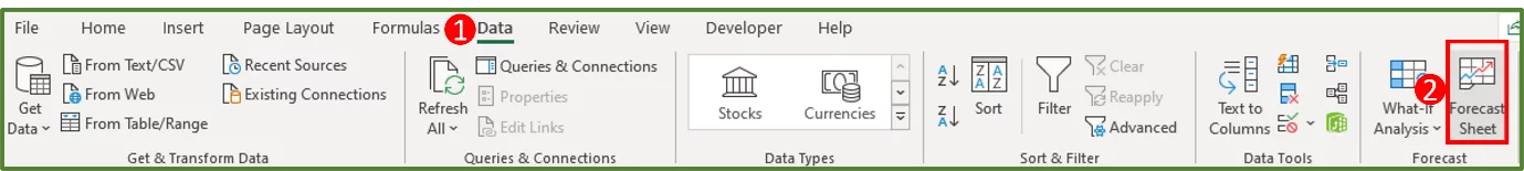
2) With this cell selected, go to the Data Tab (Step 1 in the image) and in the Forecast Group select Forecast Sheet (Step 2 in the image).
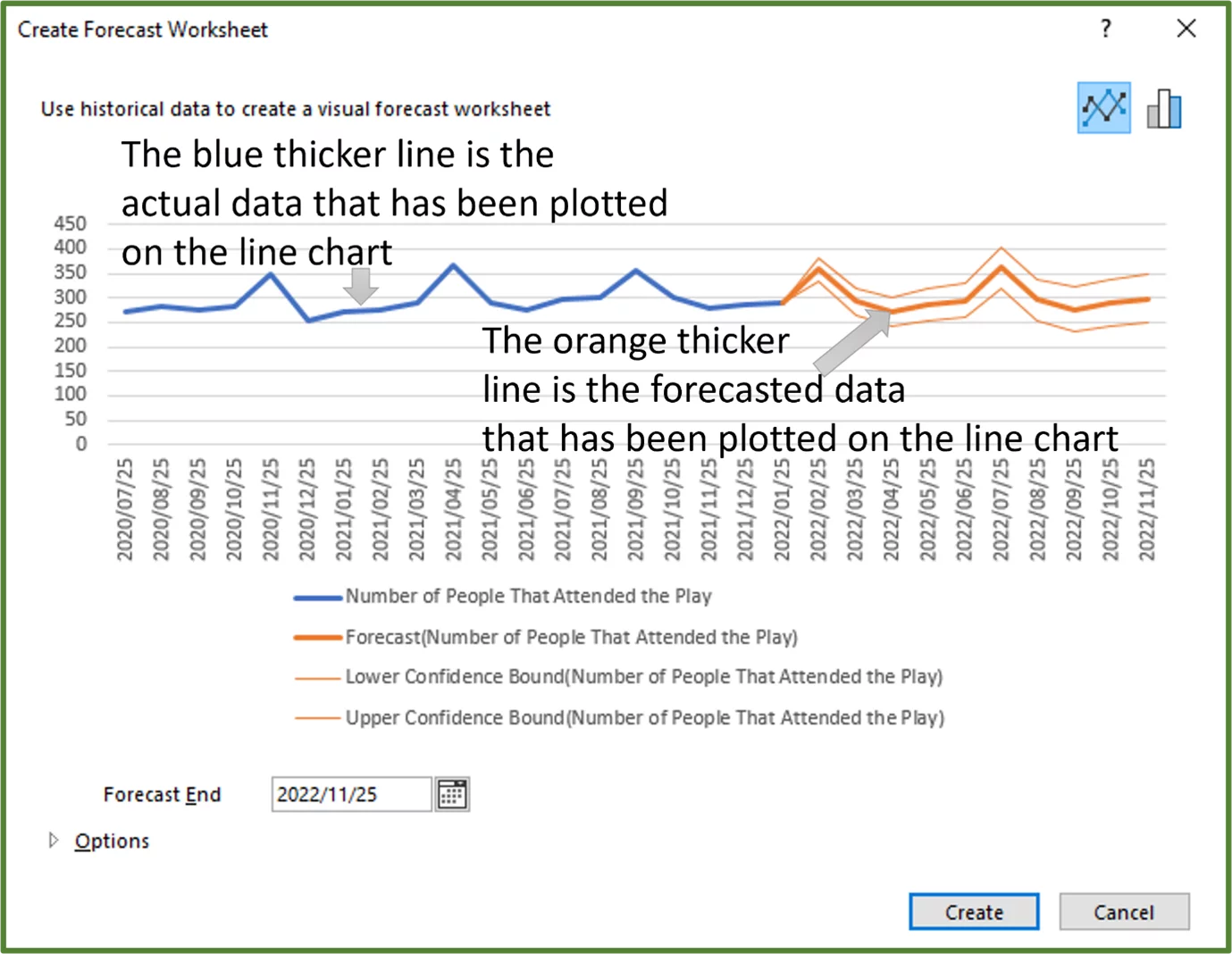
3) The Create Forecast Worksheet option should appear.
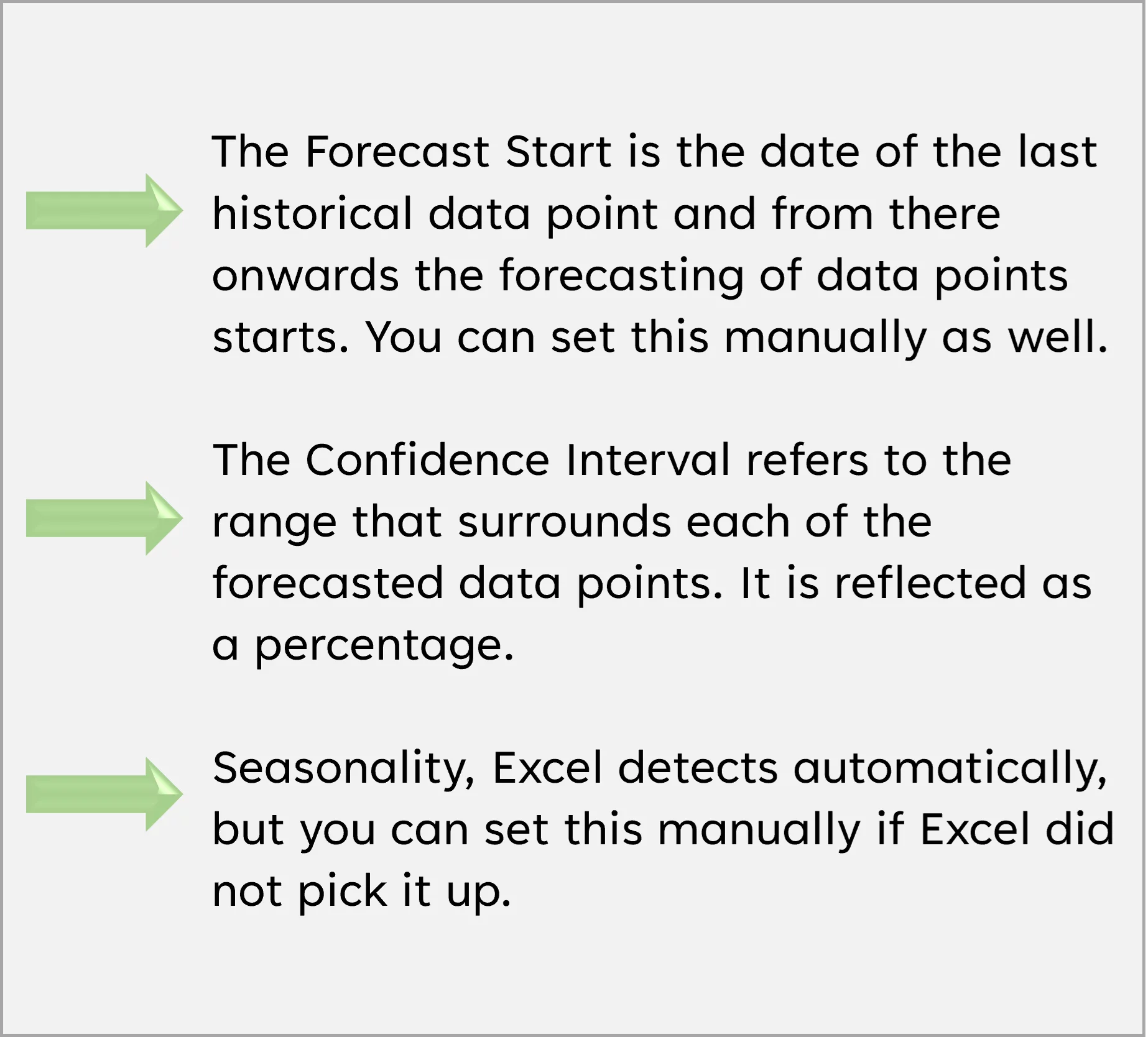
Now we will expand the Options section.
1) You should see the following.
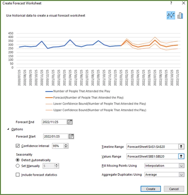
2) Click the Create Button.
3) You should see the following.
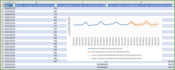
The forecasted data i.e the number of people that Excel estimates will attend the play for the each of the dates given is in column C.
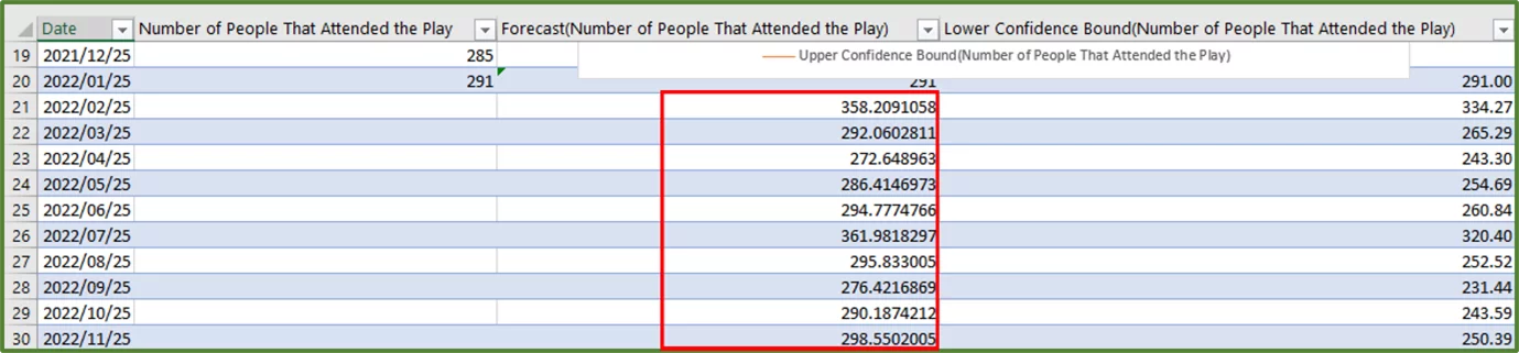
So, the theatre managers can hire additional ushers as needed for example, to accommodate the predicted peaks.
Also, the theatre managers can look at setting up additional displays and posters to promote other plays around the times the peaks are estimated, since more people will be attendance.
Learning Objectives
You now know how to:
- Create a Line Chart
- Use a Line Chart for Forecasting
- Use the FORECAST.LINEAR Function
- Use the FORECAST.ETS Function
- Create a Forecast Sheet
Additionally, you have an understanding of:
- What a Forecast is
- Linear Regression
- How to predict future values in Excel
- Exponential Smoothing
- What a seasonal pattern is
- What a Confidence Interval is
Conclusion
Our recent survey on people using AI with Excel shows that people are increasingly trying out AI tools for forecasting. Until these tools are hugely more refined being able to forecast from scratch will continue to be a very valuable skill.
Forecasting allows you to predict future values based on existing values and past data. In this post we have given you a comprehensive guide to forecasting in Microsoft Excel.
Practicing these tools is key – did you know the average Excel problem takes 8 1/2 minutes to fix on average? Reducing this as much as possible is important to your workflow! For more fascinating Excel Statistics go here!
If you would like to learn more about Business Intelligence, then read our guide on Power BI here.
Special thank you to Taryn Nefdt for collaborating on this article!