
Analysing Data In Excel (3 Quick Methods)
Contents
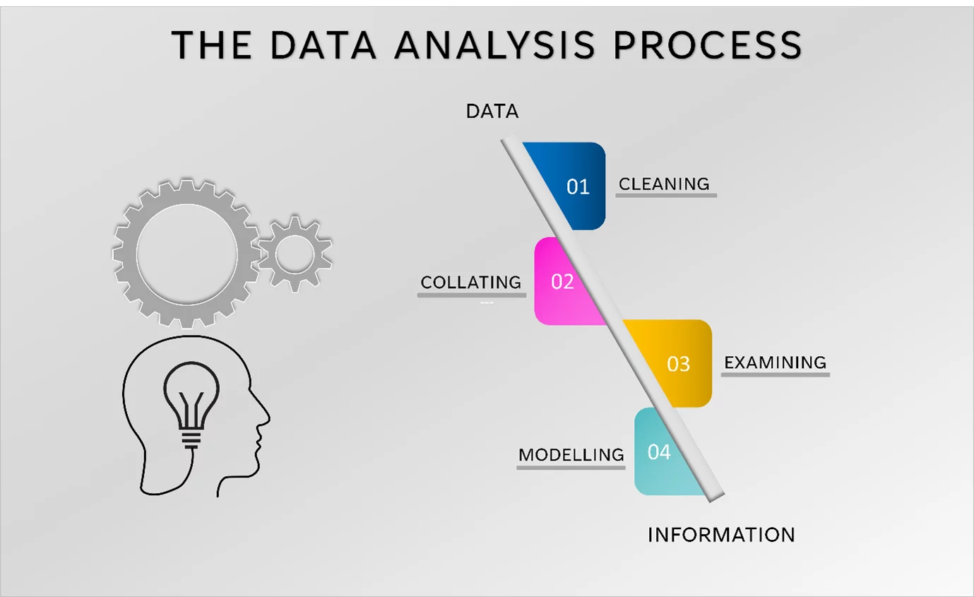
Data Analysis is the process of cleaning, collating, examining, and modelling data to deliver information and key insights.
These insights can be used to assist with decision-making.
Data Analysts look at providing answers, to specific business-related questions, by using data.
To learn more about data analysis, join one of our Excel training classes!
Analysing Data In Excel
Data analysts use tools and software to summarize data, make predictions, visualize the data in some way, as well as generate reports.
There are a variety of tools that you can use to analyse your data.
These include Microsoft Excel, Tableau, Python, Jupyter Notebook, Microsoft Power BI, SAS and Talend.
There are many advantages to using Excel as a data analytics tool, namely:
- The learning curve is not steep
- Reports or charts generated in Excel can easily be copied into presentations and Word documents
- Workbooks can be shared easily, especially if you are using Excel for Web
- Excel has built-in features such as functions, charts and Pivot Tables which are specifically meant for data analysis
- Excel is considered to be the traditional go-to software, used in many fields, for simple and intermediate data analysis requirements
There are some disadvantages associated with Microsoft Excel. One is that it cannot handle large data sets, with millions of points, with ease. Another is that it does not have all the automation options that some other tools on the market have.
We are going to review some simple methods, which will show you how to analyse data in Excel, namely:
- Sorting
- Filtering
- Charts
- Pivot Tables
- Conditional Formatting
Once data has been analysed, you can collect all your data in one place by linking your Excel data together.
Description Of The Data Set
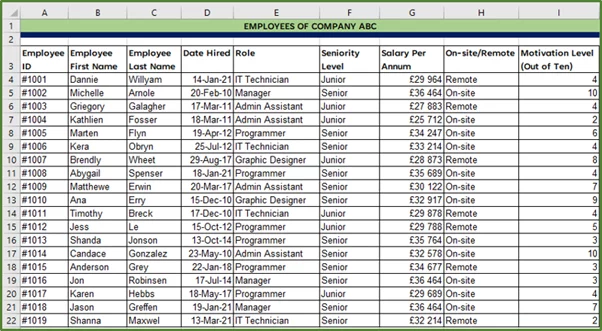
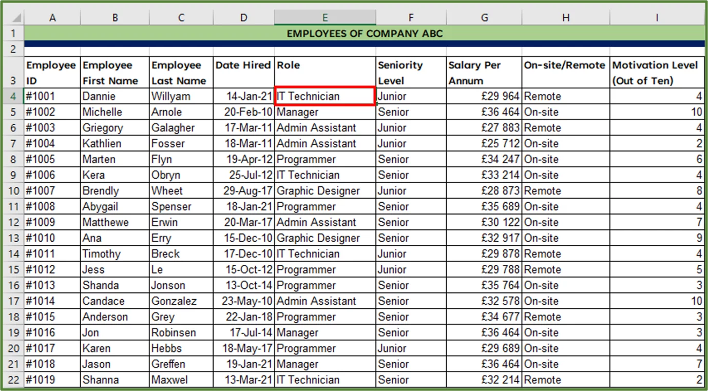
Let’s take a closer look at our data set. It is a small database containing the Employee records of a hypothetical company.
There is a column recording Employee ID, which is a unique identifier for each row.
The standard employee details such as Employee first name, last name, date hired etc. are recorded.
Additionally, whether the employee works on-site or remotely is recorded.
The last column contains the results of a short survey given to each employee, which asked them to rate their level of motivation on a scale of 1 to 10.
Sorting Data
You can quickly rearrange your data by sorting it in a certain order, if it needs cleaning, we strongly recommend you use Excel’s new REGEXREPLACE formula!. Let’s look at a simple example using our sample data set.
Situation:
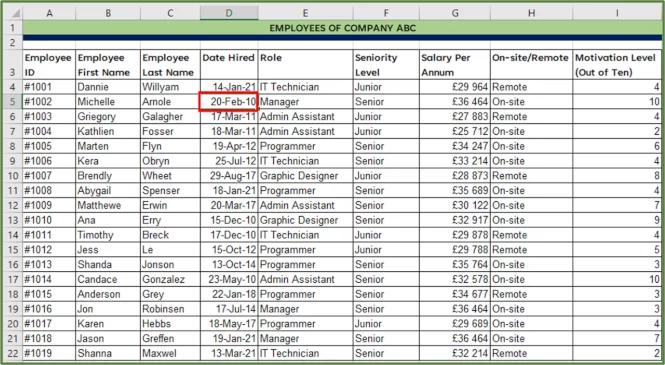
Let’s say we’d like to see which employees have been working at the company the longest. To do this, we can sort by the Date Hired Column.
1) First, select a single cell in column D, in this case it is cell D5.
2) Go to the Data Tab (Step 1 in the image) and in the Sort & Filter Group, click the Ascending Sort button (Step 2 in the image) which will sort the dates from Oldest to Newest.
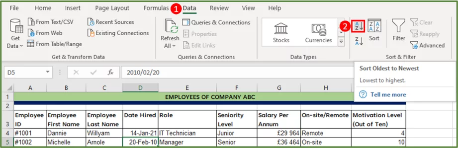
Note: The Ascending Sort button sorts values from A to Z, smallest number to largest number or oldest to newest.
The Descending Sort button sorts values from Z to A, largest number to smallest number or newest to oldest.
3) The result is the following.
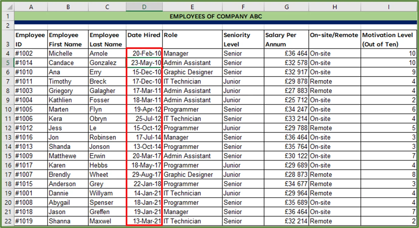
We now have an answer to our question and can see which employees have been working at the company the longest!
Charts
A chart is a graphical representation of key information in a data set. Charts showcase trends, patterns, and outliers in a visual way.
Data visualization is part of the story-telling component of Data Analysis.
You can use charts to tell a story or to illustrate certain aspects of your data that you’d like to focus on in your spreadsheets and dashboards.
The most commonly used ones for basic Data Analysis purposes are Line Charts, Pie Charts, Bar Charts, XY Scatter Charts and Column Charts.
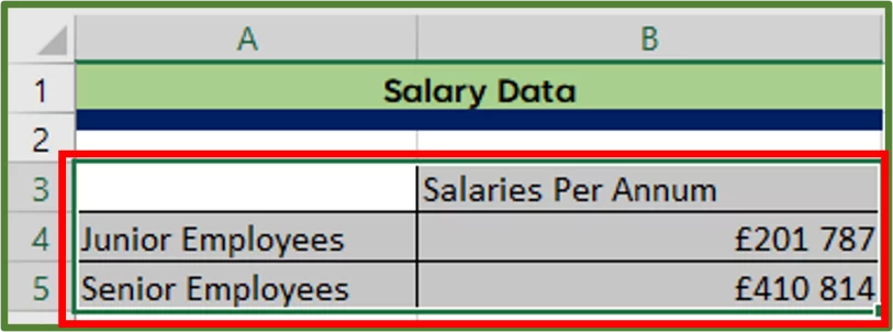
Here we have sheet which contains the salary data in the range shown below.
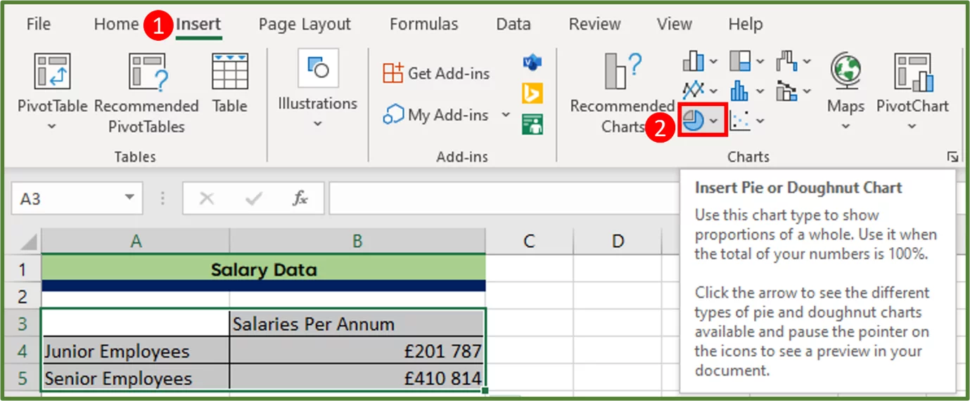
1) To insert a Pie Chart, select range A3:B5.
2) Go to the Insert Tab (Step 1 in the image), and in the Charts Group, click on the Pie Chart (Step 2 in the image) button.
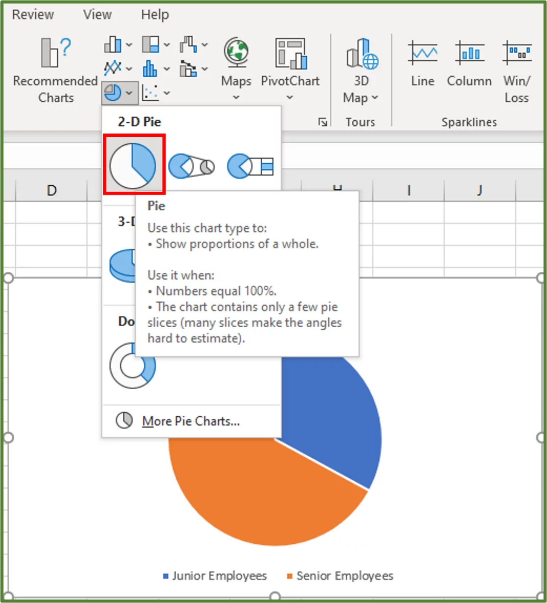
3) Under 2-D Pie select the first option as shown.
4) Now we will select a built-in, preformatted visual style for the chart. With the chart selected, go to the Chart Design Tab (Step 1 in the image) and in the Chart Styles Group, select Style 3 (Step 2 in the image).
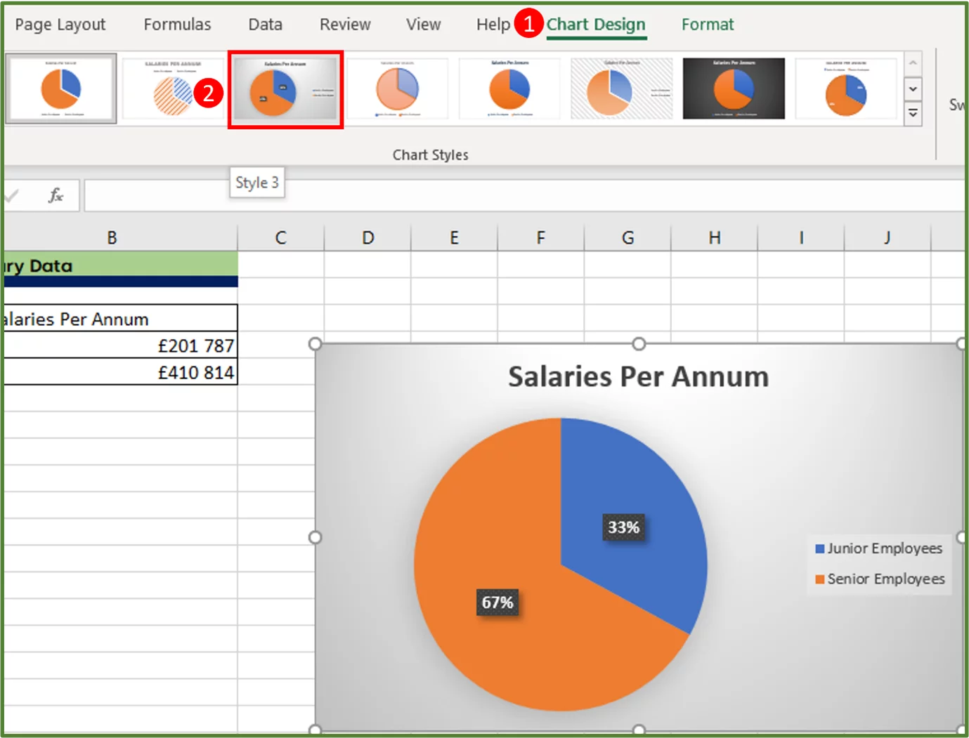
6) We will enter a new chart title by clicking on the Chart Title and typing Salary Breakdown by Employee Level. The result is the following.
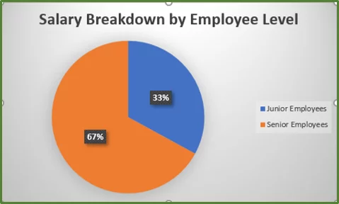
We can see that senior staff salaries make up 67% of the total annual salary bill.
Taking it one step further: There are other more advanced chart types available including Stacked Bar Charts, Radar Charts, Surface Charts, Treemap Charts, Sunburst Charts, Histogram Charts, Box and Whisker Charts and Funnel Charts.
Pivot Tables
A Pivot Table is a powerful tool that is useful for summarizing and aggregating data, in order to extract the data of interest from a larger dataset. It is one of the most useful analytical tools in Excel.
Situation: Let’s say we’d like to see our salary data grouped according to seniority level and then further categorised by on-site versus remote staff, we can use a Pivot Table to do this.
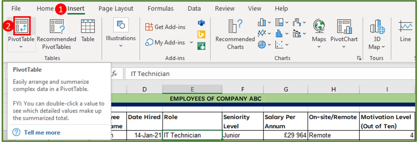
1) To insert a Pivot Table, click on any cell in the data set. In this case, we will select cell E4.
2) Go to the Insert Tab (Step 1 in the image) and, in the Tables Group, click on the PivotTable option (Step 2 in the image).
3) The PivotTable from table or range Dialog Box should appear. Excel should automatically select the correct range if your data has been set up correctly.
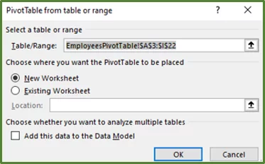
If for some reason Excel has not selected the correct range, then you can manually select the range yourself.
4) The default location for a PivotTable to be placed is New Worksheet, however, you can change this to Existing Worksheet. In this case, we will leave the Default and then click Ok.
5) You should see the following on a new worksheet.
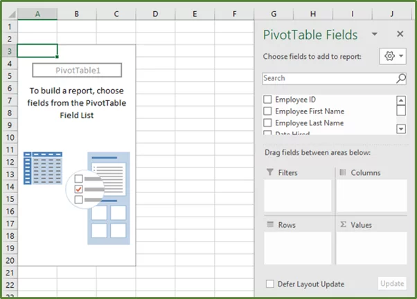
6) It doesn’t look like much at the moment, but that will soon change.
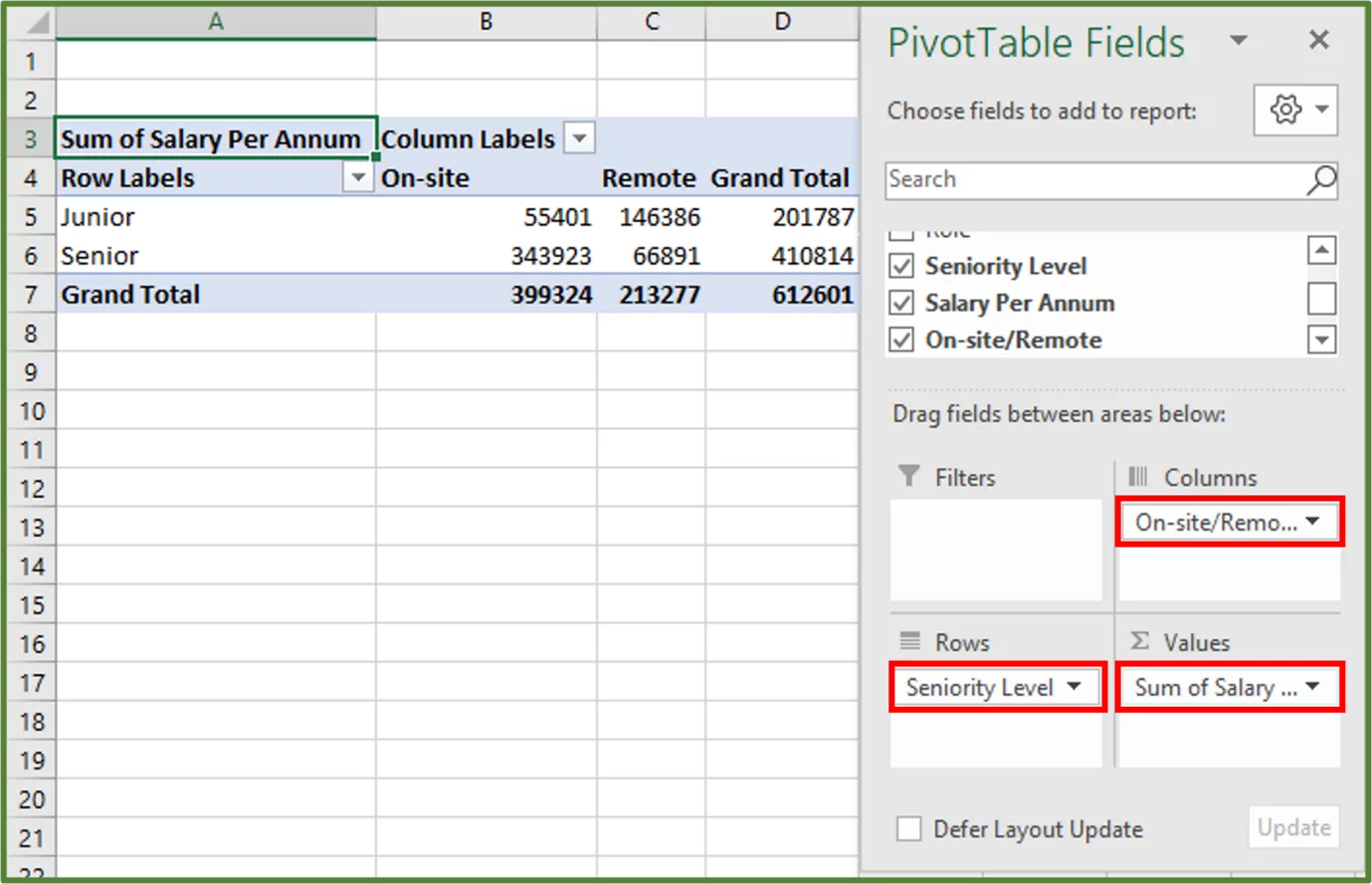
So, using the PivotTable Fields Pane, drag the field Seniority Level to the Rows area, On-site/Remote to the Columns area and the Salary Per Annum field to values as shown.
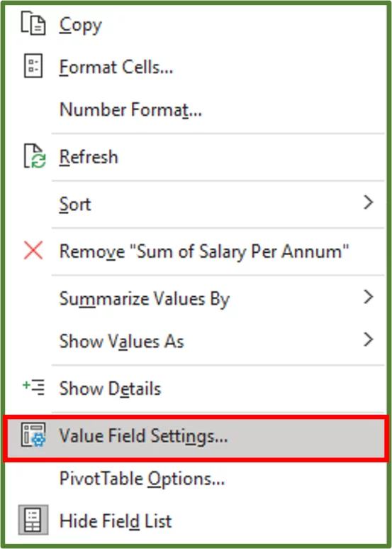
7) Now for some cosmetic changes. To change the format of the salary values to currency, right-click on one of the salary values. In this case, we will right-click cell C6.
8) Select the Value Field Settings… option.
9) In the Value Field Settings Dialog Box, click on the Number Format button.
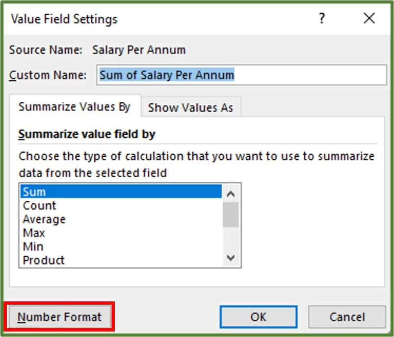
10) Using the Format Cells Dialog Box which should appear, select Currency. Set the decimal places to zero and choose the appropriate currency symbol.
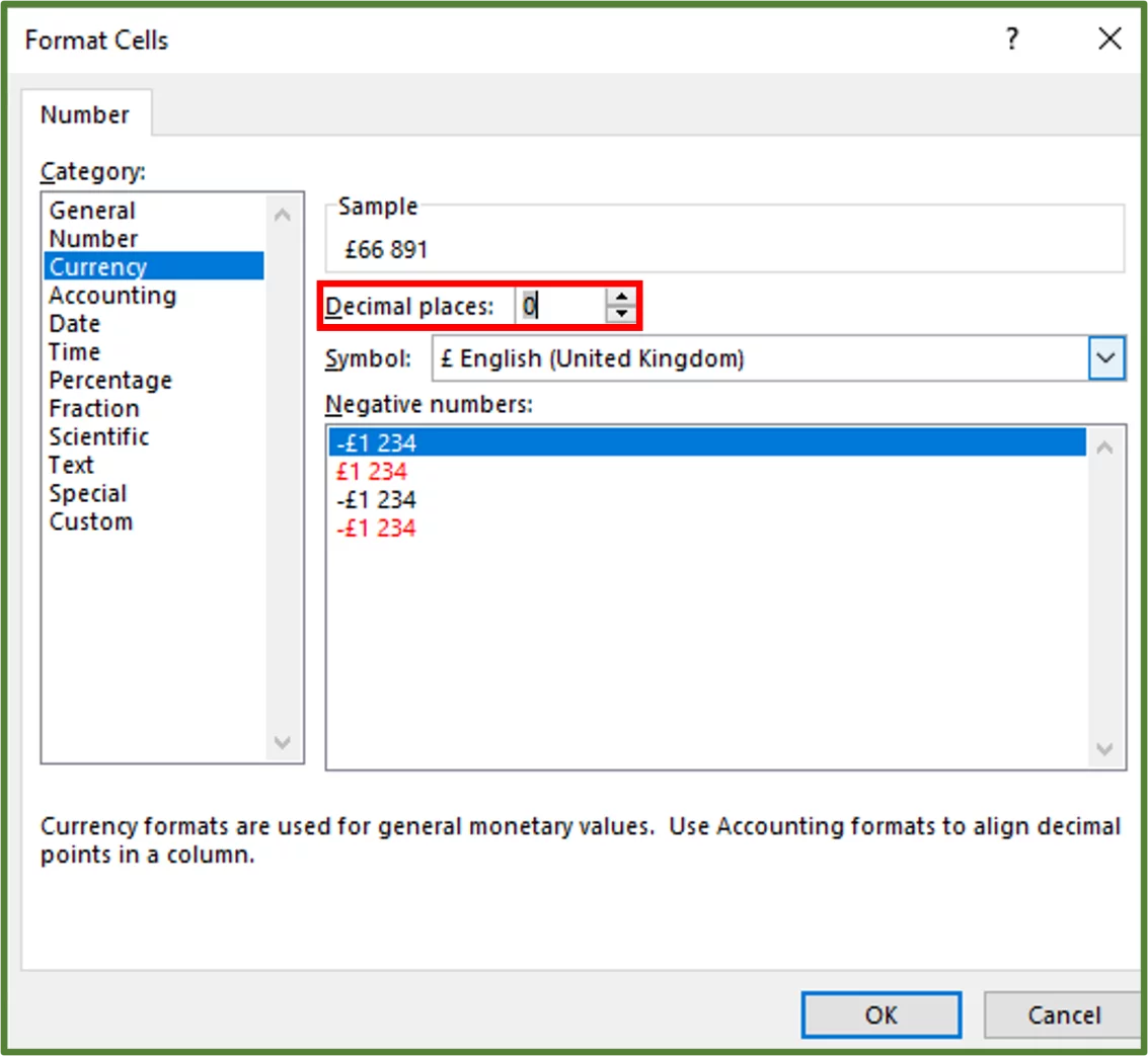
11) Click Ok and then Ok. The values section should now have currency format applied.
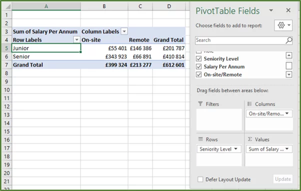
We can now see the salary data broken down by Junior and Senior levels, as well as the onsite and remote divisions.
Taking it one step further: You can do a number of other things with Pivot Tables such as add Calculated Fields, filter with Slicers and add a Report Filter.
Conclusion
You will often be presented with data that needs to be analysed in a meaningful way. Excel provides plenty of tools to get you started with organizing and summarizing your data.
Once you are comfortable with the standard data analysis features, you should consider taking the next step and learning about automation with VBA and Power Query.
Special thank you to Taryn Nefdt for collaborating on this article!

- Facebook: https://www.facebook.com/profile.php?id=100066814899655
- X (Twitter): https://twitter.com/AcuityTraining
- LinkedIn: https://www.linkedin.com/company/acuity-training/