
News & Tips
AllAdobe InDesignManagementMicrosoft CopilotMicrosoft ExcelMicrosoft Power AutomateMicrosoft Power BIMicrosoft PowerPointMicrosoft ProjectMicrosoft SharePointMicrosoft WordNewsPresentation SkillsSQLTime Management
Is Power BI Easy to Learn?
The difficulty of Power BI depends almost entirely on what you’re trying to do with it. There’s a huge gap between “I can use Power BI” and “I’m a Power BI expert” and most people won’t tell you that. If…

How Remote Access Fits Into Excel Training
Running Excel training courses across London, Guildford and Manchester means we think about device security differently to most companies. Every week, dozens of learners from different places sit down at our machines across the country and spend the day working…
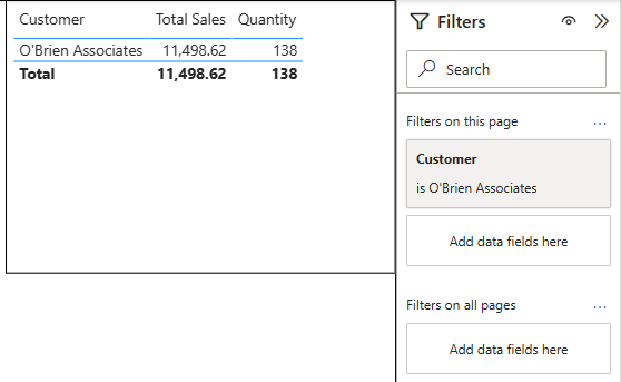
Power BI URL Filters – How To Pre Filter Your Reports!
Most Power BI users share reports one of two ways: they send the full report URL and ask people to filter it themselves, or they build separate reports for each team and spend the next year maintaining them. Neither approach…
How To Think With Copilot
We’ve been teaching Copilot ever since it first released to the public, and this is the most important thing we teach: How do you actually approach your work with Copilot in mind? Most people who struggle with Microsoft Copilot aren’t…
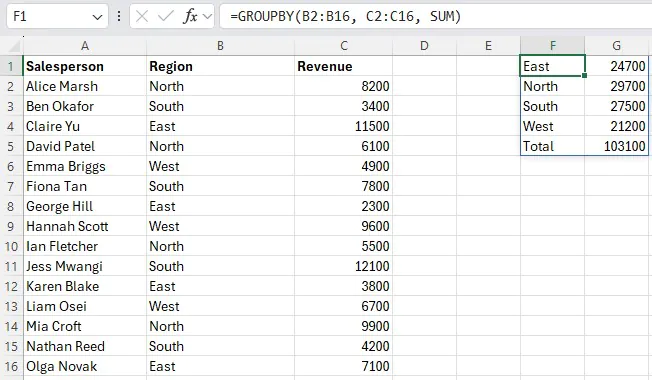
Excel’s GROUPBY Function: What It Does & When to Use It
If you’ve ever built a summary table in Excel by writing five separate SUMIFS formulas – one for each region, product, or department – you’ll appreciate what GROUPBY does. It collapses all of that into a single formula that updates…
Excel’s IMAGE Function: Put Pictures Directly Into Your Cells
Managing a spreadsheet with product images, staff photos, or visual data has always been awkward. You insert a picture, it floats over the cells, refuses to stay where you put it, and the moment anyone resizes a column the whole…

Power BI Statistics You Need To See (2026)
Power BI continues to dominate the analytics and business intelligence market. From small businesses, to the biggest conglomerates in the world – Power BI is the go-to software. As a Power BI training company, it’s important we stay on top…
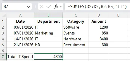
SUMIFS for Budget Reporting: Build A Summary Dashboard Without Pivot Tables
We run Excel workshops in London every month, so we get to spot a lot of trends on how users use Excel at their jobs. There are countless project managers and finance assistants all over the UK building summary dashboards,…

Copilot In Microsoft Edge – Research Workflows
Most people know Copilot as the amazing assistant inside Excel or Teams. What far fewer people use (or even know exists!) is Copilot built directly into the Edge browser itself. For anyone whose job involves researching information, reading reports, comparing…
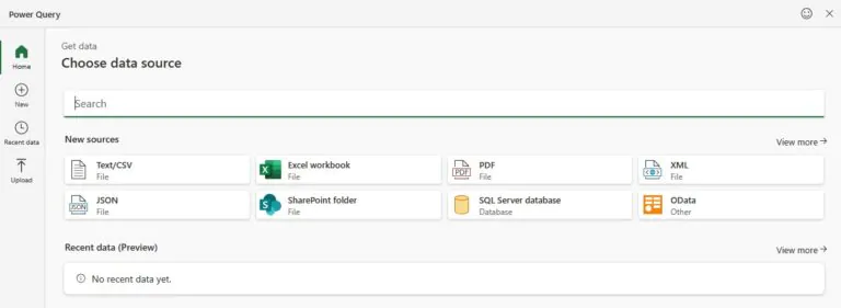
Power Query in Excel for the Web: What’s Changed
For years, Power Query was one of the main reasons Excel users couldn’t fully move their work to their browsers. You could view query results in Excel for the web, but if you needed to actually build or edit a…
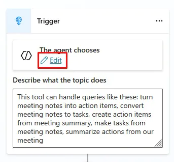
Copilot Studio – Building A Useful Meeting Agent
If you’ve been playing around with Copilot in Excel, Outlook, or Teams – you’ll know this: It’s incredible at drafting and summarising… But it doesn’t always do something practical. Copilot Studio and agents is where that all changes. Instead of…
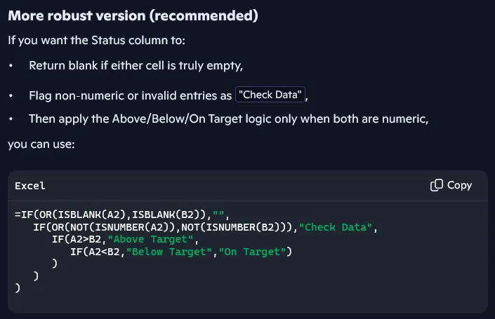
Using Copilot To Generate Formulas In Excel
Writing formulas is one of the most useful – but also the most frustrating – parts of working with data. Even when you know exactly what you need to calculate, it still takes time and knowledge to: Build the logic…
- Facebook: https://www.facebook.com/profile.php?id=100066814899655
- X (Twitter): https://twitter.com/AcuityTraining
- LinkedIn: https://www.linkedin.com/company/acuity-training/