
Microsoft Power BI
Our Power BI articles below clearly and simply how to use specific aspects of Microsoft Power BI that we also cover in our Power BI training courses.
AllAdobe InDesignManagementMicrosoft CopilotMicrosoft ExcelMicrosoft Power AutomateMicrosoft Power BIMicrosoft PowerPointMicrosoft ProjectMicrosoft SharePointMicrosoft WordNewsPresentation SkillsSQLTime Management
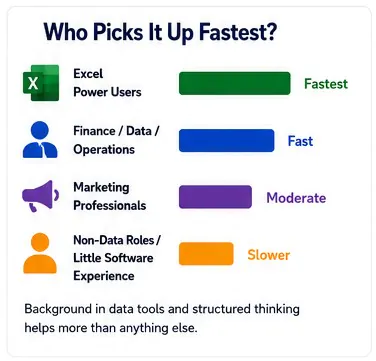
Is Power BI Easy to Learn?
The difficulty of Power BI depends almost entirely on what you’re trying to do with it. There’s a huge gap between “I can use Power BI” and “I’m a Power BI expert” and most people won’t tell you that. If…
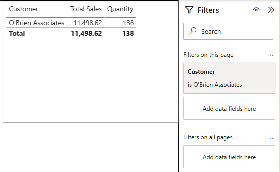
Power BI URL Filters – How To Pre Filter Your Reports!
Most Power BI users share reports one of two ways: they send the full report URL and ask people to filter it themselves, or they build separate reports for each team and spend the next year maintaining them. Neither approach…
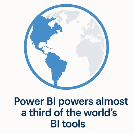
Power BI Statistics You Need To See (2026)
Power BI continues to dominate the analytics and business intelligence market. From small businesses, to the biggest conglomerates in the world – Power BI is the go-to software. As a Power BI training company, it’s important we stay on top…
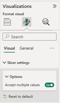
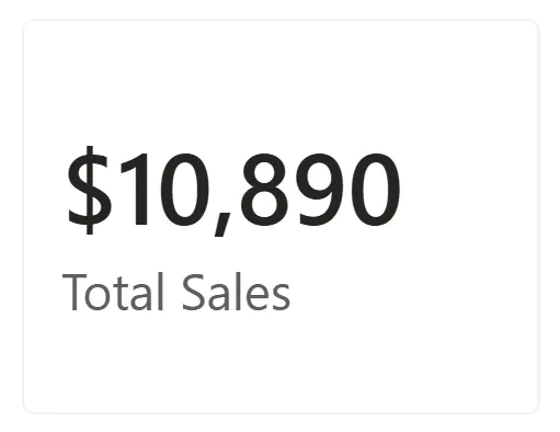
Input Slicer in Power BI – Filter Long Lists Fast!
Filtering large lists in Power BI should not feel like scrolling endlessly through hundreds of dropdown values. The Power BI input slicer makes filtering faster and smarter by allowing users to type or paste values directly into a slicer. Instead…
Power BI Filter Context – How Measures Really Evaluate
Filter context is one of the most important and most misunderstood concepts in Power BI. It is also the reason a single measure can return different values depending on where it appears in a report. This article is written for…
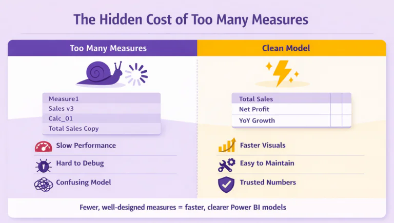
The Hidden Cost of Measures in Power BI
When you first start using Power BI, measures feel like magic. You type a quick SUM or CALCULATE, and your visual updates instantly. It’s exciting, until your model starts filling up with dozens, maybe hundreds, of measures. Before you know…
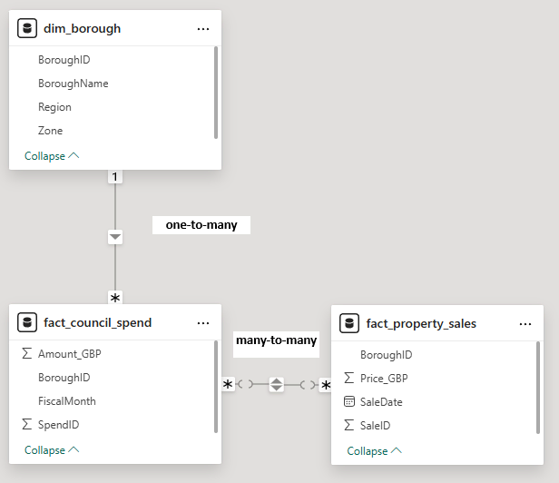
Power BI Relationships Explained (And Why “Many-to-Many” Is Almost Always Wrong!)
Relationships sit at the heart of literally everything you do in Power BI. Before you make measures, visuals and reports, relationships are established to define how your data fits together. Their job is simple on the surface – but vital:…
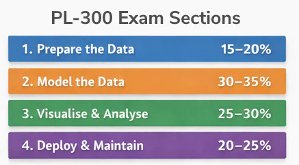
PL-300 and Our Power BI Training
If you are looking to pass the PL-300 Microsoft Power BI Data Analyst exam, you are probably wondering: Do Acuity Training’s Power BI courses actually prepare me for the exam? At Acuity Training, we do deliberately map our course content…

Power BI Courses – Buyers Guide 2026
So you want to go on a comprehensive Power BI course. Which one should you pick? Here’s a clear, numbered breakdown of six leading providers, all to help you make the right choice. To make this list, we reviewed dozens…
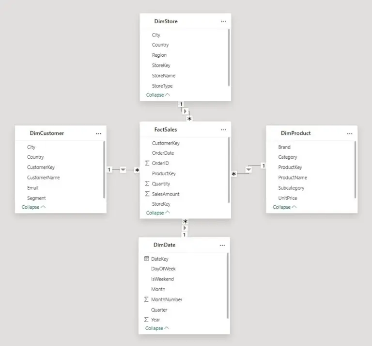
Star Schema vs Snowflake Schema in Power BI: Which Should You Use?
When you start building Power BI reports, it’s tempting to jump straight into visuals. But very quickly, you realise that slow refreshes, confusing relationships, and unpredictable DAX usually point to one thing: the data model. Good modelling is the foundation…

The Best Ways To Learn Power BI
Power BI is one of the most powerful tools for transforming raw data into interactive, insightful dashboards and reports. As more businesses seek data-driven decision-making, mastering Power BI has become an essential skill for analysts, business intelligence professionals, and even…
The 10 Star Schema Mistakes Everyone Makes
Ever had problems with your DAX that just don’t make sense? Sometimes the culprit isn’t actually your DAX, it’s your data model. Star schema mistakes are incredibly common in Power BI, and really hard to track down. When your data model…
- Facebook: https://www.facebook.com/profile.php?id=100066814899655
- X (Twitter): https://twitter.com/AcuityTraining
- LinkedIn: https://www.linkedin.com/company/acuity-training/