
Microsoft Power BI
Our Power BI articles below clearly and simply how to use specific aspects of Microsoft Power BI that we also cover in our Power BI training courses.
AllAdobe InDesignAdobe PhotoshopManagementMicrosoft ExcelMicrosoft Power AutomateMicrosoft Power BIMicrosoft PowerPointMicrosoft ProjectMicrosoft SharePointMicrosoft WordPresentation SkillsSQLTime Management
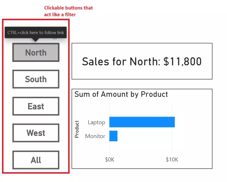
How to Create a Button Slicer in Power BI
Ever felt that standard slicers make your reports look cluttered or confuse non-technical users? Button slicers offer an elegant solution, transforming filtering into intuitive, clickable navigation. Instead of dropdown menus or checkbox lists, button slicers use custom buttons to filter…
How to Troubleshoot and Fix Slow Power BI Reports
Slow Power BI reports waste time and frustrate users. The slowdown often comes from hidden issues in the data model, DAX, visuals, or refresh settings. This guide shows you how to find the cause, fix it, and keep reports running…
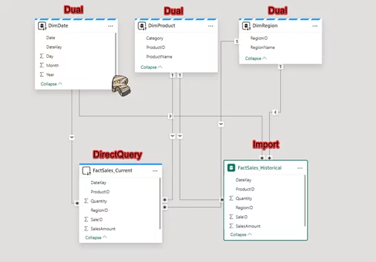
Mastering the Hybrid Model in Power BI: Designing for Speed and Freshness
Imagine delivering a Power BI dashboard that loads in seconds, stays up-to-date throughout the day, and handles billions of rows without breaking a sweat. That’s what a Hybrid Model – sometimes called a composite model – can help you achieve.…
Dynamic Power BI Dashboards with Bookmarks and Buttons
What if your Power BI dashboard could adapt to each user – showing exactly the view they need, right when they need it? With bookmarks and buttons, you can transform a static report into an interactive experience. Users can switch…
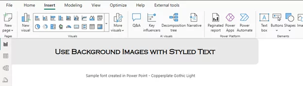
Using Custom Fonts In Power BI
Want your Power BI reports to look more polished and on-brand? Fonts play a big role in how your reports are perceived – impacting clarity, trust, and style. But Power BI doesn’t let you upload custom fonts directly. So, what…
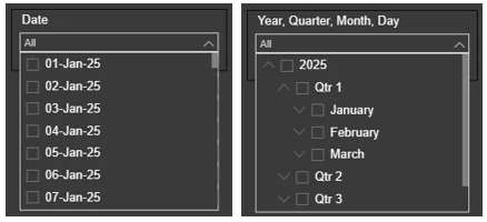
The Day-Level Slicer In Power BI
What if you could zoom in on your data one day at a time? Whether you’re tracking daily sales, monitoring customer behaviour, or managing service operations: Day-level slicers in Power BI give you the precision your reports need. Power BI…

Using The Dynamic Countdown Timer in Power BI
Do you want to track project deadlines, sales targets, or any time-sensitive metrics using Power BI? Or are you looking for a visually appealing way to track days, hours, or minutes in a dashboard until a big project or event?…
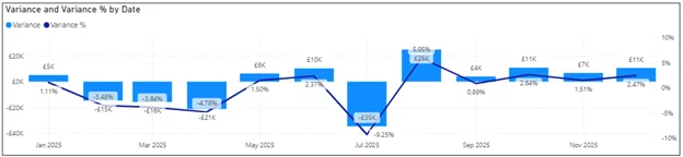
Power BI: How & When To Do A Variance Analysis
Ever wondered why your sales missed the target or expenses went over budget? Variance analysis highlights where performance deviates from expectations and why. In the context of Power BI, it turns dashboards into dynamic tools for faster, data-driven decisions. Variance…
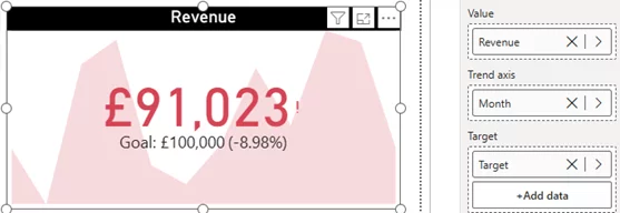
Power BI’s KPI Visuals: What They Are & When To Use Them
Ever wish you could see your business performance at a glance? KPI visuals in Power BI make that possible by turning key metrics into clear, visual indicators. In just seconds, you can see if you’re on track, spot trends, and…
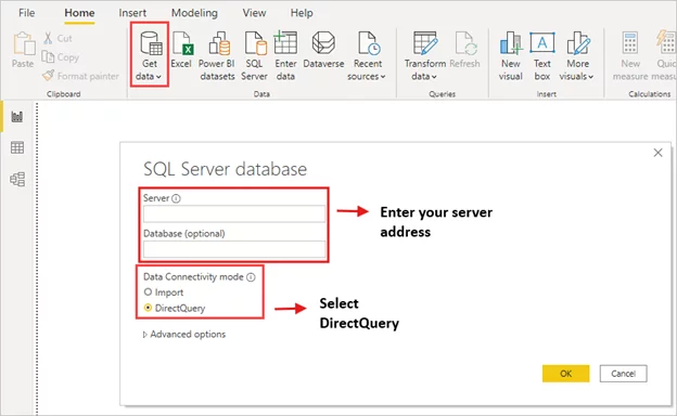
Using DirectQuery in Power BI Datasets
What if your Power BI dashboard could reflect changes the instant they happen? No waiting for scheduled refreshes, no exporting massive files, just live insights pulled straight from your database. That’s what DirectQuery can do for you. Typically, Power BI…
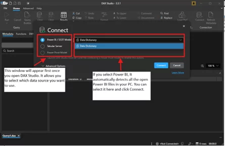
Using Data Dictionaries In Power BI
Have you ever opened a Power BI report and felt overwhelmed by all the columns, measures, and tables? It can feel like a guessing game trying to figure out what each field represents. A well-built data dictionary eliminates that confusion,…
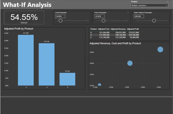
What If Analysis Power BI
What if you could predict the impact of every business decision—before making it? From tweaking prices to cutting costs or increasing sales, you’d see how each change affects your bottom line in real time. That’s exactly what the What If…
- Facebook: https://www.facebook.com/profile.php?id=100066814899655
- X (Twitter): https://twitter.com/AcuityTraining
- LinkedIn: https://www.linkedin.com/company/acuity-training/