
Moving Average Forecast – EXCEL GUIDE
Contents
This post explores how to set up a moving average forecast in Excel.
To calculate a moving average, you take the mean of several values and then track how that average changes over time.
This gives you a great idea of future data patterns, helping you make predictions!
Mastering this is great for so many businesses, which is why it’s covered on our City of London Excel courses.
Step 1: Gather And Organise Data
First, you’ll need to collect the data you want to use for your moving average and set it up in Excel so that it’s easy to work with.
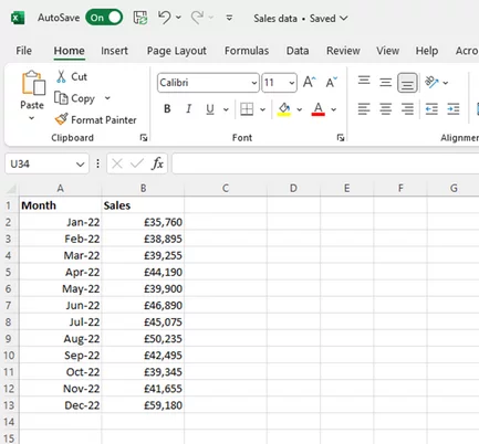
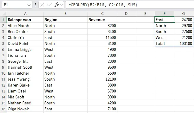
a) Organise Your Data
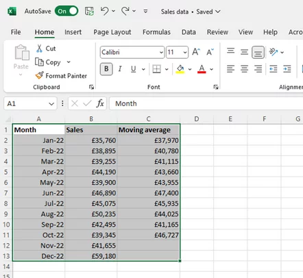
Put the columns side by side, like this:
b) Open A New Spreadsheet
This step isn’t essential, but it can be helpful to extract just the data you want to work with and paste it into a new spreadsheet so you can see what you’re doing.
On top of that, it’s easy to mess up an existing spreadsheet accidentally if you start moving things around to make space for something else.
Using a fresh spreadsheet also means you’ll have plenty of room available to create a chart.
Step 2: Use the =AVERAGE Formula
Next, let’s get into the specifics of how to apply the moving average formula.
a) Choose A Period Based
For this example, we use a 3-month moving average for monthly sales data over a year
The reason we do it this way is that three months is a good base time period for our purposes.
What we’re trying to do here is smooth out the spikiness of the sales data to get at the underlying trend.
If we only look at monthly averages, the overall trend will be obscured by monthly peaks and troughs.
Whereas if we choose a six-month moving average, we might not generate enough data points to gain any meaningful insights.
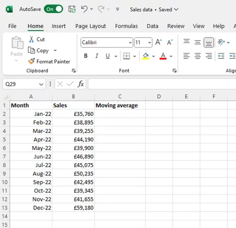
b) Create A New Column
Make this column on the right-hand side, and label it “moving average”.
Like this:
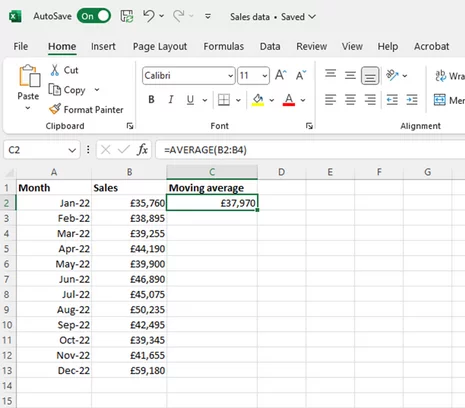
c) Use =AVERAGE(B2:B4)
The AVERAGE function will calculate the average of your highlighted data.
When you do this, Excel automatically calculates the arithmetic mean of the three numbers in cells B2, B3, and B4:
d) Drag Down The Formula
With cell C2 selected, hover over the bottom right-hand corner of it.
When your pointer symbol turns into a small black cross, click and hold, then drag it down the page.
With a bit of Excel magic, it automatically calculates every three-month average for your 2022 sales data.
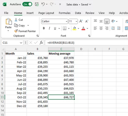
One word of warning: remember not to go too far! The reason we’ve stopped at row 11 is that that’s the final value in the series.
It gives you the three-month average for October to December.
If you drag all the way down to the bottom, you’ll get extra, meaningless averages calculated using zero values from cells B14 and B15, which isn’t what we want.
If you think you might trip up with this, you can start off by putting the January to March average in cell C4 instead of C2 (so aligning it with March rather than January).
Then you can drag all the way to the December line without a problem.
Step 3: Choose A Chart
They say a picture is worth a thousand words, and it’s certainly a good idea when you’re analysing data trends.
So the next stage is to create a chart to help you see what’s going on with the numbers.
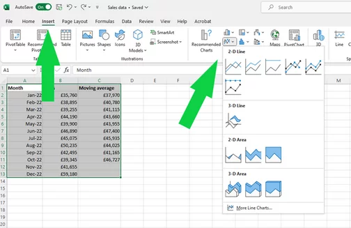
a) Select Your Data
You want to make sure you select everything, including the headers:
b) Choose A Chart
Line charts are good for displaying moving averages because they, well, move. A pie chart wouldn’t be a great choice here.
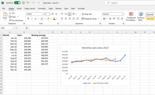
c) Add Labels And Titles
Because you selected the headers along with the data, they appear on the chart automatically. You just need to add a title by clicking at the top where it says “Chart Title” and making it your own.
d) Add A Trendline
To find the Trendline option, click once on the chart and then once on the big cross that appears top right:
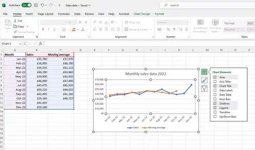
This makes a list appear, and all you have to do is tick the “Trendline” box (and state which series you want it calculated for) to add one to your chart:
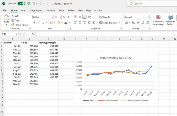
Step 4: Analyse The Results
Now we can see the trendline, it gives us a fair idea of how sales are developing.
Here you’ll notice a gentle upward slope, which is good news!
If you do this on your own data and notice a downward trend, it’s probably time to take action!
If you are struggling, we have this template you can use, just change the data to whatever you like!
Moving Average Forecasts – Use Cases
Moving average forecasting offers a structured and analytical approach to predicting future trends based on historical data.
For that reason, it crops up in a wide range of fields, from accounting to project management. Some of the specific benefits include:
1 – Creating Planning Strategies
The power of this technique is in smoothing out fluctuations in sales data.
Itlets companies align their production capacity with the forecast to optimise the process.
This means avoiding the potential problems of overproduction and underproduction!
2 – Streamlining Inventory Management
Another plus is that this technique makes it more straightforward to predict periods of stronger demand, which is ideal for efficient inventory management.
Let’s say a fashion retailer wants to identify seasonal fluctuations in demand.
As summer approaches, identifying exactly when to start stocking summer dresses can make a huge difference to the bottom line.
Jump too soon or too late, and the retailer could miss out on sales. Moving average forecasting helps managers judge it just right.
3 – Predicts Demands
This can be useful in all kinds of situations.
A hotel can use moving average forecasting based on data from past occupancy rates.
This will let them predict how much staff it will need for each season.
4 – Aids in strategic investment decisions
It can sometimes be a challenge for organisations to decide which business tools are worth spending money on, and which aren’t entirely necessary.
Let’s say a startup is thinking about switching to payroll automation software.
The senior team can use a moving average forecast to predict when their staff numbers will hit a particular level, where use of such software becomes cost-effective.
That way, they can prepare to make the switch at the right time.
Final thoughts
As you can see, moving average forecasting is both a simple and powerful technique.
And luckily, getting started with it using Excel is pretty straightforward.
You’ll probably find all sorts of useful applications for it in your own work.
Feel free to experiment. One of the great things about Excel is its flexibility, so you’ll discover plenty of ways to customise your forecasts to suit your needs.

- Facebook: https://www.facebook.com/profile.php?id=100066814899655
- X (Twitter): https://twitter.com/AcuityTraining
- LinkedIn: https://www.linkedin.com/company/acuity-training/