
The Day-Level Slicer In Power BI
Contents
What if you could zoom in on your data one day at a time?
Whether you’re tracking daily sales, monitoring customer behaviour, or managing service operations:
Day-level slicers in Power BI give you the precision your reports need.
Power BI offers great flexibility for filtering by year, quarter, or month.
But when daily trends drive your decisions, default settings just aren’t enough.
Understanding Date Hierarchies In Power BI
When you add a date field to a slicer, Power BI usually applies a built-in hierarchy.
That means your users see Year, then Quarter, then Month – before they can even get to the day level.
While useful for summary reporting, this setup can slow down users who need exact dates.
To fix this, you simply switch from the hierarchy view to the flat date format.
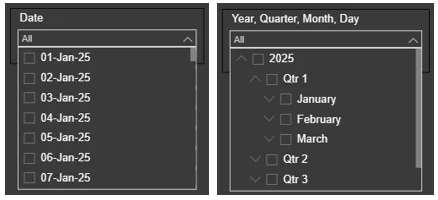
Once set to “Date,” your slicer will list or allow selection of specific calendar dates, no extra clicks required.
How To Create A Day-Level Slicer
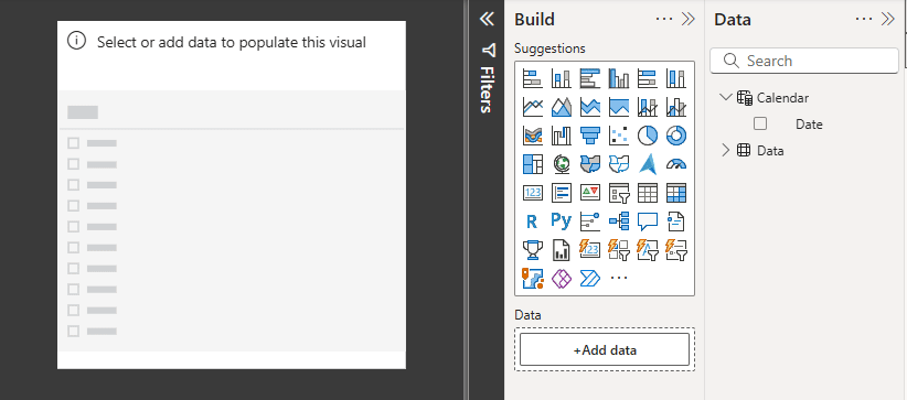
Start by dragging your date field into a slicer visual.
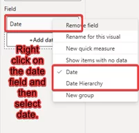
Then, click the field dropdown and select “Date” instead of “Date Hierarchy.” This tells Power BI to treat each date as a unique value.
Next, choose how users will interact with the slicer.
You can show dates as a list, a dropdown, or let them pick a range using the “Between” option.
Format your date as dd-mm-yyyy or similar for better readability.
A well-configured slicer makes daily analysis fast and frustration-free.
You can also combine this with incremental refresh to keep the data fresh day-to-day!
Creating A Custom Calendar Table (Optional)
If you want better control and performance, consider creating your own calendar table.
It ensures every date is available, even if no data exists for that day.
Use this formula in the Modelling tab:
Calendar = CALENDAR(DATE(2025,1,1), DATE(2025,12,31))
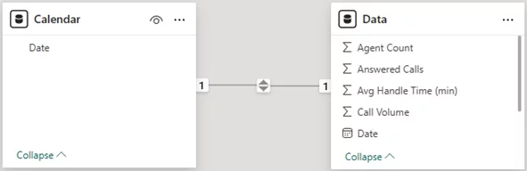
Then connect the calendar’s Date column to the date field in your fact table.
This approach is especially helpful when working with large datasets or complex models.
Trainer Insight: As we cover in our Power BI training courses, calendar tables are essential for accurate analysis.
Without it, you’ll run into missing dates if there’s no activity in your data for that day, it’ll cause confusion for report users.
A continuous calendar keeps slicers showing the full date range and provides a strong base for advanced analysis.
Tips for Better UX
To make day-level filtering even more intuitive, consider using relative date slicers like “Last 7 Days” or “Yesterday.”
These are great for dashboards that need to stay current without manual updates.
Label your slicers clearly, so users know what they’re selecting, names like “Select Report Date” work far better than just “Date.”
If your report covers a long timeline, try limiting the date range shown to only the relevant period.
It’ll improve performance and reduce visual clutter.
Common Issues & Solutions
If your slicer isn’t displaying dates, it’s often because the field isn’t set to the Date/Time data type.
Fixing the column format in Power BI or your source data will solve it.
Another common issue is when visuals don’t respond to the slicer.
Check your model relationships to ensure the date is properly linked to your main dataset.
Trainer Insight: One of the easiest ways to speed up a report is to limit how much data your visuals have to process.
If the report feels slow, narrow the date to just the period you really need, or use relative slicers.
This keeps your reports lightweight, responsive, and far easier for users to navigate.
Practical Use Cases
Day-level slicers are a must for roles that need to monitor data at a daily rhythm.
Sales teams use them to track revenue spikes. Web analysts use them to identify traffic surges.
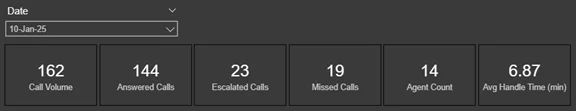
But one of the most impactful applications I’ve seen was in a call center dashboard.
The team needed to see how many calls were handled, missed, or escalated – every single day.
With daily filtering, they could instantly review performance for any shift or date, and respond quickly to service gaps.
It turned their reports into a real-time operations tool.
Conclusion
Day-level slicers may seem like a small feature, but they unlock powerful insights.
They give users the ability to track, react, and refine decisions with day-to-day precision.
For the best experience, combine slicers with a clean calendar table, limit your date ranges, and keep the slicer format simple and clear.
If daily granularity matters to your business, this is one Power BI skill you don’t want to skip.
- Facebook: https://www.facebook.com/profile.php?id=100066814899655
- X (Twitter): https://twitter.com/AcuityTraining
- LinkedIn: https://www.linkedin.com/company/acuity-training/