
Power BI Measures vs Calculated Columns: What’s the Difference?
Contents
Both measures and calculated columns perform calculations, so why does Power BI have two options?
They may look alike, but they work in different parts of the engine and serve different purposes.
Understanding this difference early helps you design reports that are faster, cleaner, and far more flexible.
What Is a Calculated Column?
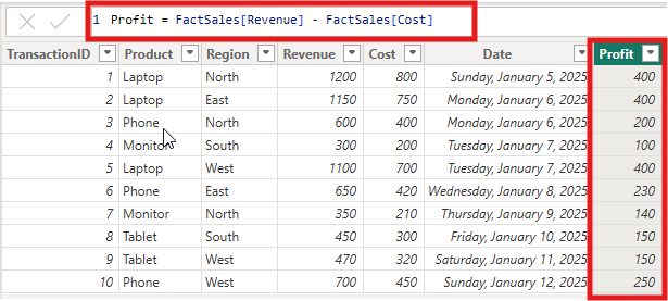
A calculated column is a new field added to a table that performs a row-by-row calculation.
Power BI evaluates the formula for each record and then stores the result in the data model.
You can think of it like adding a new formula column in Excel — the values are saved and ready to use anywhere in your report.
Example:
Profit = Sales[Revenue] – Sales[Cost]
Each transaction now has its own profit value that can be filtered, grouped, or sorted.
When to use a Calculated Column
To filter and slice data with precision. Calculated columns can be used directly in slicers, filters, and visuals where you need fixed, stored values.
Practical example:
A sales analyst creates a Profit Category column to label each product sale as “High” or “Low” margin.
The column can then be used in slicers or grouped visuals to quickly see which product lines contribute most to profit.
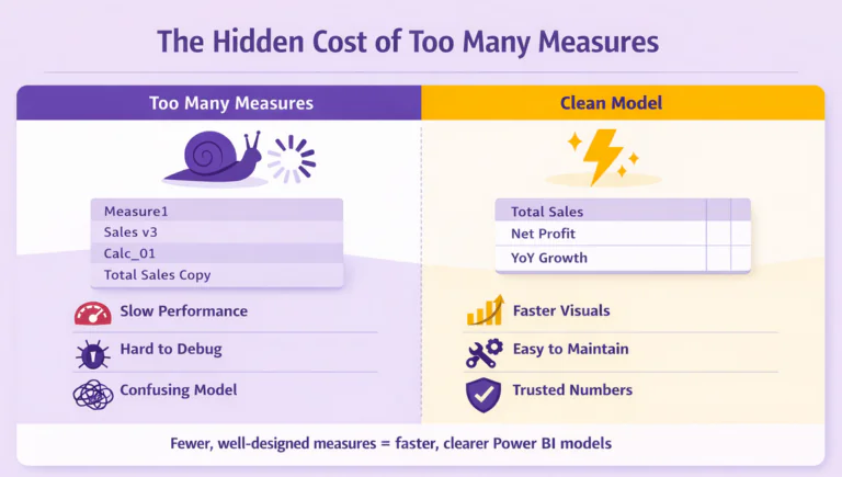
Pro Tip: Calculated columns store their results, so they increase model size.
Use them for values that must exist in the data model, not for totals or aggregates that can be calculated dynamically.
What Is a Measure?
A measure is a formula that Power BI calculates on demand. It doesn’t store data. Instead, it evaluates results based on filters, slicers, or visuals active at that moment. In practice, however, they often have a hidden cost to your performance.
Example:
Total Profit = SUM(Sales[Revenue]) – SUM(Sales[Cost])
Whenever a user changes the selected region, product, or period, the measure recalculates automatically to reflect that context.
Benefits of Using a Measure
- Keeps your model small and efficient. Since measures are not stored, they don’t increase file size.
- Responds to filters in real time. Measures adjust automatically as users interact with the report.
- Ideal for KPIs and aggregations. They are best for totals, averages, percentages, and ratios.
- Improves report performance. Calculations happen only when needed, keeping dashboards responsive.
Practical example:
A finance manager creates a Total Profit Margin measure to calculate profitability for the selected time frame.
When a user changes filters, the value updates instantly, making analysis interactive and fast.
Important Note! According to Microsoft Learn, measures are optimized for aggregation and should be used for most calculations that summarize data rather than operate row by row.
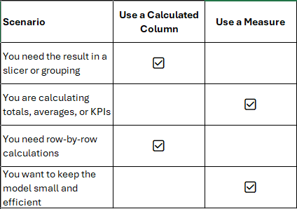
When to Use Each
Choosing between a measure and a calculated column depends on the goal of your calculation. The table below can help you decide.
Quick Comparison Example
- Calculated Column Example:
Profit Margin = (Sales[Revenue] – Sales[Cost]) / Sales[Revenue]
Use this when you need to classify or filter transactions individually, such as “High” vs. “Low” margin sales. - Measure Example:
Total Profit Margin = DIVIDE([Total Profit], [Total Revenue])
Use this when you want to view the overall profit margin for a selected region or date range.
Tip: If your calculation summarizes data, use a measure. If it needs to exist for every row, use a calculated column.
Example Dashboard Comparison
To see how these work differently, imagine a simple sales dashboard.
Scenario 1: Using a Calculated Column
You add a column that categorizes each transaction as “High” or “Low” profit based on margin percentage. It works well for row-level analysis, but your data model grows because the values are stored for every record.
Scenario 2: Using a Measure
You instead define a Total Profit measure:
Total Profit = SUM(Sales[Revenue]) – SUM(Sales[Cost])
This approach keeps your model compact. The calculation runs dynamically when the user interacts with filters or visuals. Reports stay fast, even with large datasets.
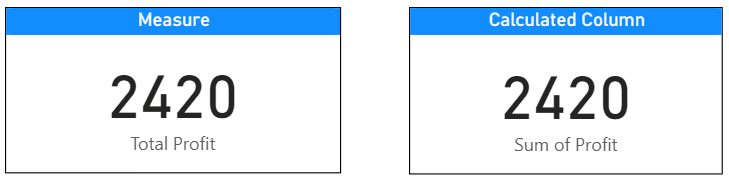
The Measure uses a DAX formula that aggregates data dynamically. It sums the Revenue and Cost fields only for the data currently filtered in the report. This means the value changes instantly when the user applies slicers or filters.
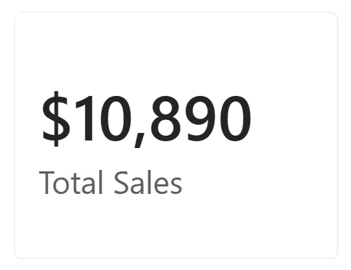
The Calculated Column stores a Profit value for every row in the table. When placed in a Card visual, Power BI automatically aggregates (sums) all those stored values to produce a total.
Best Practices
- Use measures for most calculations to keep your model light and dynamic.
- Create calculated columns only when you need stored values for slicing or grouping.
- Use consistent naming conventions, for example, Total Sales, Profit Margin, Revenue Target.
- Regularly test refresh and query performance as your model grows.
- Document each calculation in a data dictionary for clarity and governance.
Trainer Insight
From experience training Power BI beginners, this topic often causes a lot of confusion. Both methods look like formulas, so learners assume they behave the same.
A simple analogy helps clarify the difference:
“A calculated column is like adding a formula in Excel that fills down for every row.
A measure is like using a formula in a Pivot Table that changes as you filter data.”
Once learners visualize it this way, they understand that calculated columns belong to rows, while measures belong to filters.
Conclusion
Understanding when to use a calculated column or a measure is a key step toward building efficient Power BI reports.
- If you are working at the row level or need a field for filtering or grouping, use a calculated column.
- If you are summarizing or aggregating data, use a measure.
Choosing wisely helps you create faster, cleaner, and more professional dashboards that scale with your data.
- Facebook: https://www.facebook.com/profile.php?id=100066814899655
- X (Twitter): https://twitter.com/AcuityTraining
- LinkedIn: https://www.linkedin.com/company/acuity-training/