
Power BI’s Drill Down Line PRO Visual
Contents
If you’ve built a Power BI report and your users looked at a line chart only to ask:
“Can we break this down by quarter, region, or product line?”
You know the struggle with static visuals.
That’s where the Drill Down Line PRO from ZoomCharts steps in.
It takes a normal line chart and makes it interactive.
What Is Drill Down Line PRO?
Drill Down Line PRO is part of ZoomCharts’ family of advanced Power BI visuals built specifically for enhanced line chart analysis.
Unlike the default Power BI line chart, this premium visual lets users move seamlessly through hierarchies with simple clicks.
Think of it as a smarter line chart: click a year to see quarters, click again for months. All in one place, no extra charts needed.
The beauty of Drill Down Line PRO is that it works exactly like Power BI’s standard line chart.
Same drag-and-drop interface, same field wells (Category, Values, Legend).
So you can build it the exact same way as a line chart, but you get so much more out of it.
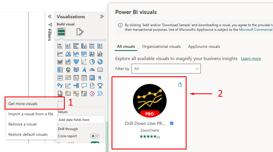
To enable Drill Down Line PRO in Power BI:
1 – Click the triple dot (…) icon in the Visualization pane
2 – Get more visuals
3 – Search “Drill Down Line PRO by ZoomCharts”
4 – Click Add.
Why Use It?
The standard Power BI line chart is fine for the basics. But if you’re dealing with:
- Multiple hierarchies that need interactive exploration
- Dozens of series to compare side by side
- Stakeholders who want to dig into details right away
…then the standard visual starts feeling like a locked box.
Drill Down Line PRO opens that box.
Real-World Applications
- Financial Dashboards – Start at yearly revenue, then drill into quarters, months, or days.
- Sales Performance – Compare up to 25 products or regions in one view. Drill from yearly to quarterly to monthly trends.
- Operational Metrics – Track things like defects, downtime, or response times with clear thresholds.
- Forecasting & Planning – Compare actuals (solid) vs. forecasts (dotted).
From Our Power BI Courses:
We once worked with a CFO who had a daily dashboard to track cash flow.
His standard Power BI line chart showed yearly cash flow, but every morning, he’d ask his analyst for a new report.
Sometimes breaking it down by quarter, then month, and sometimes even by day.
His analyst spent over an hour each day creating these one-off reports.
We replaced that single static line chart with Drill Down Line PRO. Within a week, the analyst’s daily request disappeared.
The CFO could now click through the data himself in seconds, going from a yearly view to a daily view on the same page.
The efficiency gain was massive, and the CFO felt more in control of the data.
Understanding the Limitations
1 – It’s not free
Drill Down Line PRO is a premium visual, so budget for licensing.
2 – There’s a learning curve.
More options mean more setup time, but once users get it, it feels natural.
3 – Not everything needs it.
Don’t force interactivity on simple charts. Use it where exploration truly adds value.
Download the Example File
To get started, download the PBIX file provided with this guide here.
It contains a sample sales dataset with 300+ transactions across 4 years.
There are pre-built visuals so you can focus on learning the Drill Down Line PRO features without setting up data from scratch.
This example was created and tested in the latest version of Power BI Desktop.
Remember, ZoomCharts visuals are paid, but you can preview them for free for the first 12 hours or get a free trial for 30 days.
Page 1: Standard Line Chart vs Drill Down Line PRO
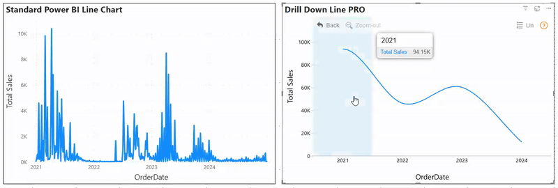
The left line chart is Power BI’s default line chart showing sales over time.
It works, but you’re stuck on one time level and can’t drill deeper.
On the right, the same data is shown with Drill Down Line PRO. Notice the hierarchy (Year → Quarter → Month → Day).
You can click and drill down smoothly without switching visuals or pages. Notice also that it cross-filters the other chart.
Key takeaway: Standard charts are static. Drill Down Line PRO makes data exploration interactive.
Page 2: Multi-Series Comparison
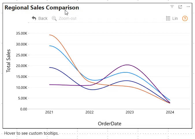
This is where Drill Down Line PRO really stands out, as it handles multiple series easily (up to 25!).
Here we’re looking at monthly sales across North, South, East, and West regions.
Hover over any point and you instantly see all region values together. No need to hover four times to compare performance.
Pro tip: Solid vs dashed lines and line colours keep the chart clean while still comparing multiple metrics.
Page 3: Thresholds & KPIs
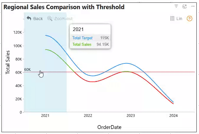
Business leaders want to see performance against targets. Here, actual sales are shown against targets, with a bold red threshold line.
Conditional formatting was applied here. It highlights results of total sales: green for above the threshold and red for below.
This lets users spot issues right away.
Business value: Executives can see gaps instantly and drill in to find when and where targets were missed.
Insights From Our Training:
One financial planning team had a complex, multipage report for comparing budgets to actuals for different cost centres.
It was a massive document that made cross-comparisons nearly impossible.
We consolidated all of this into a single report page using Drill Down Line PRO.
We set up the chart to display all cost centres as separate series.
This allowed the team to use the chart’s built-in drill-down to explore the data by cost centre and even by sub-category.
Page 4: Forecasting Clarity
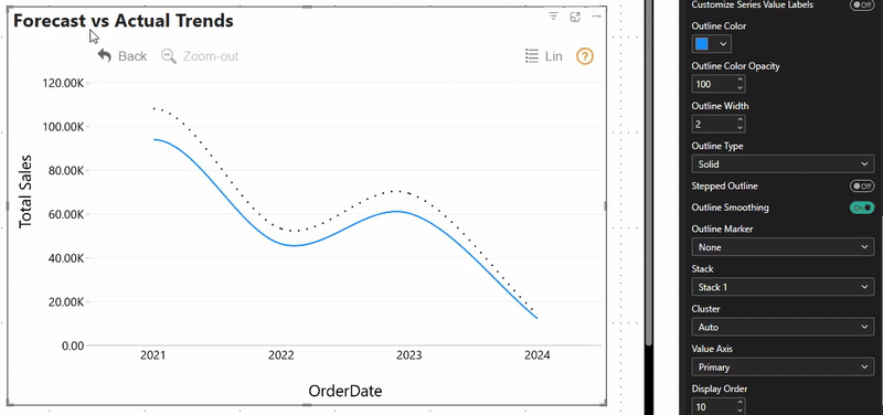
When showing forecasts, clarity matters. Actuals appear as solid lines, forecasts as dotted; so users know what’s real vs projected.
You can also toggle between stepped lines for detail or smoothed curves for trends.
Tip: Always separate actual and projected data visually.
Typical Strategy
Phase 1 Single Chart Replacement:
Identify one line chart where stakeholders always want more detail. Replace it with Drill Down Line PRO and enable basic drill functionality.
Phase 2 Gather Feedback:
Ask users how they find the experience. Are they drilling as expected? Did it uncover insights they couldn’t get before? Refine the setup based on feedback.
Phase 3 Expand Carefully:
If it proves useful, replace other charts selectively. Don’t just convert everything. Focus on where interactivity adds real value.
Phase 4 Add Advanced Features:
Once users are comfortable, layer in thresholds, conditional formatting, or multiple series where they solve real problems.
Best Practices for Implementation
- Start simple. Don’t drop in 20+ series right away. Begin with 3–4 lines and expand only if users ask for more.
- Use conditional formatting sparingly. If everything is highlighted, nothing stands out.
- Match drill hierarchies to business logic. People think “Year → Quarter → Month,” not “Dataset field A → Field B.”
- Watch performance. Complex rules + big datasets = slower visuals. Test before you roll out.
- Stay consistent. Colours, styles, and design should match the rest of your report.
Conclusion
Drill Down Line PRO turns static line charts into dynamic exploration tools.
Stakeholders can answer follow-up questions themselves instead of waiting for new reports or extra visuals.
It shines in scenarios where interactivity adds genuine value like finance, sales, and operations.
It helps users switch effortlessly between the big picture and the finer details.
Drill Down Line PRO also works seamlessly with other Power BI visuals.
Start small, keep it clear, and let your users show you where interactivity makes the most impact.
- Facebook: https://www.facebook.com/profile.php?id=100066814899655
- X (Twitter): https://twitter.com/AcuityTraining
- LinkedIn: https://www.linkedin.com/company/acuity-training/