
Power BI Data Stories Gallery – Showcase And Learn
Contents
The Power BI Data Stories Gallery is an overlooked gem for Power BI users.
It’s an amazing platform to explore community-created dashboards, get feedback, and draw inspiration.
Whether you’re a data analyst looking to showcase your work, or a beginner trying to learn through examples:
The Data Stories Gallery provides an excellent opportunity to engage with real-world visuals and storytelling techniques.
What Is The Power BI Data Stories Gallery
The Data Stories Gallery, hosted on the Microsoft Fabric community site, is a curated collection of reports and dashboards built by Power BI users from around the world.
It’s similar to using Publish to Web, but has a dedicated gallery to showcase what people upload.
Each entry is a published report accompanied by a description that walks viewers through the story it tells.
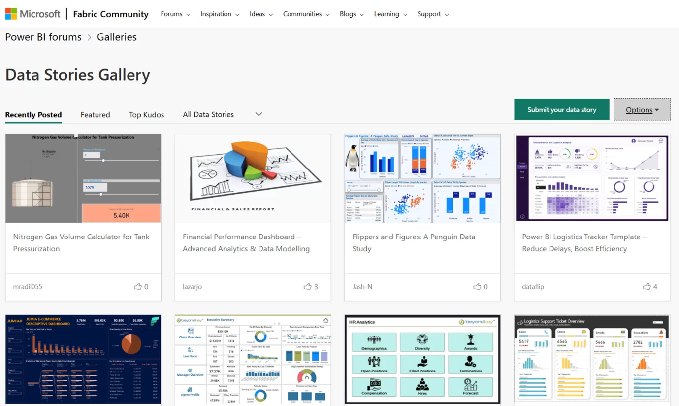
Power BI Data Stories Gallery homepage showcasing featured community reports.
This is not just a showcase, it’s a learning tool.
You can explore how different creators approach layout, interactivity, visuals, and data storytelling.
Many entries also include downloadable PBIX files for hands-on exploration.
As we teach on our Power BI courses, collaborating and learning from others is a fantastic way to help solidify your knowledge.
Why Use the Data Stories Gallery?
1. Learn from Real Examples
The gallery helps you see how experienced users design dashboards to convey insights.
It’s like browsing a design portfolio for data storytelling.
Trainer Insight
Power BI courses give you a complete foundation to start building from.
However, learning from real world examples is one of the best ways you can keep expanding on your knowledge!
This is the main reason why the Data Stories Gallery is so useful.
2. Showcase Your Work
You can upload your own reports, get feedback from the community, and build your profile as a Power BI pro.
3. Get Inspired
When you’re stuck on how to visualize a dataset, browsing the gallery can spark ideas and help you think creatively.
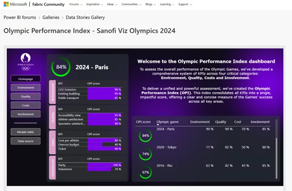
Presenting a featured dashboard from the Power BI Data Stories Gallery.
How to Upload to the Gallery
Uploading is straightforward but requires attention to a few key steps:
1. Prepare Your Report: Ensure your report tells a clear story, uses clean visuals, and has no sensitive data.
2. Publish to Web: Use Power BI’s Publish to Web feature to generate an embed link.
3. Post in the Community:
- Go to the Data Stories Gallery
- Click “Submit your data story”
- Write a title and description that walks viewers through your story
- Embed the report link using the “Insert video” or iframe tool
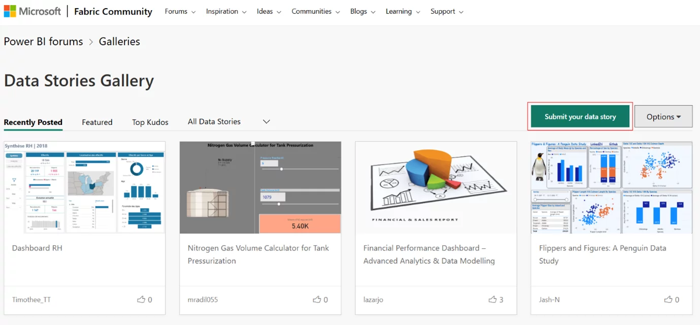
The ‘Submit your data story’ option enables users to share their Power BI dashboards with the community.
Tips for Creating a Standout Submission
- Tell a Story: Don’t just dump data—guide your viewers with context and narrative.
- Keep It Visual: Use appropriate visuals and avoid clutter. Less is more.
- Be Interactive: Include slicers, bookmarks, and tooltips for dynamic exploration.
- Describe Your Process: In your post, explain your design choices and the problems you solved.
- Respond to Feedback: Engage with commenters and update your report if needed.
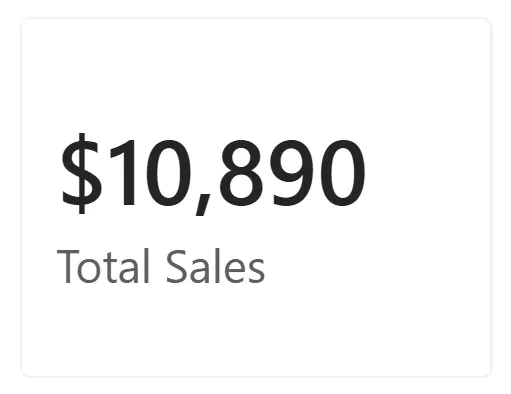
Interactive tooltip shown in the dashboard visual.
Best Practices From The Community
Browsing top-rated posts reveals some common themes:
- Use consistent colour palettes
- Incorporate storytelling elements like KPIs and annotations
- Highlight insights rather than raw data
- Use navigation buttons and bookmarks for a report-like feel
Many contributors credit the gallery with helping them land jobs, build portfolios, or refine their Power BI skills.
Final Thoughts
The Power BI Data Stories Gallery is a goldmine for both learning and sharing.
Whether you’re looking to grow your skills or establish credibility as a data professional, participating in the gallery can be a powerful step forward.
- Facebook: https://www.facebook.com/profile.php?id=100066814899655
- X (Twitter): https://twitter.com/AcuityTraining
- LinkedIn: https://www.linkedin.com/company/acuity-training/