
Power BI for London Project Managers: Visualising Costs, Risks, and Timelines
Contents
London never stops building, from new transport links to borough-wide refurbishments.
But with so many moving parts, keeping track of costs, risks, and timelines is never simple.
That’s where Power BI steps in. It pulls scattered project data into clear, interactive dashboards that tell the full story.
In this guide, you’ll learn how to build a London-focused project dashboard that tracks budgets, timelines, and performance.
All to help you make faster, smarter decisions every day!
Step 1: Create a Project Data Model
Just like our London Power BI training, a good Power BI dashboard starts with a clean, well-structured model.
For this project, you’ll need a FactProjects table and a DimBorough table.
FactProjects.csv might include:
- Project Name
- Borough
- Department
- Start/End Dates
- Budget
- Cost
- Percent Complete
- Status
- Contractor
- Risk Score
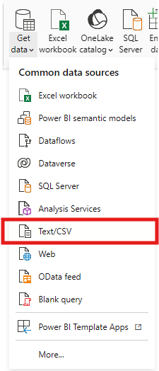
Let’s start with importing our data. Click on Get data.
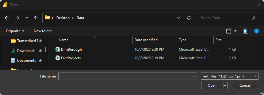
Select the file and click Open.
The navigator window will appear after you click on open, showing the preview of the data.
Click Transform Data (do NOT click Load yet) – this opens Power Query so you can clean and set types before loading.
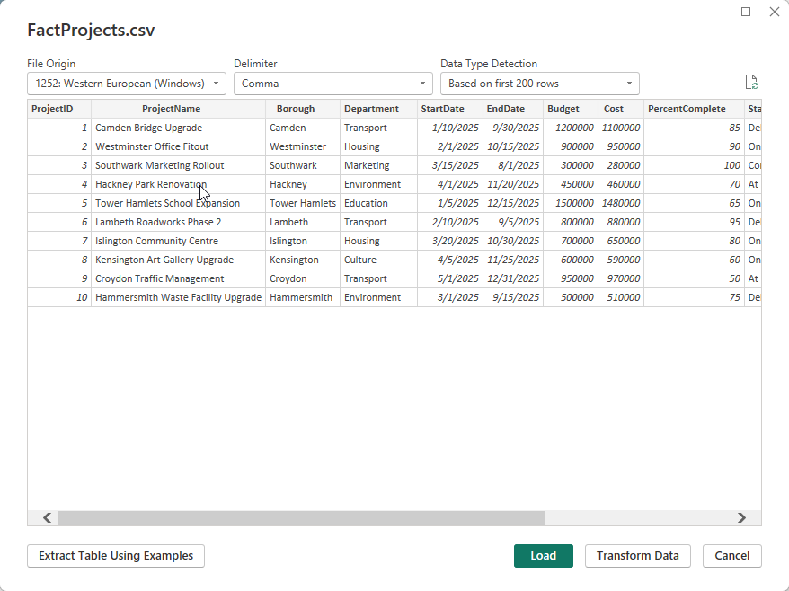
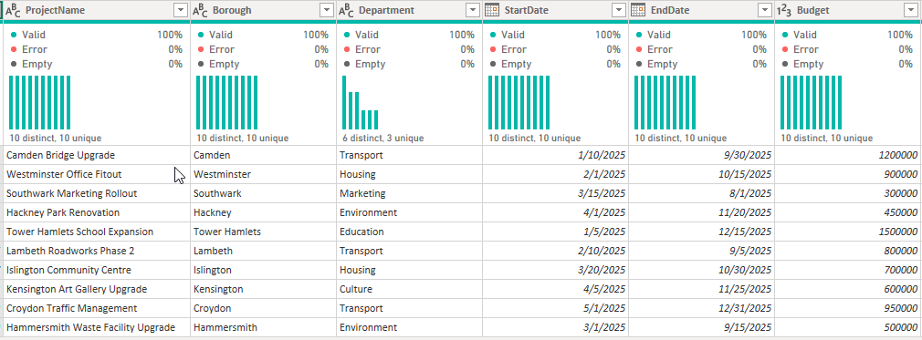
The Power Query editor gives you different options for cleaning and shaping your data before loading it to power bi.
Trainer Tip: In my experience working with PMOs across London boroughs, reports are most effective when the dataset includes a simple risk metric (like a 0–1 “RiskScore”).
It allows quick visual mapping of low, medium, and high-risk projects, without complex modeling.
To keep your model efficient:
- Always format date fields as Date for DAX compatibility.
- Use clear, consistent naming (e.g., StartDate, EndDate, Budget).
Step 2: Build Key Visuals
Now it’s time to turn data into insight.
1. Gantt-Style Timeline
Use the Gantt Chart by MAQ Software visual from AppSource.
- Fields: Project Name, Start Date, End Date, Percent Complete
- Color the bars using project Status (Green = On Track, Amber = At Risk, Red = Delayed).
This instantly shows which boroughs are progressing smoothly and which need attention.
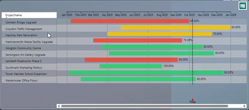
Best Practice: Stick to a consistent color scheme across visuals.
Green, amber, and red are universally understood for performance tracking, especially useful when sharing dashboards in executive meetings.
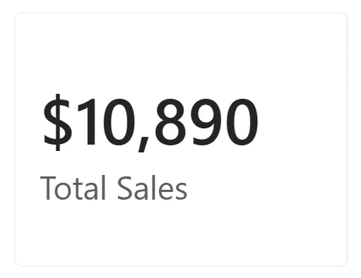
2. KPI Cards
Create a simple DAX measure:
Cost Variance = [Budget] – [Cost]
Add conditional formatting: green if under budget, red if over.
3. Risk Matrix
Plot RiskScore (X = Probability, Y = Impact, Size = RiskScore) using a scatter chart.

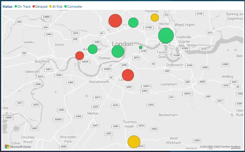
4. Map Visual
Plot boroughs using the Map visual.
Location: Borough
Size: Total Cost
Color: Status
This gives senior managers a geographical overview of project performance across London.
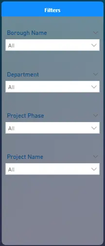
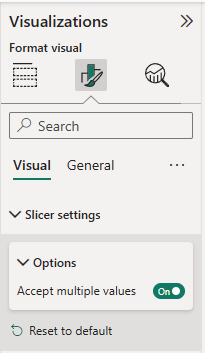
Step 3: Add Drill-through and Slicers
Make your dashboard interactive by allowing users to filter and explore.
Recommended slicers:
- Borough
- Department
- Project Phase (Planning, Construction, Delivery)
You can also create a drill-through page to show project-level detail budget breakdowns, contractor performance, and milestone status.
Trainer Insight:
After implementing drill-throughs for a London transport agency, the project reporting team cut their monthly manual summary prep time by 40%.
Interactive drill-throughs replaced static PowerPoint packs and made borough-level meetings far more efficient.
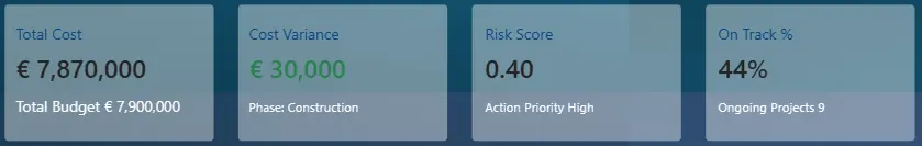
Step 4: Build an Executive Summary Page
This final page is designed for senior stakeholders. Clean, concise, and mobile-friendly.
Include:
- Total Cost
- Cost Variance
- Risk Score
- On Track %
Example DAX measure:
Projects On Track % =
DIVIDE(
CALCULATE(COUNTROWS(FactProjects), FactProjects[Status] = “On Track”),
COUNTROWS(FactProjects)
)
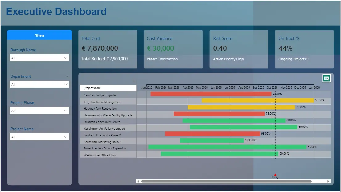
Best Practice: Keep no more than 6 visuals per page.
Use tooltips for context (like variance %), and test on Power BI Mobile to ensure readability.
Conclusion
By integrating costs, risks, and timelines into one Power BI dashboard, London project managers gain a single source of truth.
This approach replaces static spreadsheets with live insights, helping teams stay on track, on budget, and on time.
Use consistent visuals, clean data models, and Power BI’s interactive features to keep your dashboards executive-ready and performance-driven.
- Facebook: https://www.facebook.com/profile.php?id=100066814899655
- X (Twitter): https://twitter.com/AcuityTraining
- LinkedIn: https://www.linkedin.com/company/acuity-training/