
What If Analysis Power BI
Contents
- 1 What Is A What If Analysis?
- 2 Trainer Insight
- 3 Understanding Cost Sensitivity
- 4 Modelling Volume Changes And Break Even Points
- 5 Setting Up What If Parameters
- 6 Creating Measures For Analysis
- 7 Building An Interactive Dashboard
- 8 Advanced Scenario: Multi-Variable Sensitivity
- 9 Troubleshooting and Common Pitfalls
- 10 Best Practices & Tips
What if you could predict the impact of every business decision—before making it?
From tweaking prices to cutting costs or increasing sales, you’d see how each change affects your bottom line in real time.
That’s exactly what the What If Analysis in Power BI allows you to do. No more static dashboards.
This is dynamic, hands-on scenario planning. Perfect for exploring what’s possible and preparing for what’s next.
With interactive sliders and responsive visuals, Power BI lets you test assumptions, minimize risk, and make better decisions—faster.
What Is A What If Analysis?
What If Analysis is a modelling technique used to evaluate different outcomes by changing key input variables.
In Power BI, it uses What If parameters and dynamic DAX measures that recalculate outputs based on user input. Users can ask questions like:
- “What if sales increase by 10%?”
- “What if production costs drop by 5%?”
The parameters are created in the Modelling tab, where you define value ranges. Power BI automatically generates a slicer and a measure, which can then be used in DAX calculations to dynamically adjust metrics like revenue, cost, or profit.
Forecasting Profit Changes by Varying Unit Prices
Curious how a 5% price increase would affect profit?
With What If Analysis, you can use a slider to adjust the unit price and instantly see how revenue and profit respond.
This is ideal for refining pricing strategies and identifying profitable sweet spots without disrupting operations.
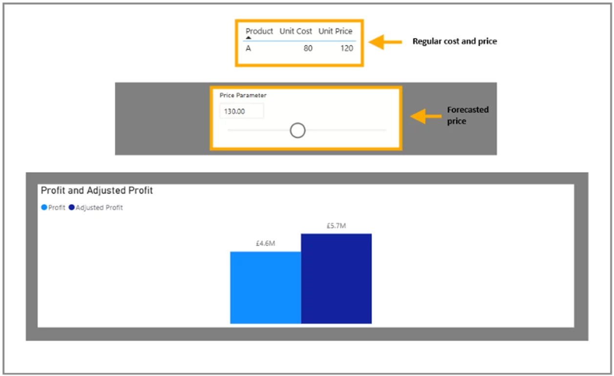
Visual Example:
- Top Table: Displays base unit cost and unit price.
- Middle Slicer: Lets users simulate various pricing scenarios.
- Bottom Bar Chart: Compares original vs. adjusted profit using clear colour contrasts.
Trainer Insight
When we run our Power BI courses, the What If Analysis always gets a big reaction.
It turns reports from static summaries into living, breathing decision tools.
Whether you’re modelling pricing, costs, or volume scenarios, this feature helps teams explore ideas without risk, and instantly understand the business impact of their choices.
We always recommend starting with a few simple parameters and expanding as you build confidence.
It’s one of the best ways to go from reporting data to driving strategy.
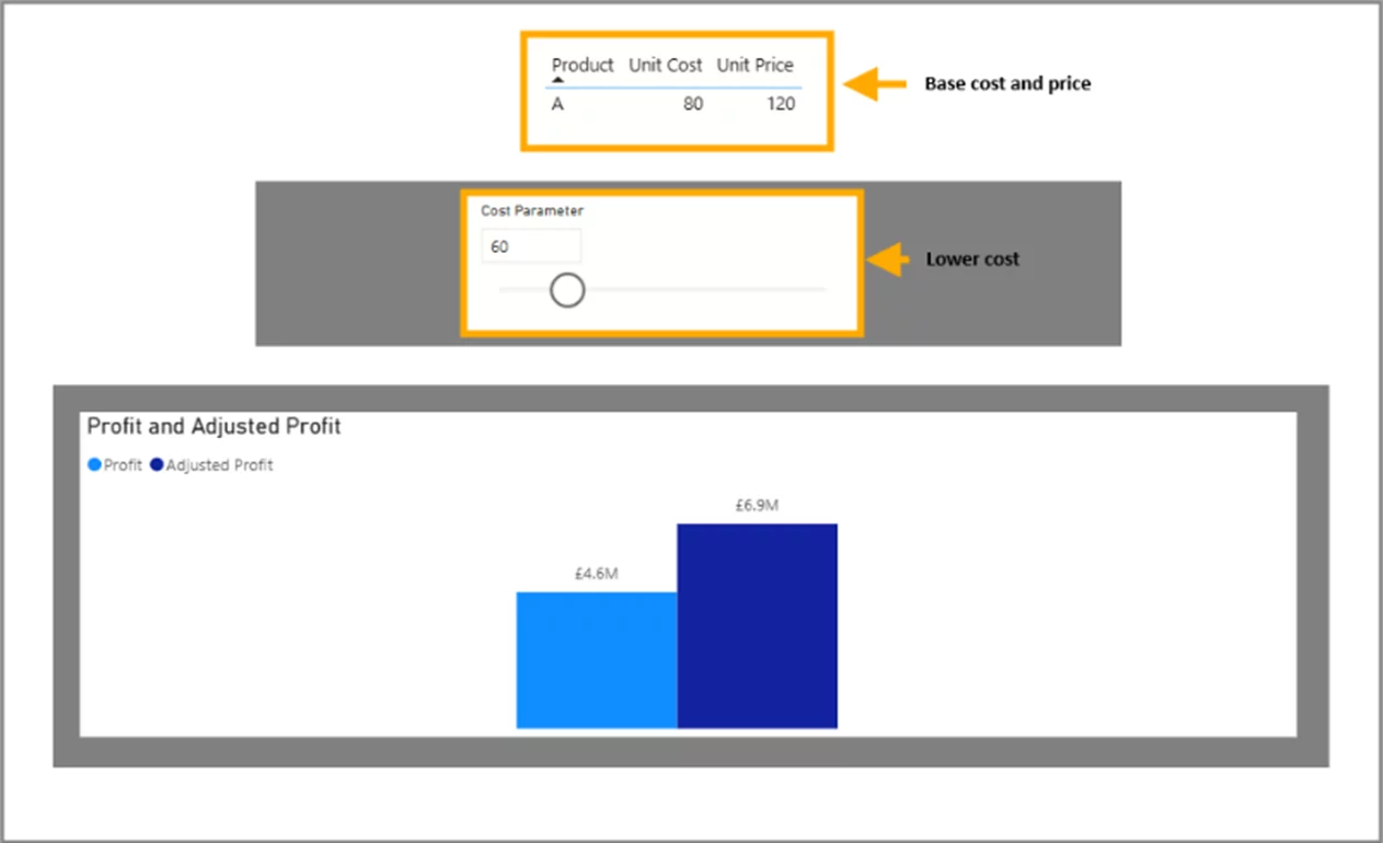
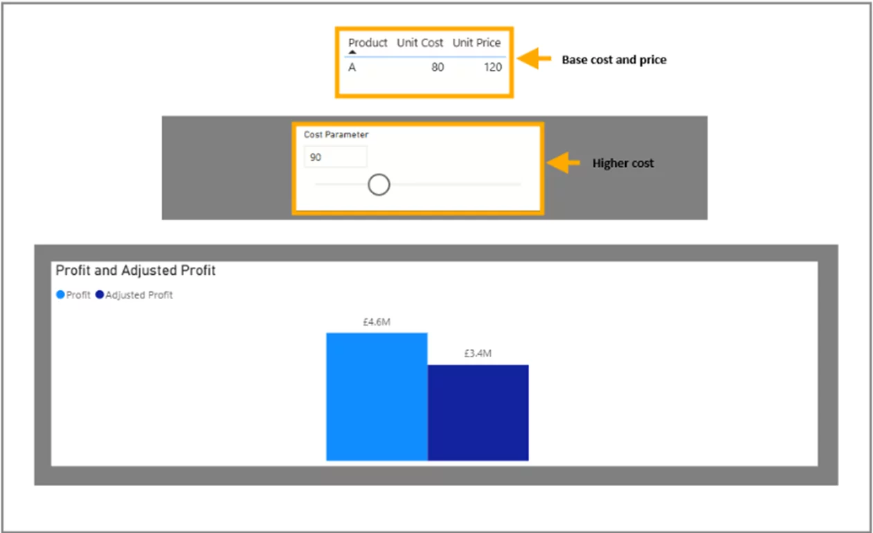
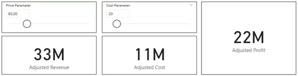
Understanding Cost Sensitivity
What if your supplier increases prices? Or what if you find a cheaper production method? ‘
Adjust the unit cost parameter and instantly measure how profit margins shift.
This enables proactive planning for cost increases and strategic insight into cost-reduction opportunities.
Visual Example 1:
- Cost Decrease: Unit cost adjusted from 80 to 60.
- Result: Significant profit boost visualized via bar chart.
Visual Example 2:
- Cost Increase: Unit cost increased to 90.
- Result: Profit decrease clearly visualized, reinforcing the importance of cost control.
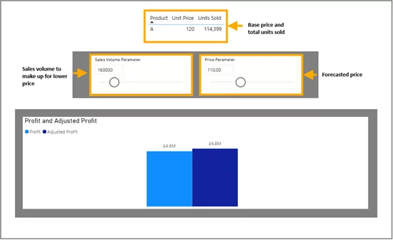
Modelling Volume Changes And Break Even Points
Launching a campaign and want to know how many units you need to sell to break even?
Use the volume parameter to model different sales levels.
Combine this with a pricing parameter to see how increased volume at a lower price can still yield higher profits.
Visual Example:
- Top Table: Displays unit price and base sales volume.
- Slicers: Adjust both price and volume.
- Bar Chart: Shows adjusted vs. original profit with intuitive colour cues.
Setting Up What If Parameters
So, how do you actually create these dynamic sliders that drive all this insight?
Good news, it’s easier than you might think.
Power BI has a built-in feature for What If parameters that makes setting them up quick and intuitive.
Let’s walk through it step by step.
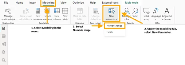
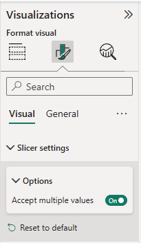
- Go to the Modelling tab > New Parameter > Numeric Range.
- Customize the following fields:
- Name: e.g., ‘Price Parameter’
- Data Type: Whole/Decimal/Fixed Decimal
- Minimum/Maximum/Increment: Based on your use case
- Default Value: Sets the starting point
- Add slicer to this page: Check this to auto-add the slicer

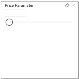
Power BI creates a slicer and a value measure (e.g., Price Parameter Value). Repeat the process for Cost and Volume.
Once you click Create, Power BI will automatically generate a new table containing your parameter values and a slicer visual tied to your selection.
This slicer is what you’ll use to interact with your report in real time.
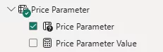
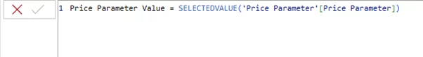
You’ll also notice that Power BI creates a measure alongside the parameter table.
This measure returns the selected value from the slicer and can be referenced in your DAX formulas to drive dynamic calculations.
You can follow this same process to create additional parameters for other variables, such as Cost and Sales Volume.
For each new parameter, define a meaningful name (e.g., “Cost Parameter”, “Sales Volume Parameter”), adjust the min and max values according to your business needs, and make sure the appropriate data type is selected.
Each of these parameters will come with its own slicer and corresponding value measure, giving you even more flexibility for scenario testing across different dimensions.
Next, let’s dive into the fun part, bringing your parameters to life with DAX!
Creating Measures For Analysis
Here’s a step-by-step guide to creating a responsive DAX measure:
Go to the Home tab in the Power BI ribbon.
Click on “New measure” under the Calculations group.
You’ll find this icon next to “Quick measure.”
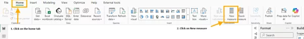
Enter your DAX formula in the formula bar that appears.

Press Enter to create the measure.
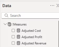
Once your base measure is in place, you can repeat the process to create additional measures for cost and volume adjustments.
Adjusted Cost = [Cost Parameter Value] * [Units Sold]
Adjusted Profit = [Adjusted Revenue] – [Adjusted Cost]
Use the new measure in visuals like cards, tables, or charts to show results based on user interaction with the parameter slicers.
Why measures over calculated columns? Measures are evaluated during interaction, responding in real-time to slicer changes.
Calculated columns are static and won’t react to user input.
Building An Interactive Dashboard
Now that your measures are ready, it’s time to bring everything together into an engaging, interactive dashboard.
This is where the magic happens, where users can tweak inputs and instantly see how profits, costs, or revenues respond.
Bring your analysis to life with a clean, responsive dashboard:
- Add slicers for each parameter (Price, Cost, Volume)
- Use bar/column charts to compare adjusted vs original metrics
- Display KPIs (e.g., profit margin) using cards
- Add dynamic titles or tooltips for clarity
- Group parameters visually to guide user flow
Test interactivity thoroughly – adjust inputs and confirm visuals respond instantly.
Check out this video with all the steps!
To summarize how it all connects, think of your dashboard as a simple flow:
Input → Calculation → Output
Input: Users interact with slicers tied to your What If parameters (e.g., adjusting price, cost, or volume).
Calculation: Behind the scenes, DAX measures use the selected values to compute adjusted revenue, cost, and profit in real time.
Output: The updated results are instantly reflected in your visuals, cards, bar charts, KPIs – so users can see the impact of their choices at a glance.
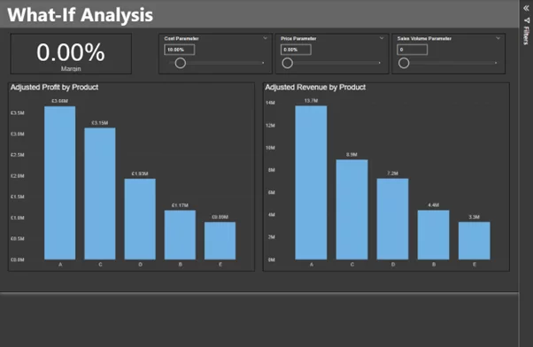
Advanced Scenario: Multi-Variable Sensitivity
Once you’ve mastered the basics, you can take What If Analysis to the next level by modelling more complex scenarios involving multiple parameters.
This allows you to simulate nuanced business situations, like increasing price while simultaneously reducing cost or boosting sales volume.
Start with parameters for price, cost, and volume, then use them together in your DAX.
Adjusted Revenue =

IF (

'Sales Volume Parameter'[Sales Volume Parameter Value] = 0,

[Volume],

'Sales Volume Parameter'[Sales Volume Parameter Value]

)

* IF (

'Price Parameter'[Price Parameter Value] = 0,

SELECTEDVALUE('product'[Unit Price]),

('Price Parameter'[Price Parameter Value] * SELECTEDVALUE('product'[Unit Price])) + SELECTEDVALUE('product'[Unit Price])

)

Adjusted Cost =

IF (

'Sales Volume Parameter'[Sales Volume Parameter Value] = 0,

[Volume],

'Sales Volume Parameter'[Sales Volume Parameter Value]

)

* IF (

'Cost Parameter'[Cost Parameter Value] = 0,

SELECTEDVALUE('product'[Unit Cost]),

('Cost Parameter'[Cost Parameter Value] * SELECTEDVALUE('product'[Unit Cost])) + SELECTEDVALUE('product'[Unit Cost])

)

Adjusted Profit =

[Adjusted Revenue] - [Adjusted Cost]
With these measures in place, you can build visuals that respond to multiple inputs at once.
This approach gives stakeholders the ability to simulate rich, layered scenarios and assess their business impact quickly and interactively.
Another great addition would be adding a variance analysis, which helps you see the difference between expected and actual values.
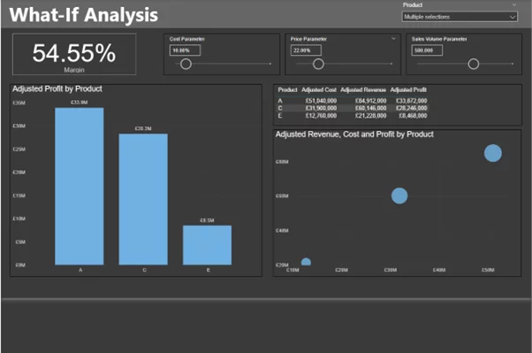
This builds a dashboard with:
- Slicers for each parameter
- KPI cards (e.g., Adjusted Profit Margin)
- Bar charts for product-wise performance
- Detailed tables for cost/revenue/profit breakdowns
- Scatter plots with bubble sizes for visual impact
Troubleshooting and Common Pitfalls
If issues arise:
- Ensure visuals are tied to parameter-based measures
- Confirm data types are correct
- Use
IF(ISBLANK(...))orIFERROR(...)to handle edge cases
Best Practices & Tips
- Clearly label slicers and visuals
- Use realistic parameter ranges
- Group related controls for easy navigation
- Test with known values to verify outputs
- Avoid overly complex DAX to preserve performance
- Use layout to guide the user’s journey: Inputs → Calculations → Outputs
Conclusion
What If Analysis isn’t just a Power BI feature – it’s a decision-making superpower.
It helps teams visualize potential outcomes, validate strategies, and plan for multiple futures.
For more development, try doing a What If Analysis on your combo charts, it’s a great combination!
You’ve learned how to:
- Create What If parameters
- Write dynamic DAX measures
- Build fully interactive dashboards
Start simple, iterate, and grow.
Before long, you’ll have a suite of dashboards that enable agile, forward-looking planning grounded in data—not guesswork.
Give your users the power to ask “what if?” and watch the insights unfold in real time.

- Facebook: https://www.facebook.com/profile.php?id=100066814899655
- X (Twitter): https://twitter.com/AcuityTraining
- LinkedIn: https://www.linkedin.com/company/acuity-training/