
How to Use a Sankey Diagram in Power BI for Flow Analysis
Contents
Ever wished you could see exactly how customers move through your sales funnel, or how costs flow across your business?
A Sankey Diagram makes those flows visible, showing not just totals but how values split and connect between categories.
In Power BI, the Sankey Diagram is available as a custom visual from AppSource, designed to reveal relationships and flow patterns.
Whether you’re analyzing customer journeys, tracking energy usage, or reviewing a sales pipeline, this visualization helps you spot bottlenecks and optimize processes.
When To Use Them
People often ask on our courses: “Why not just use a bar chart or a line chart?” – and that’s a fair question!
Sankey diagrams aren’t just for showing more numbers, they’re for showing connections.
They shine when you want to follow how something moves, splits, or merges between stages.
Here’s how they compare to a few visuals you might be using now:
- Bar charts are great for totals (like revenue), but they don’t show where that revenue came from or goes next.
- A Sankey shows the path from source to destination, not just the size of each bucket.
- Line charts & bullet charts work well for trends over time, but they can’t show relationships between categories.
- If you want to see how customers move through steps, a line chart just gives you separate lines – no flow.
- Pie charts can show proportions, but they’re static. They don’t reveal what happens after a slice leaves the pie.
- A Sankey connects the dots so you can follow how those slices move.
So, if you’re trying to understand how things move through your business, not just how big they are, that’s when a Sankey is the right choice.
It turns scattered data into a clear, connected story, which is something traditional visuals just can’t do.
Installing and Adding a Sankey Diagram
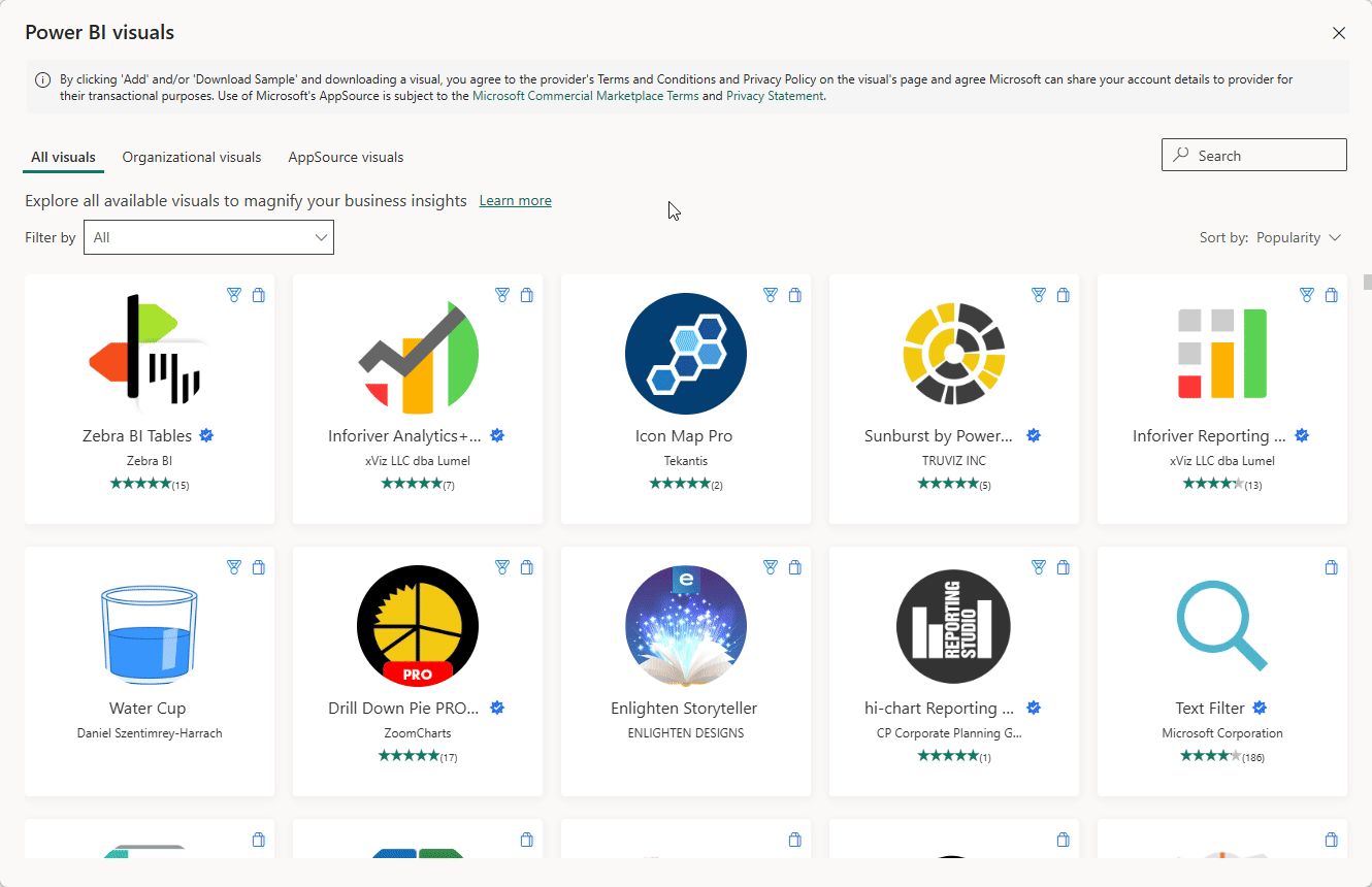
1. In Power BI Desktop, go to Visualizations → Get more visuals.
2. Search for Sankey Diagram and click Add.
3. Load your dataset!
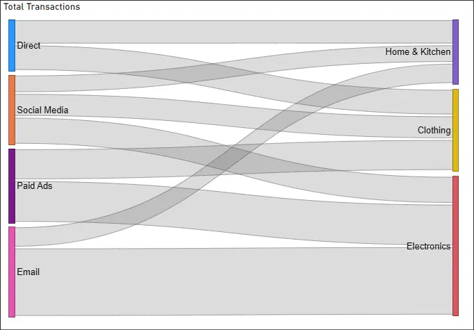
You’ll need at least two categorical fields (e.g., Source and Destination) plus a numeric value (e.g., Transactions, Revenue).
4. Drag fields into the visual’s buckets to generate the diagram.
You’ll see the diagram populate!
From The Trenches
One retail client used a Sankey diagram to map how visitors moved from the Homepage.
It revealed something they hadn’t seen before, nearly 40% of users were dropping off between checkout and purchase.
That single insight led to a checkout redesign, and within two months their conversion rate jumped by 12%!
Common Use Cases
- Customer Journey Analysis: Visualize movement from marketing channels (email, social, paid ads) through landing pages to final conversions.
- Energy or Cost Flows: Show how resources move from input → process → output (ideal for sustainability or operations teams).
- Sales Pipeline: Track progression from lead → qualified opportunity → closed deal.
Best Practices
- Limit Categories: Too many nodes make the diagram unreadable. Focus on 3–5 main stages.
- Use Consistent Colors: Assign categories consistent colors (e.g., marketing always blue, sales always green).
- Keep Flows Meaningful: Don’t force unrelated dimensions into a single diagram. Instead, build separate visuals for clarity.
Common mistake: New users often try to include every dimension in one diagram, resulting in a spaghetti of overlapping flows!
From Our Power BI Training in London
In Power BI workshops, Sankey diagrams always spark curiosity.
Students love the visual appeal, but quickly realize how cluttered it can get.
The most common question I get is: “How many nodes are too many?”
My advice is to keep it simple, if you can’t explain the story of the diagram in under 30 seconds, it needs to be simplified.
Conclusion
Sankey Diagrams transform data into storytelling visuals, revealing where flows split, merge, or get stuck.
By applying them to customer journeys, supply chains, or resource flows, you can surface insights that standard bar charts miss.
Start small, experiment with real-world datasets, and refine your visuals using the best practices above.
With Power BI and Sankey Diagrams, you’ll be better equipped to uncover bottlenecks and optimize business processes.

- Facebook: https://www.facebook.com/profile.php?id=100066814899655
- X (Twitter): https://twitter.com/AcuityTraining
- LinkedIn: https://www.linkedin.com/company/acuity-training/