
Power BI: How & When To Do A Variance Analysis
Contents
Ever wondered why your sales missed the target or expenses went over budget?
Variance analysis highlights where performance deviates from expectations and why.
In the context of Power BI, it turns dashboards into dynamic tools for faster, data-driven decisions.
Variance analysis compares actual results to targets / forecasts, showing which outcomes are favourable or unfavourable.
With Power BI, you can:
- Calculate variances dynamically using DAX
- Visualize trends with KPIs and color-coded charts
- Drill into details to uncover the reasons behind performance gaps
Mastering variance analysis makes your dashboards clear, actionable, and decision-ready.

What Is Variance Analysis?
Variance analysis measures the difference between actual and expected performance – typically used in financial or operational contexts.
It helps businesses understand their performance, and investigate the underlying causes when differences arise.
The goal is usually to identify areas that need attention or improvement.
Types of Variance:
- Absolute Variance: Actual – Target
- Percentage Variance: (Actual – Target) ÷ Target
- Favorable / Unfavorable: Categorizes results based on impact
Common Use Cases:
- Monthly sales vs. target reports
- Budget vs. actual expense analysis
- Forecast accuracy tracking
Pro Tip: Running variance analysis monthly helps you spot trends before they become bigger problems.

When Should You Perform Variance Analysis?
Variance analysis is most valuable:
- At the end of reporting periods – month, quarter, or year
- After campaigns or projects – to measure effectiveness
- When KPIs show sharp deviations – for immediate investigation
From our trainers: We find variance analysis most impactful right after month-end close.
It quickly highlights which regions or products underperformed.
Then we can adjust next month’s targets or campaigns before the issue grows.
Step‑by‑Step: How to Do Variance Analysis in Power BI
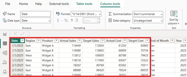
Step 1: Prepare Your Data
- Actuals (Sales, Expenses, etc.)
- Targets/Budget/Forecast values
- Date field for time comparisons
- Category fields (e.g., product, region)
Best Practice: Always align both datasets to the same time level – whether it’s day, week, or month before calculating variances.
This ensures your analysis is meaningful, accurate, and reliable.
Step 2: Create Variance Measures with DAX
Create three key measures in DAX:
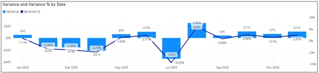
Absolute Variance:
Variance = [Actual] - [Target]
Percentage Variance:
Variance % = DIVIDE([Actual] - [Target], [Target])
Favorable / Unfavorable Label:
Variance Status =

SWITCH(

TRUE(),

[Variance] > 0, "Favorable",

[Variance] < 0, "Unfavorable",

"On Target"

)
Pro Tip: Show both value and percentage variance for full context.
Step 3: Choose the Right Visuals
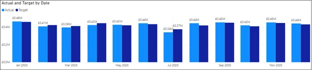
Use visuals that make variances instantly clear:
- Column or Bar Charts – Compare actual vs. target visually
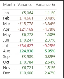
- Matrix/Table with Conditional Formatting – Highlight green for positive, red for negative
- Custom Variance or Bullet Charts – Ideal for KPI dashboards
From our trainers: On our Power BI courses, we advise using bullet charts for variance analysis.
They pack a huge amount of insights into a compact visual.
With them, executive can quickly assess whether KPIs are on track without needing complex visuals.
Step 4: Apply Design Best Practices
- Use consistent color coding: Green = favorable, Red = unfavorable
- Show both absolute and percentage variances
- Add tooltips or smart narratives for explanations
- Group KPIs logically by type or department
Step 5: Explore Advanced Techniques
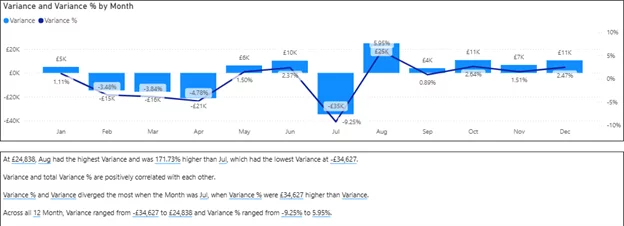
- Dynamic commentary with Smart Narrative visuals
- Drill-through pages to analyze variance by region or product
- Parameter-driven thresholds for defining “significant” variance
Common Pitfalls to Avoid
- Mismatched timeframes leading to incorrect variances
- No context for large or small deviations
- Overcrowded visuals that confuse instead of clarify
Conclusion
Variance analysis in Power BI turns numbers into actionable insights.
By comparing actuals to targets, you can:
- Spot issues early
- Understand root causes
- Take corrective action faster
Start simple with one or two KPIs like Revenue vs. Target, then expand as your dashboard matures.
With clear visuals, thoughtful DAX, and clean design, your variance analysis becomes a powerful decision-making tool.
- Facebook: https://www.facebook.com/profile.php?id=100066814899655
- X (Twitter): https://twitter.com/AcuityTraining
- LinkedIn: https://www.linkedin.com/company/acuity-training/