
Power BI’s KPI Visuals: What They Are & When To Use Them
Contents
Ever wish you could see your business performance at a glance?
KPI visuals in Power BI make that possible by turning key metrics into clear, visual indicators.
In just seconds, you can see if you’re on track, spot trends, and identify problem areas.
No spreadsheets, no guesswork – just a clear answer.

What Are KPI’s?
KPI stands for Key Performance Indicator, and is the common name for a metric that shows how well your business is meeting its goals.
In Power BI, KPI visuals help you:
- Instantly see current performance vs. target
- Spot trends and variances quickly
- Enable faster, data‑driven decisions
Power BI provides multiple ways to display KPIs, including the built‑in KPI visual, cards, gauges, and custom visuals from AppSource!
This guide will walk you through how to create effective KPI visuals, plus design best practices and pitfalls to avoid.
What Makes a Good KPI Visual?
A good KPI visual is about instant clarity. Keep these three principles in mind:
- Clarity – The KPI should be understood in seconds.
- Context – Include current value, target, and trend to make the metric meaningful.
- Simple Design – Avoid clutter; use color cues to indicate performance.
For example: A revenue KPI should immediately show this month’s revenue, the target, and whether it’s trending up or down.
Trainer Insight: Something we teach on our Power BI courses is do not overcomplicate KPI visuals.
A well-designed KPI often shows just three things: actual, target, and trend.
If stakeholders can’t understand it in five seconds, it’s time to simplify.
KPI Visual Options in Power BI
1 – Built‑in KPI Visual
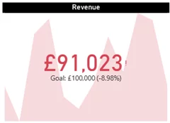
- Best for: Showing actual vs. target with a visible trend
- Required Fields:
- Indicator – Actual value (e.g., Total Sales)
- Trend Axis – Time dimension (e.g., Date)
- Target Goal – Static or dynamic benchmark
- Ideal Use Case: Tracking monthly or quarterly performance
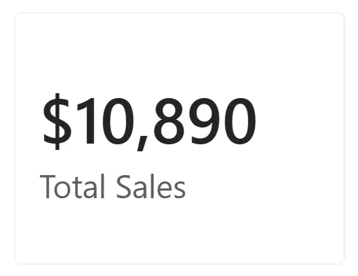
2 – Card Visuals
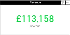
- Best for: Displaying a single metric, such as Net Profit or Customer Satisfaction Score
- Enhancement: Add conditional formatting to highlight performance status
- Example: Green when above target, Red when below target
3 – Custom KPI Visuals from AppSource
- Popular Options:
- Bullet Chart KPI – Compact, precise, and great for dashboards
- Advanced KPI Visual – Adds variance percentages and trend indicators
- Pros: Flexible and highly visual
- Cons: Require installation and potential maintenance
4 – Gauges and Thermometers
- Pros: Eye‑catching and useful for executive summaries
- Cons: Less precise and best for high‑level overview only
How to Create a KPI Visual in Power BI
Note: we recommend DAX to get dynamic measures, but we know not everyone knows it!
If you are curious and want to implement it, we have a great DAX introduction guide to help you get started.
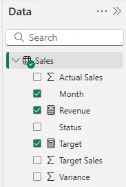
Step 1: Prepare Your Data
- Ensure your dataset includes:
- Actual Measure (e.g., Total Sales)
- Target Measure (static or DAX-based)
- Trend Field (like Date or Month)
Example DAX Measures:
Revenue = SUM(Sales[Revenue])
Target = 100000
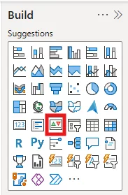
Step 2: Insert the KPI Visual
- In Power BI Desktop, open the Visualizations pane
- Select the KPI visual icon
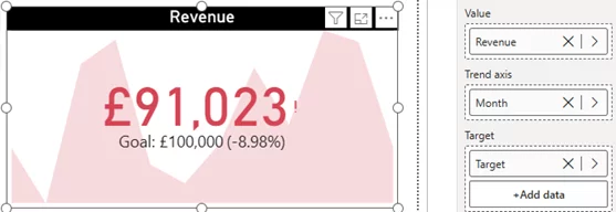
Step 3: Assign Fields
- Value – Total Sales
- Trend Axis – Date
- Target Goal – Sales Target
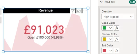
Step 4: Format for Impact
- Use Clear Colors – Green for success, Red for underperformance
- Enable Data Labels – Make the KPI value clear
- Format Target Line – Ensure the goal line stands out
Design Best Practices
When designing your KPI visuals, try and keep each visual focused on a single specific KPI – to keep things clear.
Consistent use of colours and layouts across all of your individual KPI elements will also help people scanning through understand things at a glance.
Finally, make sure you test your KPI layouts! Grab a few people in your team and have them take a look at your visuals, and adjust based on their feedback.
Trainer Insight: Great KPI design isn’t just about visuals, it’s about usability.
After building your dashboard, do a 5-second test:
Ask someone unfamiliar with the report what they see first and what they think it means.
Their answers will inform the very best layout decisions.
Conclusion
KPI visuals in Power BI turn metrics into actionable insights.
By designing them with clarity, context, and consistency, you help stakeholders spot trends, monitor targets, and make smarter decisions.
Start with a few high‑impact KPIs, follow best practices, and your dashboards will become powerful decision‑making tools.
- Facebook: https://www.facebook.com/profile.php?id=100066814899655
- X (Twitter): https://twitter.com/AcuityTraining
- LinkedIn: https://www.linkedin.com/company/acuity-training/