

How to Use PIVOTBY in Excel (The New Way Of Reporting)
PivotTables are a classic, powerful tool in Excel.
They are a great way to show you really understand Excel, and it’s more powerful tools. You can summarise and group data in just a few clicks, but they’re also a little out the way!
You build them in a separate interface, refresh them manually, and adjust them through menus instead of formulas. But that’s finally all changing.
Modern Excel has amazing new functions – today we’re looking at PIVOTBY. It brings PivotTable-style reporting straight into the formulas and functions we all know and love.
Instead of building an entirely separate object, you can group summaries straight from your data with just one function.
For those of us that build a lot of reports, this is a big shift – so let’s look at what PIVOTBY does, how it works, and where it fits into modern Excel workflows.
The PIVOTBY Syntax
From a high level view, PIVOTBY groups data and applies a calculation to it, but it does look a little complex!
=PIVOTBY(row_fields, col_fields, values, function,
[field_headers], [row_total_depth], [row_sort_order],
[col_total_depth], [col_sort_order], [filter_array], [relative_to])
Each part play its own role, but let’s just break down the first few for now, as the rest are optional – we’ll explain them later!
The row_fields are what you want to group by, so think a category column, supplier name or department, that kind of thing.
The column_fields control how values are grouped across those columns.
The values are the numeric field you want to summarise, like sales figures, expenses, quantities or hours.
The function defines what calculation Excel should perform, most of the time we’ll be using SUM, but you can also use AVERAGE, COUNT, MAX, MIN, whatever you like!
Once entered, this function will return a fully grouped summary table straight into your worksheet.
A Simple Example Of PIVOTBY
Here’s the dataset I’ll be working with today:
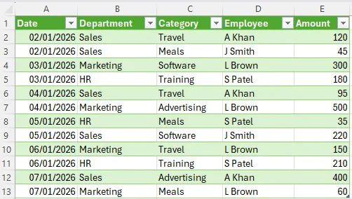
Plenty of delegates on our top–rated London Excel workshops tell us they prefer working with formulas rather than the external tools, which is exactly what PIVOTBY lets you keep doing!
Think of this task like you would a PivotTable – what can we find with one?
Well, we can find things like what people are spending on by department, and you can get the exact same thing with PIVOTBY. Let’s start off with:
=PIVOTBY(B2:B13,C2:C13,E2:E13,SUM)
This tells Excel to look at column B to draw the rows of the summary, each unique department will appear down the left-hand side.
Next, it looks at column C for the category, and uses this to create the column headings across the top. Each category in the dataset will become it’s own column in the final output.
Then it looks at column E, to draw the numeric values we want to look at.
Finally, the SUM tells Excel what calculation to perform. Since here we want to look at the total spend, we use SUM.
Enter that formula, and Excel will produce your PivotTable for you:

When You Should Still Use A PivotTable
Microsoft’s documentation for PIVOTBY carries a note that is easy to miss, and worth quoting exactly:
“Though it can produce similar outputs, PIVOTBY is not directly related to Excel’s PivotTable feature.”
That is a more important sentence than it first appears. PIVOTBY is not a PivotTable with a nicer interface.
It is a different tool that happens to return something that looks similar. Once you treat it that way, choosing between them gets a lot easier.
Stick with a PivotTable when:
- You need to explore, not just report. PivotTables are built for dragging fields around, expanding and collapsing groups, and following a question wherever it goes. A PIVOTBY output is fixed until you go back and edit the formula.
- You want to drill into the underlying rows. Double-clicking a PivotTable value gives you the records behind it on a new sheet. PIVOTBY has no equivalent — you would need to build the filter yourself.
- You are grouping dates. PivotTables will group into months, quarters and years automatically. With PIVOTBY you have to create those groupings in your data or in the formula.
- Other people need to interact with it. If your report is going to someone who wants to change what they are looking at, a PivotTable with slicers is still the better hand-over.
Reach for PIVOTBY when:
- You do not want to remember to refresh. This is the big one. A PIVOTBY output recalculates like any other formula, so a report built on a live data connection stays current on its own.
- Someone needs to check your logic. The whole calculation sits visibly in one cell. A PivotTable hides its configuration behind a pane, which is exactly why they are difficult to audit and easy to break.
- The summary feeds something else. Because PIVOTBY spills a normal array, you can reference it, filter it, or wrap it in another function. Try doing that reliably against a PivotTable and you will end up in GETPIVOTDATA.
- You want a chart PivotCharts will not give you. PivotCharts block several chart types outright. A PIVOTBY output is just cells, so anything goes.
One thing to watch: PIVOTBY spills. If anything is sitting in the cells it needs, you get #SPILL! rather than a report, and the amount of space it needs changes whenever your data does.
Understanding The Optional Arguments
So now we know how to use PIVOTBY for a simple table, let’s dig back into those optional arguments.
For a full lsiting on what values you can enter, check the Microsoft documentation for PIVOTBY.
1 – field_headers
This controls how headers are going to appear in the final output. Excel can automatically detect and display your headers, but if your data is messy, then this is probably the solution!
It tells Excel exactly what to do, and answers the question – are there headers?
2 – row_total_depth
Row totals control whether or not totals will appear for each group in the rows.
Without row totals, you’ll see individual category values, but no overall total (in our example for each department).
3 – row_sort_order
The sort order indicates how columns are meant to be sorted.
Typically, numbers will be sorted in ascending value for example, but you can change it if you like.
4 – col_total_depth
This one determines whether the columns should contain totals, just like row_total_depth.
Again, in our example, this would be the categories.
5 – col_sort_order
Just as before with the row_sort_order, you can change how the rows are meant to be sorted.
6 – filter_array
This one is a bit technical! Filter_array is a column-oriented 1D array of Booleans that indicate whether the corresponding row should be considered.
Sounds complicated, but it’s basically just telling Excel which rows to actually use for the data.
7 – relative_to
Finally, we have relative_to, which controls which values are provided to the 2nd argument of the aggregation function – if you are using one that requires two arguments.
This is typically used when PERCENTOF is being used.

Why PIVOTBY Is So Valuable
It might look like PIVOTBY is just another way to summarise data – and it kind of is!
But to us, it represents a bigger shift in how Excel is being used. Traditionally, Excel reporting usually takes a few steps.
Importing data, cleaning it, building a PivotTable, adjusting the layout, refreshing it when needed, and linking it to your dashboard.
But with PIVOTBY, reporting is now straight in your worksheet.
If you connect it up with a data set that is refreshed automatically, then the PivotTable will update automatically too!
And it being a function, means whole new ways to structure your sheets. You can combine PIVOTBY with tables, dynamic arrays, and other modern functions to build a reporting system with much more flexibility than ever before.
It might not replace PivotTables for everyone, but it gives you another option – and if you like formulas then it’ll be great for you!

- Facebook: https://www.facebook.com/profile.php?id=100066814899655
- X (Twitter): https://twitter.com/AcuityTraining
- LinkedIn: https://www.linkedin.com/company/acuity-training/