
Building a London House Prices Dashboard in Power BI
Contents
London housing costs affect everyone.
Families, investors, even policymakers feel the impact.
Prices rise and fall quickly.
Rents shift just as fast.
And costs vary wildly between boroughs.
That’s why it helps to see the numbers clearly.
Today, we will be going over a dashboard we make in our London Power BI workshops!
It will track average prices over time, compare rents with house prices and rank boroughs.
By the end, you’ll have a simple but powerful tool to explore London housing data for yourself!
Section 1: Getting the Data
We’ll use two main public sources, let’s cover why we picked them.
1. UK Land Registry House Price Index – Borough-level
This dataset provides monthly average house prices for every London borough.
It covers both property sales and transfers, so it reflects real market movements.
Data goes back years, which makes it perfect for analysing long-term trends like growth rates or boom-and-bust cycles.
2. ONS Private Rental Market Statistics – Average rental prices by borough.
This dataset tracks average private rental prices for different property types across London.
It’s especially useful if you want to compare renting vs buying costs side by side.
Adding this data allows you to calculate ratios like rent-to-price or rent-to-income, giving a more complete picture of affordability.
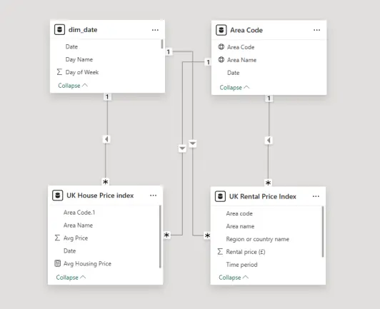
Section 2: Modelling the Data
1. Load Data into Power BI: Import both CSVs.
2. Build a Calendar Table: Calendar = CALENDAR(DATE(2023,1,1), DATE(2024,12,31))
3. Relate Tables: Create relationships on Calendar, Housing prices and Rental prices
We use this example in our workshops!
One common mistake we see learners make is skipping the calendar table.
Without it, rolling averages or year-on-year calculations almost always fail.
Once people add a proper date table and relationships, their time-series visuals click into place – and they finally understand why modelling matters.
Section 3: Building the Visuals
Now let’s create the core visuals:
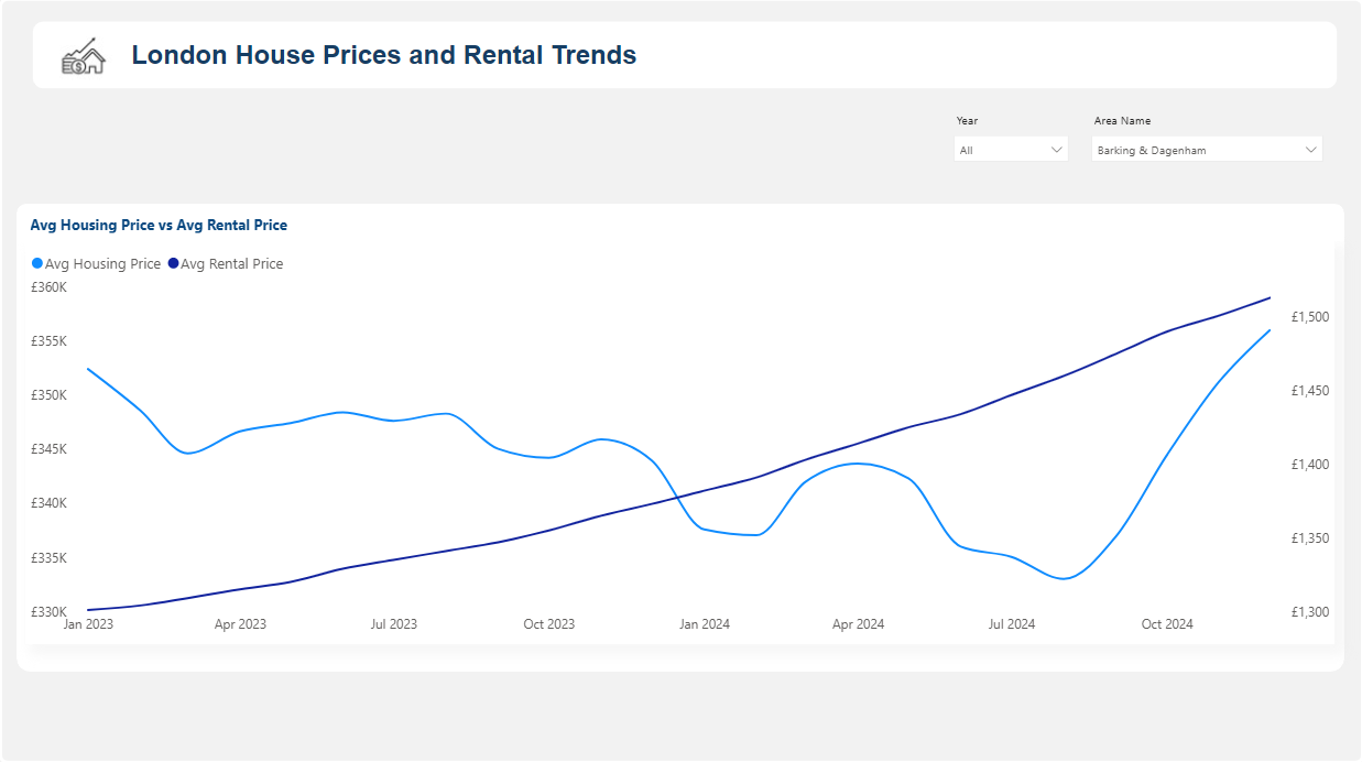
1. Line Chart – Average house prices over time vs Average rental prices over time
-
- X-axis: Date (from Calendar table)
- Y-axis: Avg Housing Price
- Secondary Y-axis: Avg Rental Price
- Add a slicer for Borough selection
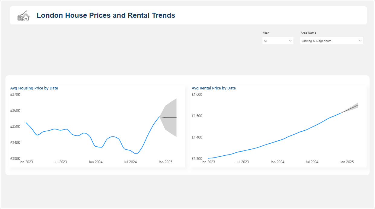
2. Line Chart – Housing prices and Rental prices forecasts
-
- X-axis: Date
- Values: Avg Housing Price, Avg Rental Price
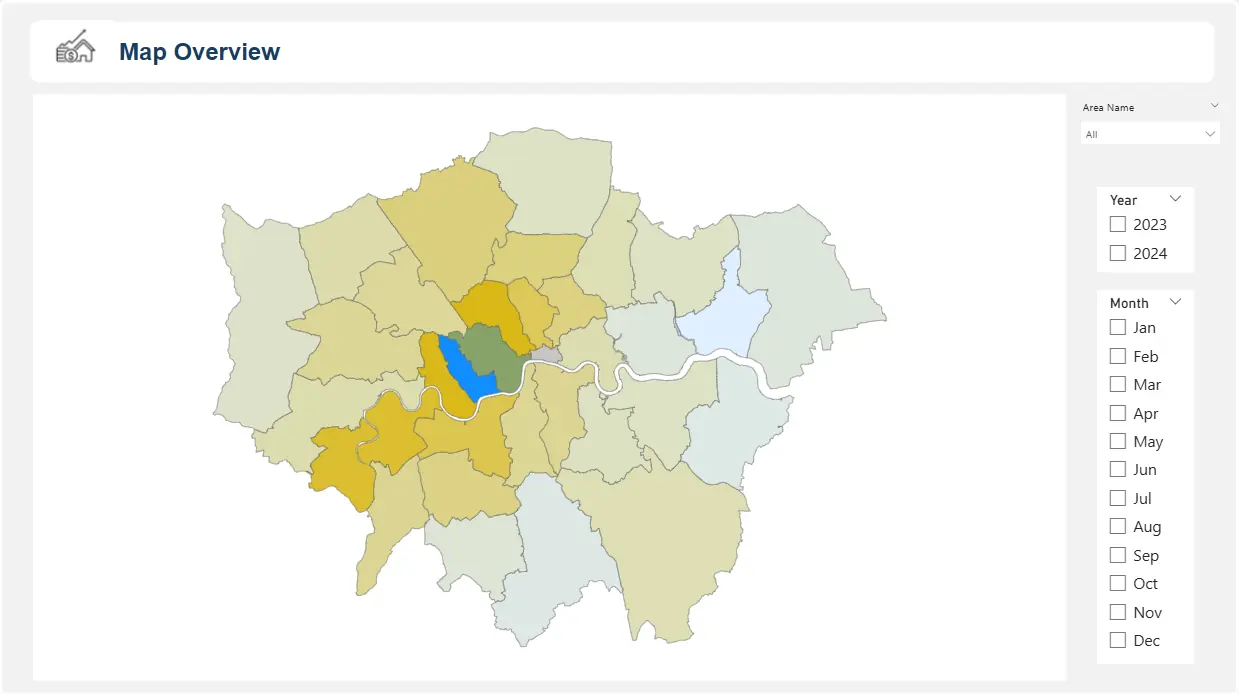
3. Map – Borough Prices
-
- Use a Shape Map with London borough boundaries
- Fill colour by Latest Avg Housing Price
Our trainers’ favourite visuals:
People often overlook the Shape Map visual when working with geography.
However, our trainers think it’s great because it makes patterns jump out instantly!
Colouring boroughs by price or rent shows trends as soon as you see the visual.
People often overlook the Shape Map visual when working with geography.
However, our trainers think it’s great because it makes patterns jump out instantly!
Colouring boroughs by price or rent shows trends as soon as you see the visual.
Section 4: Insights & Use Cases
This dashboard can be applied in multiple ways:
- Real estate analysts – Identify boroughs where markets are accelerating or cooling.
- Financial planners – Compare housing costs with income affordability for clients.
- Local government – Track affordability gaps and housing pressure points.
Section 5: Conclusion
With just a few steps, Power BI turns raw housing datasets into clear, actionable dashboards.
- You can track borough-level trends over time,
- Compare rents to house prices,
- Forecast where markets may head next.
The same framework can be applied beyond housing. Any dataset with geography and time dimensions – such as regional sales, healthcare costs, or education outcomes – can benefit from this approach.
💡 Next Step: Try adding mortgage rates or income data to enrich the analysis and create an affordability index.
Trainer’s Advice:
When we teach dashboards like this, we remind learners that the first build is only the beginning.
The real value comes from keeping the data fresh and gradually layering in new context, like mortgage rates.
Start simple, share it with your audience, then improve based on the questions they ask.
That’s how dashboards evolve into tools that people rely on every day.
- Facebook: https://www.facebook.com/profile.php?id=100066814899655
- X (Twitter): https://twitter.com/AcuityTraining
- LinkedIn: https://www.linkedin.com/company/acuity-training/