Using Glyph Alternates [Adobe Fonts]
Glyphs are the actual symbols you see when you press a key on the keyboard and it gets typed.
Alternates, as you may have guessed, are alternative glyphs for letters in a font. Alternates come in handy when dealing with fonts that appear handwritten, or for just making a font feel more varied.
Adobe offers great Glyph Alternate support across its Creative Suite. Even better, most fonts from Adobe TypeKit feature some or many alternates.
With a little bit of tinkering, you can even create your own alternates if you are unhappy with the look of a specific glyph in a font.
Once you get more advanced, you can even get to making ligatures which are specific glyphs for a combination of letters, such as “fi”.
To learn more view our PhotoShop Course Offerings.
This tutorial is part 1 of four parts. To see the other parts, see the links below:
Adobe Fonts: Part 2 – Creating Your Own Glyphs
Adobe Fonts: Part 3 – Creating Ligatures And Colour Alternates
Adobe Fonts: Part 4 – Creating A Greetings Card In Photoshop
Alternates
To start, open your web browser and go to typekit.com
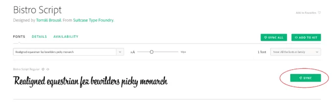
Bistro Script is a great font. Search for it in the search bar and hit ENTER. One result will come up, Bistro Script. Click the result and then click the SYNC button. I’ve circled it in red for you in Figure 1.
I’m going to be using Photoshop as my workspace, but if you want to use InDesign that will work just fine for the purposes of this tutorial.
Note: Not every workspace is supportive of Open-Type Fonts or Adobe Variable Fonts. You typically need either a web-based platform or an Adobe Platform for Alternates to show
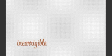
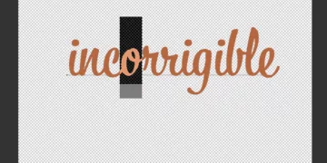
Open a New Document in whatever Adobe Program you are using. When the document is loaded, create text (T) and type “incorrigible”. Apply the Bistro Script font to this text.
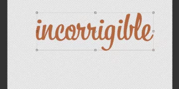
Hit Ctrl + T to switch to the free transform tool and stretch this text out to a bigger size for easier viewing. Remember to hold down Shift to constrain proportions.
Now we can get cracking. Reopen the Text tool (T) and click the Text. If you select certain letters of the text, alternative options will appear. To start with, highlight the first “i”.
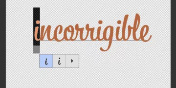
As you can see, there are 2 different options for a lowercase “i” in the Bistro Script font. The first one is the default, and the second one is pretty much the same, but just larger and more prominent.
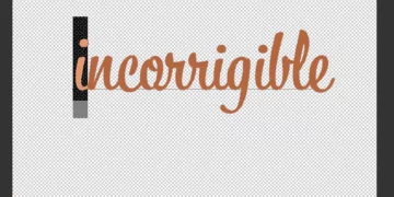
You can click the second “i” glyph to switch ours to that one.
Select the second “r” in our word. You will notice, like the “i”, there are two glyphs. In this example and the last, the alternates are more aesthetic than functional. These are referred to as stylistic alternates. We’ll learn more about them later.
If you try to select either the “o” or the first “r”, you will notice that they select together. This is because the font was coded in such a way that when an “r” follows an “o”, they will have specific glyphs.
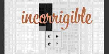
You’ll notice if you change the “o” glyph, it will end up not looking great.
Bistro Script is cursive, and cursive letters connect. There may be a letter following an r that ends at mid-height, in which case we would want an alternate are.
There are 3 glyph alternates for lowercase “o” in this font for that exact reason.
Alternates can help keep the cursive under control and looking good.
Glyphs Menu
In Photoshop
In Photoshop, opening the Glyph window is pretty simple. In some Workspace modes there is an icon that looks like this:
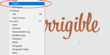
If you don’t see it, that’s fine. Click “Window” on the Title Bar, and then click “Glyphs”.
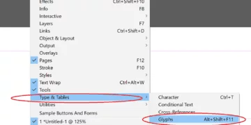
In InDesign
In InDesign, there is a keyboard shortcut to open the glyphs window: Alt + Shift + F11. InDesign keyboard shortcuts are covered in detail in our Introduction to InDesign course.
Alternatively, you can navigate to the Title Bar, click Windows>Types & Tables>Glyphs
The Glyph Window is quite useful, so we are going to go through it now.
There are three drop-downs in the Glyph Window:
-the Font drop-down
-the Style drop-down and
-the Alternates drop-down
We will be focusing our efforts on the Alternates drop-down. In Photoshop it is the lowest; in InDesign, it is the highest. I’ll be using PhotoShop.
Let’s start by opening the Alternates dropdown and clicking “Entire Font”
Scrolling through the “Entire Font” Section, we see all sorts of glyphs that we were not privy to before.
The “Entire Font” Section gives us every single glyph in the font. Usually, we will want to narrow things down a bit, however.
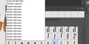
Stylistic Alternates
In the Alternates dropdown in Photoshop, you will see several options that all say “Stylistic Alternates”. Select the Top-most one.
The other options show the Stylistic Alternates only for specific letters, whereas this one shows it for them all.
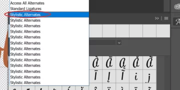
But what are Stylistic Alternates? Stylistic Alternates are alternates with a marked difference from the original glyph. They can be functional, aesthetic, or both.
In Figure 12, you see a normal “r” with a cursive appearance. This is a Stylistic Alternate to the default cursive “r” in Bistro Script.
You also see a “j” with a “^” above it. Languages other than English often use symbols like that to facilitate pronunciation.
Ligatures
Erase the word “incorrigible” and type “yy”. Look carefully at what happens to the letters. They attach and become a single glyph.
This is because they are a ligature. A ligature is a single glyph that is representative of multiple letters.
This can be important, as in the case where two glyphs would otherwise appear badly next to each other. But it can also be aesthetic, as in the case with the two y’s.
In Part 2, we’ll get into creating Glyphs, for ourselves!