
Making Power BI Reports Tell a Story [Smart Formatting]
Contents
- 1 The Limitations of Basic Formatting
- 2 The Role of Smart Formatting
- 3 Technique 1: Dynamic Performance Indicators
- 4 Technique 2: Peer Group Comparisons
- 5 Technique 3: Multi-Level Status Indicators
- 6 Technique 4: Context-Aware Formatting
- 7 Technique 5: Replacing Text Explanations with Formatting
- 8 Conclusion
Most Power BI users apply basic conditional formatting to change cell colours.
But few realize formatting’s potential to communicate complex insights automatically.
Advanced formatting techniques can replace multiple visuals and help guide users, speeding up your reports!
The Limitations of Basic Formatting
Consider a typical sales dashboard filled with charts, KPIs, and large tables.
Users often have to guess what is important, read legends, or ask questions like “What does this mean?” or “Which numbers require attention?”
Many dashboards display data but do not guide users to key insights effectively.
The Role of Smart Formatting
Advanced conditional formatting acts like a spotlight for data.
It highlights what matters most and instantly conveys meaning.
Instead of requiring users to search for insights, the insights become immediately visible.
For this article, let’s dive down with a sample sales dataset of 10 salespeople across regions with their monthly sales amounts and targets.
We will demonstrate how smart formatting can instantly highlight the top performers.
Technique 1: Dynamic Performance Indicators
Instead of using fixed hard-coded rules such as “above $10,000 is green”:
Formatting can adapt dynamically based on business-defined thresholds.
For example, rather than setting arbitrary sales amounts, formatting can compare each salesperson’s actual performance against their individual targets.
This ensures colouring reflects true achievement levels, regardless of varying target expectations.
From Our Power BI Courses:
We once worked with a sales director who kept asking their analyst for “updated target lines” every month.
The analyst was rebuilding visuals from scratch just to reflect new goals.
We helped them use dynamic performance indicators instead, comparing each salesperson’s sales to their individual target via DAX.
It turned a monthly rebuild into a single reusable visual, saving the analyst several hours every cycle.
You can create an efficient DAX measure that calculates the sales-to-target ratio.
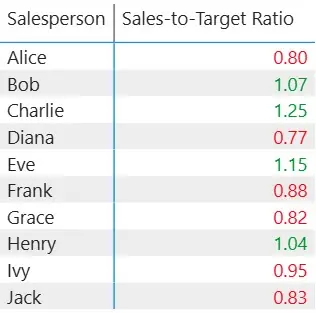
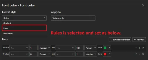
Then apply conditional formatting on the column using this measure: values above 1 (meeting or exceeding target) show in green, while values below 1 shown in red.
In Power BI, this is done by going to the Format pane → Cell elements → Values → Conditional formatting, and setting rules based on the measure.
This makes performance against targets clear and keeps the report meaningful as targets change over time.
Technique 2: Peer Group Comparisons
This technique answers the question, “How is performance compared to peers?” without needing separate comparison charts.
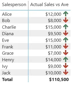
In this example, each row in the matrix compares a salesperson’s sales to the team average, which is calculated using a simple DAX measure.
The conditional rule then references this measure: an up arrow (↑) is shown when sales are above the team average, while a down arrow (↓) appears when below.
This makes it easy to spot who is over or under-performing at a glance:
All while keeping the view relevant no matter when the data is reviewed.
Trainer Insight:
In one of our Power BI workshops in London, a client used peer comparison to track team performance.
They could see who was above or below the team average without creating extra charts.
During reviews, managers could spot top performers in seconds and focus conversations on recognition instead of recalculating benchmarks.
Technique 3: Multi-Level Status Indicators
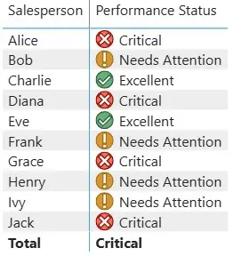
Moving beyond simple binary formatting, multi-level indicators provide more nuance to performance status.
For instance, sales results can be classified into multiple categories:
- Check for significantly above target
- Exclamation point for meeting target
- Cross mark for failing to meet the target
Adding icons as such further clarify the message.
Pro Tip: You can also use both colour and icons together for accessibility. Colour-blind users can rely on the icons, while others benefit from the colour coding.
This dual approach ensures your formatting communicates effectively to all users, regardless of visual limitations.
From the Trenches:
A finance team we supported had a KPI table that confused everyone, users didn’t know which numbers were good or bad.
We added multi-level status icons (✓, !, ✗) alongside colour coding.
Suddenly, the same table became self-explanatory.
Managers stopped asking for extra notes because the meaning was clear at a glance.
Technique 4: Context-Aware Formatting
This advanced approach allows formatting to adapt based on region, making comparisons more meaningful.
In this example, a DAX measure sets different performance thresholds depending on the selected region.
More mature regions, such as East or North, have higher sales expectations, while developing regions have lower thresholds.
The Sales values are then formatted against these region-specific targets, ensuring the report reflects realistic performance standards regardless of where the salesperson operates.

Insights From Our Training:
One national sales team wanted fairer comparisons between mature and developing regions.
We showed them how to apply region-specific thresholds through DAX measures.
This made performance reviews much more balanced!
Struggling regions weren’t penalised unfairly, and high-performing ones were recognised properly.
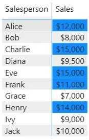
Technique 5: Replacing Text Explanations with Formatting
Instead of using text notes to explain insights, you can use formatting to show key information directly.
In this example, instead of adding text notes or other columns, we highlight the top 5 salespeople dynamically using a DAX ranking measure.
Each salesperson’s total sales are compared across the team, and conditional formatting is applied based on their rank.
This way, the top sales are automatically emphasized in the matrix, without any explanatory callouts.
Benefit: Dashboards become leaner, less cluttered, and users can instantly see who is performing best, letting formatting do the explanatory work.
Conclusion
Advanced conditional formatting is more than just a design tool.
It makes reports smarter and easier to understand.
By reducing clutter and eliminating the need for lengthy explanations, formatting guides users straight to the insights that matter.
Starting with even one of these techniques can greatly improve report clarity and user experience.
When formatting does the talking, data storytelling becomes more effective and engaging.
- Facebook: https://www.facebook.com/profile.php?id=100066814899655
- X (Twitter): https://twitter.com/AcuityTraining
- LinkedIn: https://www.linkedin.com/company/acuity-training/