
How to Create Carousel Buttons in Power BI
Contents
If you’ve ever tried to cram too many charts onto one report page, you know what happens.
The page gets cluttered, users don’t know where to look, and the story you’re trying to tell gets lost.
Carousel buttons fix that problem.
Instead of stacking visuals side by side:
You place them in the same spot and let people flip through them like slides.
It feels cleaner, takes up less space, and keeps the audience focused.
What Are Carousel Buttons?
Think of them as a mini slideshow inside your report.
Several visuals share the same location, but only one shows at a time.
Users click “Next” or “Previous” to switch views.
This works well when:
- You want to group related visuals
- The page feels overcrowded
- You want users to explore insights in a logical sequence
The benefits are simple: you save space, tell a cleaner story, and make it easier for users to focus.
From The Trenches:
When we help people redesign overcrowded dashboards, carousel buttons are often the breakthrough.
One client had crammed six visuals side by side, and nobody knew where to look.
We grouped them into a three-step carousel:
Suddenly the report felt clean, guided, and purposeful – stakeholders actually started using it again.
Step 1: Decide What Goes in the Carousel
Two to four visuals are plenty. More than that can feel overwhelming.
Good combinations include:
- Sales chart → KPI cards → Top customers
- Regional map → Monthly trend → Product performance
- Financial summary → Variance analysis → Forecast
Place the visuals in exactly the same spot so they overlap perfectly.
Only the top visual shows initially; the others are hidden behind it.
Trainer Insight: The visuals should tell a story. Randomly stacked charts just create extra clicking without guiding the user.
Step 2: Create Bookmarks
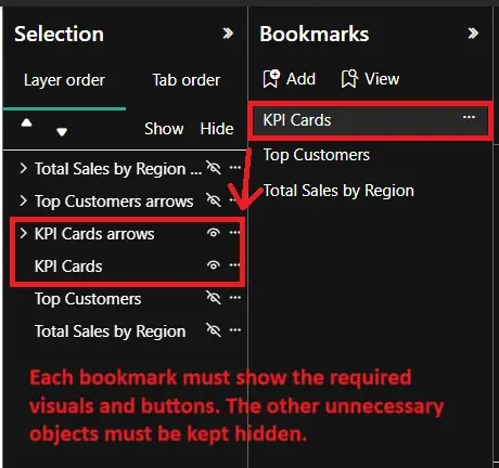
This is where the carousel starts working. Open View → Bookmarks Pane and Selection Pane.
For each bookmark:
- In the Selection Pane, hide everything except the visual you want visible (toggle the little eye icon).
- Click Add in the Bookmarks pane.
- Rename it clearly according to the visual being shown.
- Make sure Display and Current Page are checked. Uncheck Data if you want slicers to remain interactive.
Test each bookmark.
If clicking it shows the wrong visual, go back to the Selection Pane, adjust visibility, and update the bookmark.
Power BI buttons link to a specific bookmark, not a dynamic “next” or “previous” function, so you’ll need a button set for each visual.
For a 3-visual carousel:
- Set 1: Next → View 2, Previous → View 3
- Set 2: Next → View 3, Previous → View 1
- Set 3: Next → View 1, Previous → View 2
Next button:
- Insert → Elements → Button → Blank Button
- Add text: “Next” or use a right arrow icon
- Place near the visual
Previous button:
- Copy the Next button, change text/icon to “Previous” or left arrow
- Position on the other side
Assign actions and visibility:
- Select the button → Format → Action → Type = Bookmark → assign the correct bookmark
- Use the Selection Pane to show only the button set for the current visual
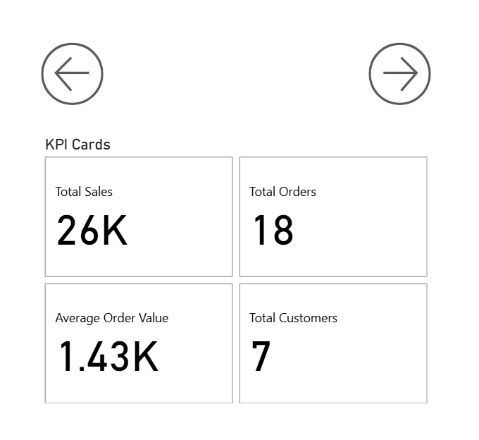
For example, say a carousel has three visuals: KPI Cards, Top Customers, and Total Sales by Region.
Each visual has its own arrow set.
The KPI Cards next arrow go to Top Customers, Top Customers next arrow go to Total Sales by Region, and Total Sales by Region next arrow loop back to KPI Cards, creating a smooth navigation flow.
This is also applicable vice versa.
Step 4: Style the Buttons
Don’t skip styling. Clear, consistent buttons improve usability:
- Match your report’s color scheme
- Add hover effects
- Use arrows instead of text if it’s cleaner
- Keep buttons large enough for touch interaction
Consistency is key: same size, shape, and spacing across all sets.
However, make sure you keep a clear logic alongside your style!
Step 5: Test the Carousel
Click through the buttons. Make sure:
- The correct visual appears each time
- Hidden visuals stay hidden
- Navigation buttons correspond to the current visual
If something looks off, check bookmarks and button visibility. Adjust until it runs smoothly.
Best Practices
Keep It Short: Two to four visuals max.
More steps confuse users and reduce the benefit of focused presentation.
Maintain Logical Flow: Visuals should tell a story.
Make sure visuals in your carousel make sense together, and are a part of the same story.
Use Intuitive Button Labels: Carousels should be simple!
Users should immediately understand how to navigate.
From our Power BI Training in London:
In our London training sessions, we see a common mistake: treating carousels as decoration.
If the visuals don’t form a logical sequence, users get lost.
Make each visual leads naturally to the next (KPIs → trends → detailed breakdown)
And people will stay engaged and follow the story.
In our London training sessions, we see a common mistake: treating carousels as decoration.
If the visuals don’t form a logical sequence, users get lost.
Make each visual leads naturally to the next (KPIs → trends → detailed breakdown)
And people will stay engaged and follow the story.
Common Uses
Executive Dashboards: KPIs, charts, and follow-up items in one space
Regional Breakdowns: Map, then details, then comparisons
Finance Reports: Summary → analysis → forecast
Storytelling Reports: Guide users from problem → cause → solution
Troubleshooting
- Visuals don’t hide? Recreate the bookmarks
- Buttons not working? Check bookmark names
- Layout issues? Ensure all visuals are aligned and sized the same
Conclusion
Carousel buttons are simple, but they change the way a report feels.
They save space, guide users, and make the report interactive.
Start with two or three visuals, then experiment with styling and advanced options.
The goal isn’t flash: it’s clarity and usability.
- Facebook: https://www.facebook.com/profile.php?id=100066814899655
- X (Twitter): https://twitter.com/AcuityTraining
- LinkedIn: https://www.linkedin.com/company/acuity-training/