
How London Teams Use Power BI to Drive Hybrid Work Decisions
Contents
Hybrid work has become the new normal in London.
But with office space in the city costing around £140+ per square foot each year, businesses are facing tough questions.
Which offices sit half-empty most of the week?
Are people actually using those hot desks?
Do we even really need this lease?
The answers are already sitting in your data.
Be it in office check-in logs, desk booking tools, and employee surveys.
Power BI helps bring all that information together, so managers can see what’s really happening and make smarter decisions about workspace and policy.
Making Use of the Data You Already Have
Most London companies already collect hybrid work data, even if it’s scattered across different systems.
You might have building access data showing when employees badge in, desk booking records from tools like Envoy or OfficeSpace, and activity data from Microsoft Teams or pulse surveys.
For example, imagine a dataset from a London HQ tracking attendance in a week.
It includes employee names, departments, office locations, dates, and whether each person came into the office.
In Power BI, this small dataset becomes a foundation for powerful insights about how teams use space.
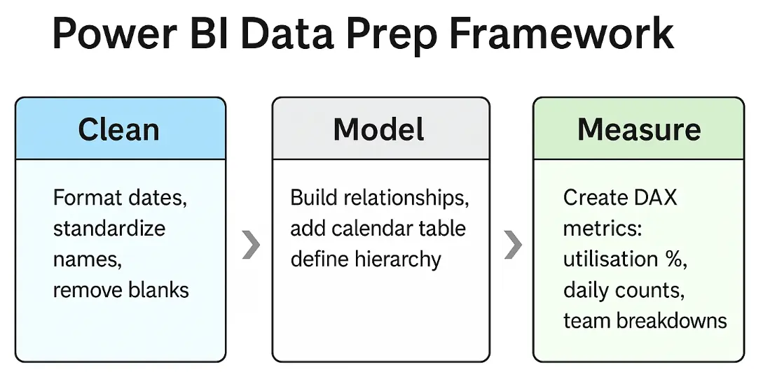
Cleaning and Modelling Your Data
Before building visuals, you need to prepare the data properly in Power Query.
Make sure your date columns are formatted correctly, and create a simple calendar table if you plan to analyse attendance by week or month.
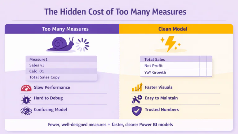
Next, create DAX measures to power your visuals.
You’ll need measures such as office utilisation percentage, total in-office days, daily attendance counts, and department-level breakdowns.
These measures use CALCULATE and DIVIDE functions to count attendance records and compute percentages.
Build measures that work at different grain levels, overall utilisation for KPI cards, daily metrics for trend lines, and department-specific calculations for heatmaps.
Once your measures are in place, they’ll automatically respond to filters and slicers, letting managers drill into specific teams or time periods without rebuilding formulas.
You can also add calculated columns for details like office location or department. For companies with multiple sites across London, this helps you compare usage by area.
Building Dashboards That Answer Real Questions
Visuals are the way Power BI communicates, so let’s build them to answer the questions managers care about most.
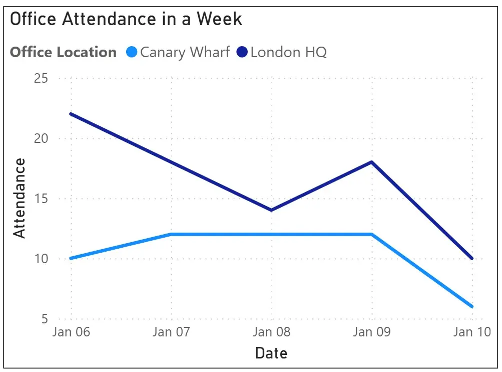
A line chart showing weekly attendance can quickly reveal patterns.
You might notice peaks on the four weekdays and a drop on Friday (Jan 06 is a Monday).
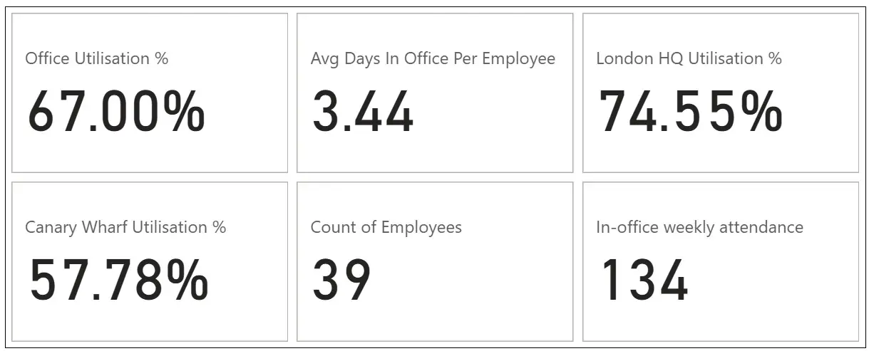
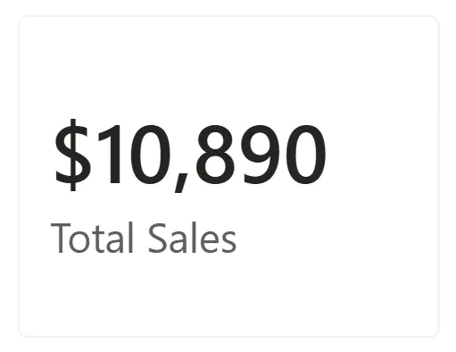
Add KPI cards at the top of your dashboard to highlight key numbers such as average utilisation, average in-office days, and the count of employees.
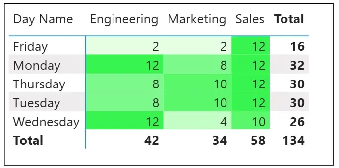
A heatmap is great for spotting team-level trends. For example, you can visualise which departments come in most often on certain days.
Darker colours can indicate higher attendance, making it easy to see where space is actually needed.
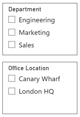
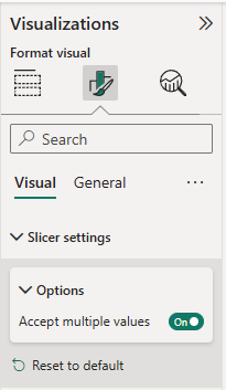
Finally, use slicers for filtering by department, date range, or office location.
This allows HR or operations managers to focus on their specific teams without being overwhelmed by company-wide data.
Put these together, and you’ll have a dynamic dashboard that will refresh week by week, and make it easy for you to make decisions.
Turning Insights Into Action
The real value of Power BI comes from using those insights to take action.
One London fintech, for example, discovered through its Power BI dashboard that its Canary Wharf office was only 38% full on Fridays.
They switched to a four-day in-office schedule and subleased two floors, saving around £400,000 a year.
You can do the same by:
- Spotting underused offices. If your Holborn site is sitting at 40% utilisation, you might consider downsizing or switching to flexible workspace.
- Redesigning collaboration areas. If certain teams cluster midweek, dedicate meeting rooms to those days.
- Tailoring hybrid policies. If your sales team needs desks daily, but engineers work remotely most of the time, adjust schedules and seating accordingly.
You can even add a short note on the dashboard to explain what the data shows, something like: “Friday attendance is down 60% compared to Monday. Consider making Fridays remote-first.”
Clear messages like this help teams act on the insights right away.
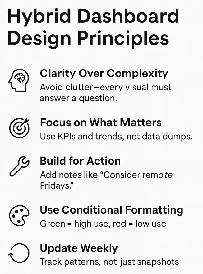
Building Better Hybrid Dashboards
The best hybrid dashboards aren’t overloaded with visuals, they’re focused on helping people make decisions.
A key point we always make a part of our Power BI workshops in London, is that end users want clear takeaways!
Managers don’t want complex tables; they want something that makes sense to them: “Do we need this space?” or “When are people actually in?”
Use conditional formatting to highlight important trends.
For instance, show low attendance in red and optimal utilisation in green.
Update your reports weekly so you can track changing patterns over time.
It also helps to include short explanations within the report.
In training sessions across London, we’ve seen managers understand dashboards faster when there’s a short narrative explaining why something matters, not just what it shows.
Conclusion
Hybrid work in London isn’t going away. According to Microsoft’s Work Trend Index, about 70% of UK workers want flexible arrangements.
But flexibility without insight leads to wasted space and higher costs.
Power BI helps cut through the noise. It turns disconnected spreadsheets into a single view that tells you exactly how your offices are used.
Whether you’re managing one London HQ or multiple sites across the city, these insights can help you save money and create better workplace experiences for your people.
Start simple, load your check-in data, calculate utilisation, and plot attendance over time.
You’ll start to see trends you didn’t notice before, and it won’t be long before leadership starts asking for more dashboards like it.
- Facebook: https://www.facebook.com/profile.php?id=100066814899655
- X (Twitter): https://twitter.com/AcuityTraining
- LinkedIn: https://www.linkedin.com/company/acuity-training/